HarmonyOs开发:导航tabs组件封装与使用
前言
主页的底部导航以及页面顶部的切换导航,无论哪个系统,哪个App,都是最常见的功能之一,虽然说在鸿蒙中有现成的组件tabs可以很快速的实现,但是在使用的时候,依然有几个潜在的问题存在,第一,当导航较少时,tabs是默认居中模式,目前无法进行居左,在有这样功能的时候,难以满足需求;第二,导航右侧需要展示按钮的时候,tabs也是无法满足的;除此之外,还有很多人都非常关心的问题,底部的指示器可以跟随页面的滑动而滑动;面对着种种问题的存在,系统的tabs改进之路仍然很艰巨。
本篇的文章内容如下:
1、封装tabs效果及基本使用
2、主要的封装实现分析
3、开源地址
4、相关总结
一、封装tabs效果及基本使用
所有的效果都是基于tabs组件进行拓展的。
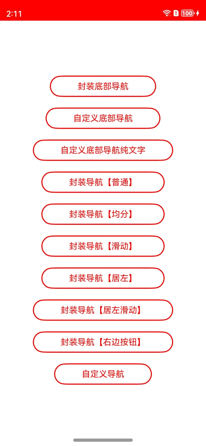
(功能项)
(底部Tab)
(普通导航)
以上就是封装后的部分效果,目前已经上传到了远程仓库,大家可以按照以下的方式进行使用。
**方式一:**在Terminal窗口中,执行如下命令安装三方包,DevEco Studio会自动在工程的oh-package.json5中自动添加三方包依赖。
ohpm install @abner/tab
**方式二:**在工程的oh-package.json5中设置三方包依赖,配置示例如下:
"dependencies": { "@abner/tab": "^1.0.7"}
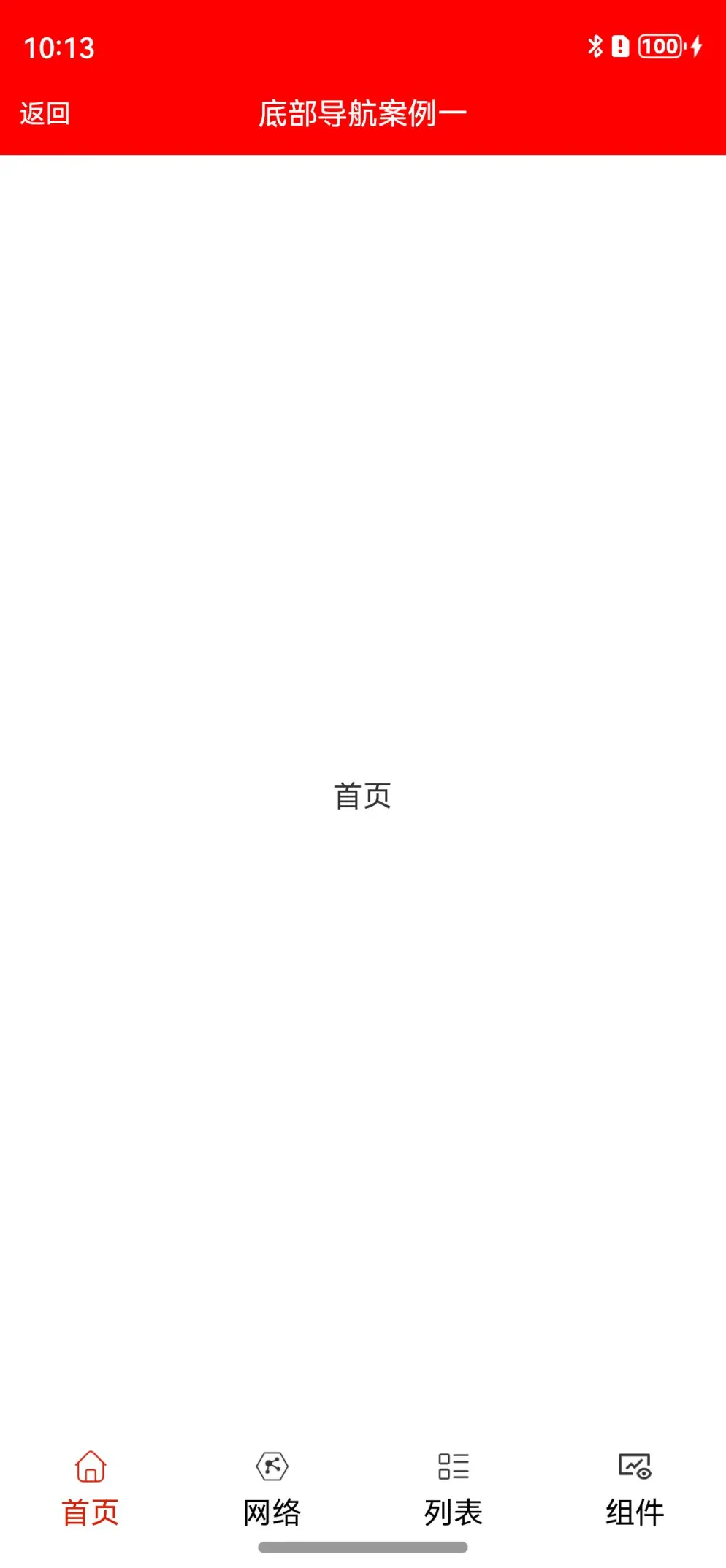
1、底部导航案例
相关效果:
代码实现:
@Entry
@Component
struct BottomTabPage1 {
/**
* AUTHOR:AbnerMing
* INTRODUCE:tab对应的页面
* @param index 索引
* @param item TabBar对象,非必须
* */
@Builder
itemPage(index: number, item: TabBar) {
Text(item.title)
}
build() {
Column() {
ActionBar({ title: "底部导航案例一" })
BottomTabLayout({
itemPage: this.itemPage,//tab对应的页面
tabSelectedColor: "#D81E06",//文字未选择颜色
tabNormalColor: Color.Black,//文字未选择颜色
tabLabelMarginTop: 10,//文字距离图片的高度
tabScrollable: true,//是否可以滑动
tabMarginBottom: 30, //距离底部的距离,一般可以获取底部导航栏的高度,然后进行设置
onChangePage: (position) => {
//页面切换
},
onTabBarClick: (position) => {
//tab点击
},
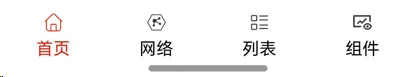
tabBar: [
new TabBar("首页", $r("app.media.ic_home_select"), $r("app.media.ic_home_unselect")),
new TabBar("网络", $r("app.media.ic_net_select"), $r("app.media.ic_net_unselect")),
new TabBar("列表", $r("app.media.ic_list_select"), $r("app.media.ic_list_unselect")),
new TabBar("组件", $r("app.media.ic_view_select"), $r("app.media.ic_view_unselect"))
]
})
}.height("100%")
}
}
相关属性
| 属性 | 类型 | 概述 |
|---|---|---|
| itemPage | BuilderParam | tab对应得页面 |
| tabSelectedColor | ResourceColor | tab选中颜色 |
| tabNormalColor | ResourceColor | tab未选中颜色 |
| tabSelectedBgColor | ResourceColor | 选中背景颜色 |
| tabNormalBgColor | ResourceColor | 未选中背景颜色 |
| tabIconWidth | number | 图片icon的宽度,默认20 |
| tabIconHeight | number | 图片icon的高度,默认20 |
| tabSize | number | tab文字大小 |
| tabWeight | number /FontWeight / string | 文字权重 |
| tabLabelMarginTop | number | 标签距离图片的高度 |
| tabBar | Array | tab数据源 |
| tabWidth | Length | tab指示器的宽度 |
| tabHeight | number | tab指示器的高度,默认56 |
| currentIndex | number | 当前索引,默认是第一个 |
| onChangePage | 回调方法 | 页面切换监听 |
| onTabBarClick | tab点击回调 | tab点击监听 |
| tabScrollable | boolean | 是否可滑动,默认不可以滑动 |
| tabMarginBottom | number | tab距离底部的距离 |
2、底部导航案例2,自定义Tab视图
相关效果:

代码实现:
@Entry
@Component
struct BottomTabPage2 {
  private currentIndex = 0 //默认是第一个

  /**
   * AUTHOR:AbnerMing
   * INTRODUCE:tab对应的页面
   * @param index 索引
   * @param item TabBar对象,非必须
   * */
  @Builder
  itemPage(index: number, item: TabBar) {
    Text(item.title)
  }

/**
 * AUTHOR:AbnerMing
 * INTRODUCE:自定义Tab视图,自己绘制
 * @param index 索引
 * @param item TabBar对象,非必须
 * */
@Builder
itemTab(index: number, item: TabBar) {
    Column() {
      Image(this.currentIndex == index ? item.selectedIcon
        : item.normalIcon)
        .width(30).height(30)
      Text(item.title)
        .fontColor(this.currentIndex == index ? "#D81E06" : "#000000")
        .fontSize(14)
        .margin({ top: 5 })
    }.width("100%")
}

build() {
    Column() {
      ActionBar({ title: "底部导航案例二" })
      BaseBottomTabLayout({
        itemPage: this.itemPage,
        itemTab: this.itemTab,
        tabBar: [
          new TabBar("首页", $r("app.media.ic_home_select"), $r("app.media.ic_home_unselect")),
          new TabBar("网络", $r("app.media.ic_net_select"), $r("app.media.ic_net_unselect")),
          new TabBar("列表", $r("app.media.ic_list_select"), $r("app.media.ic_list_unselect")),
          new TabBar("组件", $r("app.media.ic_view_select"), $r("app.media.ic_view_unselect"))
        ],
        tabMarginBottom: 30, //距离底部的距离,一般可以获取底部导航栏的高度,然后进行设置
        onTabBarClick: (position) => {
          //tab点击
          console.log("====点击了Tab" + position)
        },
        onChangePage: (position) => {
          //页面切换
          console.log("====页面切换了" + position)
        }
      })
    }
}
}
相关属性
| 属性 | 类型 | 概述 |
|---|---|---|
| itemPage | BuilderParam | tab对应得页面 |
| tabSelectedColor | ResourceColor | tab选中颜色 |
| tabNormalColor | ResourceColor | tab未选中颜色 |
| tabSelectedBgColor | ResourceColor | 选中背景颜色 |
| tabNormalBgColor | ResourceColor | 未选中背景颜色 |
| tabIconWidth | number | 图片icon的宽度,默认20 |
| tabIconHeight | number | 图片icon的高度,默认20 |
| tabSize | number | tab文字大小 |
| tabWeight | number /FontWeight / string | 文字权重 |
| tabLabelMarginTop | number | 标签距离图片的高度 |
| tabBar | Array | tab数据源 |
| tabWidth | Length | tab指示器的宽度 |
| tabHeight | number | tab指示器的高度,默认56 |
| currentIndex | number | 当前索引,默认是第一个 |
| onChangePage | 回调方法 | 页面切换监听 |
| onTabBarClick | tab点击回调 | tab点击监听 |
| tabScrollable | boolean | 是否可滑动,默认不可以滑动 |
| tabMarginBottom | number | tab距离底部的距离 |
| isMarginBottom | boolean | 默认开启,tab距离底部的距离 |
3、底部导航案例3,中间图片
代码案例
/**
 * AUTHOR:AbnerMing
 * DATE:2024/3/5
 * INTRODUCE:底部导航案例中间图片
 * */
@Entry
@Component
struct BottomTabPage4 {
  private currentIndex = 0 //默认是第一个

  /**
   * AUTHOR:AbnerMing
   * INTRODUCE:tab对应的页面
   * @param index 索引
   * @param item TabBar对象,非必须
   * */
  @Builder
  itemPage(index: number, item: TabBar) {
    Text(item.title)
  }

  /**
   * AUTHOR:AbnerMing
   * INTRODUCE:自定义Tab视图,自己绘制
   * @param index 索引
   * @param item TabBar对象,非必须
   * */
  @Builder
  itemTab(index: number, item: TabBar) {
    if (index == 2) {
      Column() {
        Image($r("app.media.add"))
          .width(50).height(50)
          .margin({ top: -10 })
      }
    } else {
      Column() {
        Column() {
          Image(this.currentIndex == index ? item.selectedIcon
            : item.normalIcon)
            .width(30).height(30)
          Text(item.title)
            .fontColor(this.currentIndex == index ? "#D81E06" : "#000000")
            .fontSize(14)
            .margin({ top: 5 })
        }
      }.width("100%")
      .justifyContent(FlexAlign.Center)
    }
  }

  build() {
    Column() {
      ActionBar({ title: "自定义底部导航(中间图片)" })
      BaseBottomTabLayout({
        itemPage: this.itemPage,
        itemTab: this.itemTab,
        barBackgroundColor: "#e8e8e8",
        centerImageMarginBottom: 10,
        tabBar: [
          new TabBar("首页", $r("app.media.ic_home_select"), $r("app.media.ic_home_unselect")),
          new TabBar("网络", $r("app.media.ic_net_select"), $r("app.media.ic_net_unselect")),
          new TabBar("中间图片"),
          new TabBar("列表", $r("app.media.ic_list_select"), $r("app.media.ic_list_unselect")),
          new TabBar("组件", $r("app.media.ic_view_select"), $r("app.media.ic_view_unselect"))
        ],
        tabMarginBottom: 30, //距离底部的距离,一般可以获取底部导航栏的高度,然后进行设置
        onTabBarClick: (position) => {
          //tab点击
          console.log("====点击了Tab" + position)
        },
        onChangePage: (position) => {
          //页面切换
          console.log("====页面切换了" + position)
        },
        onDoubleClick: (position) => {
          //双击
          console.log("===========双击:" + position)
        },
      })
    }
  }
}
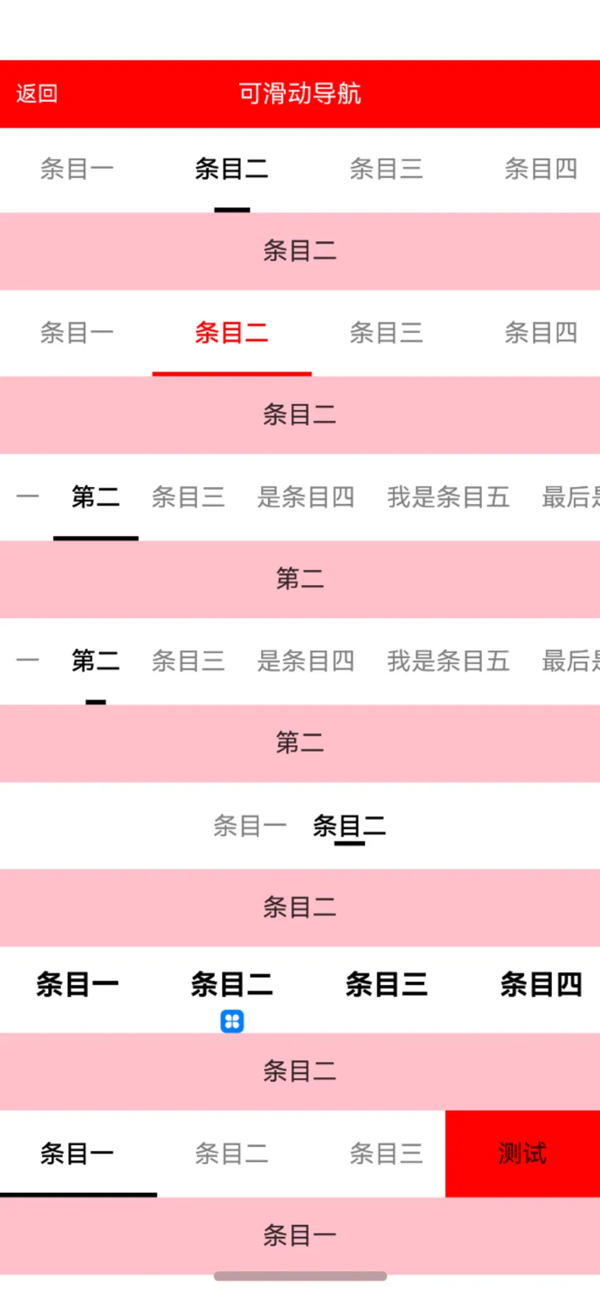
4、普通指示器导航【滑动】
简单案例
TabLayout({
  tabBar: ["条目一", "条目二"],
  itemPage: this.itemPage,
  onChangePage: (position) => {
    //页面改变
    console.log("===页面改变:" + position)
  },
  onTabBarClick: (position) => {
    //点击改变
    console.log("===点击改变:" + position)
  }
})
设置圆角
TabLayout({
            tabBar: ["条目一", "条目二", "条目三", "条目四", "条目五", "条目六"],
            itemPage: this.itemPage,
            tabAttribute: (tab) => {
              tab.tabDividerStrokeWidth = 10
              tab.tabDividerLineCapStyle = LineCapStyle.Round
            },
            onChangePage: (position) => {
              //页面改变
              console.log("===页面改变:" + position)
            },
            onTabBarClick: (position) => {
              //点击改变
              console.log("===点击改变:" + position)
            }
          })
设置宽度
TabLayout({
            tabBar: ["条目一", "条目二", "条目三", "条目四", "条目五", "条目六"],
            itemPage: this.itemPage,
            tabAttribute: (tab) => {
              tab.tabDividerWidth = 20
            },
            onChangePage: (position) => {
              //页面改变
              console.log("===页面改变:" + position)
            },
            onTabBarClick: (position) => {
              //点击改变
              console.log("===点击改变:" + position)
            }
          })
跟随文字宽度
TabLayout({
            tabBar: ["一", "第二", "条目三", "是条目四", "我是条目五", "最后是条目六"],
            itemPage: this.itemPage,
            tabAttribute: (tab) => {
              tab.tabItemWidth = undefined
              tab.tabItemMargin = { left: 10, right: 10 }
              //更改下划线的宽度
              tab.tabDividerWidth = undefined
            },
            onChangePage: (position) => {
              //页面改变
              console.log("===页面改变:" + position)
            },
            onTabBarClick: (position) => {
              //点击改变
              console.log("===点击改变:" + position)
            }
          })
左侧按钮
TabLayout({
            tabBar: ["条目一", "条目二", "条目三", "条目四", "条目五", "条目六"],
            itemPage: this.itemPage,
            tabMenu: this.itemMenu, //按钮
            onChangePage: (position) => {
              //页面改变
              console.log("===页面改变:" + position)
            },
            onTabBarClick: (position) => {
              //点击改变
              console.log("===点击改变:" + position)
            }
          })
自定义下划线
BaseTabLayout({
            tabBar: ["条目一", "条目二", "条目三", "条目四", "条目五", "条目六"],
            itemPage: this.itemPage,
            tabModel: {
              tabDividerStrokeWidth: 15
            },
            itemTabIndicator: () => {
              this.tabItemTabIndicator(this) //自己定义指示器
            },
            itemTab: (index: number, item: string) => {
              this.tabItem(this, index, item)
            },
          })
相关属性
| 属性 | 类型 | 概述 |
|---|---|---|
| tabWidth | Length | tab指示器的宽度 |
| tabHeight | number | tab指示器的高度 |
| onChangePage | 回调方法(position: number) | 页面改变回调 |
| currentIndex | number | 当前索引,默认第0个 |
| tabScrollable | boolean | 是否可以滑动切换页面,默认可以滑动 |
| tabBar | Array | 数据源 |
| itemPage | 回调方法BuilderParam (index: number, item: string) | tab对应得页面 |
| tabAttribute | 回调方法(attribute: TabModel) | 设置tab相关属性 |
| isHideDivider | boolean | 是否隐藏下划线,默认展示 |
| isTabAlignLeft | boolean | 是否从最左边开始,默认不是 |
| barMode | BarMode | 是均分还是可滑动,默认滑动 |
| onTabBarClick | 回调方法(position: number) | tab点击回调 |
| isShowTabMenu | boolean | 是否展示右边的按钮选项,默认不展示 |
| tabMenu | 回调方法BuilderParam | 右边展示的按钮视图 |
| tabMenuWidth | number | tab右侧按钮的宽度 |
| tabMenuMarginRight | number | tab按钮距离右侧的距离 |
5、普通指示器导航【不可滑动】
简单案例
TabLayout({
        tabBar: ["条目一", "条目二", "条目三", "条目四", "条目五", "条目六"],
        itemPage: this.itemPage,
        tabType: TabType.DEFAULT, //普通的需要设置默认值,指示器不会跟着手势滑动
        onChangePage: (position) => {
          //页面改变
          console.log("===页面改变:" + position)
        },
        onTabBarClick: (position) => {
          //点击改变
          console.log("===点击改变:" + position)
        }
      })
均分
TabLayout({
        tabBar: ["条目一", "条目二"],
        barMode: BarMode.Fixed, //均分
        tabType: TabType.DEFAULT, //普通的需要设置默认值,指示器不会跟着手势滑动
        itemPage: this.itemPage,
        onChangePage: (position) => {
          //页面改变
          console.log("===页面改变:" + position)
        },
        onTabBarClick: (position) => {
          //点击改变
          console.log("===点击改变:" + position)
        }
      })
二、主要的封装实现分析
大部分的封装都是基于系统提供的Api实现的,无非就是简化了相关代码,基本上都不难,大家可以直接查看源码即可,这里重点说下普通导航的居左效果。
在文章开头的时候已经阐述,目前的tabs是不支持居左的,如果要实现居左的效果,就要自己自定义,这里使用的是横向的List组件实现的,通过Scroller来控制滑动距离。
List({ scroller: this.scroller }) {
            ForEach(this.tabBar, (item: string, index: number) => {
              ListItem() {
                this.tabItem(index, item)
              }.height(this.tabHeight)
              .onClick(() => {
                //条目点击
                if (this.isTabAlignLeft) {
                  //自定义滑动
                  if (index > this.currentIndex) {
                    this.scroller.scrollBy(20 * (index + 1), 0)
                  } else {
                    this.scroller.scrollBy(-20 * (this.tabBar.length - index), 0)
                  }
                }
                this.currentIndex = index
              })
            }, (item: string) => item)
          }
          .listDirection(Axis.Horizontal)
          .width(this.tabListWidth)
          .height(this.tabHeight)
          .scrollBar(BarState.Off)
需要注意的是,如果采用居左的效果,那么系统的tabBar我们就要舍弃,如下代码,如果居左,采用上述自定义tabBar,否则采用系统自定义的。
//使用tabBar对象形式传递
        if (this.isTabAlignLeft) {
          ForEach(this.tabBar, (item: string, index) => {
            TabContent() {
              this.itemPage(index, item)
            }
          })
        } else {
          ForEach(this.tabBar, (item: string, index) => {
            TabContent() {
              this.itemPage(index, item)
            }.tabBar(this.tabItem(index, item))
          })
        }
至于右侧的按钮布局,其实和自定义tabBar一致,采用的是RelativeContainer组件,包裹住按钮组件和tabBar组件即可,当然了,更多的代码,大家还是查看源码比较好,代码里的注释写的比较详细。
三、开源地址
地址中也有详细的使用概述:
[https://ohpm.openharmony.cn/#/cn/detail/@abner%2Ftab](https://ohpm.openharmony.cn/#/cn/detail/@abner%2Ftab)
四、相关总结
指示器随着手势滑动,系统中的Api是支持的,但是需要实现的代码量很多,而且模式只支持Fixed,那么在导航条目较多的情况下,这个模式是很不符合需求的,当然了,我也在一步一步优化中,也希望在较短的时间内可以实现,大家可以持续关注。