鸿蒙开发:自定义一个任意位置弹出的Dialog
前言
本文基于Api12
鸿蒙开发中,一直有个问题困扰着自己,想必也困扰着大多数开发者,那就是,系统提供的dialog自定义弹窗,无法实现在任意位置进行弹出,仅限于@CustomDialog和@Component struct的成员变量,这就导致了,我想在封装的工具类或者ViewModel,或者其他地方弹出,只能通过事件或者回调触发UI层才能执行,很是不方便,除此之外,虽然说UI我们可以共用,但CustomDialogController,每个使用的地方都需要定义,也是很冗余。当然了,本身dialog应该在UI层弹出,鸿蒙这样设计是不存在问题的,但为了兼顾到易用性,任意位置弹出,想必有很多人还是非常需要的。

系统自定义弹窗
dialogController = new CustomDialogController({
    builder: this.customDialog,
    autoCancel: true,
  })

  /*
 * Author:AbnerMing
 * Describe:自定义Dialog
 */
  @Builder
  customDialog() {
    Text("我是自定义Dialog")
      .width("100%")
      .height(100)
  }


 this.dialogController.open()//弹出
 this.dialogController.close()//关闭
如何摆脱UI的限制,在任意位置弹出,目前有两种方案可以实现,第一种是使用window创建窗口的形式,这种形式,有初始化的需要,无论是依赖window.WindowStage还是普通的页面,都是前置的依赖项,当然了还有一点,就是弹出方式稍微生硬,不过可以满足正常的需求;第二种是通过promptAction中的openCustomDialog方式,不过这种方式需要在Api11及以上的版本,对于目前的使用需求,如果想实现任意位置弹出,还是建议使用openCustomDialog方式。
openCustomDialog简单使用
通过openCustomDialog方式弹出弹窗,通过closeCustomDialog方式关闭弹窗。
private customDialogComponentId: number = 0

  build() {
    Column() {
      Button("简单Demo")
        .onClick(() => {
          promptAction.openCustomDialog({
            builder: () => {
              this.customDialogComponent()
            }
          }).then((dialogId: number) => {
            this.customDialogComponentId = dialogId
          })
        })
    }
    .width("100%")
    .height("100%")
    .justifyContent(FlexAlign.Center)
  }

  @Builder
  customDialogComponent() {
    Column() {
      Text('弹窗').fontSize(30)
      Row({ space: 50 }) {
        Button("确认").onClick(() => {
          promptAction.closeCustomDialog(this.customDialogComponentId)
        })
        Button("取消").onClick(() => {
          promptAction.closeCustomDialog(this.customDialogComponentId)
        })
      }
    }.height(200).padding(5).justifyContent(FlexAlign.SpaceBetween)
  }
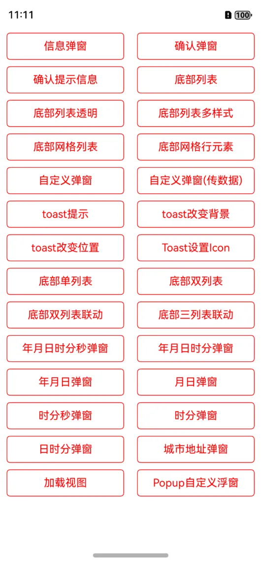
目前基于openCustomDialog方式,自己也封装了一层,已支持市场上常见的大部分功能,比如信息弹窗,确认取消形式弹窗,底部弹窗,时间,城市等等样式,当然了,也支持自定义组件形式,几乎涵盖了所有的场景,有需要的朋友可以直接进行使用。
中心仓库地址:
https://ohpm.openharmony.cn/#/cn/detail/@abner%2Fdialog
目前针对各个功能也进行罗列一下,方便大家可以针对性的使用。
快速使用
方式一:在Terminal窗口中,执行如下命令安装三方包,DevEco Studio会自动在工程的oh-package.json5中自动添加三方包依赖。
建议:在使用的模块路径下进行执行命令。
ohpm install @abner/dialog
方式二:在工程的oh-package.json5中设置三方包依赖,配置示例如下:
"dependencies": { "@abner/dialog": "^1.1.1"}
初始化
初始化可以更改统一的配置,比如宽高,比如大小、比如背景等等,当然是在需要的情况下,如果默认的样式满足需求,全局初始化可以省略,您也可以在单独调用的时候进行修改样式。
initDialog(attribute)
属性介绍
| 属性 | 类型 | 概述 |
|---|---|---|
| attribute | FusionAttribute | 可选参数,dialog属性全局配置,用于修改弹窗样式,可根据UI在这里进行配置 |
FusionAttribute属性
FusionAttribute是全局的dialog属性配置,如果默认提供的dialog样式和您的项目中样式不一样,可通过此参数进行设置,全局配置一次 页面中的所有使用地方均会生效,方便您后续使用。
| 属性 | 类型 | 概述 |
|---|---|---|
| infoOrConfirmAttribute | ContentAttribute | 可选参数,信息或者确认形式弹窗属性配置 |
| bottomListAttribute | BottomListAttribute | 可选参数,底部列表弹窗属性配置 |
| bottomGridAttribute | BottomGridAttribute | 可选参数,底部网格列表弹窗属性配置 |
| bottomListScrollAttribute | BottomListScrollAttribute | 可选参数,底部的滑动列表属性 |
| toastAttribute | ToastAttribute | 可选参数,Toast属性配置 |
| loadingAttribute | LoadingAttribute | 可选参数,loading提示 |
| isUseMainWindow | boolean | 是使用主window还是子window,默认是子 |
ContentAttribute属性
ContentAttribute是信息或者确认形式弹窗属性配置。
| 属性 | 类型 | 概述 |
|---|---|---|
| title | string / Resource | 可选参数,标题,全局初始化中无需配置 |
| message | string / Resource | 可选参数,描述信息,全局初始化中无需配置 |
| cancelText | string / Resource | 可选参数,取消文字 |
| confirmText | string / Resource | 可选参数,确认文字 |
| clickCancelHide | boolean | 可选参数,默认点击取消隐藏 |
| isHideTitle | boolean | 可选参数,是否隐藏标题,默认不隐藏 |
| clickCancel | 回调 | 可选参数,点击取消回调事件 |
| clickConfirm | 回调 | 可选参数,点击确认回调事件 |
| bottomMenuHeight | Length | 可选参数,底部按钮高度 |
| backgroundColor | ResourceColor | 可选参数,背景颜色 |
| radius | BorderRadiuses / Length | 可选参数,角度 |
| titleAttribute | TitleAttribute | 可选参数,标题样式属性 |
| messageAttribute | MessageAttribute | 可选参数,描述样式属性 |
| dividerHAttribute | DividerHAttribute | 可选参数,横向分割线样式属性 |
| dividerVAttribute | DividerVAttribute | 可选参数,垂直分割线样式属性 |
| confirmAttribute | ConfirmAttribute | 可选参数,确认样式属性 |
| cancelAttribute | CancelAttribute | 可选参数,取消样式属性 |
| dialogAttribute | DialogAttribute | 可选参数,弹窗总体属性 |
BottomListAttribute属性
BottomListAttribute是底部列表弹窗属性配置。
| 属性 | 类型 | 概述 |
|---|---|---|
| backgroundColor | ResourceColor | 背景颜色 |
| items | string[] | 列表条目 |
| itemClick | (position: number) | 条目点击回调 |
| cancelClick | () | 取消点击回调 |
| isHideCancel | boolean | 是否隐藏取消按钮 |
| isTransparent | boolean | 是否透明展示 |
| itemRadius | Length / BorderRadiuses | 透明后条目整体的角度 |
| cancelRadius | Length / BorderRadiuses | 透明后取消按钮角度 |
| topLeftRadius | Length | dialog左上角角度 |
| topRightRadius | Length | dialog右上角角度 |
| itemAttr | BottomListItem | 条目属性 |
| itemDivider | ListItemDivider | 分割线属性 |
| cancelAttr | BottomListCancel | 底部取消属性 |
| dialogAttribute | DialogAttribute | 弹窗总体属性 |
BottomGridAttribute属性
| 属性 | 类型 | 概述 |
|---|---|---|
| items | BottomGridModel[] | 条目数据,用于网格 |
| itemLineArray | Array<BottomGridModel[]> | 条目数据,用户每行展示几个,每行几个就几个数据 |
| columnSize | number | 列数,默认是2列 |
| barTitleAttr | BarTitleGridAttribute | 网格上边的titlebar属性 |
| barHeight | number | 网格上边的titleBar的高度 |
| barCancelTextAttr | BarCancelTextGridAttribute | titleBar中的取消属性 |
| barCancelImageAttr | BarCancelImageGridAttribute | titleBar中的取消图片属性,和文字二选一 |
| isBarCancelImage | boolean | titleBar中的取消是否图片方式,默认是false |
| itemMarginTop | number | item每一行距离顶部 |
| backgroundColor | ResourceColor | 背景颜色 |
| topLeftRadius | Length | dialog左上角角度 |
| topRightRadius | Length | dialog右上角角度 |
| isHideBar | boolean | 是否隐藏titlebar |
| dialogAttribute | DialogAttribute | 全局dialog属性 |
| isItemAttrGlobal | boolean | 条目属性是否使用全局,默认是 |
| itemAttr | ItemGridAttribute | 条目属性 |
| itemClick | (position: number) | 条目点击回调 |
| cancelClick | () | 取消点击回调 |
| dividerColor | ResourceColor | 分割线颜色 |
| dividerHeight | number | 分割线高度 |
| isLastDividerShow | boolean | 最后一个是否显示,默认展示 |
| dividerMarginTop | Margin / Length | 分割线距离上边高度 |
| isShowBottomCancel | boolean | 是否展示底部取消按钮,默认不展示 |
| bottomCancelTextAttr | CancelTextGridAttribute | 底部的取消按钮属性 |
ToastAttribute属性
| 属性 | 类型 | 概述 |
|---|---|---|
| msg | string / Resource | 提示信息,初始化时无需 |
| duration | number | 弹出时间,默认2000 |
| backgroundColor | ResourceColor | 背景颜色 |
| fontColor | ResourceColor | 字体颜色 ,默认ffffff |
| fontWeight | number / FontWeight / string | 字体粗细设置,默认400 |
| fontSize | number / string / Resource | 字体大小,默认16 |
| fontFamily | string / Resource | 字体样式 |
| borderRadius | Length / BorderRadiuses | 角度 |
| padding | Padding / Length | 内边距 |
| flexAlign | FlexAlign | 位置方向 |
| leftSrc | PixelMap / ResourceStr/ DrawableDescriptor | 左边图片 |
| rightSrc | PixelMap / ResourceStr/ DrawableDescriptor | 右边图片 |
| topSrc | PixelMap / ResourceStr/ DrawableDescriptor | 上边图片 |
| bottomSrc | PixelMap / ResourceStr/ DrawableDescriptor | 下边图片 |
| imageMargin | Length | 图片距离文字距离 |
| imageWidth | Length | 图片宽度 |
| imageHeight | Length | 图片高度 |
| imageAlt | string /Resource | 加载时显示的占位图 |
DialogAttribute属性
每个弹窗中都有一个dialogAttribute属性,用来控制整体的弹窗样式。
| 属性 | 类型 | 概述 |
|---|---|---|
| windowAlignment | DialogAlignment | 弹窗位置 |
| dialogDismiss | (action?:DismissDialogAction) => void | dialog隐藏状态回调 |
| dialogAppear | () => void | dialog显示回调 |
| windowBottomAnimation | boolean | 是否开启底部动画 |
| isPrivacyMode | boolean | 是否防止截屏,默认不是 |
| isSystemAnimation | boolean | 是否系统动画,默认既是 |
代码案例
1、信息弹窗
showDialogInfo({
  title: "我是标题",
  message: "我是一段描述",
  clickConfirm: () => {
    //确认
    console.log("===确认")
    // hide() //隐藏
  }
})
2、确认/取消弹窗
showDialogConfirm({
  title: "我是一个标题",
  message: "我是一段描述",
  clickCancel: () => {
    //取消
    console.log("===取消")
    // hide() //隐藏
  },
  clickConfirm: () => {
    //确认
    console.log("===确认")
    // hide() //隐藏
  }
})
3、底部列表
showDialogBottomList({
  items: ["我是条目一", "我是条目二"],
  itemClick: (position: number) => {
    console.log("==========:" + position)
  }
})
4、确认提示信息弹窗
showDialogConfirm({
  title: "我是一个标题",
  message: "我是一段描述",
  isShowInformation: true, //展示信息
  informationAttribute: {
    checkboxSelect: true, //是否默认选中
    iconAttribute: {
      srcSelect: $r("app.media.startIcon"), //选中
      srcUnselected: $r("app.media.loading001"), //未选中
    },
    onChange: (isChange) => {
      //点击改变了状态
      console.log("===" + isChange)
    }
  },
  clickCancel: () => {
    //取消
    //hide()
    console.log("===取消")
  },
  clickConfirm: () => {
    //确认
    console.log("===确认")
  }
})
5、底部列表
showDialogBottomList({
  items: ["我是条目一", "我是条目二"],
  itemClick: (position: number) => {
    console.log("==========:" + position)
  }
})
6、底部列表透明
showDialogBottomList({
  items: ["我是条目一", "我是条目二"],
  itemClick: (position: number) => {
    console.log("==========:" + position)
  },
  isTransparent: true,
  dialogAttribute: {
    dialogMarginLeft: 20,
    dialogMarginRight: 20
  }
})
7、底部列表多样式
showDialogBottomList({
  itemModels: [new BottomListModel("条目一", { fontColor: Color.Red }), new BottomListModel("条目二")],
  itemClick: (position: number) => {
    hide()
  }
})
8、底部网格列表
showDialogBottomGrid({
  columnSize: 4,
  items: [new BottomGridModel("微信", $r("app.media.app_icon")),
          new BottomGridModel("朋友圈", $r("app.media.app_icon")),
          new BottomGridModel("QQ", $r("app.media.app_icon")),
          new BottomGridModel("QQ空间", $r("app.media.app_icon")),
          new BottomGridModel("微博", $r("app.media.app_icon")),
          new BottomGridModel("微博", $r("app.media.app_icon")),
          new BottomGridModel("微博", $r("app.media.app_icon")),
          new BottomGridModel("微博", $r("app.media.app_icon"))
         ],
  itemClick: (position) => {
    console.log("==============:" + position)
  }
})
9、底部网格按行区分
showDialogBottomGrid({
  columnSize: 4,
  isShowBottomCancel: true,
  isHideBar: true,
  itemLineArray: [
    [new BottomGridModel("测试", $r("app.media.app_icon")),
     new BottomGridModel("测试", $r("app.media.app_icon"))],
    [new BottomGridModel("测试", $r("app.media.app_icon")),
     new BottomGridModel("测试", $r("app.media.app_icon")),
     new BottomGridModel("测试", $r("app.media.app_icon"))]
  ],
  itemClick: (position) => {
    console.log("==============" + position)
  }
})
10、自定义组件弹窗
首先要自定义一个全局组件,可传入自定义的组件,或者直接写布局
/*
* Author:AbnerMing
* Describe:自定义弹窗,布局自己定义
*/
@Builder
  function BuilderDialog() {
    Column() {
      Text("我是一个自定义弹窗")
        .margin({ top: 30 })
      Row() {
        Button("取消").onClick(() => {
          //隐藏dialog
          hide()
        })
        Button("确定")
          .margin({ left: 30 })
      }.margin({ top: 20 })
        .margin({ top: 30 })
    }.backgroundColor(Color.White)
      .width("60%")
  }
代码调用
showDialog(wrapBuilder(BuilderDialog))
11、自定义组件弹窗带参数
首先要自定义一个全局组件,可传入自定义的组件,或者直接写布局
class DialogParams {
  title?: string
}

@Builder
  function BuilderDialogParams(params: DialogParams) {
    Column() {
      Text(params.title)
        .margin({ top: 30 })
      Row() {
        Button("取消").onClick(() => {
          //隐藏dialog
          hide()
        })
        Button("确定")
          .margin({ left: 30 })
      }.margin({ top: 20 })
        .margin({ top: 30 })
    }.backgroundColor(Color.White)
      .width("60%")
  }
代码调用
let params = new DialogParams()
params.title = "我是传递的参数"
showDialogParams(wrapBuilder(BuilderDialogParams), params)
12、toast提示
toast("我是一个普通的toast")
13、toast改变背景
toast("我是一个改变背景的Toast", { backgroundColor: Color.Red })
14、toast改变位置
toast("我是一个改变位置的Toast", { alignment: DialogAlignment.Center })
15、toast图片设置
toast("Toast设置Icon", { leftSrc: $r("app.media.app_icon") })
16、底部单列表
showDialogBottomListScroll({
  items: ["男", "女"],
  titleBarAttribute: {
    titleText: "选择性别"
  },
  confirmClick: (value, index) => {
    console.log(value + "=========" + index)
  }
})
17、底部双列表不联动
showDialogBottomListScroll({
  selected: [1, 2],
  items: [["第一列1", "第一列2"], ["第二列1", "第二列2", "第二列3"]],
  titleBarAttribute: {
    titleText: "底部双列表不联动"
  },
  confirmClick: (value, index) => {
    console.log(value + "=========" + index)
  }
})
18、底部双列表联动
showDialogBottomListScroll({
  items: this.doubleList,
  titleBarAttribute: {
    titleText: "底部双列表联动"
  },
  confirmClick: (value, index) => {
    console.log(value + "=========" + index)
  }
})
19、底部三列表联动
showDialogBottomListScroll({
  items: this.thirdList,
  titleBarAttribute: {
    titleText: "底部三列表联动",
  },
  confirmClick: (value, index) => {
    console.log(value + "=========" + index)
  }
})
20、年月日时分秒时间弹窗
showDialogTime({
  titleBarAttribute: {
    titleText: "年月日时分秒-弹窗",
  },
  timeAttribute: {
    timeType: TimeDialogType.YMDHMS,
  },
  timeConfirmClick: (date) => {
    //时间回调
    console.log("===时间结果:" + date)
  },
  confirmClick: (value, index) => {
    //内容和索引回调
    console.log("===内容结果:" + value + "===索引结果:" + index)
  }
})
21、年月日时分弹窗
showDialogTime({
  titleBarAttribute: {
    titleText: "年月日时分-弹窗",
  },
  timeAttribute: {
    timeType: TimeDialogType.YMDHM
  },
  timeConfirmClick: (date) => {
    //时间回调
    console.log("===时间结果:" + date)
  },
  confirmClick: (value, index) => {
    //内容和索引回调
    console.log("===内容结果:" + value + "===索引结果:" + index)
  }
})
22、年月日弹窗
showDialogTime({
  titleBarAttribute: {
    titleText: "年月日-弹窗",
  },
  timeAttribute: {
    startTime: "2022-6-12",
    endTime: "2025-8-20",
  },
  timeConfirmClick: (date) => {
    //时间回调
  },
  confirmClick: (value, index) => {
    //内容和索引回调
  }
})
23、月日弹窗
showDialogTime({
  titleBarAttribute: {
    titleText: "月日-弹窗",
  },
  timeAttribute: {
    timeType: TimeDialogType.MD
  },
  timeConfirmClick: (date) => {
    //时间回调
  },
  confirmClick: (value, index) => {
    //内容和索引回调
  }
})
24、时分秒弹窗
showDialogTime({
  titleBarAttribute: {
    titleText: "时分秒-弹窗",
  },
  timeAttribute: {
    timeType: TimeDialogType.HMS,
  },
  timeConfirmClick: (date) => {
    //时间回调
  },
  confirmClick: (value, index) => {
    //内容和索引回调
  }
})
25、城市地址弹窗
showDialogAddress({
  titleBarAttribute: {
    titleText: "城市地址弹窗",
  },
  confirmClick: (value, index) => {
  }
})
26、PopupWindow弹出
首先要定义弹出的组件,自定义即可,支持自定义组件形式,传入即可
/**
 * AUTHOR:AbnerMing
 * INTRODUCE:popup 弹出框,可以自定义,任意组件
 * */
@Builder
  function BuilderWindowView() {
    Text("我是任意的组件")
      .backgroundColor(Color.Pink)
  }
任意位置
showPopupWindow({
  view: wrapBuilder(BuilderWindowView),
  x: 60,
  y: 300
})
上边
showPopupWindow({
  id: "popupTop",//要弹出的组件id,也就是你要在哪一个组件进行弹出
  view: wrapBuilder(BuilderWindowView)
})
下边
showPopupWindow({
  id: "popupBottom",//要弹出的组件id,也就是你要在哪一个组件进行弹出
  view: wrapBuilder(BuilderWindowView),
  direction: PopupDirection.BOTTOM
})
左边
showPopupWindow({
  id: "popupLeft",
  view: wrapBuilder(BuilderWindowView),
  direction: PopupDirection.LEFT
})
右边
showPopupWindow({
  id: "popupRight",
  view: wrapBuilder(BuilderWindowView),
  direction: PopupDirection.RIGHT
})
左上
showPopupWindow({
  id: "popupTopLeft",
  view: wrapBuilder(BuilderWindowView),
  direction: PopupDirection.TOP_LEFT
})
右上
showPopupWindow({
  id: "popupTopRight",
  view: wrapBuilder(BuilderWindowView),
  direction: PopupDirection.TOP_RIGHT
})
左下
showPopupWindow({
  id: "popupBottomLeft",
  view: wrapBuilder(BuilderWindowView),
  direction: PopupDirection.BOTTOM_LEFT
})
右下
showPopupWindow({
  id: "popupBottomRight",
  view: wrapBuilder(BuilderWindowView),
  direction: PopupDirection.BOTTOM_RIGHT
})
携带参数
class WindowParams {
  title?: string
}

@Builder
  function BuilderWindowParams(params: WindowParams) {
    Text(params.title)
      .backgroundColor(Color.Pink)
  }

//代码调用
let params = new WindowParams()
params.title = "我是携带的参数"
showPopupWindow({
  id: "popupParams",
  params: params,
  viewParams: wrapBuilder(BuilderWindowParams),
  direction: PopupDirection.BOTTOM
})
使用总结
每个弹窗都有一个统一的隐藏,直接调用hide方法即可,如果你想要底部弹窗的动画效果,目前有两种方式,一种是系统自带的,一种是自定义的,系统自带的,动画是,整个背景一起滑动,自定义的是背景不动,只弹出的组件动,具体使用哪种效果,主要看自己的需求,另外,底部的弹出动画,自己也封装了一个动画组件BottomAnimationView,可以很方便的实现动画方式,大家有需要也可以使用,相关Demo中也有案例。
需要注意,如果你的项目中有悬浮窗存在,有可能会出现,弹出的弹窗在悬浮窗的窗口,为了解决这个问题,您可以选择是弹出主窗口,还是子窗口。
initDialog({
      isUseMainWindow:true
    })