鸿蒙-试一下属性字符串实现Text+Span效果
前言
在开发中,经常会遇到一段文字中需要设置不同的字体样式和点击事件,最常见的就是在"我已仔细阅读并同意《隐私政策》和《用户协议》"这种情况,需要将书名号中的文字高亮,并且在点击的时候需要跳转到不同页面。一般我们可以使用Text+Span来实现,但我们还有另外一种方法:属性字符串
简介
方便灵活应用文本样式的对象,可通过TextController中的setStyledString方法与Text组件绑定,可通过RichEditorStyledStringController中的setStyledString方法与RichEditor组件绑定。 但需要注意以下几点:
- 当组件样式和属性字符串中的样式冲突时,冲突部分以属性字符串设置的样式为准,未冲突部分则生效组件的样式。
- 当属性字符串和Text子组件冲突时,属性字符串优先级高,即当Text组件中绑定了属性字符串,忽略Text组件下包含Span等子组件的情况。
- 不支持@State修饰。
- 建议将StyledString定义为成员变量,从而避免应用退后台后被销毁。
- 目前不支持在worker线程中使用。
最重要的一点,文档上没提到的:在aboutToAppear生命周期中调用textController.setStyledString()是没有效果的的。
着也是为什么文档中的示例将该方法的调用放在onPageShow方法的原因。 当然也可以在组件的onAppear方法中调用
有哪些类型
一般情况下,MutableStyledString使用的多一些。该类继承自StyledString,其构造方法如下
constructor(value: string | ImageAttachment | CustomSpan , styles?: Array<StyleOptions>)
一般情况下我们是这么使用的
//创建无样式属性的字符串,然后调用该对象的 appendStyledString insertStyledString 等方法设置各种属性
let mutableStyledString:MutableStyledString = new MutableStyledString("字符串")

//直接添加各种样式属性
let mutableStyledString:MutableStyledString = new MutableStyledString("字符串",[{
      start:2,
      length:2,
      styledKey:StyledStringKey.DECORATION,
      styledValue:new DecorationStyle({color:Color.Red,type:TextDecorationType.LineThrough,style:TextDecorationStyle.WAVY})
    }])
这里的styledKey和styledValue是需要一一对应的,当这两个值不匹配时不生效。 比如:
StyledStringKey.FONT <-> TextStyle
StyledStringKey.DECORATION <-> DecorationStyle
StyledStringKey.BASELINE_OFFSET <-> BaselineOffsetStyle
StyledStringKey.LETTER_SPACING <-> LetterSpacingStyle
StyledStringKey.TEXT_SHADOW <-> TextShadowStyle
StyledStringKey.LINE_HEIGHT <-> LineHeightStyle
StyledStringKey.BACKGROUND_COLOR <-> BackgroundColorStyle
StyledStringKey.URL <-> UrlStyle
StyledStringKey.GESTURE <-> GestureStyle
StyledStringKey.PARAGRAPH_STYLE <-> ParagraphStyle
StyledStringKey.USER_DATA <-> extends UserDataSpan
还有两个比较特殊的:StyledStringKey.CUSTOM_SPAN 和 StyledStringKey.IMAGE,这两个用的比较少。
拉出来溜溜
来看下如何实现一开始说的那个例子
Text + Span
Text(){
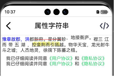
Span("我已仔细阅读并同意").fontColor("#333333").fontSize(16)
Span("《用户协议》").fontColor("#39d175").fontSize(16).onClick((_)=>{
promptAction.showToast({message:"打开用户协议页面"})
})
Span("和").fontColor("#333333").fontSize(16)
Span("《隐私协议》").fontColor("#39d175").fontSize(16).onClick((_)=>{
promptAction.showToast({message:"打开隐私协议页面"})
})
}
StyledString
      Text(undefined,{controller:this.protocolTextController}).onAppear(()=>{
        let protocolStyledString : MutableStyledString = new MutableStyledString("我已仔细阅读并同意《用户协议》和《隐私协议》",[
          {
            start: 9,
            length: 6,
            styledKey: StyledStringKey.FONT,
            styledValue: new TextStyle({
              fontColor:"#39d175",
              fontSize:LengthMetrics.fp(16),
            })
          },
          {
            start: 9,
            length: 6,
            styledKey: StyledStringKey.GESTURE,
            styledValue: new GestureStyle({onClick:(event:ClickEvent)=>{
              promptAction.showToast({message:"打开用户协议页面"})
            },onLongPress:(event:GestureEvent)=>{}})
          },

          {
            start: 16,
            length: 6,
            styledKey: StyledStringKey.FONT,
            styledValue: new TextStyle({
              fontColor:"#39d175",
              fontSize:LengthMetrics.fp(16),
            })
          },
          {
            start: 16,
            length: 6,
            styledKey: StyledStringKey.GESTURE,
            styledValue: new GestureStyle({onClick:(event:ClickEvent)=>{
              promptAction.showToast({message:"打开隐私协议页面"})
            },onLongPress:(event:GestureEvent)=>{}})
          }
        ])
        this.protocolTextController.setStyledString(protocolStyledString)
      })
当然这么比较起来还是Text+Span比较简洁。但当遇到Span不支持的属性的时候,还是得用StyledString,比如设置背景色、下划线、删除线、偏移、字间距等等
其他
整个全乎的看下效果
    this.mutableStyledString = new MutableStyledString("豫章故郡,洪都新府。星分翼轸,地接衡庐。襟三江而带五湖,控蛮荆而引瓯越。物华天宝,龙光射牛斗之墟;人杰地灵,徐孺下陈蕃之榻。", [{
      start: 0,
      length: 6,
      styledKey: StyledStringKey.FONT,
      styledValue:  new TextStyle({ fontColor: Color.Blue })
    }, {
      start: 7,
      length: 6,
      styledKey: StyledStringKey.DECORATION,
      styledValue: new DecorationStyle({
        color: Color.Red,
        type: TextDecorationType.LineThrough,
        style: TextDecorationStyle.WAVY
      })
    }, {
      start: 14,
      length: 6,
      styledKey: StyledStringKey.BASELINE_OFFSET,
      styledValue: new BaselineOffsetStyle(new LengthMetrics(6, LengthUnit.VP))
    }
      , {
        start: 21,
        length: 6,
        styledKey: StyledStringKey.LETTER_SPACING,
        styledValue: new LetterSpacingStyle(new LengthMetrics(6, LengthUnit.VP))
      }
      , {
        start: 28,
        length: 6,
        styledKey: StyledStringKey.TEXT_SHADOW,
        styledValue: new TextShadowStyle({
          radius: 5,
          type: ShadowType.COLOR,
          color: Color.Yellow,
          offsetX: 10,
          offsetY: -10
        })
      }
      , {
        start: 35,
        length: 6,
        styledKey: StyledStringKey.LINE_HEIGHT,
        styledValue: new LineHeightStyle(LengthMetrics.fp(20))
      }
      // , {
      //   start: 42,
      //   length: 6,
      //   styledKey: StyledStringKey.BACKGROUND_COLOR,
      //   styledValue: new BackgroundColorStyle({
      //     color: Color.Pink,
      //     radius: 6
      //   })
      // }
      // , {
      //   start: 49,
      //   length: 6,
      //   styledKey: StyledStringKey.URL,
      //   styledValue: new UrlStyle("https://www.example.com")
      // }
      , {
        start: 56,
        length: 6,
        styledKey: StyledStringKey.PARAGRAPH_STYLE,
        styledValue:new ParagraphStyle({ textAlign: TextAlign.End, maxLines: 1, wordBreak: WordBreak.BREAK_ALL, overflow: TextOverflow.Ellipsis})
      }
    ]);
注意:BackgroundColorStyle和UrlStyle是api14开始支持的
CustomSpan
我们需要继承CustomSpan并重写onMeasure(measureInfo: CustomSpanMeasureInfo): CustomSpanMetrics来完成测量,重写onDraw(context: DrawContext, options: CustomSpanDrawInfo)来完成绘制,这和自定义组件的自定义布局中重写onMeasureSize和onPlaceChildren差不多。
先看一下构造函数
CustomSpan对象只有一个无参构造函数,但一般情况下我们需要在构造函数中传入我们需要的参数,大多数情况我们需要传入要绘制的内容,这里简单的以绘制字符串为例。还需要一个UIContext的上下文对象,用于获取各种工具。 另外我们还需要根据需求,定义一些变量,来保存我们需要使用的参数。这里我们需要保存字体大小。
class MyCustomSpan extends CustomSpan {
  constructor(text: string, uiContext: UIContext) {
    super();
    this.text = text;
    this.uiContext = uiContext
  }

  text: string
  uiContext: UIContext

  fontSizeFp:number =0

}
onMeasure(measureInfo: CustomSpanMeasureInfo): CustomSpanMetrics
这个方法中,我们可以获取到文字大小,需要返回一个CustomSpanMetrics对象,表示自定义绘制Span的尺寸。
  onMeasure(measureInfo: CustomSpanMeasureInfo): CustomSpanMetrics {
    // measureInfo.fontSize单位为fp
    this.fontSizeFp = measureInfo.fontSize

    // 传入的fontSize单位为fp,返回文本所占布局宽度和高度单位均为px。
    let size =
      this.uiContext.getMeasureUtils().measureTextSize({ textContent: this.text, fontSize: measureInfo.fontSize })

    //customSpanMetrics的width和height 单位为vp
    this.customSpanMetrics = { width: px2vp(size.width as number), height: px2vp(size.height as number) };
    return this.customSpanMetrics
  }
这样我们就获取到了Span的尺寸信息
onDraw(context: DrawContext, drawInfo: CustomSpanDrawInfo)
DrawContext的实例对象context中的size属性保存的画布的宽高,canvas属性保存了画布对象;这里需要注意的是:获取的画布是Text组件的画布,绘制时不会超出Text组件的范围。这里就先认为是属性的,戳进去看源码就是定义的get方法:get canvas(): drawing.Canvas;
而CustomSpanDrawInfo的实例对象drawInfo则保存了自定义绘制Span的绘制信息。比如属性x是自定义绘制Span相对于挂载组件的偏移、 lineTop是自定义绘制Span相对于Text组件的上边距、 lineBottom是自定义绘制Span相对于Text组件的下边距。baseline是自定义绘制Span的所在行的基线偏移量,它们的单位是都px。
  onDraw(context: DrawContext, drawInfo: CustomSpanDrawInfo): void {


    console.error(`onDraw drawInfo x:${drawInfo.x}  lineTop:${drawInfo.lineTop}  lineBottom:${drawInfo.lineBottom}  baseline:${drawInfo.baseline}`)
    console.error(`onDraw context ${vp2px(context.size.width)}   ${vp2px(context.size.height)}`)

    let canvas = context.canvas;
    const font = new drawing.Font();
    font.setSize(vp2px(this.fontSizeFp));
    const brush = new drawing.Brush();
    brush.setColor({
      alpha: 255,
      red: 0,
      green: 74,
      blue: 175
    });

    canvas.attachBrush(brush)
    const textBlob = drawing.TextBlob.makeFromString(this.text, font, drawing.TextEncoding.TEXT_ENCODING_UTF8);

    canvas.drawTextBlob(textBlob, drawInfo.x, drawInfo.baseline);

    canvas.detachBrush()
  }
这样我们就完成了一个简单的自绘制的Span。
遗留问题
但是这里有个很大的问题:当绘制的文字多的时候,文字并不会换行。因为我们测量出来文字是按一行计算的,高度也是一行文字的高度。
想要计算需要几行,就需要知道Text组件的宽度。这里可以从构造函数中传进来。
那么问题就变成了如何获取Text组件的宽度?可以从onAreaChange回调中获取,但这个函数并不可靠,有时候一步小心使用属性字符串时返回的宽度就是0。
另外一个问题就是,我们如何知道组件的宽度可以放下几个字?假如一行可以放下5.4个字,那实际结果肯定是一行只绘制5个字。
我们可以根据这个方法来计算需要多大的高度。
还有一个问题就是在onDraw方法中drawInfo.baseLine属性,目前来看就是最后一行文字的baseLine,如果有多行文字,还需要我们自己计算每一行的baseLine
哈哈,遗留的问题有时间再说吧,这个自定义绘制Span用的机会应该不大。