【拥抱鸿蒙】HarmonyOS之构建一个自定义弹框
弹窗是一种模态窗口,通常用来展示用户当前需要的或用户必须关注的信息或操作。在UI开发中,弹框是重要且不可忽视的组件。
HarmonyOS内置了多种系统弹框,分别有AlertDialog 、TextPickerDialog 、DatePickerDialog以及TimePickerDialog等。
本文将详细介绍系统弹框的封装和使用,并着重展现自定义弹框的实现。
系统弹框
AlertDialog
AlertDialog是警告弹窗,一般由App主动弹出,用于警告和确认用户的操作行为,需用户手动点击操作按钮来取消或进行下一步。
AlertDialog的实现
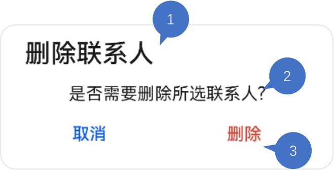
如下图中的“删除联系人”弹框,一个AlertDialog包含标题、内容和操作区三个部分组成,操作区包含两个按钮,我们可以在按钮的点击事件里添加对应响应逻辑。
以上弹框的实现代码如下:
AlertDialog.show(

      {

        title: '删除联系人', // 标题

        message: '是否需要删除所选联系人?', // 内容

        autoCancel: false, // 点击遮障层时,是否关闭弹窗。

        alignment: DialogAlignment.Bottom, // 弹窗在竖直方向的对齐方式

        offset: { dx: 0, dy: -20 }, // 弹窗相对alignment位置的偏移量

        primaryButton: {

          value: '取消',

          action: () => {

            console.info('Callback when the first button is clicked');

          }

        },

        secondaryButton: {

          value: '删除',

          fontColor: '#D94838',

          action: () => {

            console.info('Callback when the second button is clicked');

          }

        },

        cancel: () => { // 点击遮障层关闭dialog时的回调

          console.info('Closed callbacks');

        }

      }

    )

  })
AlertDialog的封装
我们可以对AlertDialog进行封装,作为工具类调用。
export class CommonUtils {

/\*\*

   \* Common alert dialog

   \* @param title 标题

   \* @param msg 提示信息

   \* @param context 需要保存状态的UIAbility所对应的context

   \* @param primaryCallback 第一个按钮点击事件的回调

   \* @param secondCallback 第二个按钮点击事件的回调

   \*/

  commonAlertDialog(title:ResourceStr, msg: ResourceStr, context: common.UIAbilityContext, primaryCallback: Function, secondCallback: Function) {

    AlertDialog.show({

      title: title,

      message: msg,

      alignment: DialogAlignment.Bottom,

      offset: {

        dx: 0,

        dy: CommonConstants.DY\_OFFSET

      },

      primaryButton: {

        value: $r('app.string.cancel\_button'),

        action: () => {

          primaryCallback();

        }

      },

      secondaryButton: {

        value: $r('app.string.definite\_button'),

        action: () => {

          context.terminateSelf()

          secondCallback();

        }

      }

    });

  }

}
这里创建了CommonUtils的工具类,把标题、提示信息作为创建自定义弹框的参数,按钮的点击事件可在回调里分别实现。
有了这种封装,我们就能很容易地在App里调用一个风格统一的AlertDialog弹框了。
CommonUtils.commonAlertDialog("提示", "是否退出登录", context, () => {

  // 取消


}, () => {

  // 确认


});
TextPickerDialog
这是一种文本滑动选择弹窗,一般用于从多个选项中单选内容,再将用户所选的内容返回给调用方。
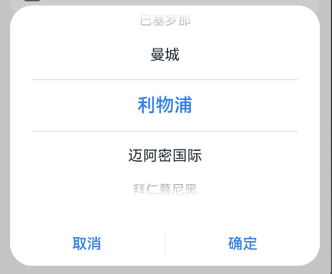
如下图所示,这里实现了一个选择“足球主队”的弹窗,用户上下滑动滑块再点击“确认”就可以完成选择。
TextPickerDialog的实现
@Entry
@Component
struct TextPickerDialogDemo {
@State select: number = 2;
private fruits: string[] = ['巴塞罗那', '曼城', '利物浦', '迈阿密国际', '拜仁慕尼黑', '多特蒙德', 'AC米兰', '那不勒斯'];
build() {
Column() {
Button('TextPickerDialog')
.margin(20)
.onClick(() => {
TextPickerDialog.show({
range: this.fruits, // 设置文本选择器的选择范围
selected: this.select, // 设置初始选中项的索引值。
onAccept: (value: TextPickerResult) => { // 点击弹窗中的“确定”按钮时触发该回调。
// 设置select为按下确定按钮时候的选中项index,这样当弹窗再次弹出时显示选中的是上一次确定的选项
this.select = value.index;
console.info("TextPickerDialog:onAccept()" + JSON.stringify(value));
},
onCancel: () => { // 点击弹窗中的“取消”按钮时触发该回调。
console.info("TextPickerDialog:onCancel()");
},
onChange: (value: TextPickerResult) => { // 滑动弹窗中的选择器使当前选中项改变时触发该回调。
console.info('TextPickerDialog:onChange()' + JSON.stringify(value));
}
})
})
}
.width('100%')
}
}
TextPickerDialog的封装
我们可以将选项作为参数进行TextPickerDialog的封装,并提供用户确认选项的回调。
这里的range的类型为:string[] | string[][] | Resource | TextPickerRangeContent[] | TextCascadePickerRangeContent[],提供了多种数据源类型,我们一般使用Resource方便多语言适配。
export class CommonUtils {
/\*\*
\* Text picker dialog
\* @param items 选项
\* @param textCallback 选中返回
\*/
textPickerDialog(items: Resource, textCallback: Function) {
if (this.isEmpty(items)) {
Logger.error(CommonConstants.TAG\_COMMON\_UTILS, 'item is null')
return;
}
TextPickerDialog.show({
range: items,
canLoop: false,
selected: 0,
onAccept: (result: TextPickerResult) => {
textCallback(result.value);
},
onCancel: () => {
Logger.info(CommonConstants.TAG\_COMMON\_UTILS, 'TextPickerDialog canceled')
}
});
}
}
对工具类中的TextPickerDialog的调用如下:
CommonUtils.textPickerDialog($r('app.strarray.club\_array'), (selectedValue: string) => {

            this.club = selectedValue;

          })

        }
这里的app.strarray.club\_array指向resources中的配置文件stringarray.json5,其内容如下:
{

    "strarray": [

        {

            "name": "club\_array",

            "value": [

                {

                    "value": "巴塞罗那"

                },

                {

                    "value": "曼城"

                },

                {

                    "value": "利物浦"

                },

                {

                    "value": "迈阿密国际"

                },

                {

                    "value": "拜仁慕尼黑"

                },

                {

                    "value": "AC米兰"

                },

                {

                    "value": "多特蒙德"

                },

                {

                    "value": "阿贾克斯"

                }

            ]

        }

    ]

}
DatePickerDialog
DatePickerDialog是日期选择器弹框,用于选择特定格式的日期,并返回给调用方。

DatePickerDialog的实现
以“出生日期”选择器弹框为例,我们通过如下代码可以实现:
let selectedDate = new Date('1949-10-1');

DatePickerDialog.show({

            start: new Date('1900-1-1'), // 设置选择器的起始日期

            end: new Date('2000-12-31'), // 设置选择器的结束日期

            selected: selectedDate, // 设置当前选中的日期

            lunar: false,

            onDateAccept: (value: Date) => { // 点击弹窗中的“确定”按钮时触发该回调

              // 通过Date的setFullYear方法设置按下确定按钮时的日期,这样当弹窗再次弹出时显示选中的是上一次确定的日期

              selectedDate.setFullYear(value.getFullYear(), value.getMonth() + 1, value.getDate())

              console.info('DatePickerDialog:onDateAccept()' + JSON.stringify(value))

            },

            onCancel: () => { // 点击弹窗中的“取消”按钮时触发该回调

              console.info('DatePickerDialog:onCancel()')

            },

            onDateChange: (value: Date) => { // 滑动弹窗中的滑动选择器使当前选中项改变时触发该回调

              console.info('DatePickerDialog:onDateChange()' + JSON.stringify(value))

            }

          })

        })
DatePickerDialog的封装
日期选择器包含起始日期、截止日期和默认选中日期三个参数,我们只需对用户确认选择后的回调里响应即可。
export class CommonUtils {

  /\*\*

   \* Date picker dialog

   \* @param dateCallback 确认选中日期回调

   \*/

  datePickerDialog(dateCallback: Function) {

    DatePickerDialog.show({

      start: new Date(CommonConstants.START\_TIME),

      end: new Date(),

      selected: new Date(CommonConstants.SELECT\_TIME),

      lunar: false,

      onDateAccept: (value: Date) => {

        let year: number = value.getFullYear();

        let month: number = value.getMonth() + 1;

        let day: number = value.getDate();

        let selectedDate: string = `${year}${CommonConstants.DATE\_YEAR}`+`${month}${CommonConstants.DATE\_MONTH}`+`${day}${CommonConstants.DATE\_DAY}`;

        dateCallback(selectedDate);

      }

    });

  }

}
基于以上封装,datePickerDialog的调用可以简单地实现如下:
CommonUtils.datePickerDialog((dateValue: string) => {

    this.birthdate = dateValue;

})
自定义弹框
除了系统弹框,还可以对弹框进行自定义。自定义弹框更加灵活,适用于更多的业务场景。
这里,我们实现一个包含多选器的自定义弹框,其实现效果如下图所示。
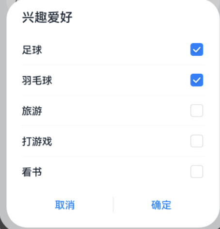
不难看出,这个弹框由标题、选择列表和按钮操作区构成。
自定义弹框需要使用装饰器@CustomDialog,
我们创建一个名为CustomDialogWidget的struct,并添加三个属性。
* items是数据源;
* selectedContent是选中结果拼接而成的字符串;
* controller是自定义弹框的控制器,其类型为CustomDialogController。
export default struct CustomDialogWidget {

  @State items: Array<CustomItem> = [];

  @Link selectedContent: string;

  private controller?: CustomDialogController;

}
在组件的aboutToAppear()中实现数据源的获取,使用到resmgr.ResourceManager的getStringArrayValue方法。
aboutToAppear(): void {
let context: Context = getContext(this);
if (CommonUtils.isEmpty(context) || CommonUtils.isEmpty(context.resourceManager)) {
Logger.error(CommonConstants.TAG\_CUSTOM, 'context or resourceManager is null');
return;
}
let manager = context.resourceManager;
manager.getStringArrayValue($r('app.strarray.hobbies\_data').id, (error, hobbyArray) => {
if (!CommonUtils.isEmpty(error)) {
Logger.error(CommonConstants.TAG\_CUSTOM, 'error = ' + JSON.stringify(error));
} else {
hobbyArray.forEach((itemTitle: string) => {
let item = new CustomItem();
item.title = itemTitle;
item.isChecked = false;
this.items.push(item);
Logger.info(item.title);
});
}
});
}
然后在Build()中实现其界面的搭建:
build() {
Column() {
// 标题
Text($r('app.string.title\_hobbies'))
.fontSize($r('app.float.title\_hobbies\_size'))
.fontColor($r('app.color.custom\_color'))
.lineHeight($r('app.float.title\_line\_height'))
.fontWeight(CommonConstants.BIGGER)
.alignSelf(ItemAlign.Start)
.margin({ left: $r('app.float.title\_left\_distance') })
// 选项列表
List() {
ForEach(this.items, (item: CustomItem) => {
ListItem() {
Row() {
Text(item.title)
.fontSize($r('app.float.label\_size'))
.fontColor($r('app.color.custom\_color'))
.layoutWeight(CommonConstants.WEIGHT\_ONE)
.textAlign(TextAlign.Start)
.fontWeight(CommonConstants.BIGGER)
.margin({ left: $r('app.float.label\_left\_distance') })
Toggle({ type: ToggleType.Checkbox, isOn: false })
.onChange((isCheck) => {
item.isChecked = isCheck;
})
.width($r('app.float.toggle\_size'))
.height($r('app.float.toggle\_size'))
.margin({ right: $r('app.float.toggle\_right\_distance') })
}
}
.height($r('app.float.options\_height'))
.margin({
top: $r('app.float.options\_top\_distance'),
bottom:$r('app.float.options\_bottom\_distance')
})
}, (item: CustomItem) => JSON.stringify(item.title))
}
.margin({
top: $r('app.float.list\_top\_distance'),
bottom: $r('app.float.list\_bottom\_distance')
})
.divider({
strokeWidth: $r('app.float.divider\_height'),
color: $r('app.color.divider\_color')
})
.listDirection(Axis.Vertical)
.edgeEffect(EdgeEffect.None)
.width(CommonConstants.FULL\_WIDTH)
.height($r('app.float.options\_list\_height'))
// 操作按钮
Row() {
Button($r('app.string.cancel\_button'))
.dialogButtonStyle()
.onClick(() => {
this.controller?.close();
})
Blank()
.backgroundColor($r('app.color.custom\_blank\_color'))
.width($r('app.float.blank\_width'))
.opacity($r('app.float.blank\_opacity'))
.height($r('app.float.blank\_height'))
Button($r('app.string.definite\_button'))
.dialogButtonStyle()
.onClick(() => {
this.setSelectedItems(this.items);
this.controller?.close();
})
}
}
}
在确定按钮的回调中,我们调用setSelectedItems(),其实现如下:
setSelectedItems(items: CustomItem[]) {
if (CommonUtils.isEmpty(items)) {
Logger.error(CommonConstants.TAG\_HOME, "Items is empty")
return;
}
let selectedText: string = items.filter((isCheckedItem: CustomItem) => isCheckedItem?.isChecked)
.map<string>((checkedItem: CustomItem) => {
return checkedItem.title!;
})
.join(CommonConstants.COMMA);
if (!CommonUtils.isEmpty(selectedText)) {
this.selectedContent = selectedText;
}
}
}
这里我们还用到了组件的属性扩展方法封装(用于提取重复的属性代码进行复用):
@Extend(Button)

function dialogButtonStyle() {

  .fontSize($r('app.float.button\_text\_size'))

  .fontColor(Color.Blue)

  .layoutWeight(CommonConstants.WEIGHT\_ONE)

  .height($r('app.float.button\_height'))

  .backgroundColor(Color.White)

}
自定义弹框的调用
自定义弹框的调用基于CustomDialogController,将CustomDialogWidget作为它的参数builder即可实现控制器调出我们预期的自定义弹框。
@State birthdate: string = '';
@State sex: string = '';
@State hobbies: string = '';
private sexArray: Resource = $r('app.strarray.sex\_array');
customDialogController: CustomDialogController = new CustomDialogController({
builder: CustomDialogWidget({
selectedContent: this.hobbies
}),
alignment: DialogAlignment.Bottom,
customStyle: true,
offset: {
dx: 0,
dy: CommonConstants.DY\_OFFSET
}
});
以上,我们总结了HarmonyOS系统弹框和自定义弹框的实现、封装及调用。
我是郑知鱼🐳,欢迎大家讨论与指教。
如果你觉得有所收获,也请点赞👍🏻收藏⭐️关注🔍我吧~~
具体代码见:customDialog