鸿蒙ArkTS+ArkUI仿微信通讯录页面制作【2】
继续先放一下效果图 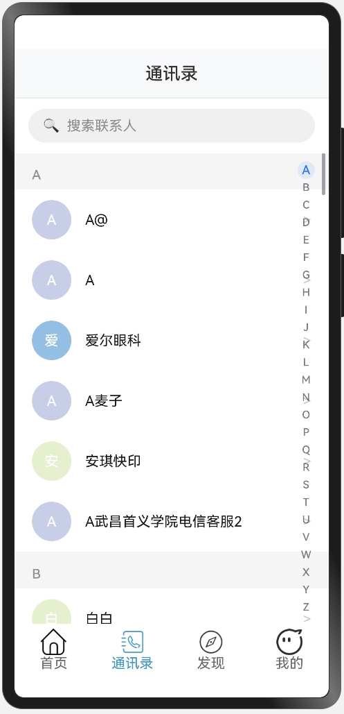
然后继续上一篇文章的内容,上一次我们讲到如何去获取每个人名字的第一个字,接下来讲一下如何设置每个名字之前的那个圆的背景色 先放一下代码:
  getAvatarColor(name:string):string{
    const colors = [
      '#FF9AA2', '#FFB7B2', '#FFDAC1', '#E2F0CB', '#B5EAD7',
      '#C7CEEA', '#A8E6CF', '#FFD3A5', '#FD9644', '#9BB5FF',
      '#98D8C8', '#F7DC6F', '#BB8FCE', '#85C1E9', '#F8C471'
    ];
    const index = name.charCodeAt(0) % colors.length;
    return colors[index];
  }
name.charCodeAt(0) 方法用于获取 name 字符串的第一个字符的 Unicode 编码。例如,如果 name 是 "Apple",那么 name.charCodeAt(0) 将返回字符 'A' 的 Unicode 编码(65)。 colors.length 表示 colors 数组的长度,这里是 15。 % 是取模运算符,用于计算 name.charCodeAt(0) 除以 colors.length 的余数。这个余数将作为 colors 数组的索引,确保索引值在 0 到 colors.length - 1 的范围内。例如,如果 name.charCodeAt(0) 是 65,colors.length 是 15,那么 65 % 15 的结果是 5,这意味着 index 的值为 5。所以说,每一个字符都能找到其专属的一个颜色,而不用搞随机数,也能保证视觉效果的一致性。
然后要先设置基本的UI,通过List + ListItemGroup + ListItem来实现,一般项目里我们很少用到ListItemGroup,但是因为这里我们在滚动的时候,是按照首字母为一个组进行滚动的,并且每一组上面都有一个字母作为“标题”,所以使用ListItemGroup更加方便,代码如下:
List({scroller:this.scroller}){
          //联系人列表
          ForEach(this.contactListArr,(val:Contact)=>{
            ListItemGroup({header:this.HeaderGroupItem(val.group)}){
              ForEach(val.namesList,(name:string)=>{
                ListItem(){
                  Row(){
                    //头像
                    Column(){
                      Text(this.getInitial(name))
                        .fontSize(16)
                        .fontWeight(FontWeight.Medium)
                        .fontColor('#ffffff')
                    }.width(45).height(45).backgroundColor(this.getAvatarColor(name)).borderRadius(22.5).justifyContent(FlexAlign.Center).margin({right:16}).shadow({
                      radius:4,color:'#00000015',offsetX:0,offsetY:2
                    })
                    //姓名
                    Text(name)
                      .fontSize(16)
                      .fontColor('#1a1a1a')
                      .layoutWeight(1)
                    //右箭头
                    Text('>')
                      .fontSize(16)
                      .fontColor('#c7c7cc')
                  }.width('100%').padding({left:20,right:20,top:12,bottom:12}).alignItems(VerticalAlign.Center).backgroundColor('#ffffff').onClick(()=>{
                    console.log(`点击了联系人: ${name}`)
                  })
                }
              })
            }
          })
        }.backgroundColor('#f5f5f5').divider({
          strokeWidth:0.5,color:'#f0f0f0',startMargin:81,endMargin:20
        }).onScrollIndex((start)=>{
          this.currentIndex = start;
        }).layoutWeight(1)
接下来是AlphabetIndexer组件,我们先贴一下代码,然后再详细讲解里面的各个属性
AlphabetIndexer({arrayValue:this.alphabets,selected:this.currentIndex})
          .autoCollapse(false)
          .selectedColor('#007AFF')
          .itemSize(20)
          .popupBackground('#ffffff')
          .usingPopup(true)
          .alignStyle(IndexerAlign.Right)
          .popupFont({size:24,weight:FontWeight.Medium})
          .selectedFont({size:14,weight:FontWeight.Medium})
          .font({size:12})
          .itemBorderRadius(10)
          .popupPosition({x:30,y:0})
          .margin({right:12})
          .popupItemBorderRadius(8)
          .popupSelectedColor('#007AFF')
          .popupUnselectedColor('#8e8e93')
          .onSelect((index)=>{
            this.scroller.scrollToIndex(index)
          })
autoCollpase是是否自适应折叠模式,在api12以后,这个值默认为true,即自适应折叠模式,因为我们现在是26个英文字母,所以按照文档里的说法,是会默认折叠的。 usingPopup代表的是是否默认显示弹窗,也就是比如说你点了右边的A以后,会有一个弹窗来显示你当前点击的是“A” popupPosition就是代表的这个弹窗的位置,具体位置是相对于索引条上边框中点的位置。但是这里和普通的position有点不太一样……普通的坐标轴是往左往上是负值,这里的是往左和往下是正值 然后是onSelect,也就是选中后,那么让滚动的控制器滚动到对应的ListItemGroup即可,因为26个英文字母都有自己对应的Group 最后,要注意这个List组件和AlphabetIndexer组件需要放在同一个stack组件里,采用堆叠容器