【HarmonyOS 5】鸿蒙中常见的标题栏布局方案
【HarmonyOS 5】鸿蒙中常见的标题栏布局方案
##鸿蒙开发能力 ##HarmonyOS SDK应用服务##鸿蒙金融类应用 (金融理财#
一、问题背景:
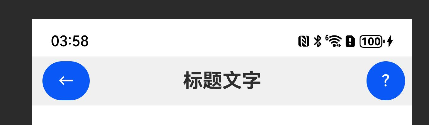
鸿蒙中常见的标题栏:矩形区域,左边是返回按钮,右边是问号帮助按钮,中间是标题文字。
金融类应用对标题栏的要求更为严苛:一方面需保证导航功能的稳定性(返回按钮必须触达便捷),另一方面要兼顾品牌调性(标题文字需清晰突出),同时帮助按钮需易于发现(便于用户获取理财指引)。
理想的标题栏应满足:
- 跨设备适配(手机、平板等多终端显示一致)
- 组件对齐精准(垂直居中、水平间距合理)
- 交互反馈清晰(按钮点击有明确状态变化)
- 扩展灵活(可快速添加用户头像、通知图标等元素)
那有几种布局方式,分别怎么布局呢?常见的思维是,有老铁使用row去布局,怎么都对不齐。
二、解决方案
方案一:Flex布局(推荐首选)
Flex布局(弹性布局)是鸿蒙中处理线性排列的最佳选择,通过justifyContent和alignItems属性可轻松实现组件的均匀分布与居中对齐,尤其适合响应式场景。 利用Flex容器的Row方向(默认水平排列),通过SpaceBetween使三个组件(返回按钮、标题、帮助按钮)在水平方向上两端对齐、中间自适应;alignItems设置为Center确保垂直方向居中。这种布局会自动分配剩余空间,在不同屏幕尺寸下保持组件相对位置稳定。
代码实现
@Entry
@Component
struct FinanceTitleBar {
  // 标题文字可动态修改(适应不同页面)
  @State title: string = "我的资产"

  build() {
    Column() {
      // 标题栏主体
      Flex({
        direction: FlexDirection.Row,
        justifyContent: FlexAlign.SpaceBetween,
        alignItems: ItemAlign.Center
      }) {
        // 左侧返回按钮:添加水波纹效果增强交互感
        Button({ type: ButtonType.Circle, stateEffect: true }) {
          Image($r("app.media.ic_back")) // 使用实际返回图标
            .width(24)
            .height(24)
            .fillColor("#333333")
        }
        .width(40)
        .height(40)
        .backgroundColor("transparent")
        .onClick(() => {
          // 金融应用中返回可能需要确认(如表单未保存)
          router.back()
        })

        // 中间标题:金融场景建议加粗突出
        Text(this.title)
          .fontSize(18)
          .fontWeight(FontWeight.Medium)
          .fontColor("#1A1A1A")
          .maxLines(1) // 防止标题过长换行
          .textOverflow({ overflow: TextOverflow.Ellipsis })

        // 右侧帮助按钮:圆形设计符合金融应用的安全感
        Button({ type: ButtonType.Circle, stateEffect: true }) {
          Image($r("app.media.ic_help")) // 使用实际帮助图标
            .width(24)
            .height(24)
            .fillColor("#333333")
        }
        .width(40)
        .height(40)
        .backgroundColor("transparent")
        .onClick(() => {
          // 跳转至帮助中心(金融应用常见需求)
          router.pushUrl({ url: "pages/HelpPage" })
        })
      }
      .width('100%')
      .height(56) // 符合鸿蒙设计规范的标题栏高度
      .padding({ left: 16, right: 16 }) // 左右边距适配触摸区域
      .backgroundColor("#FFFFFF")
      .shadow({ radius: 2, color: "#00000010" }) // 底部阴影增强层次感

      // 页面内容区域(示例)
      Text("资产详情内容...")
        .flexGrow(1)
        .padding(16)
    }
    .width('100%')
    .height('100%')
    .backgroundColor("#F5F5F5")
  }
}
方案二:Stack布局(精准定位场景)
Stack布局(堆叠布局)通过层级叠加组件,适合需要精确定位的场景。核心思路是将标题文字固定在中心,返回按钮与帮助按钮通过绝对定位放置在两侧。
Stack容器默认将子组件堆叠显示,通过alignContent: Alignment.Center使标题文字居中;按钮组件通过position属性设置x轴坐标(左侧按钮距左16vp,右侧按钮距右16vp),y轴坐标设为0实现垂直居中。
代码实现
@Entry
@Component
struct StackTitleBar {
  @State title: string = "理财产品"

  build() {
    Column() {
      Stack({ alignContent: Alignment.Center }) {
        // 中间标题:优先渲染在底层,确保不被按钮遮挡
        Text(this.title)
          .fontSize(18)
          .fontWeight(FontWeight.Medium)
          .fontColor("#1A1A1A")

        // 左侧返回按钮:使用绝对定位
        Button({ type: ButtonType.Circle, stateEffect: true }) {
          Image($r("app.media.ic_back"))
            .width(24)
            .height(24)
        }
        .width(40)
        .height(40)
        .backgroundColor("transparent")
        .position({ x: 16, y: 0 }) // x=16贴左,y=0垂直居中
        .onClick(() => {
          router.back()
        })

        // 右侧帮助按钮:通过计算右间距定位
        Button({ type: ButtonType.Circle, stateEffect: true }) {
          Image($r("app.media.ic_help"))
            .width(24)
            .height(24)
        }
        .width(40)
        .height(40)
        .backgroundColor("transparent")
        .position({ x: "calc(100% - 56vp)", y: 0 }) // 100%宽度减去按钮宽(40)和右距(16)
        .onClick(() => {
          router.pushUrl({ url: "pages/HelpPage" })
        })
      }
      .width('100%')
      .height(56)
      .backgroundColor("#FFFFFF")
      .shadow({ radius: 2, color: "#00000010" })

      // 页面内容
      Text("理财产品列表...")
        .flexGrow(1)
        .padding(16)
    }
    .width('100%')
    .height('100%')
    .backgroundColor("#F5F5F5")
  }
}
方案三:Row+Column组合布局(复杂扩展场景)
当标题栏需要包含更多元素(如用户头像、多按钮组)时,可采用Row嵌套Column的组合布局,通过权重分配实现灵活排列。 外层用Row作为主容器,内部划分三个区域:左侧区域(返回按钮)、中间区域(标题)、右侧区域(帮助按钮+用户头像),每个区域通过flexGrow设置权重(左侧和右侧权重为0,中间权重为1,确保标题占满剩余空间)。
代码实现
@Entry
@Component
struct ComplexTitleBar {
  @State title: string = "账户设置"
  @State userName: string = "张**" // 金融应用隐藏部分姓名

  build() {
    Column() {
      Row() {
        // 左侧区域:仅返回按钮
        Row() {
          Button({ type: ButtonType.Circle, stateEffect: true }) {
            Image($r("app.media.ic_back"))
              .width(24)
              .height(24)
          }
          .width(40)
          .height(40)
          .backgroundColor("transparent")
          .onClick(() => router.back())
        }
        .flexGrow(0) // 不占用额外空间

        // 中间区域:标题(占满剩余空间)
        Row() {
          Text(this.title)
            .fontSize(18)
            .fontWeight(FontWeight.Medium)
        }
        .flexGrow(1) // 权重1,占满剩余空间
        .justifyContent(FlexAlign.Center) // 内部居中

        // 右侧区域:帮助按钮+用户头像
        Row({ space: 12 }) { // 按钮间间距12vp
          Button({ type: ButtonType.Circle, stateEffect: true }) {
            Image($r("app.media.ic_help"))
              .width(24)
              .height(24)
          }
          .width(40)
          .height(40)
          .backgroundColor("transparent")
          .onClick(() => router.pushUrl({ url: "pages/HelpPage" }))

          // 金融应用常见:用户头像
          Image($r("app.media.ic_avatar"))
            .width(36)
            .height(36)
            .borderRadius(18) // 圆形头像
            .onClick(() => router.pushUrl({ url: "pages/UserPage" }))
        }
        .flexGrow(0)
        .alignItems(ItemAlign.Center)
      }
      .width('100%')
      .height(56)
      .padding({ left: 16, right: 16 })
      .backgroundColor("#FFFFFF")
      .shadow({ radius: 2, color: "#00000010" })

      // 页面内容
      Text("账户安全设置...")
        .flexGrow(1)
        .padding(16)
    }
    .width('100%')
    .height('100%')
    .backgroundColor("#F5F5F5")
  }
}