15 HarmonyOS NEXT UVList组件开发指南(二)
2025-03-08 22:19:06
348次阅读
0个评论
温馨提示:本篇博客的详细代码已发布到 git : https://gitcode.com/nutpi/HarmonyosNext 可以下载运行哦!
第二篇:UVList组件实现细节与渲染机制
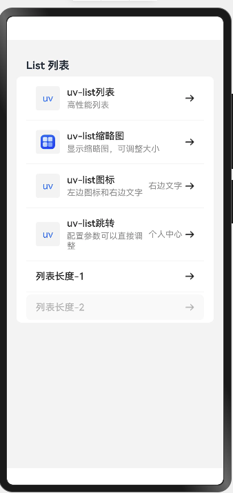
项目运行效果示例如下:
1. UVList组件实现
1.1 组件结构
UVList组件是一个列表容器组件,负责整体布局和列表项的渲染。下面是UVList组件的完整实现代码:
// UVList.ets
import { ListProps,ListItemProps } from '../common/interfaces';
import UVListItem from './UVListItem';

@Component
struct UVList {
    // 列表属性
    private props: ListProps ={} as ListProps;

    build() {
        Column() {
            // 列表标题(如果有)
            if (this.props.title) {
                Text(this.props.title)
                    .fontSize(18)
                    .fontWeight(FontWeight.Bold)
                    .width('100%')
                    .textAlign(TextAlign.Start)
                    .padding({ left: 16, right: 16, top: 16, bottom: 8 })
            }

            // 列表内容
            List() {
                // 使用ForEach遍历列表项数据
                ForEach(this.props.items, (item:ListItemProps) => {
                    ListItem() {
                        // 使用列表项组件
                        UVListItem({
                            item: item,
                            showThumbnail: this.props.showThumbnail ?? true,
                            showIcon: this.props.showIcon ?? true,
                            showRightText: this.props.showRightText ?? true,
                            navigable: this.props.navigable ?? true
                        })
                    }
                    .padding({ left: 16, right: 16, top: 4, bottom: 4 })
                })
            }
            .width('100%')
            .divider({ strokeWidth: 1, color: '#f5f5f5', startMargin: 16, endMargin: 16 })
            .borderRadius(8)
            .backgroundColor(Color.White)
        }
        .width('100%')
    }
}

export default UVList;
1.2 组件属性解析
| 属性 | 类型 | 说明 |
|---|---|---|
| props | ListProps | 列表组件的配置属性,包含标题、列表项数据等 |
1.3 渲染流程
UVList组件的渲染流程如下:
- 渲染标题:如果提供了标题,则渲染标题文本
- 渲染列表:使用HarmonyOS的List组件作为容器
- 遍历列表项:使用ForEach遍历列表项数据
- 渲染列表项:为每个列表项数据创建一个ListItem,并使用UVListItem组件渲染内容
2. UVListItem组件实现
2.1 组件结构
UVListItem组件负责单个列表项的内容展示和交互。下面是UVListItem组件的核心实现:
import { ListItemProps } from "../common/interfaces";

@Component
struct UVListItem {
    // 列表项属性
    private item: ListItemProps ={} as ListItemProps;
    // 是否显示缩略图
    private showThumbnail: boolean = true;
    // 是否显示图标
    private showIcon: boolean = true;
    // 是否显示右侧文本
    private showRightText: boolean = true;
    // 是否可导航(显示右侧箭头)
    private navigable: boolean = true;

    build() {
        Row() {
            // 左侧图标区域
            if (this.showIcon && this.item.icon) {
                Row() {
                    // 根据图标类型显示不同的内容
                    if (typeof this.item.icon === 'string') {
                        // 如果是字符串类型,显示文本作为图标
                        Text(this.item.icon)
                            .fontSize(16)
                            .fontColor('#2979ff')
                    } else {
                        // 如果是Resource类型,显示图片作为图标
                        Image(this.item.icon)
                            .width(24)
                            .height(24)
                            .objectFit(ImageFit.Contain)
                    }
                }
                .width(40)
                .height(40)
                .justifyContent(FlexAlign.Center)
                .alignItems(VerticalAlign.Center)
                .margin({ right: 12 })
                .borderRadius(4)
                .backgroundColor('#f5f5f5')
            }

            // 中间内容区域
            Column() {
                // 标题
                Text(this.item.title)
                    .fontSize(16)
                    .fontWeight(FontWeight.Medium)
                    .fontColor(this.item.disabled ? '#bdbdbd' : '#333')
                    .width('100%')
                    .textAlign(TextAlign.Start)

                // 描述文本(如果有)
                if (this.item.note) {
                    Text(this.item.note)
                        .fontSize(14)
                        .fontColor(this.item.disabled ? '#e0e0e0' : '#999')
                        .width('100%')
                        .textAlign(TextAlign.Start)
                        .margin({ top: 4 })
                }
            }
            .layoutWeight(1)
            .alignItems(HorizontalAlign.Start)

            // 右侧区域
            Row() {
                // 右侧文本(如果有且允许显示)
                if (this.showRightText && this.item.rightText) {
                    Text(this.item.rightText)
                        .fontSize(14)
                        .fontColor(this.item.disabled ? '#e0e0e0' : '#999')
                        .margin({ right: 4 })
                }

                // 右侧箭头(如果允许导航且显示箭头)
                if (this.navigable && this.item.showArrow !== false) {
                    Image($r('app.media.ic_arrow_right'))
                        .width(16)
                        .height(16)
                        .objectFit(ImageFit.Contain)
                        .opacity(this.item.disabled ? 0.3 : 1)
                }
            }
            .alignItems(VerticalAlign.Center)
        }
        .width('100%')
        .padding({ left: 16, right: 16, top: 12, bottom: 12 })
        .backgroundColor(this.item.disabled ? '#fafafa' : Color.White)
        .borderRadius(8)
        .onClick(() => {
            // 如果项目未禁用且有点击回调,则执行回调
            if (!this.item.disabled && this.item.onClick) {
                this.item.onClick();
            }
        })
    }
}
2.2 组件属性解析
| 属性 | 类型 | 说明 |
|---|---|---|
| item | ListItemProps | 列表项数据,包含标题、描述、图标等 |
| showThumbnail | boolean | 是否显示缩略图 |
| showIcon | boolean | 是否显示图标 |
| showRightText | boolean | 是否显示右侧文本 |
| navigable | boolean | 是否可导航(控制右侧箭头显示) |
2.3 渲染区域划分
UVListItem组件的布局分为三个主要区域:
- 左侧图标区域:显示图标或缩略图
- 中间内容区域:显示标题和描述文本
- 右侧区域:显示右侧文本和导航箭头
3. 渲染机制详解
3.1 条件渲染
UVList组件使用条件渲染来优化性能和提高灵活性:
// 条件渲染标题
if (this.props.title) {
    Text(this.props.title)
        // 样式设置
}

// 条件渲染图标
if (this.showIcon && this.item.icon) {
    // 渲染图标
}

// 条件渲染描述文本
if (this.item.note) {
    Text(this.item.note)
        // 样式设置
}
3.2 图标渲染策略
UVListItem组件支持两种类型的图标渲染:
// 根据图标类型显示不同的内容
if (typeof this.item.icon === 'string') {
    // 如果是字符串类型,显示文本作为图标
    Text(this.item.icon)
        .fontSize(16)
        .fontColor('#2979ff')
} else {
    // 如果是Resource类型,显示图片作为图标
    Image(this.item.icon)
        .width(24)
        .height(24)
        .objectFit(ImageFit.Contain)
}
3.3 状态适配
UVListItem组件根据列表项的状态(如禁用状态)调整样式:
// 标题文本颜色根据禁用状态调整
.fontColor(this.item.disabled ? '#bdbdbd' : '#333')

// 描述文本颜色根据禁用状态调整
.fontColor(this.item.disabled ? '#e0e0e0' : '#999')

// 背景颜色根据禁用状态调整
.backgroundColor(this.item.disabled ? '#fafafa' : Color.White)

// 箭头透明度根据禁用状态调整
.opacity(this.item.disabled ? 0.3 : 1)
4. 布局与样式
4.1 列表容器布局
UVList组件使用Column作为根容器,包含标题和列表内容:
Column() {
    // 标题(如果有)
    // 列表内容
}
.width('100%')
4.2 列表项布局
UVListItem组件使用Row作为根容器,包含左侧图标、中间内容和右侧区域:
Row() {
    // 左侧图标区域
    // 中间内容区域
    // 右侧区域
}
.width('100%')
.padding({ left: 16, right: 16, top: 12, bottom: 12 })
.backgroundColor(this.item.disabled ? '#fafafa' : Color.White)
.borderRadius(8)
4.3 样式定制
UVList组件提供了丰富的样式定制选项:
- 列表分割线:使用divider属性设置分割线样式
- 圆角边框:使用borderRadius属性设置圆角大小
- 背景颜色:使用backgroundColor属性设置背景颜色
- 内边距:使用padding属性设置内边距
5. 交互处理
5.1 点击事件处理
UVListItem组件通过onClick方法处理点击事件:
.onClick(() => {
    // 如果项目未禁用且有点击回调,则执行回调
    if (!this.item.disabled && this.item.onClick) {
        this.item.onClick();
    }
})
5.2 禁用状态处理
UVListItem组件通过检查item.disabled属性来处理禁用状态:
- 调整文本颜色
- 调整背景颜色
- 调整箭头透明度
- 禁用点击事件
6. 最佳实践
6.1 组件封装最佳实践
- 职责分离:将列表容器和列表项分离,各自负责不同的功能
- 条件渲染:使用条件渲染优化性能和提高灵活性
- 样式统一:保持样式的一致性和可定制性
6.2 渲染优化最佳实践
- 按需渲染:只渲染必要的内容,如有条件地渲染图标、描述文本等
- 类型检查:根据数据类型选择合适的渲染方式
- 状态适配:根据组件状态调整样式和行为
7. 下一步学习
在下一篇教程中,我们将介绍UVList组件的使用方法和实际应用场景,敬请期待!
00
