harmony OS NEXT-常用组件及其导航
2025-03-22 15:40:35
389次阅读
0个评论
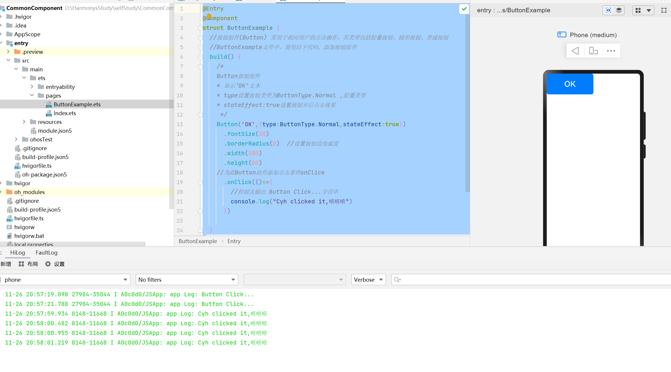
1.任务一:构建Button组件,展示UI效果
@Entry
@Component
struct ButtonExample {
  //按钮组件(Button) 常用于相应用户的点击操作,其类型包括胶囊按钮、圆形按钮、普通按钮
  //ButtonExample文件中,使用以下代码,添加按钮组件
  build() {
    /*
    Button按钮组件
    * 显示‘OK'文本
    * type设置按钮类型为ButtonType.Normal ,胶囊类型
    * stateEffect:true设置按钮开启点击效果
     */
    Button('OK',{type:ButtonType.Normal,stateEffect:true})
      .fontSize(30)
      .borderRadius(8)  //设置按钮边角弧度
      .width(180)
      .height(80)
    //为此Button组件添加点击事件onClick
      .onClick(()=>{
        //控制太输出 Button Click...字符串
        console.log("Cyh clicked it,嘻嘻嘻")
      })

  }
}
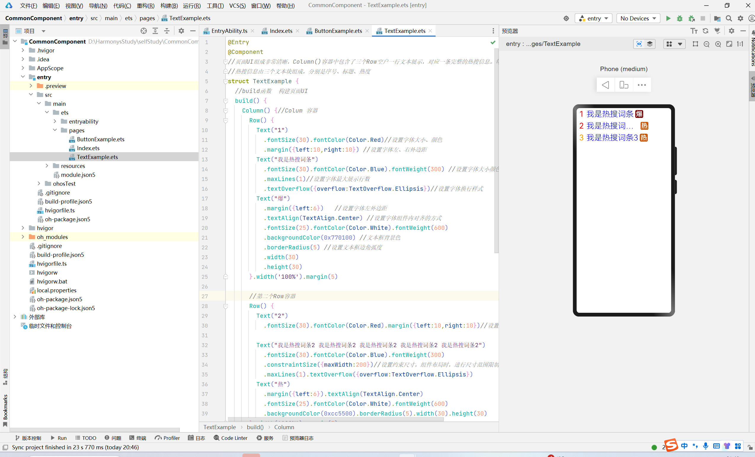
2.任务二:使用文本显示组件构建热搜榜
任务二将通过的文本的样式控制,构建一个简单的热搜榜展示效果
实现分析:Coloum容器中包含了三个Row()容器,每个Row容器控制一行文本显示;对应一条完整的热搜信息
@Entry
@Component
//页面UI组成非常清晰,Column()容器中包含了三个Row空户一行文本展示,对应一条完整的热搜信息。每条
//热搜信息由三个文本块组成,分别是序号、标题、热度
struct TextExample {
  //build函数  构建页面UI
  build() {
    Column() {//Colum 容器
      Row() {
        Text("1")
          .fontSize(30).fontColor(Color.Red)//设置字体大小、颜色
          .margin({left:10,right:10}) //设置字体左、右外边距
        Text("我是热搜词条")
          .fontSize(30).fontColor(Color.Blue).fontWeight(300) //设置字体大小颜色,粗细
          .maxLines(1)//设置字体最大展示行数
          .textOverflow({overflow:TextOverflow.Ellipsis})//设置字体换行样式
        Text("爆")
          .margin({left:6})   //设置字体左外边距
          .textAlign(TextAlign.Center) //设置字体组件内对齐的方式
          .fontSize(25).fontColor(Color.White).fontWeight(600)
          .backgroundColor(0x770100) //文本框背景色
          .borderRadius(5) //设置文本框边角弧度
          .width(30)
          .height(30)
      }.width('100%').margin(5)

      //第二个Row容器
      Row() {
        Text("2")
          .fontSize(30).fontColor(Color.Red).margin({left:10,right:10})//设置字体大小、颜色

        Text("我是热搜词条2 我是热搜词条2 我是热搜词条2 我是热搜词条2 我是热搜词条2")
          .fontSize(30).fontColor(Color.Blue).fontWeight(300)
          .constraintSize({maxWidth:200})//设置约束尺寸,组件布局时,进行尺寸范围限制
          .maxLines(1).textOverflow({overflow:TextOverflow.Ellipsis})
        Text("热")
          .margin({left:6}).textAlign(TextAlign.Center)
          .fontSize(25).fontColor(Color.White).fontWeight(600)
          .backgroundColor(0xcc5500).borderRadius(5).width(30).height(30)
      }.width('100%').margin(5)
      //第三个Row容器
      Row() {
        Text("3")
          .fontSize(30).fontColor(Color.Orange).margin({left:10,right:10})
        Text("我是热搜词条3")
          .fontSize(30).fontColor(Color.Blue).fontWeight(300)
          .constraintSize({maxWidth:280})//设置约束尺寸,组件布局时,进行尺寸范围限制
          .maxLines(1).textOverflow({overflow:TextOverflow.Ellipsis})
        Text("热")
          .margin({left:6}).textAlign(TextAlign.Center)
          .fontSize(25).fontColor(Color.White).fontWeight(600)
          .backgroundColor(0xcc5500).borderRadius(5).width(30).height(30)
      }.width('100%').margin(5)
      //步骤2 第一行文本添加样式
      //接下来,通过文本属性的设置,调整文本颜色、尺寸、换行、间距等展示样式、进一步优化UI
      //界面展示,对第一个行Row容器内字体设置样式
      //通过.fontSize设置字体大小,通过.fontColor设置字体颜色,通过.fontWeight设置
      //字体粗细
      //可以通过.maxLines设置字体最大展示行数,通过.textOverflow设置字体换行样式;textOverflow
      //需配合maxLines一起使用
      //可以通过margin设置字体外边框,通过.textAlign设置字体组件内对齐方式,通过.backgroundColor
      //文本框背景色,通过.borderRadius设置文本框边角弧度
//步骤三  完善文本样式
    }.width('100%')
  }
}
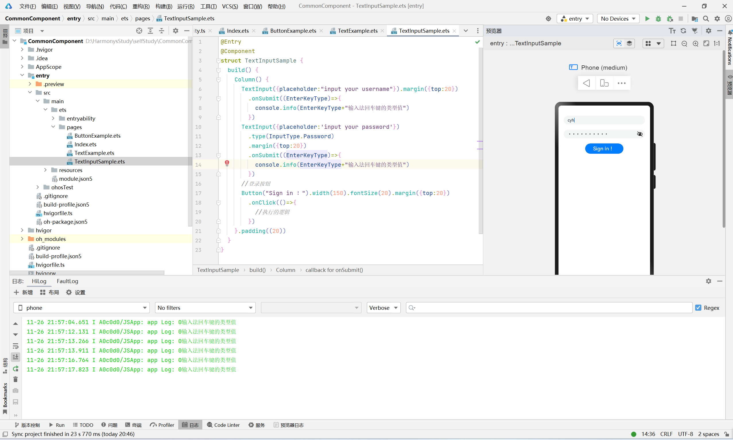
3.任务三:使用文本输入组件构建登录组件
@Entry
@Component
struct TextInputSample {
  build() {
    Column() {
      TextInput({placeholder:"input your username"}).margin({top:20})
        .onSubmit((EnterKeyType)=>{
          console.info(EnterKeyType+"输入法回车键的类型值")
        })
      TextInput({placeholder:'input your password'})
        .type(InputType.Password)
        .margin({top:20})
        .onSubmit((EnterKeyType)=>{
          console.info(EnterKeyType+"输入法回车键的类型值")
        })
      //登录按钮
      Button("Sign in !").width(150).fontSize(20).margin({top:20})
        .onClick(()=>{
          //执行的逻辑
        })
    }.padding((20))
  }
}
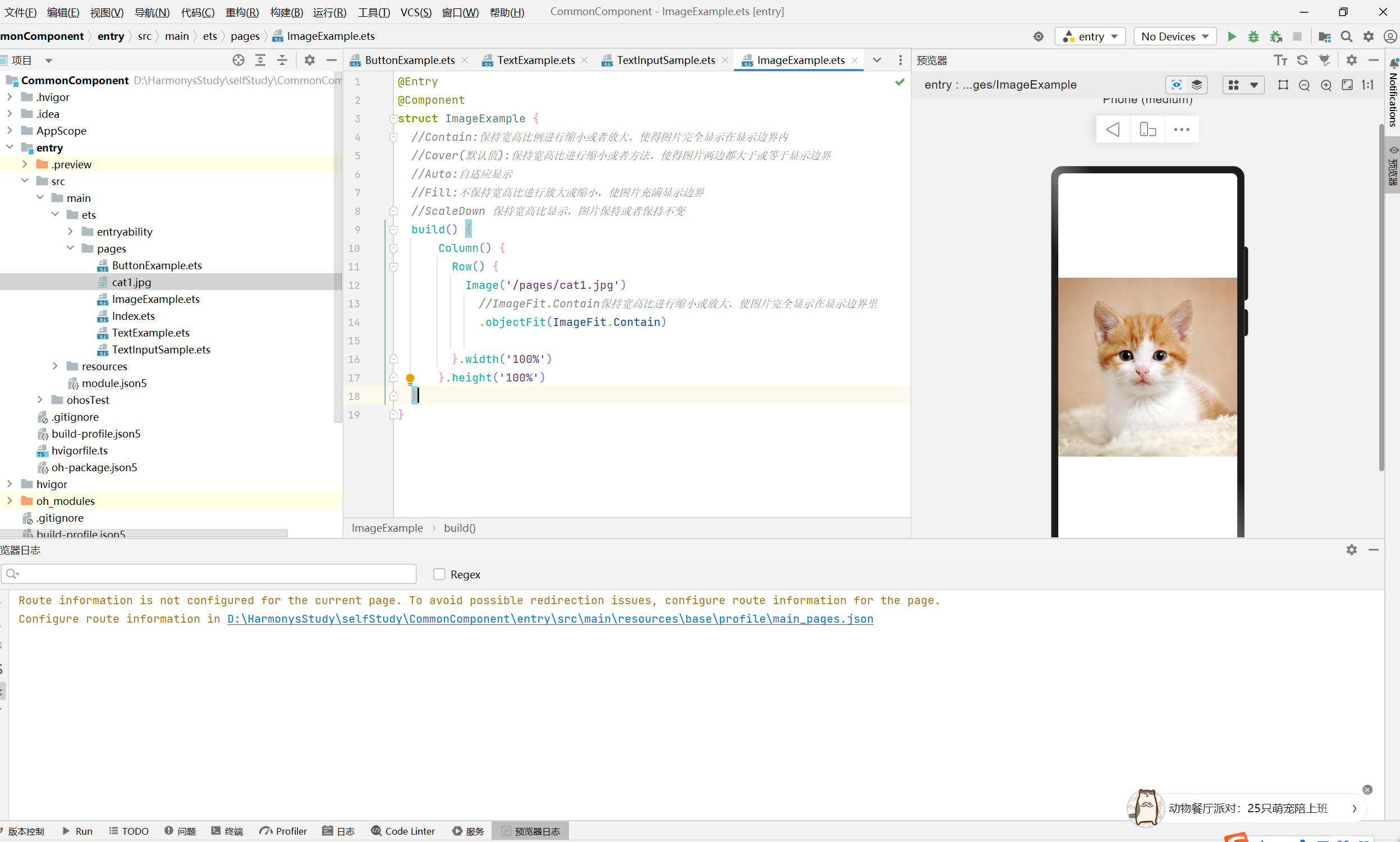
4.任务四:使用Image组件展示图片
开发者经常需要再应用中显示1一些图片,例如,按钮中的icon、网络图片、本地图片等,在应用中显示图片需要使用Image组件实现,Image支持多种图片格式,包括png、jpg、bmp、svg和gif
4.1.1 引用本地图片资源
图片置于etc下的任意位置均可,Image组件引用本地图片路径,即可显示图片
@Entry
@Component
struct ImageExample {
  //Contain:保持宽高比例进行缩小或者放大,使得图片完全显示在显示边界内
  //Cover(默认值):保持宽高比进行缩小或者方法,使得图片两边都大于或等于显示边界
  //Auto:自适应显示
  //Fill:不保持宽高比进行放大或缩小,使图片充满显示边界
  //ScaleDown 保持宽高比显示,图片保持或者保持不变
  build() {
      Column() {
        Row() {
          Image('/pages/cat1.jpg')
            //ImageFit.Contain保持宽高比进行缩小或放大,使图片完全显示在显示边界里
            .objectFit(ImageFit.Contain)

        }.width('100%')
      }.height('100%')
  }
}
4.1.2 引用网络图片资源
引入网络图片需要申请权限ohos.permission.INTERNET,此时,Image组件的src参数为网络图片的链接,为了成功加载网络图片,您需要在module.json5文件中申请网络访问权限
注意:实际可用的时候,首先需要保证网络地址可以访问,可以在浏览器中地址栏直接输如图像链接地址。同时,使用内网环境可能导致图片访问失败,可以断开网络代理尝试,接下来请看详细步骤
- 引入网络图片需要申请ohos.permission.INTERNET,可在module.json5文件中声明网络访问权限
代码示例
  "requestPermissions": [
      {
        "name": "ohos.permission.INTERNET"
      }
    ]

- 在保证图片地址可以访问的情况下,将地址写入Image组件当中
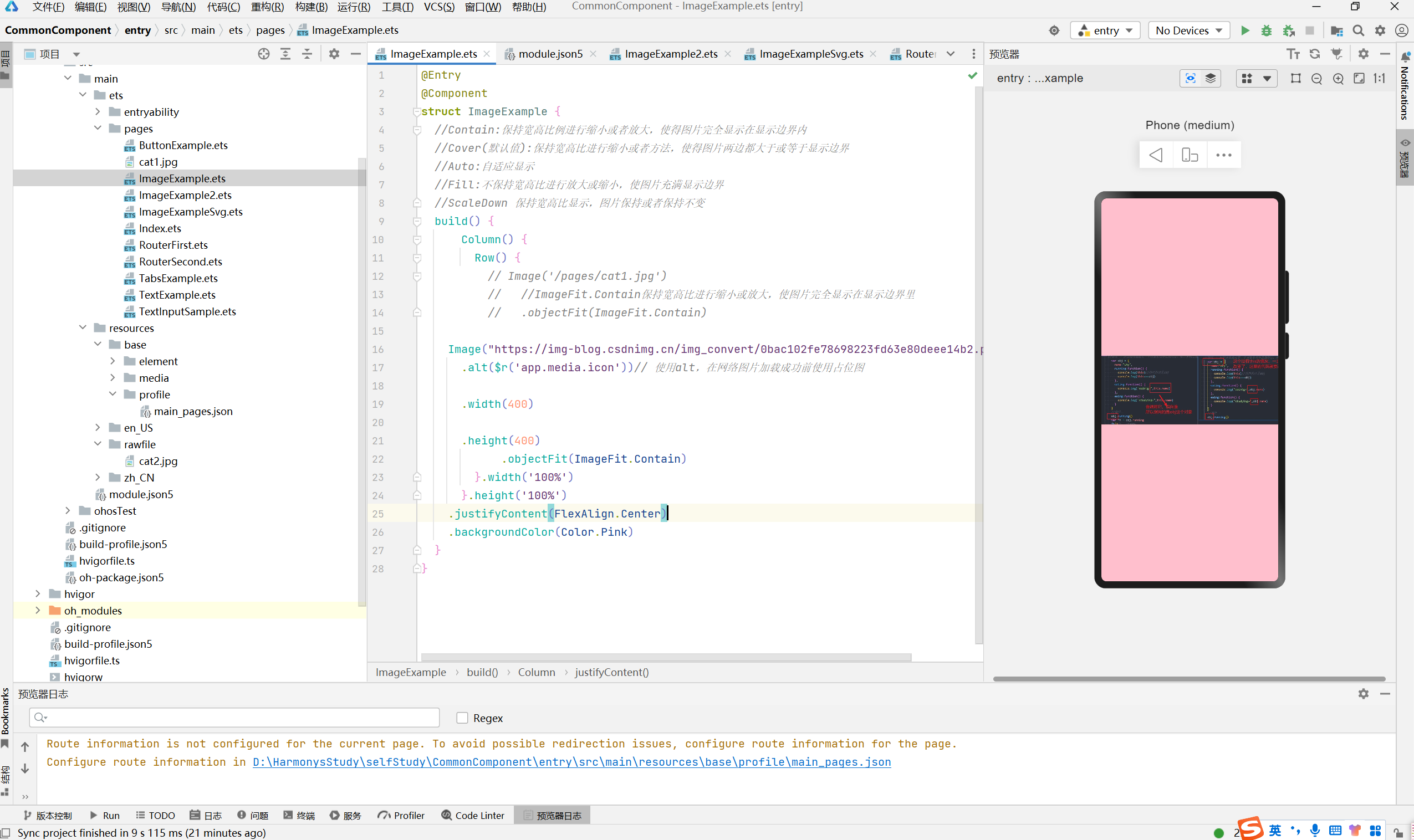
以我的图片网络地址为例
https://img-blog.csdnimg.cn/img_convert/0bac102fe78698223fd63e80deee14b2.png"
@Entry
@Component
struct ImageExample {
  //Contain:保持宽高比例进行缩小或者放大,使得图片完全显示在显示边界内
  //Cover(默认值):保持宽高比进行缩小或者方法,使得图片两边都大于或等于显示边界
  //Auto:自适应显示
  //Fill:不保持宽高比进行放大或缩小,使图片充满显示边界
  //ScaleDown 保持宽高比显示,图片保持或者保持不变
  build() {
      Column() {
        Row() {
    Image("https://img-blog.csdnimg.cn/img_convert/0bac102fe78698223fd63e80deee14b2.png")
            .objectFit(ImageFit.Contain)
        }.width('100%')
      }.height('100%')
    .justifyContent(FlexAlign.Center)
    .backgroundColor(Color.Pink)
  }
}
但是图片并不会显示,这时候可以使用alt属性设置占位图,然后就能成功显示了
Image("https://www.example.com/xxx.png")// 直接加载网络地址,请填写一个具体的网络图片地址

        .alt($r('app.media.icon'))// 使用alt,在网络图片加载成功前使用占位图

        .width(100)

        .height(100)
@Entry
@Component
struct ImageExample {
  //Contain:保持宽高比例进行缩小或者放大,使得图片完全显示在显示边界内
  //Cover(默认值):保持宽高比进行缩小或者方法,使得图片两边都大于或等于显示边界
  //Auto:自适应显示
  //Fill:不保持宽高比进行放大或缩小,使图片充满显示边界
  //ScaleDown 保持宽高比显示,图片保持或者保持不变
  build() {
      Column() {
        Row() {
    Image("https://img-blog.csdnimg.cn/img_convert/0bac102fe78698223fd63e80deee14b2.png")
      .alt($r('app.media.icon'))// 使用alt,在网络图片加载成功前使用占位图
      .width(400)
      .height(400)
            .objectFit(ImageFit.Contain)
        }.width('100%')
      }.height('100%')
    .justifyContent(FlexAlign.Center)
    .backgroundColor(Color.Pink)
  }
}
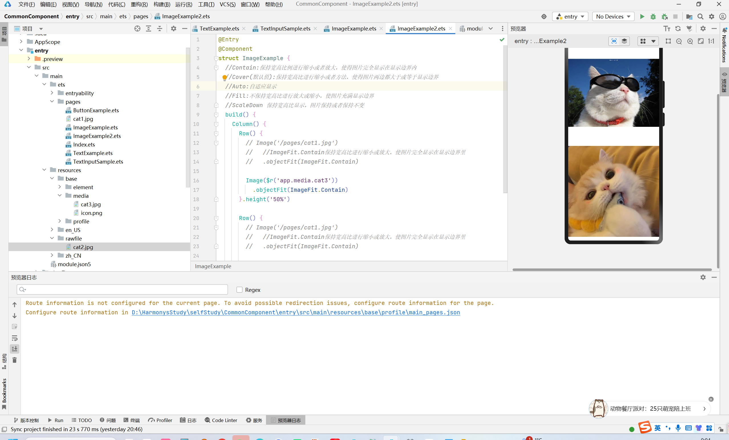
4.1.3 引入Resource图片资源
图片位置可以放在src > main > resourse > base >media的目录下
或者放在src > main > resourses > rewfile目录下
@Entry
@Component
struct ImageExample {
  //Contain:保持宽高比例进行缩小或者放大,使得图片完全显示在显示边界内
  //Cover(默认值):保持宽高比进行缩小或者方法,使得图片两边都大于或等于显示边界
  //Auto:自适应显示
  //Fill:不保持宽高比进行放大或缩小,使图片充满显示边界
  //ScaleDown 保持宽高比显示,图片保持或者保持不变
  build() {
    Column() {
      Row() {
        // Image('/pages/cat1.jpg')
        //   //ImageFit.Contain保持宽高比进行缩小或放大,使图片完全显示在显示边界里
        //   .objectFit(ImageFit.Contain)

        Image($r('app.media.cat3'))//media下   $r('app.')
          .objectFit(ImageFit.Contain)
      }.height('50%')

      Row() {
        Image($rawfile("cat2.jpg"))//reafile下  $rawfile('图片路径')
          .objectFit(ImageFit.Contain)
      }.height('50%')
    }.height('100%')
  }
}
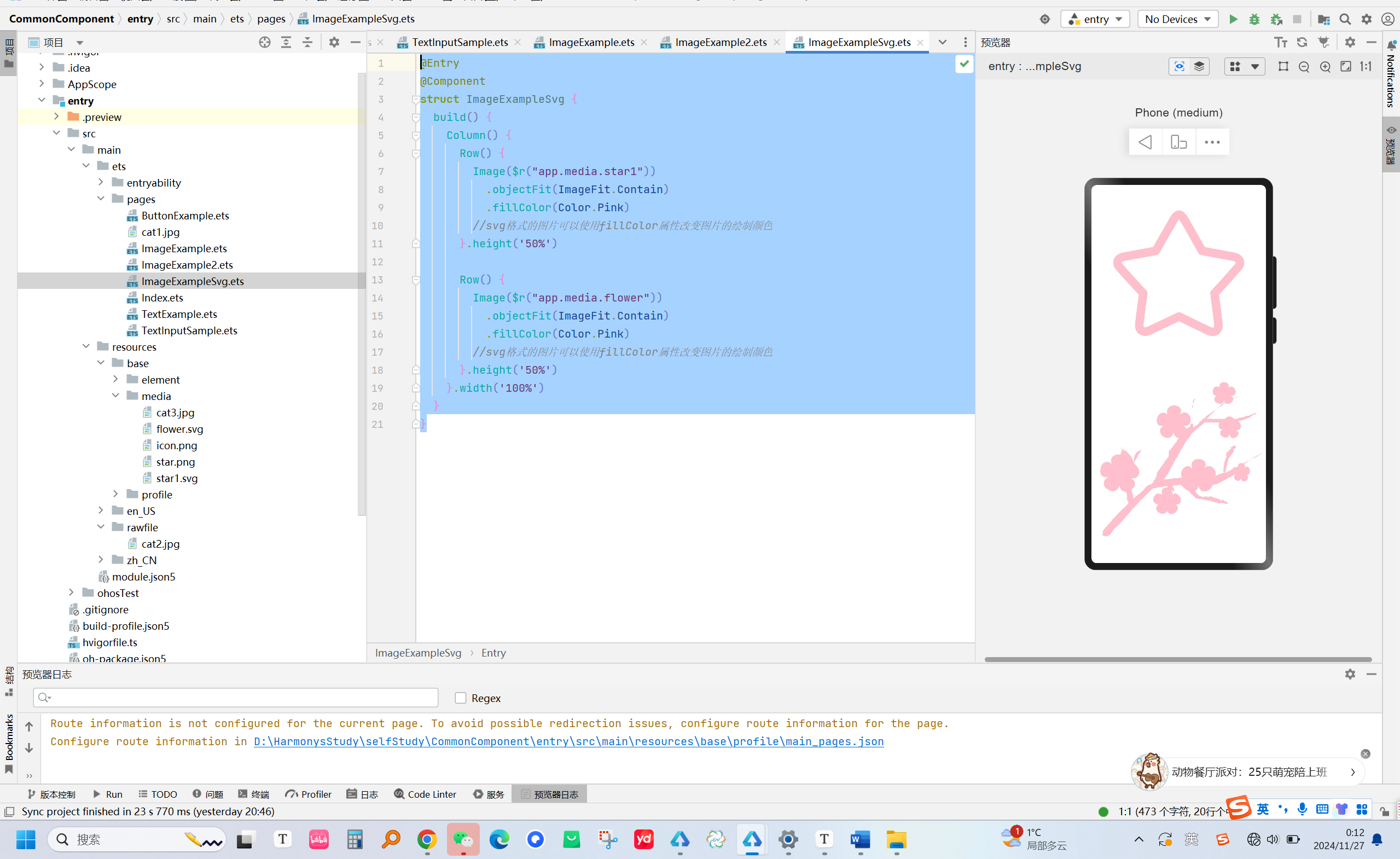
4.1.4 引入矢量图资源
@Entry
@Component
struct ImageExampleSvg {
  build() {
    Column() {
      Row() {
        Image($r("app.media.star1"))  //和rawfile一样
          .objectFit(ImageFit.Contain)
          .fillColor(Color.Pink)
        //svg格式的图片可以使用fillColor属性改变图片的绘制颜色
      }.height('50%')

      Row() {
        Image($r("app.media.flower"))
          .objectFit(ImageFit.Contain)
          .fillColor(Color.Pink)
        //svg格式的图片可以使用fillColor属性改变图片的绘制颜色
      }.height('50%')
    }.width('100%')
  }
}
5.任务五:使用router完成页面跳转
通过router模块,通过不同的URL地址,可以方便轻松的进行页面跳转
import router from '@ohos.router'
@Entry
@Component
struct RouterFirst {
  @State message: string = 'Welcome  to my HarmonyNext  Study Travel'

  build() {
    Row() {
      Column() {
        //文本组件
        Text(this.message)
          .fontSize(40)
          .fontWeight(FontWeight.Bold)
        Button('Click')
          .width('45%').height('8%')
          .margin({top:30}).fontSize(20).fontWeight(FontWeight.Bold)
      }
      .onClick(()=>{
        router.pushUrl({
          url:"pages/RouterSecond",
          params:{
            keyWord:"Harmony4.0"
          }
        })
      })
      .width('100%')
    }
    .height('100%')
  }
}
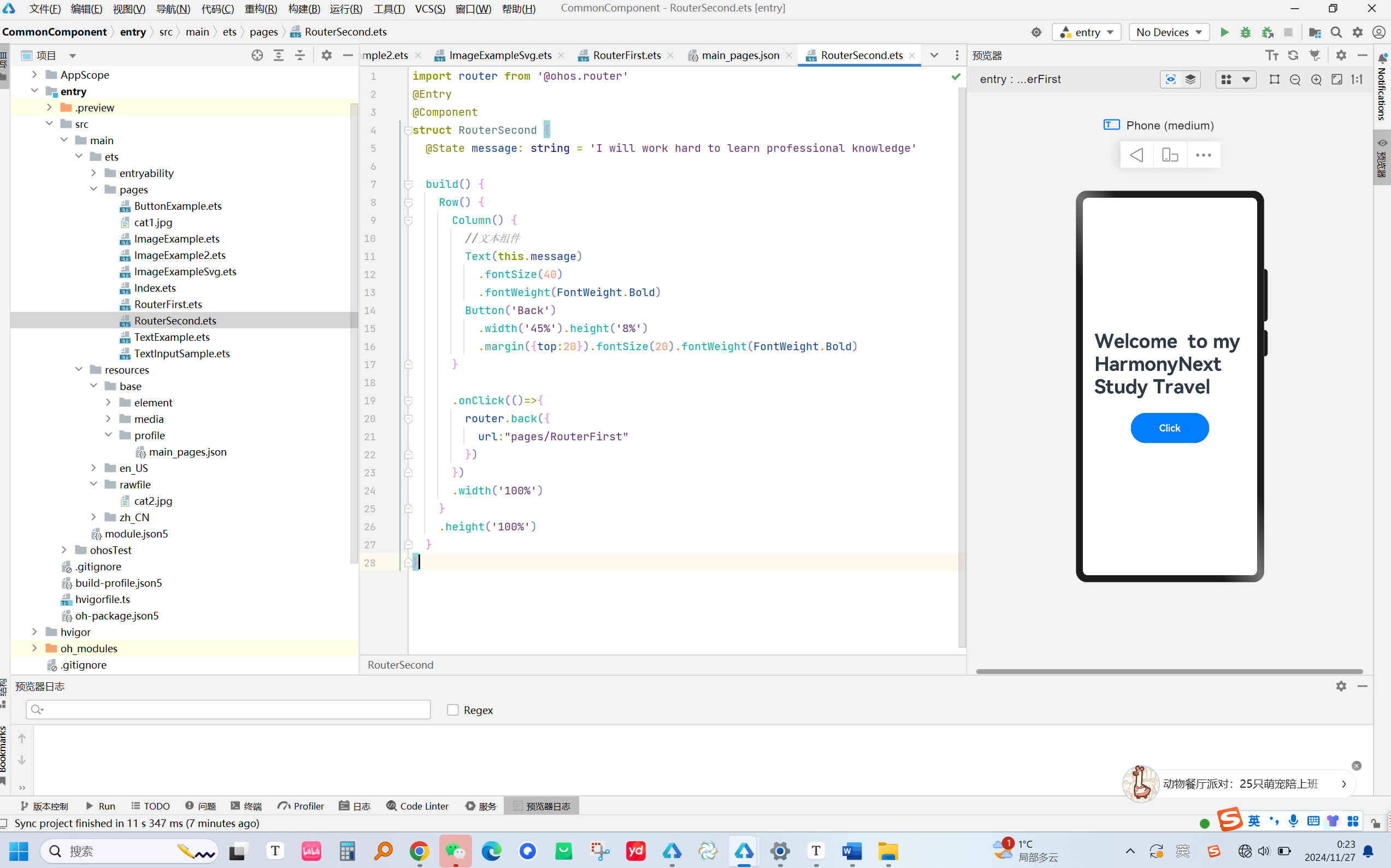
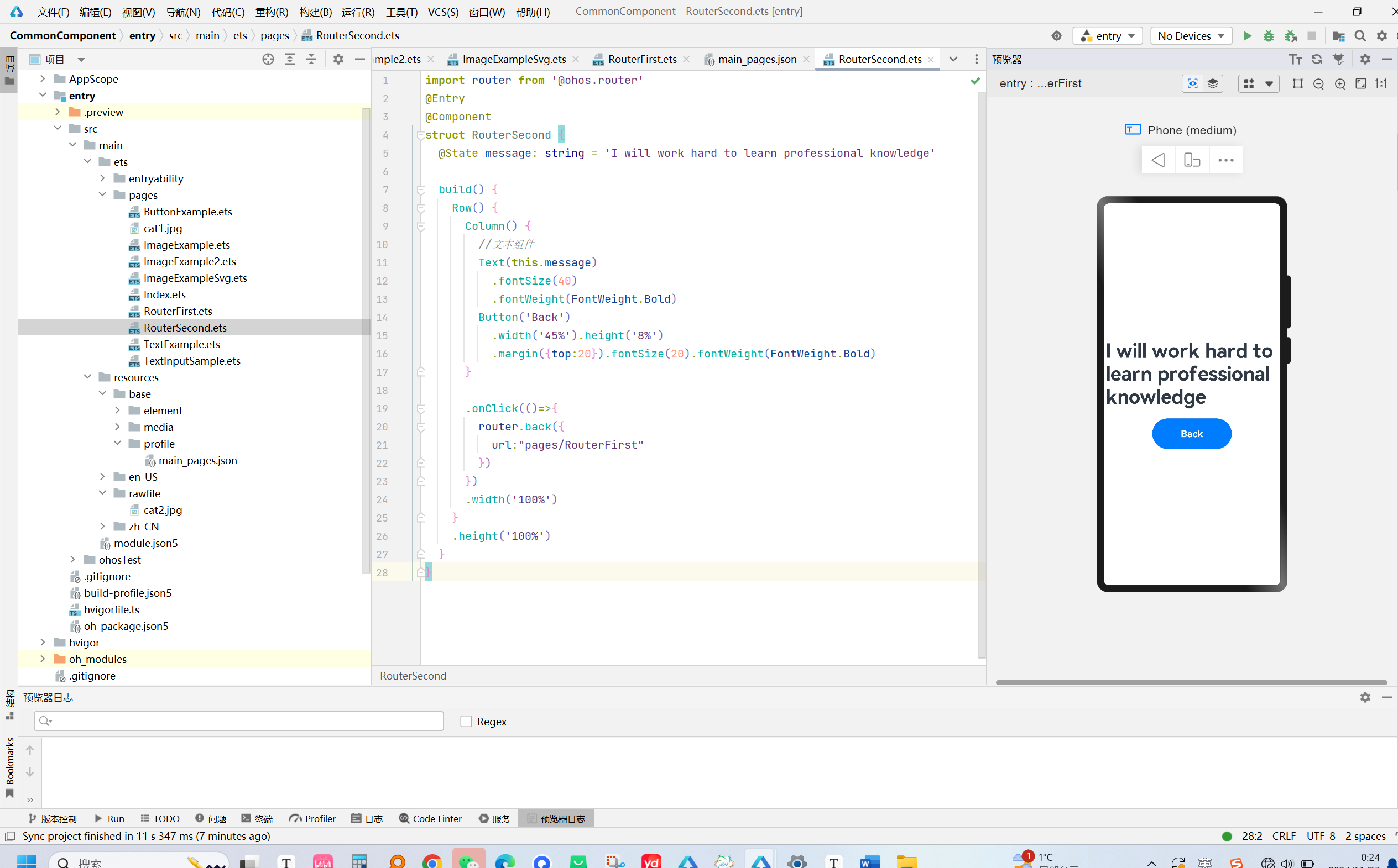
import router from '@ohos.router'
@Entry
@Component
struct RouterSecond {
  @State message: string = 'I will work hard to learn professional knowledge'

  build() {
    Row() {
      Column() {
        //文本组件
        Text(this.message)
          .fontSize(40)
          .fontWeight(FontWeight.Bold)
        Button('Back')
          .width('45%').height('8%')
          .margin({top:20}).fontSize(20).fontWeight(FontWeight.Bold)
      }

      .onClick(()=>{
        router.back({
          url:"pages/RouterFirst"
        })
      })
      .width('100%')
    }
    .height('100%')
  }
}
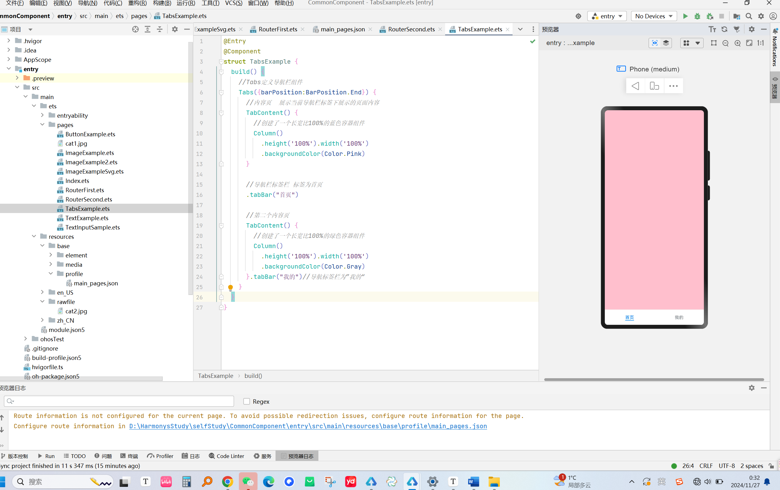
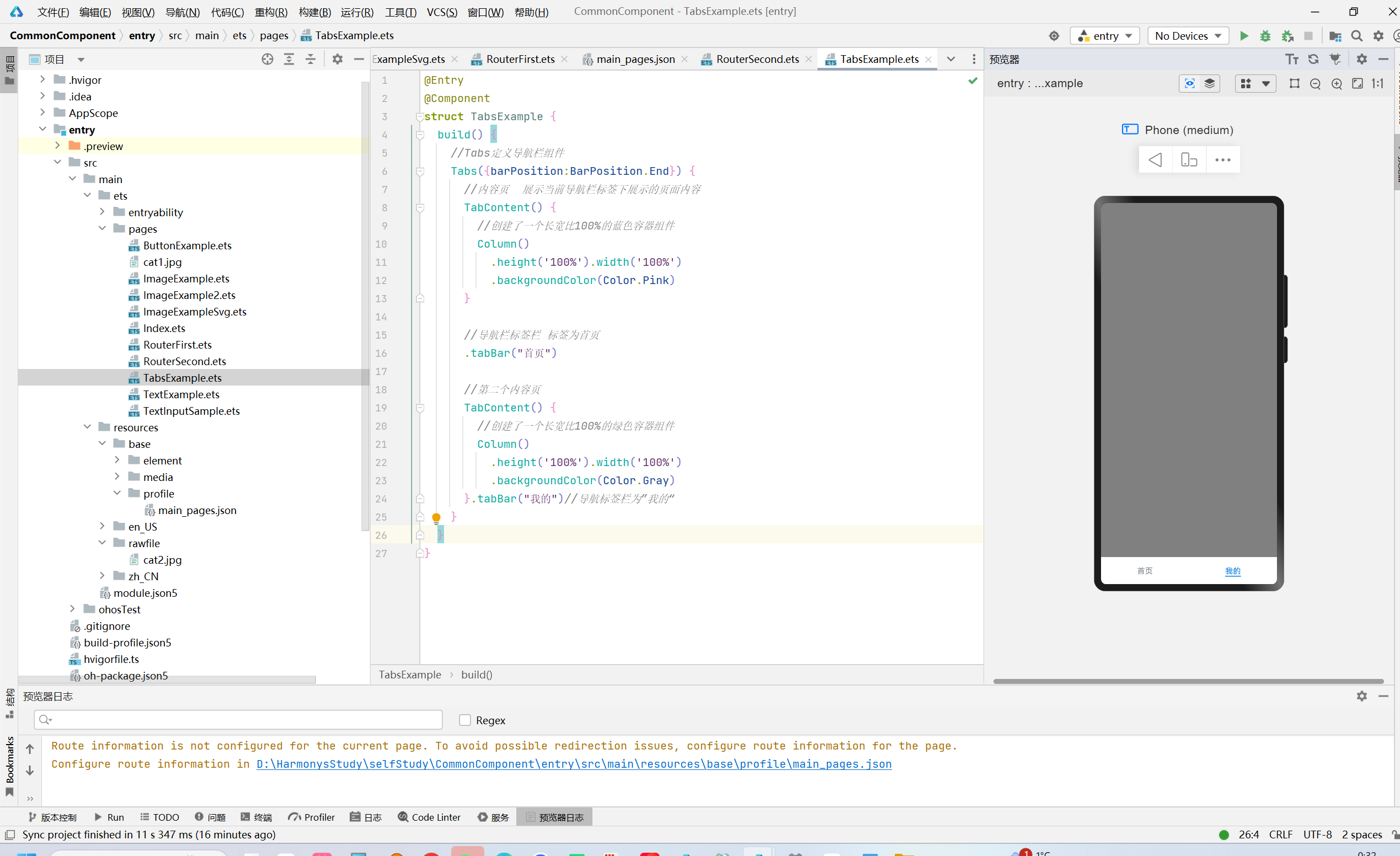
6.任务六:使用导航栏Tabs切换页面
Tabs定义了一个导航栏组件,一个Tabs包含了多对内容页(TabContent)和标签栏(tobBar),内容页和标签栏也是对应的
@Entry
@Component
struct TabsExample {
  build() {
    //Tabs定义导航栏组件
    Tabs({barPosition:BarPosition.End}) {
      //内容页  展示当前导航栏标签下展示的页面内容
      TabContent() {
        //创建了一个长宽比100%的蓝色容器组件
        Column()
          .height('100%').width('100%')
          .backgroundColor(Color.Pink)
      }

      //导航栏标签栏 标签为首页
      .tabBar("首页")

      //第二个内容页
      TabContent() {
        //创建了一个长宽比100%的绿色容器组件
        Column()
          .height('100%').width('100%')
          .backgroundColor(Color.Gray)
      }.tabBar("我的")//导航标签栏为”我的“
    }
  }
}
00