216.HarmonyOS NEXT系列教程之 TabBar凸起效果与图片偏移实现解析
2025-03-27 21:58:47
420次阅读
0个评论
温馨提示:本篇博客的详细代码已发布到 git : https://gitcode.com/nutpi/HarmonyosNext 可以下载运行哦!

HarmonyOS NEXT系列教程之 TabBar凸起效果与图片偏移实现解析
本文将详细解析TabBar中凸起效果和图片偏移的实现原理,包括ChamferInfo类和RaisedSelectImageInfo类的具体实现。
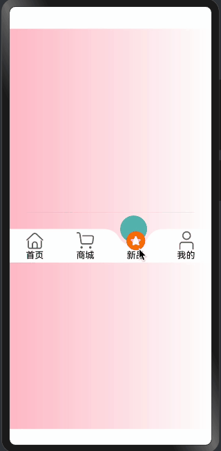
效果演示
1. ChamferInfo凸起效果类
@Observed
export class ChamferInfo extends CircleClass {
  @Track
  circleDiameter: number = 0;
  @Track
  circleRadius: number = 0;
  @Track
  circleOffsetX: number = 0;
  @Track
  circleOffsetY: number = 0;
  @Track
  chamferXY: [number, number] = [0, 0];
  @Track
  chamferRadius: number;

  constructor(context: componentUtils.ComponentInfo, menuLength: number, ChamferRadius: number = 30) {
    super({
      width: px2vp(context.size.width),
      height: px2vp(context.size.height),
      menuLength: menuLength
    });
    this.initCircleRadius();
    this.chamferRadius = ChamferRadius;
    this.getChamferXY();
  }
}
凸起效果核心属性:
-
圆形参数:
circleDiameter: 圆形直径circleRadius: 圆形半径- 控制凸起大小
-
偏移量:
circleOffsetX: X轴偏移circleOffsetY: Y轴偏移- 控制凸起位置
-
倒角参数:
chamferXY: 倒角坐标chamferRadius: 倒角半径- 实现圆滑过渡
2. 初始化与计算
initCircleRadius(): void {
  this.circleDiameter = this.getMinWidth();
  this.circleRadius = this.circleDiameter / 2;
  this.circleOffsetX = this.circleRadius;
  this.circleOffsetY = this.circleDiameter / 3;
}

getChamferXY(): void {
  this.chamferXY = utilGetChamferXY(this.circleDiameter, this.chamferRadius)
}
初始化流程说明:
-
圆形尺寸设置:
- 计算直径和半径
- 基于最小宽度适配
- 确保比例协调
-
偏移量计算:
- X轴偏移等于半径
- Y轴偏移为直径的1/3
- 创造自然凸起效果
-
倒角计算:
- 调用工具函数计算
- 确保平滑过渡
- 优化视觉效果
3. RaisedSelectImageInfo图片偏移类
@Observed
export class RaisedSelectImageInfo extends CircleClass {
  @Track
  offsetY: number = 0;

  constructor(context: componentUtils.ComponentInfo) {
    super({
      width: px2vp(context.size.width),
      height: px2vp(context.size.height),
      menuLength: 0
    });
    this.offsetY = px2vp(context.localOffset.y);
  }

  getCenterOffsetY(): number {
    let widthHalf = this.width / 2;
    return this.offsetY + widthHalf;
  }
}
图片偏移实现:
-
基础设置:
- 继承CircleClass
- 跟踪Y轴偏移量
- 使用像素转换
-
偏移计算:
- 考虑组件尺寸
- 计算中心偏移
- 确保居中显示
-
单位转换:
- 使用px2vp转换
- 确保跨设备适配
- 保持一致性
4. 工具函数集成
const SURPLUSRADIUS = 6;

function px2vp(value: number): number {
  // 像素到视口单位的转换
  return value;
}

function utilGetChamferXY(itemHeight: number, r: number = 30): [number, number] {
  let topH = itemHeight / 3;
  let center = itemHeight / 2;
  let cenToTop = center - topH;
  let chamferY = cenToTop + r;
  let sr = r + center;
  let chamferX = Math.sqrt(Math.pow(sr, 2) - Math.pow(chamferY, 2));
  return [chamferX, chamferY];
}
工具函数说明:
-
常量定义:
SURPLUSRADIUS: 多余尺寸- 用于微调效果
-
单位转换:
- px2vp函数
- 确保跨设备适配
-
倒角计算:
- 使用数学公式
- 计算精确位置
- 确保平滑效果
总结
凸起效果和图片偏移通过:
- 精确的数学计算
- 合理的参数配置
- 响应式状态管理
- 优雅的继承结构
实现了:
- 自然的凸起效果
- 平滑的过渡动画
- 准确的图片定位
- 良好的适配性
这些实现为TabBar提供了专业的视觉效果和交互体验。
00
