Openharmony App development tutorial (2) Simple UI tour
In this post I’d introduce the base concept that how to create UIs. Never mind what the language we are using (It’s called ArkTS. We can talk afterwards). Never mind the grammar detail. Only you need is some basic OOP concept. We’ll dig deeper afterwards.
Following my last post of this series, we are now ready to do coding. The IDE are all set and the new project is finished initailizing.
The IDE will create some template codes automatically. That complex code makes a beginner confused a lot. The code is like below.
@Entry
@Component
struct Index {
  @State message: string = 'Hello World';

  build() {
    RelativeContainer() {
      Text(this.message)
        .id('HelloWorld')
        .fontSize($r('app.float.page_text_font_size'))
        .fontWeight(FontWeight.Bold)
        .alignRules({
          center: { anchor: '__container__', align: VerticalAlign.Center },
          middle: { anchor: '__container__', align: HorizontalAlign.Center }
        })
        .onClick(() => {
          this.message = 'Welcome';
        })
    }
    .height('100%')
    .width('100%')
  }
}
Let’s remove all the UI codes in method build().
Let’s remove all the UI codes in method build().
@Entry
@Component
struct Index {
  @State message: string = 'Hello World';

  build() {

  }
}
Now it’s much better. And you cannot see anything in previewer. That’s for sure.
The line of property message can also be deleted.
@Entry
@Component
struct Index {
  build() {

  }
}
Let’s explain a little of this basic structure. This block of code is minimized and legal to pass the compilation.
As mentioned above, if you have basic OOP concept, you’ll understand the code directly. This code style is typical OOP language. struct is almost the same as class. In struct you can have properties and methods. The deleted message was a property. Here build() is a method. For other elements in the code like those @s, we’ll talk later.
Now we can add some UI elements in build(). Remember the code pattern in build() could be a little different. UI codes here are called declarative programming.
Let’s start with adding a Text to show a hello world. Still typical OOP grammar. Passing a string as param to the constructor of Text component.
@Entry
@Component
struct Index {
  build() {
    Text("Hello World")
  }
}
Let’s open the previewer from the tool bar on the right side of IDE, as last post mentioned. For the first time opened, it’ll take some time to compile. I strongly suggest you keep this previewer opened. You’ll see how convenient it is. If you close it, next time you open it again, it’ll take some time to compile again.
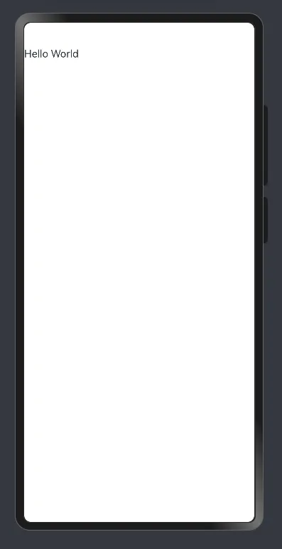 As you can see in the screenshot. There comes the text on the screen.
That it! Now you know how to develop an Openharmony App. Finish the Facebook copy yourself! You can do this!
 Just kidding as a break.
We learned first step how to put a UI element on the screen. Next step we are going to learn how to modify the styles. For a Text, we can change the properties like font size and font color.
@Entry
@Component
struct Index {
  build() {
    Text("Hello World")
      .fontSize(30)
      .fontColor(Color.Red)
  }
}
You must have guessed. Based on OOP concept. Modifying styles is like setting properties using methods. Don’t memorize the properties letter by letter. Memorize the keywords. Let IDE to prompt the full code.
let’s check how these new codes take effect. If you kept previewer opened, usually the UI will update automatically, but sometimes not. So usually when I want to see latest UI, I manually save the file using ctrl+s on Windows.
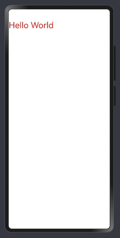
See, very convenient to adjust UI structure and styles.
Currently the Text component is on the left top corner. Looks not that elegant. I want to put it in center of the screen.
Text is now the child of nobody. In build() method there directly be the Text. So there is nowhere to tell it’s in center of which container.
The solution is simple, let’s put the Text into a container called Column. Column is a container for vertical linear layout. (Yeah contents for most of the Apps on the phone goes vertically.) (If you need a horizontal linear layout, there is a container called Row.)
Check the updated code.
@Entry
@Component
struct Index {
  build() {
    Column() {
      Text("Hello World")
        .fontSize(30)
        .fontColor(Color.Red)
    }
    .width("100%") // 1
    .height("100%") // 2
  }
}
Text is now contained in Column. Check comment 1 and 2 here. The container as a root node, we usually set the component size match it’s parent. Here the container’s parent is current page. You can sonsider in this way. Setting width and height supports using percentage string.
Now it comes the final shot.
@Entry
@Component
struct Index {
  build() {
    Column() {
      Text("Hello World")
        .fontSize(30)
        .fontColor(Color.Red)
    }
    .alignItems(HorizontalAlign.Center) // 1
    .justifyContent(FlexAlign.Center) // 2
    .width("100%")
    .height("100%")
  }
}
For Column, setting alignItems() is to set horizontal alignment. Setting justifyContent() is to set vertical alignment. For Row, vice versa. I am always confused when to use which of these 2 properties. But don’t worry, we have auto prompts and we can see UI updates very easily in previewer.
Let’s check the final effect.
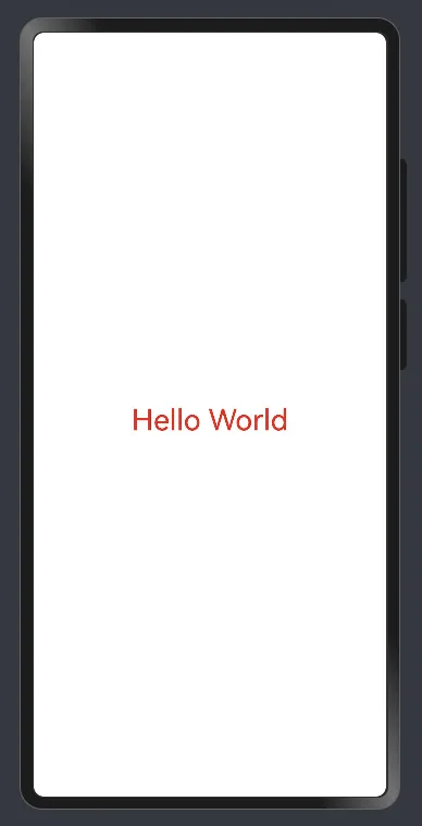 Hello world is now in the center of the screen.
Let’s summarize this post. We learned:
- Basic concept of coding language for Openharmony App.
- Basic concept of building UI for Openharmony App using declarative pattern.
- How to show a string using Text component.
- How to change style of a component.
- How to put a component to a position we need using a container called Column. Thanks for reading. More amazing content in coming.