自定义组件之<五>自定义对话框(PromptAction)
9.5:自定义对话框(PromptAction)
除了使用 CustomDialogController 实现自定义弹窗外,ArkUI 开发框架还提供了 PromptAction 对象实现弹框功能,本节笔者简单介绍一下 PromptAction 的使用。
9.5.1:PromptAction简介
PromptAction 需要从当前 UIContext 提供的 getPromptAction() 方法获取到,然后调用其 openCustomDialog() 和 closeCustomDialog() 方法显示和隐藏自定义对话框。
PromptAction 定义如下:
export class PromptAction {

  openCustomDialog<T extends Object>(dialogContent: ComponentContent<T>, options?: promptAction.BaseDialogOptions): Promise<void>;

  closeCustomDialog<T extends Object>(dialogContent: ComponentContent<T>): Promise<void>;
}
- openCustomDialog: 接收一个自定义的
ComponentContent对象和对话框的配置项。 - closeCustomDialog: 关闭一个自定义的
ComponentContent对象。
9.5.2:创建ComponentContent
PromptAction 的 openCustomDialog() 方法接收一个 ComponentContent 对象,该对象定义如下:
export class ComponentContent<T extends Object> extends Content {
    constructor(uiContext: UIContext, builder: WrappedBuilder<[]>);
    constructor(uiContext: UIContext, builder: WrappedBuilder<[T]>, args: T);
    constructor(uiContext: UIContext, builder: WrappedBuilder<[T]>, args: T, options: BuildOptions);
}
该对象提供了三种创建方式,创建时需要传递一个 UIContext 和使用 wrapBuilder() 包装的 @Builder 对象,还可以给 @Builder 对象传递参数,创建 ComponentContent 实例简单样例如下所示:
import { ComponentContent, promptAction } from '@kit.ArkUI';
import { HashMap } from '@kit.ArkTS';

// 全局缓存集合
let globalDialogMap: HashMap<string, ComponentContent<string>> = new HashMap<string, ComponentContent<string>>()

// 自定义弹窗布局
@Builder function customComponentBuilder(dialogId: string) {
  Stack() {
    Column() {
      Text('电池电量不足')
        .fontSize(20)
        .margin({top: 15})
      Text('还剩20%电量')
        .fontSize(16)
        .margin({top: 3})
      Text()
        .size({width: "100%", height: "2px"})
        .backgroundColor("#bebbc1")
        .margin({top: 15})
      Row() {
        Text("关闭")
          .height("100%")
          .layoutWeight(1)
          .textAlign(TextAlign.Center)
          .fontSize(18)
          .fontColor("#317ef5")
          .onClick(() => {
          })
        Text()
          .size({width: "2px", height: "100%"})
          .backgroundColor("#bebbc1")
        Text("低电量模式")
          .textAlign(TextAlign.Center)
          .fontSize(18)
          .fontColor("#317ef5")
          .height("100%")
          .layoutWeight(1)
          .onClick(() => {
          })
      }
      .height(45)
      .width('100%')
    }
    .backgroundColor("#e6ffffff")
    .borderRadius(20)
  }
  .padding({left: 40, right: 40})
  .width("100%")
}

@Entry @ComponentV2 struct Page_ComponentContent {

  private customComponent: ComponentContent<string> | undefined = undefined // 声明ComponentContent,它接收一个string参数


  private initComponentContent() {
    // 定义一个表示当前对话框的id
    let dialogId = "10086"
    // 初始化ComponentContent,把dialogId传递进去
    this.customComponent = new ComponentContent(this.getUIContext(), wrapBuilder(customComponentBuilder), dialogId);
    // 缓存customComponent
    globalDialogMap.set(dialogId, this.customComponent)
  }
}
样例中定义了一个全局 globalDialogMap 来缓存创建的 ComponentContent,然后定义了 customComponentBuilder 来代表对话框的布局,最后在 initComponentContent() 创建该对话框。
9.5.3:显示ComponentContent
创建完 ComponentContent 后,接着是调用 PromptAction 的 openCustomDialog() 方法显示自定义对话框的内容,样例如下所示:
@Entry @ComponentV2 struct Page_07_loadmore {

  private customComponent: ComponentContent<string> | undefined = undefined

  // 显示自定义弹窗
  private showComponentContent() {
    let _promptAction = this.getUIContext().getPromptAction()
    _promptAction.openCustomDialog(this.customComponent)
  }
}
9.5.4:隐藏ComponentContent
当调用 PromptAction 的 openCustomDialog() 方法显示自定义对话框后,如果要隐藏对话框,这调用 PromptAction 的 openCustomDialog() 方法即可,简单样例如下所示:
@Entry @ComponentV2 struct Page_07_loadmore {

  private customComponent: ComponentContent<string> | undefined = undefined

  // 隐藏自定义弹窗
  private dismissComponentContent() {
    let _promptAction = this.getUIContext().getPromptAction()
    _promptAction.closeCustomDialog(this.customComponent)
  }
}
9.5.5:完整样例
使用 ComponentContent 方式显示和隐藏自定义对话框完整样例如下所示:
import { ComponentContent } from '@kit.ArkUI';
import { HashMap } from '@kit.ArkTS';
class ComponentWrapper {
readonly context: UIContext;
readonly component: ComponentContent<string>;
constructor(context: UIContext, component: ComponentContent<string>) {
this.context = context;
this.component = component;
}
}
let globalDialogMap: HashMap<string, ComponentWrapper> = new HashMap<string, ComponentWrapper>()
@Builder function customComponentBuilder(dialogId: string) {
Stack() {
Column() {
Text('电池电量不足')
.fontSize(20)
.margin({top: 15})
Text('还剩20%电量')
.fontSize(16)
.margin({top: 3})
Text()
.size({width: "100%", height: "2px"})
.backgroundColor("#bebbc1")
.margin({top: 15})
Row() {
Text("关闭")
.height("100%")
.layoutWeight(1)
.textAlign(TextAlign.Center)
.fontSize(18)
.fontColor("#317ef5")
.onClick(() => { // 点击关闭弹出
let wrapper = globalDialogMap.get(dialogId)
if (wrapper) {
wrapper.context.getPromptAction().closeCustomDialog(wrapper.component)
}
})
Text()
.size({width: "2px", height: "100%"})
.backgroundColor("#bebbc1")
Text("低电量模式")
.textAlign(TextAlign.Center)
.fontSize(18)
.fontColor("#317ef5")
.height("100%")
.layoutWeight(1)
.onClick(() => { // 点击关闭弹窗
let wrapper = globalDialogMap.get(dialogId)
if (wrapper) {
wrapper.context.getPromptAction().closeCustomDialog(wrapper.component)
}
})
}
.height(45)
.width('100%')
}
.backgroundColor("#e6ffffff")
.borderRadius(20)
}
.padding({left: 40, right: 40})
.width("100%")
}
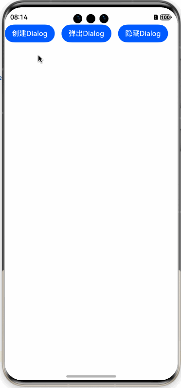
@Entry @ComponentV2 struct Page_07_loadmore {
build() {
Row({space: 15}) {
Button("创建Dialog")
.onClick(() => {
this.initComponentContent()
})
Button("弹出Dialog")
.onClick(() => {
this.showComponentContent();
})
Button("隐藏Dialog")
.onClick(() => {
this.dismissComponentContent();
})
}
.width("100%")
.width('100%')
}
private initComponentContent() {
let dialogId = "10086"
let context = this.getUIContext();
let customComponent = new ComponentContent(context, wrapBuilder(customComponentBuilder), dialogId);
globalDialogMap.set(dialogId, new ComponentWrapper(context, customComponent))
}
private showComponentContent() {
let dialogId = "10086"
let wrapper = globalDialogMap.get(dialogId)
if (wrapper) {
wrapper.context.getPromptAction().openCustomDialog(wrapper.component)
}
}
private dismissComponentContent() {
let dialogId = "10086"
let wrapper = globalDialogMap.get(dialogId)
if (wrapper) {
wrapper.context.getPromptAction().closeCustomDialog(wrapper.component)
}
}
}
样例运行结果如下图所示:
备注
作者:灰太狼
來源:坚果派
著作权归作者所有。商业转载请联系作者获得授权,非商业转载请注明出处。否则追究相关责任。