[HarmonyOS NEXT 实战案例一] 电商首页商品网格布局(下)
[HarmonyOS NEXT 实战案例一] 电商首页商品网格布局(下)
项目已开源,开源地址: https://gitcode.com/nutpi/HarmonyosNextCaseStudyTutorial , 欢迎fork & star
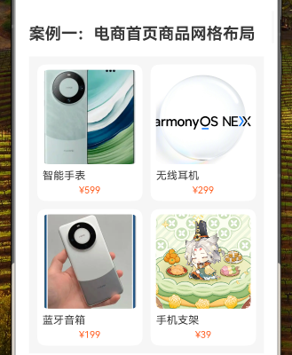
效果演示
1. 引言
在上一篇教程中,我们介绍了如何使用HarmonyOS NEXT的GridRow和GridCol组件实现基本的电商首页商品网格布局。本篇教程将深入探讨GridRow和GridCol组件的高级用法,以及如何优化电商首页的商品展示效果。
2. GridRow和GridCol组件详解
2.1 GridRow组件属性
GridRow组件是HarmonyOS NEXT中实现网格布局的核心组件,它提供了丰富的属性来控制网格布局的行为:
| 属性名 | 类型 | 描述 | 示例 |
|---|---|---|---|
| columns | number | GridRowColumnOptions | 设置布局列数 | columns: 2 |
| gutter | Length | GutterOption | 设置列间距 | gutter: 12 |
| breakpoints | { value: Array, reference: BreakpointsReference } | 设置断点响应参考值 | - |
| direction | GridRowDirection | 设置布局方向 | direction: GridRowDirection.Row |
其中,GridRowColumnOptions类型可以设置不同断点下的列数,GutterOption类型可以设置水平和垂直方向的间距。
2.2 GridCol组件属性
GridCol组件用于定义网格中的列项,它提供了以下属性:
| 属性名 | 类型 | 描述 | 示例 |
|---|---|---|---|
| span | number | GridColSpanOption | 设置跨列数 | span: 1 |
| offset | number | GridColOffsetOption | 设置偏移列数 | offset: 1 |
| order | number | GridColOrderOption | 设置显示顺序 | order: 2 |
其中,GridColSpanOption、GridColOffsetOption和GridColOrderOption类型可以设置不同断点下的跨列数、偏移列数和显示顺序。
3. 响应式布局实现
在电商首页中,我们可以使用GridRow和GridCol组件的断点响应特性实现响应式布局,使页面在不同屏幕尺寸下呈现最佳效果。
3.1 断点设置
我们可以使用breakpoints属性设置断点响应参考值:
GridRow({
    columns: {
        sm: 1,  // 小屏幕显示1列
        md: 2,  // 中屏幕显示2列
        lg: 4   // 大屏幕显示4列
    },
    gutter: {
        x: 12,  // 水平间距
        y: 16   // 垂直间距
    },
    breakpoints: {
        value: ['320vp', '600vp', '820vp'],
        reference: BreakpointsReference.WindowSize
    }
})
这样设置后,当窗口宽度小于320vp时显示1列,在320vp到600vp之间显示2列,大于820vp时显示4列。
3.2 列项适配
对应地,我们可以使用GridCol的span属性设置不同断点下的跨列数:
GridCol({
    span: {
        sm: 1,  // 小屏幕占1列
        md: 1,  // 中屏幕占1列
        lg: 1   // 大屏幕占1列
    }
})
4. 商品卡片优化
4.1 阴影效果
为了提升商品卡片的视觉层次感,我们可以添加阴影效果:
Column() {
    // 商品卡片内容
}
.padding(8)
.backgroundColor('#FFFFFF')
.borderRadius(12)
.shadow({
    radius: 6,
    color: 'rgba(0, 0, 0, 0.1)',
    offsetX: 0,
    offsetY: 2
})
4.2 商品标签
我们可以为特定商品添加标签,如"热销"、"新品"等:
Stack() {
    Image(item.image)
        .width('100%')
        .aspectRatio(1)
        .objectFit(ImageFit.Cover)
        .borderRadius(8)

    if (item.isHot) {
        Text('热销')
            .fontSize(12)
            .fontColor('#FFFFFF')
            .backgroundColor('#FF5722')
            .padding({ left: 6, right: 6, top: 2, bottom: 2 })
            .borderRadius(4)
            .position({ x: 8, y: 8 })
    }
}
4.3 价格与原价对比
为了展示商品的优惠力度,我们可以同时显示现价和原价:
Row() {
    Text(item.price)
        .fontSize(16)
        .fontColor('#FF5722')

    Text(item.originalPrice)
        .fontSize(12)
        .fontColor('#999999')
        .decoration({ type: TextDecorationType.LineThrough })
        .margin({ left: 4 })
}
.margin({ top: 4 })
5. 交互功能实现
5.1 点击事件
为商品卡片添加点击事件,实现跳转到商品详情页的功能:
Column() {
    // 商品卡片内容
}
.padding(8)
.backgroundColor('#FFFFFF')
.borderRadius(12)
.onClick(() => {
    // 跳转到商品详情页
    console.info(`点击商品: ${item.name}`)
})
5.2 加载状态
在数据加载过程中,我们可以使用LoadingProgress组件显示加载状态:
Column() {
    if (this.isLoading) {
        LoadingProgress()
            .width(24)
            .height(24)
            .color('#FF5722')
    } else {
        GridRow({ columns: 2, gutter: 12 }) {
            // 商品网格内容
        }
    }
}
5.3 下拉刷新
使用Refresh组件实现下拉刷新功能:
Refresh({ refreshing: this.refreshing, offset: 120, friction: 66 }) {
    Column() {
        GridRow({ columns: 2, gutter: 12 }) {
            // 商品网格内容
        }
    }
    .width('100%')
    .padding(12)
    .backgroundColor('#F5F5F5')
}
.onRefreshing(() => {
    // 刷新数据
    this.refreshData()
})
6. 布局变体
6.1 瀑布流布局
除了等宽网格布局,我们还可以实现瀑布流布局,使商品卡片高度不一:
GridRow({ columns: 2, gutter: 12 }) {
    ForEach(this.products, (item:productsType, index:number) => {
        GridCol({ span: 1 }) {
            Column() {
                // 商品卡片内容
            }
            .height(index % 2 === 0 ? 280 : 320)  // 交错高度
        }
    })
}
6.2 横向滚动布局
对于特定类别的商品,我们可以使用横向滚动布局:
Text('热门推荐')
    .fontSize(18)
    .fontWeight(FontWeight.Bold)
    .margin({ top: 16, bottom: 8 })

Scroll({ direction: ScrollDirection.Horizontal }) {
    Row({ space: 12 }) {
        ForEach(this.hotProducts, (item:productsType) => {
            Column() {
                // 商品卡片内容
            }
            .width(140)
        })
    }
    .padding({ left: 12, right: 12 })
}
.scrollBar(BarState.Off)
7. 完整代码示例
以下是优化后的电商首页商品网格布局完整代码示例:
@Component
export struct EnhancedECommerceGrid {
    @State isLoading: boolean = false
    @State refreshing: boolean = false

    private products:productsType[] = [
        { name: '智能手表', price: '¥599', originalPrice: '¥699', image: $r('app.media.phone'), isHot: true },
        { name: '无线耳机', price: '¥299', originalPrice: '¥399', image: $r('app.media.img'), isHot: false },
        { name: '蓝牙音箱', price: '¥199', originalPrice: '¥249', image: $r('app.media.img_1'), isHot: true },
        { name: '手机支架', price: '¥39', originalPrice: '¥59', image: $r("app.media.big1"), isHot: false }
    ]

    private refreshData() {
        this.isLoading = true
        // 模拟网络请求
        setTimeout(() => {
            this.isLoading = false
            this.refreshing = false
        }, 1000)
    }

    build() {
        Refresh({ refreshing: this.refreshing, offset: 120, friction: 66 }) {
            Column() {
                if (this.isLoading) {
                    LoadingProgress()
                        .width(24)
                        .height(24)
                        .color('#FF5722')
                        .margin(20)
                } else {
                    GridRow({
                        columns: {
                            sm: 1,
                            md: 2,
                            lg: 4
                        },
                        gutter: {
                            x: 12,
                            y: 16
                        },
                        breakpoints: {
                            value: ['320vp', '600vp', '820vp'],
                            reference: BreakpointsReference.WindowSize
                        }
                    }) {
                        ForEach(this.products, (item:productsType) => {
                            GridCol({
                                span: {
                                    sm: 1,
                                    md: 1,
                                    lg: 1
                                }
                            }) {
                                Column() {
                                    Stack() {
                                        Image(item.image)
                                            .width('100%')
                                            .aspectRatio(1)
                                            .objectFit(ImageFit.Cover)
                                            .borderRadius(8)

                                        if (item.isHot) {
                                            Text('热销')
                                                .fontSize(12)
                                                .fontColor('#FFFFFF')
                                                .backgroundColor('#FF5722')
                                                .padding({ left: 6, right: 6, top: 2, bottom: 2 })
                                                .borderRadius(4)
                                                .position({ x: 8, y: 8 })
                                        }
                                    }

                                    Text(item.name)
                                        .fontSize(16)
                                        .margin({ top: 8 })
                                        .width('100%')
                                        .textAlign(TextAlign.Start)

                                    Row() {
                                        Text(item.price)
                                            .fontSize(16)
                                            .fontColor('#FF5722')

                                        Text(item.originalPrice)
                                            .fontSize(12)
                                            .fontColor('#999999')
                                            .decoration({ type: TextDecorationType.LineThrough })
                                            .margin({ left: 4 })
                                    }
                                    .margin({ top: 4 })
                                }
                                .padding(8)
                                .backgroundColor('#FFFFFF')
                                .borderRadius(12)
                                .shadow({
                                    radius: 6,
                                    color: 'rgba(0, 0, 0, 0.1)',
                                    offsetX: 0,
                                    offsetY: 2
                                })
                                .onClick(() => {
                                    console.info(`点击商品: ${item.name}`)
                                })
                            }
                        })
                    }
                }
            }
            .width('100%')
            .padding(12)
            .backgroundColor('#F5F5F5')
        }
        .onRefreshing(() => {
            this.refreshing = true
            this.refreshData()
        })
    }
}
8. 总结
本教程深入探讨了HarmonyOS NEXT的GridRow和GridCol组件的高级用法,以及如何优化电商首页的商品展示效果。通过添加响应式布局、视觉优化和交互功能,我们实现了一个功能丰富、用户体验良好的电商首页商品网格布局。这些技术可以应用于实际的电商应用开发中,提升应用的用户体验和视觉效果。
