158.[HarmonyOS NEXT 实战案例一:Grid] 基础网格布局进阶篇:电商商品列表的交互与状态管理
2025-06-30 22:40:44
349次阅读
0个评论
[HarmonyOS NEXT 实战案例一:Grid] 基础网格布局进阶篇:电商商品列表的交互与状态管理
项目已开源,开源地址: https://gitcode.com/nutpi/HarmonyosNextCaseStudyTutorial , 欢迎fork & star
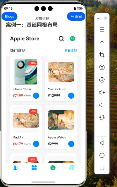
效果演示
1. Grid组件进阶特性
在上一篇教程中,我们学习了Grid和GridItem组件的基础用法,创建了一个电商商品列表页面。本篇教程将深入探讨Grid组件的进阶特性,以及如何实现更复杂的交互功能和状态管理。
1.1 Grid组件的高级属性
| 属性 | 描述 | 用途 |
|---|---|---|
| maxCount | 设置每行/列最大子组件数量 | 控制网格布局的密度 |
| minCount | 设置每行/列最小子组件数量 | 确保布局的最小密度 |
| cellLength | 设置网格布局中单元格的长度 | 精确控制单元格尺寸 |
| multiSelectable | 是否支持多选 | 实现商品多选功能 |
| cachedCount | 设置预加载的网格项数量 | 优化长列表性能 |
1.2 GridItem的高级属性
| 属性 | 描述 | 用途 |
|---|---|---|
| selectable | 是否可选中 | 控制单个商品是否可选 |
| selected | 是否被选中 | 控制商品的选中状态 |
2. 状态管理设计
在电商应用中,有效的状态管理对于提供流畅的用户体验至关重要。我们将设计以下状态变量来管理商品列表:
2.1 状态变量定义
// 商品数据状态
@State products: Product[] = [...]

// 购物车状态
@State cartItems: Map<number, number> = new Map<number, number>()

// 筛选状态
@State filterOptions: {
    priceRange: [number, number],
    hasDiscount: boolean,
    sortBy: 'price' | 'popularity' | 'newest'
} = {
    priceRange: [0, 50000],
    hasDiscount: false,
    sortBy: 'popularity'
}

// 布局状态
@State gridColumns: string = '1fr 1fr'
@State isListView: boolean = false
2.2 数据模型扩展
我们可以扩展商品数据模型,添加更多属性以支持进阶功能:
interface Product {
    id: number,
    name: string,
    price: number,
    image: Resource,
    discount?: number,
    // 新增属性
    category: string,
    rating: number,
    stock: number,
    dateAdded: Date,
    popularity: number
}
3. 交互功能实现
3.1 商品筛选功能
// 筛选面板组件
@Component
struct FilterPanel {
    @Link filterOptions: {
        priceRange: [number, number],
        hasDiscount: boolean,
        sortBy: 'price' | 'popularity' | 'newest'
    }
    @Consume('closeFilter') closeFilter: () => void

    build() {
        Column() {
            // 价格范围选择
            Text('价格范围')
                .fontSize(16)
                .fontWeight(FontWeight.Medium)
                .margin({ top: 16, bottom: 8 })

            Row() {
                Slider({
                    value: this.filterOptions.priceRange[0],
                    min: 0,
                    max: 50000,
                    step: 100,
                    onChange: (value: number) => {
                        this.filterOptions.priceRange[0] = value
                    }
                })
                .width('80%')

                Text(`¥${this.filterOptions.priceRange[0]}`)
                    .fontSize(14)
                    .margin({ left: 8 })
            }
            .width('100%')

            Row() {
                Slider({
                    value: this.filterOptions.priceRange[1],
                    min: 0,
                    max: 50000,
                    step: 100,
                    onChange: (value: number) => {
                        this.filterOptions.priceRange[1] = value
                    }
                })
                .width('80%')

                Text(`¥${this.filterOptions.priceRange[1]}`)
                    .fontSize(14)
                    .margin({ left: 8 })
            }
            .width('100%')

            // 折扣商品筛选
            Row() {
                Text('只看折扣商品')
                    .fontSize(16)
                    .fontWeight(FontWeight.Medium)

                Toggle({ type: ToggleType.Checkbox, isOn: this.filterOptions.hasDiscount })
                    .onChange((isOn: boolean) => {
                        this.filterOptions.hasDiscount = isOn
                    })
            }
            .width('100%')
            .justifyContent(FlexAlign.SpaceBetween)
            .margin({ top: 16, bottom: 16 })

            // 排序方式
            Text('排序方式')
                .fontSize(16)
                .fontWeight(FontWeight.Medium)
                .margin({ bottom: 8 })

            Column() {
                Radio({ value: 'price', group: 'sortBy' })
                    .checked(this.filterOptions.sortBy === 'price')
                    .onChange((isChecked: boolean) => {
                        if (isChecked) {
                            this.filterOptions.sortBy = 'price'
                        }
                    })
                Text('按价格')
                    .fontSize(14)
            }
            .width('100%')
            .alignItems(HorizontalAlign.Start)

            Column() {
                Radio({ value: 'popularity', group: 'sortBy' })
                    .checked(this.filterOptions.sortBy === 'popularity')
                    .onChange((isChecked: boolean) => {
                        if (isChecked) {
                            this.filterOptions.sortBy = 'popularity'
                        }
                    })
                Text('按热度')
                    .fontSize(14)
            }
            .width('100%')
            .alignItems(HorizontalAlign.Start)
            .margin({ top: 8 })

            Column() {
                Radio({ value: 'newest', group: 'sortBy' })
                    .checked(this.filterOptions.sortBy === 'newest')
                    .onChange((isChecked: boolean) => {
                        if (isChecked) {
                            this.filterOptions.sortBy = 'newest'
                        }
                    })
                Text('按最新')
                    .fontSize(14)
            }
            .width('100%')
            .alignItems(HorizontalAlign.Start)
            .margin({ top: 8 })

            // 应用按钮
            Button('应用筛选')
                .width('100%')
                .height(40)
                .margin({ top: 24 })
                .onClick(() => {
                    this.closeFilter()
                })
        }
        .width('100%')
        .padding(16)
    }
}
3.2 商品排序功能
// 根据筛选条件对商品进行排序和过滤
private getFilteredProducts(): Product[] {
    // 首先过滤价格范围
    let filtered = this.products.filter(product => {
        const discountedPrice = product.discount ?
            product.price * (100 - product.discount) / 100 :
            product.price;

        return discountedPrice >= this.filterOptions.priceRange[0] &&
               discountedPrice <= this.filterOptions.priceRange[1];
    });

    // 如果只看折扣商品
    if (this.filterOptions.hasDiscount) {
        filtered = filtered.filter(product => product.discount !== undefined);
    }

    // 根据排序方式排序
    switch (this.filterOptions.sortBy) {
        case 'price':
            filtered.sort((a, b) => {
                const priceA = a.discount ? a.price * (100 - a.discount) / 100 : a.price;
                const priceB = b.discount ? b.price * (100 - b.discount) / 100 : b.price;
                return priceA - priceB;
            });
            break;
        case 'popularity':
            filtered.sort((a, b) => b.popularity - a.popularity);
            break;
        case 'newest':
            filtered.sort((a, b) => b.dateAdded.getTime() - a.dateAdded.getTime());
            break;
    }

    return filtered;
}
3.3 购物车功能
// 添加商品到购物车
private addToCart(productId: number): void {
    if (this.cartItems.has(productId)) {
        // 如果已在购物车中,数量+1
        this.cartItems.set(productId, this.cartItems.get(productId) + 1);
    } else {
        // 否则添加到购物车,数量为1
        this.cartItems.set(productId, 1);
    }

    // 更新购物车图标上的数字
    this.updateCartBadge();
}

// 从购物车移除商品
private removeFromCart(productId: number): void {
    if (this.cartItems.has(productId)) {
        const currentCount = this.cartItems.get(productId);
        if (currentCount > 1) {
            // 如果数量大于1,数量-1
            this.cartItems.set(productId, currentCount - 1);
        } else {
            // 否则从购物车中移除
            this.cartItems.delete(productId);
        }

        // 更新购物车图标上的数字
        this.updateCartBadge();
    }
}

// 更新购物车图标上的数字
private updateCartBadge(): void {
    let totalItems = 0;
    this.cartItems.forEach(count => {
        totalItems += count;
    });

    // 更新UI上的购物车数量
    this.cartItemCount = totalItems;
}
4. 布局切换功能
电商应用通常提供网格视图和列表视图两种布局模式,我们可以实现一个布局切换功能:
// 顶部操作栏
Row() {
    Text('热门商品')
        .fontSize(18)
        .fontWeight(FontWeight.Medium)
        .fontColor('#1D1D1F')

    Blank()

    // 布局切换按钮
    Button() {
        Image(this.isListView ? $r('app.media.grid_icon') : $r('app.media.list_icon'))
            .width(24)
            .height(24)
    }
    .width(40)
    .height(40)
    .borderRadius(20)
    .backgroundColor('#F5F5F7')
    .margin({ right: 12 })
    .onClick(() => {
        this.isListView = !this.isListView;
        // 根据视图类型调整列数
        this.gridColumns = this.isListView ? '1fr' : '1fr 1fr';
    })

    // 筛选按钮
    Button() {
        Image($r('app.media.filter_icon'))
            .width(24)
            .height(24)
    }
    .width(40)
    .height(40)
    .borderRadius(20)
    .backgroundColor('#F5F5F7')
    .onClick(() => {
        this.showFilter = true;
    })
}
.width('100%')
.padding({ left: 20, right: 20, top: 16, bottom: 16 })
.backgroundColor('#FFFFFF')
5. 响应式布局增强
为了适应不同屏幕尺寸,我们可以实现更加智能的响应式布局:
// 在组件初始化时设置响应式布局
aboutToAppear() {
    // 获取屏幕信息
    const displayInfo = display.getDefaultDisplaySync();
    const screenWidth = px2vp(displayInfo.width);

    // 根据屏幕宽度设置网格列数
    if (screenWidth < 360) {
        // 小屏手机
        this.gridColumns = '1fr';
    } else if (screenWidth < 600) {
        // 普通手机
        this.gridColumns = '1fr 1fr';
    } else if (screenWidth < 840) {
        // 大屏手机/小平板
        this.gridColumns = '1fr 1fr 1fr';
    } else {
        // 平板/桌面
        this.gridColumns = '1fr 1fr 1fr 1fr';
    }
}

// 监听屏幕旋转
onPageShow() {
    display.on('change', this.updateLayout.bind(this));
}

onPageHide() {
    display.off('change', this.updateLayout.bind(this));
}

// 更新布局
private updateLayout() {
    const displayInfo = display.getDefaultDisplaySync();
    const screenWidth = px2vp(displayInfo.width);

    // 如果是列表视图,保持单列
    if (this.isListView) {
        this.gridColumns = '1fr';
        return;
    }

    // 根据屏幕宽度更新网格列数
    if (screenWidth < 360) {
        this.gridColumns = '1fr';
    } else if (screenWidth < 600) {
        this.gridColumns = '1fr 1fr';
    } else if (screenWidth < 840) {
        this.gridColumns = '1fr 1fr 1fr';
    } else {
        this.gridColumns = '1fr 1fr 1fr 1fr';
    }
}
6. 商品卡片组件化
为了提高代码的可维护性,我们可以将商品卡片抽取为独立组件:
@Component
struct ProductCard {
    @ObjectLink product: Product
    @Link cartItems: Map<number, number>
    isListView: boolean = false
    onAddToCart: (productId: number) => void

    build() {
        // 根据视图类型选择不同的布局
        if (this.isListView) {
            this.buildListItem()
        } else {
            this.buildGridItem()
        }
    }

    @Builder
    buildGridItem() {
        Column() {
            // 商品图片容器
            Stack({ alignContent: Alignment.TopEnd }) {
                Image(this.product.image)
                    .width('100%')
                    .height(120)
                    .objectFit(ImageFit.Contain)
                    .backgroundColor('#F8F8F8')
                    .borderRadius(12)

                // 折扣标签
                if (this.product.discount) {
                    Text(`-${this.product.discount}%`)
                        .fontSize(12)
                        .fontColor('#FFFFFF')
                        .backgroundColor('#FF3B30')
                        .padding({ left: 8, right: 8, top: 4, bottom: 4 })
                        .borderRadius(8)
                        .margin({ top: 8, right: 8 })
                }
            }
            .width('100%')
            .height(120)

            // 商品信息
            Column() {
                Text(this.product.name)
                    .fontSize(14)
                    .fontWeight(FontWeight.Medium)
                    .fontColor('#1D1D1F')
                    .maxLines(2)
                    .textOverflow({ overflow: TextOverflow.Ellipsis })
                    .margin({ top: 12 })

                Row() {
                    if (this.product.discount) {
                        Text(`¥${(this.product.price * (100 - this.product.discount) / 100).toFixed(0)}`)
                            .fontSize(16)
                            .fontWeight(FontWeight.Bold)
                            .fontColor('#FF3B30')

                        Text(`¥${this.product.price}`)
                            .fontSize(12)
                            .fontColor('#8E8E93')
                            .decoration({ type: TextDecorationType.LineThrough })
                            .margin({ left: 4 })
                    } else {
                        Text(`¥${this.product.price}`)
                            .fontSize(16)
                            .fontWeight(FontWeight.Bold)
                            .fontColor('#1D1D1F')
                    }

                    Blank()

                    Button() {
                        Image($r('app.media.add_icon'))
                            .width(16)
                            .height(16)
                            .fillColor('#FFFFFF')
                    }
                    .width(28)
                    .height(28)
                    .borderRadius(14)
                    .backgroundColor('#007AFF')
                    .onClick(() => {
                        this.onAddToCart(this.product.id)
                    })
                }
                .width('100%')
                .margin({ top: 8 })
            }
            .alignItems(HorizontalAlign.Start)
            .width('100%')
        }
        .width('100%')
        .padding(12)
        .backgroundColor('#FFFFFF')
        .borderRadius(16)
        .shadow({
            radius: 8,
            color: 'rgba(0, 0, 0, 0.1)',
            offsetX: 0,
            offsetY: 2
        })
    }

    @Builder
    buildListItem() {
        Row() {
            // 商品图片
            Stack({ alignContent: Alignment.TopEnd }) {
                Image(this.product.image)
                    .width(100)
                    .height(100)
                    .objectFit(ImageFit.Contain)
                    .backgroundColor('#F8F8F8')
                    .borderRadius(12)

                // 折扣标签
                if (this.product.discount) {
                    Text(`-${this.product.discount}%`)
                        .fontSize(12)
                        .fontColor('#FFFFFF')
                        .backgroundColor('#FF3B30')
                        .padding({ left: 6, right: 6, top: 2, bottom: 2 })
                        .borderRadius(6)
                        .margin({ top: 6, right: 6 })
                }
            }
            .width(100)
            .height(100)

            // 商品信息
            Column() {
                Text(this.product.name)
                    .fontSize(16)
                    .fontWeight(FontWeight.Medium)
                    .fontColor('#1D1D1F')
                    .maxLines(2)
                    .textOverflow({ overflow: TextOverflow.Ellipsis })

                // 库存信息
                Text(`库存: ${this.product.stock}件`)
                    .fontSize(14)
                    .fontColor('#8E8E93')
                    .margin({ top: 4 })

                // 评分
                Row() {
                    ForEach(Array(5).fill(0).map((_, i) => i < Math.floor(this.product.rating)), () => {
                        Image($r('app.media.star_filled'))
                            .width(16)
                            .height(16)
                            .fillColor('#FF9500')
                    })

                    ForEach(Array(5).fill(0).map((_, i) => i >= Math.floor(this.product.rating)), () => {
                        Image($r('app.media.star_empty'))
                            .width(16)
                            .height(16)
                            .fillColor('#C7C7CC')
                    })

                    Text(`${this.product.rating.toFixed(1)}`)
                        .fontSize(14)
                        .fontColor('#8E8E93')
                        .margin({ left: 4 })
                }
                .margin({ top: 4 })

                Blank()

                // 价格和购物车
                Row() {
                    if (this.product.discount) {
                        Text(`¥${(this.product.price * (100 - this.product.discount) / 100).toFixed(0)}`)
                            .fontSize(18)
                            .fontWeight(FontWeight.Bold)
                            .fontColor('#FF3B30')

                        Text(`¥${this.product.price}`)
                            .fontSize(14)
                            .fontColor('#8E8E93')
                            .decoration({ type: TextDecorationType.LineThrough })
                            .margin({ left: 4 })
                    } else {
                        Text(`¥${this.product.price}`)
                            .fontSize(18)
                            .fontWeight(FontWeight.Bold)
                            .fontColor('#1D1D1F')
                    }

                    Blank()

                    // 购物车数量控制
                    if (this.cartItems.has(this.product.id) && this.cartItems.get(this.product.id) > 0) {
                        Button() {
                            Image($r('app.media.minus_icon'))
                                .width(16)
                                .height(16)
                                .fillColor('#FFFFFF')
                        }
                        .width(28)
                        .height(28)
                        .borderRadius(14)
                        .backgroundColor('#007AFF')
                        .onClick(() => {
                            // 减少购物车中的数量
                            const currentCount = this.cartItems.get(this.product.id);
                            if (currentCount > 1) {
                                this.cartItems.set(this.product.id, currentCount - 1);
                            } else {
                                this.cartItems.delete(this.product.id);
                            }
                        })

                        Text(`${this.cartItems.get(this.product.id)}`)
                            .fontSize(16)
                            .fontWeight(FontWeight.Medium)
                            .margin({ left: 8, right: 8 })

                        Button() {
                            Image($r('app.media.add_icon'))
                                .width(16)
                                .height(16)
                                .fillColor('#FFFFFF')
                        }
                        .width(28)
                        .height(28)
                        .borderRadius(14)
                        .backgroundColor('#007AFF')
                        .onClick(() => {
                            // 增加购物车中的数量
                            const currentCount = this.cartItems.get(this.product.id);
                            this.cartItems.set(this.product.id, currentCount + 1);
                        })
                    } else {
                        Button() {
                            Image($r('app.media.add_icon'))
                                .width(16)
                                .height(16)
                                .fillColor('#FFFFFF')
                        }
                        .width(28)
                        .height(28)
                        .borderRadius(14)
                        .backgroundColor('#007AFF')
                        .onClick(() => {
                            this.onAddToCart(this.product.id)
                        })
                    }
                }
                .width('100%')
            }
            .height('100%')
            .layoutWeight(1)
            .alignItems(HorizontalAlign.Start)
            .justifyContent(FlexAlign.Start)
            .margin({ left: 12 })
        }
        .width('100%')
        .height(120)
        .padding(12)
        .backgroundColor('#FFFFFF')
        .borderRadius(16)
        .shadow({
            radius: 8,
            color: 'rgba(0, 0, 0, 0.1)',
            offsetX: 0,
            offsetY: 2
        })
    }
}
7. 长列表优化
对于包含大量商品的电商应用,我们需要优化长列表性能:
// 使用LazyForEach代替ForEach,实现懒加载
class ProductDataSource implements IDataSource {
    private products: Product[] = []
    private listener: DataChangeListener

    constructor(products: Product[]) {
        this.products = products
    }

    totalCount(): number {
        return this.products.length
    }

    getData(index: number): Product {
        return this.products[index]
    }

    registerDataChangeListener(listener: DataChangeListener): void {
        this.listener = listener
    }

    unregisterDataChangeListener() {
    }

    // 更新数据源
    updateData(products: Product[]) {
        this.products = products
        this.listener.onDataReloaded()
    }
}

// 在组件中使用
@State productDataSource: ProductDataSource = new ProductDataSource([])

aboutToAppear() {
    // 初始化数据源
    this.productDataSource = new ProductDataSource(this.products)
}

// 在Grid中使用LazyForEach
Grid() {
    LazyForEach(this.productDataSource, (product: Product) => {
        GridItem() {
            ProductCard({
                product: product,
                cartItems: $cartItems,
                isListView: this.isListView,
                onAddToCart: this.addToCart.bind(this)
            })
        }
        .onClick(() => {
            console.log(`点击了商品: ${product.name}`)
        })
    })
}
.columnsTemplate(this.gridColumns)
.columnsGap(16)
.rowsGap(16)
.cachedCount(4) // 预加载4个网格项
.width('100%')
.layoutWeight(1)
.padding({ left: 20, right: 20, bottom: 20 })
.backgroundColor('#F2F2F7')
8. 总结
在本教程中,我们深入探讨了HarmonyOS NEXT中Grid组件的进阶用法,实现了一个功能完善的电商商品列表页面。
00
