159.[HarmonyOS NEXT 实战案例一:Grid] 基础网格布局高级篇:电商应用的复杂交互与动效实现
2025-06-30 22:41:19
360次阅读
0个评论
[HarmonyOS NEXT 实战案例一:Grid] 基础网格布局高级篇:电商应用的复杂交互与动效实现
项目已开源,开源地址: https://gitcode.com/nutpi/HarmonyosNextCaseStudyTutorial , 欢迎fork & star
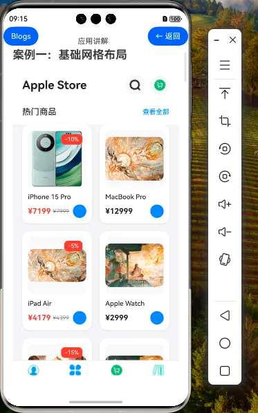
效果演示
1. Grid组件的高级应用场景
在前两篇教程中,我们学习了Grid组件的基础用法和进阶特性。本篇教程将探讨Grid组件在电商应用中的高级应用场景,以及如何实现复杂的交互效果和动画效果。
1.1 Grid组件的高级应用场景
| 应用场景 | 描述 | 实现要点 |
|---|---|---|
| 瀑布流布局 | 不规则高度的商品卡片布局 | 使用自定义高度的GridItem |
| 拖拽排序 | 允许用户拖拽商品调整顺序 | 结合手势识别和状态管理 |
| 多级分类展示 | 展示商品的多级分类结构 | 嵌套Grid组件和状态管理 |
| 动态布局切换 | 根据用户操作动态调整布局 | 状态驱动的布局变化 |
| 无限滚动加载 | 滚动到底部自动加载更多商品 | 结合滚动事件和数据加载 |
2. 瀑布流布局实现
瀑布流布局是电商应用中常见的展示方式,可以更好地利用屏幕空间,展示不同高度的商品卡片。
2.1 瀑布流数据模型
interface WaterfallProduct extends Product {
    // 额外添加高度属性,用于瀑布流布局
    cardHeight: number
}

// 生成瀑布流数据
private generateWaterfallData(): WaterfallProduct[] {
    return this.products.map(product => {
        // 根据商品名称长度和是否有折扣等因素动态计算卡片高度
        const nameLength = product.name.length;
        const hasDiscount = product.discount !== undefined;
        const hasDescription = Math.random() > 0.5;

        // 基础高度 + 动态高度
        const baseHeight = 240;
        const dynamicHeight = (nameLength > 15 ? 20 : 0) +
                            (hasDiscount ? 20 : 0) +
                            (hasDescription ? 60 : 0);

        return {
            ...product,
            cardHeight: baseHeight + dynamicHeight
        };
    });
}
2.2 瀑布流布局实现
@Component
struct WaterfallLayout {
    @State products: WaterfallProduct[] = []
    @State leftColumnHeight: number = 0
    @State rightColumnHeight: number = 0
    @State leftColumnProducts: WaterfallProduct[] = []
    @State rightColumnProducts: WaterfallProduct[] = []
    @Link cartItems: Map<number, number>
    onAddToCart: (productId: number) => void

    aboutToAppear() {
        this.distributeProducts();
    }

    // 分配商品到左右两列,保持高度平衡
    distributeProducts() {
        this.leftColumnProducts = [];
        this.rightColumnProducts = [];
        this.leftColumnHeight = 0;
        this.rightColumnHeight = 0;

        this.products.forEach(product => {
            // 将商品添加到高度较小的一列
            if (this.leftColumnHeight <= this.rightColumnHeight) {
                this.leftColumnProducts.push(product);
                this.leftColumnHeight += product.cardHeight;
            } else {
                this.rightColumnProducts.push(product);
                this.rightColumnHeight += product.cardHeight;
            }
        });
    }

    build() {
        Row() {
            // 左列
            Column() {
                ForEach(this.leftColumnProducts, (product: WaterfallProduct) => {
                    this.WaterfallItem(product)
                })
            }
            .width('48%')

            // 右列
            Column() {
                ForEach(this.rightColumnProducts, (product: WaterfallProduct) => {
                    this.WaterfallItem(product)
                })
            }
            .width('48%')
        }
        .width('100%')
        .justifyContent(FlexAlign.SpaceBetween)
    }

    @Builder
    WaterfallItem(product: WaterfallProduct) {
        Column() {
            // 商品图片
            Stack({ alignContent: Alignment.TopEnd }) {
                Image(product.image)
                    .width('100%')
                    .aspectRatio(1)
                    .objectFit(ImageFit.Cover)
                    .borderRadius({ topLeft: 12, topRight: 12 })

                // 折扣标签
                if (product.discount) {
                    Text(`-${product.discount}%`)
                        .fontSize(12)
                        .fontColor('#FFFFFF')
                        .backgroundColor('#FF3B30')
                        .padding({ left: 8, right: 8, top: 4, bottom: 4 })
                        .borderRadius(8)
                        .margin({ top: 8, right: 8 })
                }
            }
            .width('100%')

            // 商品信息
            Column() {
                Text(product.name)
                    .fontSize(14)
                    .fontWeight(FontWeight.Medium)
                    .fontColor('#1D1D1F')
                    .maxLines(2)
                    .textOverflow({ overflow: TextOverflow.Ellipsis })
                    .margin({ top: 12 })

                // 随机添加商品描述(仅部分商品有)
                if (product.cardHeight > 260) {
                    Text('这是一段商品描述,介绍商品的特点和优势,帮助用户更好地了解商品。')
                        .fontSize(12)
                        .fontColor('#8E8E93')
                        .maxLines(3)
                        .textOverflow({ overflow: TextOverflow.Ellipsis })
                        .margin({ top: 8 })
                }

                Row() {
                    if (product.discount) {
                        Text(`¥${(product.price * (100 - product.discount) / 100).toFixed(0)}`)
                            .fontSize(16)
                            .fontWeight(FontWeight.Bold)
                            .fontColor('#FF3B30')

                        Text(`¥${product.price}`)
                            .fontSize(12)
                            .fontColor('#8E8E93')
                            .decoration({ type: TextDecorationType.LineThrough })
                            .margin({ left: 4 })
                    } else {
                        Text(`¥${product.price}`)
                            .fontSize(16)
                            .fontWeight(FontWeight.Bold)
                            .fontColor('#1D1D1F')
                    }

                    Blank()

                    Button() {
                        Image($r('app.media.add_icon'))
                            .width(16)
                            .height(16)
                            .fillColor('#FFFFFF')
                    }
                    .width(28)
                    .height(28)
                    .borderRadius(14)
                    .backgroundColor('#007AFF')
                    .onClick(() => {
                        this.onAddToCart(product.id)
                    })
                }
                .width('100%')
                .margin({ top: 8 })
            }
            .alignItems(HorizontalAlign.Start)
            .width('100%')
            .padding(12)
        }
        .width('100%')
        .backgroundColor('#FFFFFF')
        .borderRadius(12)
        .margin({ bottom: 16 })
        .shadow({
            radius: 8,
            color: 'rgba(0, 0, 0, 0.1)',
            offsetX: 0,
            offsetY: 2
        })
    }
}
3. 拖拽排序功能
拖拽排序功能可以让用户自定义商品的展示顺序,提升用户体验。
3.1 拖拽排序状态管理
// 拖拽排序状态
@State isDragging: boolean = false
@State dragIndex: number = -1
@State dragPosition: { x: number, y: number } = { x: 0, y: 0 }
@State dragOffset: { x: number, y: number } = { x: 0, y: 0 }
@State gridItemRects: Array<{ left: number, top: number, width: number, height: number }> = []
3.2 拖拽排序实现
@Component
struct DraggableGrid {
    @State products: Product[] = []
    @State isDragging: boolean = false
    @State dragIndex: number = -1
    @State dragPosition: { x: number, y: number } = { x: 0, y: 0 }
    @State dragOffset: { x: number, y: number } = { x: 0, y: 0 }
    @State gridItemRects: Array<{ left: number, top: number, width: number, height: number }> = []
    @State gridColumns: string = '1fr 1fr'
    @State gridRows: string = ''
    @State targetIndex: number = -1

    aboutToAppear() {
        // 初始化网格项位置信息
        this.calculateGridItemRects();
    }

    // 计算每个网格项的位置和尺寸
    calculateGridItemRects() {
        const columnCount = 2; // 假设是2列网格
        const rowCount = Math.ceil(this.products.length / columnCount);
        const itemWidth = 160; // 假设每个网格项宽度为160px
        const itemHeight = 240; // 假设每个网格项高度为240px
        const columnGap = 16; // 列间距
        const rowGap = 16; // 行间距

        this.gridItemRects = [];

        for (let i = 0; i < this.products.length; i++) {
            const row = Math.floor(i / columnCount);
            const col = i % columnCount;

            const left = col * (itemWidth + columnGap);
            const top = row * (itemHeight + rowGap);

            this.gridItemRects.push({
                left,
                top,
                width: itemWidth,
                height: itemHeight
            });
        }
    }

    // 开始拖拽
    startDrag(index: number, event: TouchEvent) {
        this.isDragging = true;
        this.dragIndex = index;

        // 记录拖拽起始位置
        this.dragPosition = {
            x: this.gridItemRects[index].left,
            y: this.gridItemRects[index].top
        };

        // 计算触摸点与网格项左上角的偏移
        this.dragOffset = {
            x: event.touches[0].screenX - this.gridItemRects[index].left,
            y: event.touches[0].screenY - this.gridItemRects[index].top
        };
    }

    // 拖拽中
    onDrag(event: TouchEvent) {
        if (!this.isDragging) return;

        // 更新拖拽位置
        this.dragPosition = {
            x: event.touches[0].screenX - this.dragOffset.x,
            y: event.touches[0].screenY - this.dragOffset.y
        };

        // 计算目标位置索引
        this.calculateTargetIndex();
    }

    // 结束拖拽
    endDrag() {
        if (!this.isDragging) return;

        // 如果有有效的目标位置,交换商品位置
        if (this.targetIndex !== -1 && this.targetIndex !== this.dragIndex) {
            this.swapProducts(this.dragIndex, this.targetIndex);
        }

        // 重置拖拽状态
        this.isDragging = false;
        this.dragIndex = -1;
        this.targetIndex = -1;

        // 重新计算网格项位置
        this.calculateGridItemRects();
    }

    // 计算拖拽目标位置
    calculateTargetIndex() {
        const dragCenterX = this.dragPosition.x + this.gridItemRects[this.dragIndex].width / 2;
        const dragCenterY = this.dragPosition.y + this.gridItemRects[this.dragIndex].height / 2;

        for (let i = 0; i < this.gridItemRects.length; i++) {
            if (i === this.dragIndex) continue;

            const rect = this.gridItemRects[i];

            if (dragCenterX >= rect.left &&
                dragCenterX <= rect.left + rect.width &&
                dragCenterY >= rect.top &&
                dragCenterY <= rect.top + rect.height) {
                this.targetIndex = i;
                return;
            }
        }

        this.targetIndex = -1;
    }

    // 交换商品位置
    swapProducts(fromIndex: number, toIndex: number) {
        const temp = this.products[fromIndex];

        // 如果是向后移动
        if (fromIndex < toIndex) {
            for (let i = fromIndex; i < toIndex; i++) {
                this.products[i] = this.products[i + 1];
            }
        }
        // 如果是向前移动
        else {
            for (let i = fromIndex; i > toIndex; i--) {
                this.products[i] = this.products[i - 1];
            }
        }

        this.products[toIndex] = temp;
    }

    build() {
        Column() {
            // 拖拽模式提示
            Row() {
                Text('拖拽模式:长按商品卡片可拖拽排序')
                    .fontSize(14)
                    .fontColor('#8E8E93')
            }
            .width('100%')
            .padding(16)
            .justifyContent(FlexAlign.Center)

            // 网格布局
            Grid() {
                ForEach(this.products, (product: Product, index: number) => {
                    GridItem() {
                        // 普通状态的商品卡片
                        if (index !== this.dragIndex || !this.isDragging) {
                            Column() {
                                // 商品图片
                                Image(product.image)
                                    .width('100%')
                                    .aspectRatio(1)
                                    .objectFit(ImageFit.Cover)
                                    .borderRadius({ topLeft: 12, topRight: 12 })

                                // 商品信息
                                Column() {
                                    Text(product.name)
                                        .fontSize(14)
                                        .fontWeight(FontWeight.Medium)
                                        .fontColor('#1D1D1F')
                                        .maxLines(2)
                                        .textOverflow({ overflow: TextOverflow.Ellipsis })
                                        .margin({ top: 12 })

                                    Text(`¥${product.price}`)
                                        .fontSize(16)
                                        .fontWeight(FontWeight.Bold)
                                        .fontColor('#1D1D1F')
                                        .margin({ top: 8 })
                                }
                                .alignItems(HorizontalAlign.Start)
                                .width('100%')
                                .padding(12)
                            }
                            .width('100%')
                            .height('100%')
                            .backgroundColor('#FFFFFF')
                            .borderRadius(12)
                            .shadow({
                                radius: 8,
                                color: 'rgba(0, 0, 0, 0.1)',
                                offsetX: 0,
                                offsetY: 2
                            })
                            // 长按开始拖拽
                            .gesture(
                                LongPressGesture()
                                    .onAction((event: GestureEvent) => {
                                        this.startDrag(index, event as TouchEvent);
                                    })
                            )
                            // 高亮目标位置
                            .border(this.targetIndex === index ? {
                                width: 2,
                                color: '#007AFF',
                                style: BorderStyle.Solid
                            } : {
                                width: 0
                            })
                        }
                    }
                })
            }
            .columnsTemplate(this.gridColumns)
            .columnsGap(16)
            .rowsGap(16)
            .width('100%')
            .layoutWeight(1)
            .padding(16)
            .backgroundColor('#F2F2F7')
            // 拖拽手势
            .gesture(
                PanGesture()
                    .onActionUpdate((event: GestureEvent) => {
                        this.onDrag(event as TouchEvent);
                    })
                    .onActionEnd(() => {
                        this.endDrag();
                    })
            )

            // 拖拽中的浮动商品卡片
            if (this.isDragging && this.dragIndex !== -1) {
                Column() {
                    // 商品图片
                    Image(this.products[this.dragIndex].image)
                        .width('100%')
                        .aspectRatio(1)
                        .objectFit(ImageFit.Cover)
                        .borderRadius({ topLeft: 12, topRight: 12 })

                    // 商品信息
                    Column() {
                        Text(this.products[this.dragIndex].name)
                            .fontSize(14)
                            .fontWeight(FontWeight.Medium)
                            .fontColor('#1D1D1F')
                            .maxLines(2)
                            .textOverflow({ overflow: TextOverflow.Ellipsis })
                            .margin({ top: 12 })

                        Text(`¥${this.products[this.dragIndex].price}`)
                            .fontSize(16)
                            .fontWeight(FontWeight.Bold)
                            .fontColor('#1D1D1F')
                            .margin({ top: 8 })
                    }
                    .alignItems(HorizontalAlign.Start)
                    .width('100%')
                    .padding(12)
                }
                .width(this.gridItemRects[this.dragIndex].width)
                .height(this.gridItemRects[this.dragIndex].height)
                .backgroundColor('#FFFFFF')
                .borderRadius(12)
                .position({
                    x: this.dragPosition.x,
                    y: this.dragPosition.y
                })
                .shadow({
                    radius: 16,
                    color: 'rgba(0, 0, 0, 0.2)',
                    offsetX: 0,
                    offsetY: 8
                })
                .zIndex(999)
                .opacity(0.9)
                .animation({
                    duration: 0,
                    curve: Curve.Linear
                })
            }
        }
        .width('100%')
        .height('100%')
    }
}
4. 多级分类展示
电商应用通常需要展示多级商品分类,我们可以使用嵌套的Grid组件来实现。
4.1 分类数据模型
interface Category {
    id: number,
    name: string,
    icon: Resource,
    subCategories?: Category[]
}

// 分类数据
private categories: Category[] = [
    {
        id: 1,
        name: '手机数码',
        icon: $r('app.media.category_phone'),
        subCategories: [
            { id: 101, name: '手机', icon: $r('app.media.category_phone') },
            { id: 102, name: '平板', icon: $r('app.media.category_tablet') },
            { id: 103, name: '笔记本', icon: $r('app.media.category_laptop') },
            { id: 104, name: '智能手表', icon: $r('app.media.category_watch') },
            { id: 105, name: '耳机', icon: $r('app.media.category_headphone') },
            { id: 106, name: '配件', icon: $r('app.media.category_accessory') }
        ]
    },
    {
        id: 2,
        name: '服饰鞋包',
        icon: $r('app.media.category_clothing'),
        subCategories: [
            { id: 201, name: '女装', icon: $r('app.media.category_women') },
            { id: 202, name: '男装', icon: $r('app.media.category_men') },
            { id: 203, name: '内衣', icon: $r('app.media.category_underwear') },
            { id: 204, name: '鞋靴', icon: $r('app.media.category_shoes') },
            { id: 205, name: '箱包', icon: $r('app.media.category_bags') },
            { id: 206, name: '配饰', icon: $r('app.media.category_accessories') }
        ]
    },
    // 更多分类...
]
4.2 多级分类实现
@Component
struct CategoryView {
    @State categories: Category[] = []
    @State selectedMainCategory: number = 1
    @State selectedSubCategory: number = -1

    build() {
        Row() {
            // 一级分类列表
            Column() {
                ForEach(this.categories, (category: Category) => {
                    Column() {
                        Image(category.icon)
                            .width(24)
                            .height(24)
                            .margin({ bottom: 8 })

                        Text(category.name)
                            .fontSize(14)
                            .fontColor(this.selectedMainCategory === category.id ? '#007AFF' : '#1D1D1F')
                    }
                    .width('100%')
                    .height(80)
                    .justifyContent(FlexAlign.Center)
                    .backgroundColor(this.selectedMainCategory === category.id ? '#F2F2F7' : '#FFFFFF')
                    .onClick(() => {
                        this.selectedMainCategory = category.id;
                        this.selectedSubCategory = -1;
                    })
                })
            }
            .width('25%')
            .height('100%')
            .backgroundColor('#FFFFFF')

            // 二级分类网格
            Column() {
                // 当前选中的一级分类
                const currentCategory = this.categories.find(c => c.id === this.selectedMainCategory);

                if (currentCategory && currentCategory.subCategories) {
                    // 二级分类标题
                    Text(currentCategory.name)
                        .fontSize(16)
                        .fontWeight(FontWeight.Medium)
                        .width('100%')
                        .padding(16)

                    // 二级分类网格
                    Grid() {
                        ForEach(currentCategory.subCategories, (subCategory: Category) => {
                            GridItem() {
                                Column() {
                                    Image(subCategory.icon)
                                        .width(40)
                                        .height(40)
                                        .margin({ bottom: 8 })

                                    Text(subCategory.name)
                                        .fontSize(14)
                                        .fontColor('#1D1D1F')
                                }
                                .width('100%')
                                .height('100%')
                                .justifyContent(FlexAlign.Center)
                                .backgroundColor('#FFFFFF')
                                .borderRadius(8)
                                .onClick(() => {
                                    this.selectedSubCategory = subCategory.id;
                                    // 导航到对应分类的商品列表
                                    console.log(`导航到分类: ${subCategory.name}`);
                                })
                            }
                        })
                    }
                    .columnsTemplate('1fr 1fr 1fr')
                    .columnsGap(16)
                    .rowsGap(16)
                    .width('100%')
                    .padding(16)
                }
            }
            .width('75%')
            .height('100%')
            .backgroundColor('#F2F2F7')
        }
        .width('100%')
        .height('100%')
    }
}
5. 无限滚动加载
无限滚动加载是提升用户体验的重要功能,可以让用户在浏览商品时无需手动点击加载更多。
5.1 无限滚动实现
@Component
struct InfiniteScrollGrid {
    @State products: Product[] = []
    @State isLoading: boolean = false
    @State hasMoreData: boolean = true
    @State currentPage: number = 1
    @State gridColumns: string = '1fr 1fr'
    @Link cartItems: Map<number, number>
    onAddToCart: (productId: number) => void

    // 加载更多商品
    loadMoreProducts() {
        if (this.isLoading || !this.hasMoreData) return;

        this.isLoading = true;

        // 模拟网络请求延迟
        setTimeout(() => {
            // 模拟获取更多商品数据
            const newProducts = this.generateMockProducts(10, this.products.length);

            // 如果返回的商品数量小于请求数量,表示没有更多数据了
            if (newProducts.length < 10) {
                this.hasMoreData = false;
            }

            // 添加新商品到列表
            this.products = this.products.concat(newProducts);
            this.currentPage++;
            this.isLoading = false;
        }, 1000);
    }

    // 生成模拟商品数据
    generateMockProducts(count: number, startId: number): Product[] {
        const mockProducts: Product[] = [];

        for (let i = 0; i < count; i++) {
            const id = startId + i + 1;
            const hasDiscount = Math.random() > 0.5;

            mockProducts.push({
                id,
                name: `商品${id}`,
                price: Math.floor(Math.random() * 5000) + 100,
                image: $r('app.media.product_placeholder'),
                discount: hasDiscount ? Math.floor(Math.random() * 50) + 10 : undefined,
                category: '分类',
                rating: Math.random() * 5,
                stock: Math.floor(Math.random() * 100) + 1,
                dateAdded: new Date(),
                popularity: Math.floor(Math.random() * 1000)
            });
        }

        return mockProducts;
    }

    build() {
        Column() {
            // 商品网格
            Grid() {
                ForEach(this.products, (product: Product) => {
                    GridItem() {
                        ProductCard({
                            product: product,
                            cartItems: $cartItems,
                            isListView: false,
                            onAddToCart: this.onAddToCart
                        })
                    }
                })

                // 加载更多指示器
                GridItem() {
                    if (this.isLoading) {
                        Column() {
                            LoadingProgress()
                                .width(24)
                                .height(24)
                                .color('#007AFF')

                            Text('加载中...')
                                .fontSize(14)
                                .fontColor('#8E8E93')
                                .margin({ top: 8 })
                        }
                        .width('100%')
                        .height(100)
                        .justifyContent(FlexAlign.Center)
                    } else if (!this.hasMoreData) {
                        Text('没有更多商品了')
                            .fontSize(14)
                            .fontColor('#8E8E93')
                            .width('100%')
                            .height(100)
                            .textAlign(TextAlign.Center)
                    }
                }
                .columnStart(0)
                .columnEnd(1)
            }
            .columnsTemplate(this.gridColumns)
            .columnsGap(16)
            .rowsGap(16)
            .width('100%')
            .layoutWeight(1)
            .padding({ left: 20, right: 20, bottom: 20 })
            .backgroundColor('#F2F2F7')
            // 监听滚动事件,实现无限滚动加载
            .onScrollEnd(() => {
                this.loadMoreProducts();
            })
        }
        .width('100%')
        .height('100%')
    }
}
6. 动画效果增强
为Grid组件添加动画效果可以提升用户体验,使界面更加生动。
6.1 商品卡片动画效果
@Component
struct AnimatedProductCard {
    @ObjectLink product: Product
    @State isHovered: boolean = false
    @State isPressed: boolean = false
    @State isAnimating: boolean = false
    @Link cartItems: Map<number, number>
    onAddToCart: (productId: number) => void

    build() {
        Column() {
            // 商品图片容器
            Stack({ alignContent: Alignment.TopEnd }) {
                Image(this.product.image)
                    .width('100%')
                    .height(120)
                    .objectFit(ImageFit.Contain)
                    .backgroundColor('#F8F8F8')
                    .borderRadius(12)

                // 折扣标签
                if (this.product.discount) {
                    Text(`-${this.product.discount}%`)
                        .fontSize(12)
                        .fontColor('#FFFFFF')
                        .backgroundColor('#FF3B30')
                        .padding({ left: 8, right: 8, top: 4, bottom: 4 })
                        .borderRadius(8)
                        .margin({ top: 8, right: 8 })
                }
            }
            .width('100%')
            .height(120)

            // 商品信息
            Column() {
                Text(this.product.name)
                    .fontSize(14)
                    .fontWeight(FontWeight.Medium)
                    .fontColor('#1D1D1F')
                    .maxLines(2)
                    .textOverflow({ overflow: TextOverflow.Ellipsis })
                    .margin({ top: 12 })

                Row() {
                    if (this.product.discount) {
                        Text(`¥${(this.product.price * (100 - this.product.discount) / 100).toFixed(0)}`)
                            .fontSize(16)
                            .fontWeight(FontWeight.Bold)
                            .fontColor('#FF3B30')

                        Text(`¥${this.product.price}`)
                            .fontSize(12)
                            .fontColor('#8E8E93')
                            .decoration({ type: TextDecorationType.LineThrough })
                            .margin({ left: 4 })
                    } else {
                        Text(`¥${this.product.price}`)
                            .fontSize(16)
                            .fontWeight(FontWeight.Bold)
                            .fontColor('#1D1D1F')
                    }

                    Blank()

                    Button() {
                        Image($r('app.media.add_icon'))
                            .width(16)
                            .height(16)
                            .fillColor('#FFFFFF')
                    }
                    .width(28)
                    .height(28)
                    .borderRadius(14)
                    .backgroundColor('#007AFF')
                    .onClick(() => {
                        this.onAddToCart(this.product.id);
                        this.playAddToCartAnimation();
                    })
                }
                .width('100%')
                .margin({ top: 8 })
            }
            .alignItems(HorizontalAlign.Start)
            .width('100%')
        }
        .width('100%')
        .padding(12)
        .backgroundColor('#FFFFFF')
        .borderRadius(16)
        .shadow({
            radius: this.isHovered ? 16 : 8,
            color: 'rgba(0, 0, 0, ' + (this.isHovered ? '0.15' : '0.1') + ')',
            offsetX: 0,
            offsetY: this.isHovered ? 4 : 2
        })
        .scale({ x: this.isPressed ? 0.95 : 1, y: this.isPressed ? 0.95 : 1 })
        .translate({ x: 0, y: this.isHovered ? -4 : 0 })
        .animation({
            duration: 200,
            curve: Curve.EaseOut
        })
        .onHover((isHover: boolean) => {
            this.isHovered = isHover;
        })
        .onTouch((event: TouchEvent) => {
            if (event.type === TouchType.Down) {
                this.isPressed = true;
            } else if (event.type === TouchType.Up || event.type === TouchType.Cancel) {
                this.isPressed = false;
            }
        })
    }

    // 添加到购物车动画
    playAddToCartAnimation() {
        this.isAnimating = true;

        // 模拟动画完成
        setTimeout(() => {
            this.isAnimating = false;
        }, 300);
    }
}
6.2 网格布局动画效果
@Component
struct AnimatedGrid {
    @State products: Product[] = []
    @State isLoaded: boolean = false
    @State gridColumns: string = '1fr 1fr'
    @Link cartItems: Map<number, number>
    onAddToCart: (productId: number) => void

    aboutToAppear() {
        // 延迟一小段时间后显示动画效果
        setTimeout(() => {
            this.isLoaded = true;
        }, 100);
    }

    build() {
        Grid() {
            ForEach(this.products, (product: Product, index: number) => {
                GridItem() {
                    AnimatedProductCard({
                        product: product,
                        cartItems: $cartItems,
                        onAddToCart: this.onAddToCart
                    })
                }
                .opacity(this.isLoaded ? 1 : 0)
                .translate({ x: 0, y: this.isLoaded ? 0 : 50 })
                .animation({
                    delay: 50 * (index % 10), // 错开动画时间,创造波浪效果
                    duration: 300,
                    curve: Curve.EaseOut
                })
            })
        }
        .columnsTemplate(this.gridColumns)
        .columnsGap(16)
        .rowsGap(16)
        .width('100%')
        .layoutWeight(1)
        .padding({ left: 20, right: 20, bottom: 20 })
        .backgroundColor('#F2F2F7')
    }
}
7. 总结
在本教程中,我们深入探讨了HarmonyOS NEXT中Grid组件的高级应用场景和复杂交互实现 通过这些高级技术,我们可以构建出功能丰富、交互流畅、视觉效果出色的电商应用界面。Grid组件的灵活性和强大功能使得我们能够实现各种复杂的布局和交互效果,为用户提供优质的购物体验。
00
