[HarmonyOS NEXT 实战案例十四] 任务管理看板网格布局(下)
[HarmonyOS NEXT 实战案例十四] 任务管理看板网格布局(下)
项目已开源,开源地址: https://gitcode.com/nutpi/HarmonyosNextCaseStudyTutorial , 欢迎fork & star
效果演示
1. 概述
在上一篇教程中,我们学习了如何使用HarmonyOS NEXT的GridRow和GridCol组件实现基础的任务管理看板网格布局。本篇教程将在此基础上,深入探讨如何优化和扩展任务管理看板,实现更加灵活、美观和功能丰富的界面。
本教程将涵盖以下内容:
- 响应式布局设计
- 任务卡片的交互设计
- 拖拽排序功能
- 数据可视化增强
- 主题与样式定制
- GridRow和GridCol的高级配置
2. 响应式布局设计
2.1 断点配置
为了使任务管理看板能够适应不同屏幕尺寸,我们需要配置GridRow的断点和列数:
// 表头
GridRow({
    columns: {
        xs: 1,  // 小屏幕设备(如手机)使用单列布局
        sm: 1,  // 小屏幕设备(如手机横屏)使用单列布局
        md: 2,  // 中等屏幕设备(如平板)使用双列布局
        lg: 3   // 大屏幕设备(如桌面)使用三列布局
    },
    gutter: { x: 16, y: 16 }  // 设置列间距和行间距
}) {
    // 表头内容
}
同样,我们也需要为任务列表设置响应式布局:
// 任务列表
Scroll() {
    GridRow({
        columns: {
            xs: 1,  // 小屏幕设备使用单列布局
            sm: 1,  // 小屏幕设备使用单列布局
            md: 2,  // 中等屏幕设备使用双列布局
            lg: 3   // 大屏幕设备使用三列布局
        },
        gutter: { x: 16, y: 16 }  // 设置列间距和行间距
    }) {
        // 任务列表内容
    }
}
2.2 自定义断点
我们可以通过breakpoints属性自定义断点值:
GridRow({
    columns: {
        xs: 1,
        sm: 1,
        md: 2,
        lg: 3
    },
    breakpoints: {
        value: ['320vp', '600vp', '840vp', '1080vp'],
        reference: BreakpointsReference.WindowSize
    },
    gutter: { x: 16, y: 16 }
}) {
    // 内容
}
这里我们自定义了四个断点值:320vp、600vp、840vp和1080vp,并设置参照为窗口尺寸。
2.3 任务卡片的响应式布局
在不同的屏幕尺寸下,任务卡片的内容布局也需要调整:
GridCol({
    span: {
        xs: 1,  // 小屏幕设备占据整行
        sm: 1,  // 小屏幕设备占据整行
        md: 1,  // 中等屏幕设备占据半行
        lg: 1   // 大屏幕设备占据三分之一行
    }
}) {
    Column() {
        // 小屏幕下使用垂直布局
        if (MediaQueryCondition.SmallDevice()) {
            this.buildTaskCardVertical(task)
        } else {
            // 中大屏幕下使用水平布局
            this.buildTaskCardHorizontal(task)
        }
    }
    .padding(12)
    .backgroundColor('#FFFFFF')
    .borderRadius(8)
    .margin({ bottom: 8 })
}
我们定义两个方法来构建不同布局的任务卡片:
private buildTaskCardVertical(task: TaskType) {
    Column() {
        Text(task.title)
            .fontSize(16)
            .fontWeight(FontWeight.Bold)
            .margin({ bottom: 8 })

        Row() {
            Text('状态:')
                .fontSize(14)
                .fontColor('#666666')
            Text(task.status)
                .fontSize(14)
                .fontColor(this.getStatusColor(task.status))
        }
        .width('100%')
        .margin({ bottom: 4 })

        Row() {
            Text('优先级:')
                .fontSize(14)
                .fontColor('#666666')
            Text(task.priority)
                .fontSize(14)
                .fontColor(this.getPriorityColor(task.priority))
        }
        .width('100%')
        .margin({ bottom: 4 })

        Row() {
            Text('进度:')
                .fontSize(14)
                .fontColor('#666666')
                .margin({ right: 8 })
            Progress({ value: task.progress, total: 100, type: ProgressType.Linear })
                .height(8)
                .layoutWeight(1)
                .color('#4CAF50')
            Text(`${task.progress}%`)
                .fontSize(14)
                .margin({ left: 8 })
        }
        .width('100%')
    }
}

private buildTaskCardHorizontal(task: TaskType) {
    Row() {
        Text(task.title)
            .fontSize(14)
            .width('40%')
            .textAlign(TextAlign.Start)

        Text(task.status)
            .fontSize(14)
            .fontColor(this.getStatusColor(task.status))
            .width('15%')
            .textAlign(TextAlign.Center)

        Text(task.priority)
            .fontSize(14)
            .fontColor(this.getPriorityColor(task.priority))
            .width('15%')
            .textAlign(TextAlign.Center)

        Progress({ value: task.progress, total: 100, type: ProgressType.Linear })
            .width('30%')
            .height(8)
            .color('#4CAF50')
    }
}
3. 任务卡片的交互设计
3.1 点击展开详情
为任务卡片添加点击展开详情的功能:
@State expandedTaskId: string = ''

// 在任务卡片中添加点击事件
Column() {
    // 任务卡片内容
}
.onClick(() => {
    if (this.expandedTaskId === task.id) {
        this.expandedTaskId = ''
    } else {
        this.expandedTaskId = task.id
    }
})
然后根据展开状态显示详情:
if (this.expandedTaskId === task.id) {
    Column() {
        Divider()
            .margin({ top: 8, bottom: 8 })

        Row() {
            Text('创建时间:')
                .fontSize(14)
                .fontColor('#666666')
            Text(task.createTime)
                .fontSize(14)
        }
        .margin({ bottom: 4 })

        Row() {
            Text('截止时间:')
                .fontSize(14)
                .fontColor('#666666')
            Text(task.deadline)
                .fontSize(14)
                .fontColor(this.isOverdue(task.deadline) ? '#F44336' : '#000000')
        }
        .margin({ bottom: 4 })

        Row() {
            Text('负责人:')
                .fontSize(14)
                .fontColor('#666666')
            Text(task.assignee)
                .fontSize(14)
        }
        .margin({ bottom: 4 })

        if (task.description) {
            Text('描述:')
                .fontSize(14)
                .fontColor('#666666')
                .margin({ top: 4, bottom: 4 })
            Text(task.description)
                .fontSize(14)
                .margin({ bottom: 4 })
        }

        Row() {
            Button('编辑')
                .fontSize(14)
                .height(32)
                .backgroundColor('#2196F3')
                .margin({ right: 8 })
            Button('完成')
                .fontSize(14)
                .height(32)
                .backgroundColor('#4CAF50')
        }
        .justifyContent(FlexAlign.End)
        .margin({ top: 8 })
    }
}
3.2 拖拽排序功能
为了实现任务的拖拽排序,我们需要使用HarmonyOS的拖拽相关API:
@State dragIndex: number = -1

// 在任务卡片中添加拖拽相关属性
GridCol() {
    Column() {
        // 任务卡片内容
    }
    .gesture(
        LongPressGesture()
            .onAction(() => {
                this.dragIndex = index
                this.startDrag(task)
            })
    )
    .onDragStart(() => {
        return this.dragIndex === index
    })
    .onDrop((event: DragEvent) => {
        if (this.dragIndex !== -1 && this.dragIndex !== index) {
            // 交换任务位置
            const temp = this.tasks[this.dragIndex]
            this.tasks[this.dragIndex] = this.tasks[index]
            this.tasks[index] = temp
            this.dragIndex = -1
        }
    })
}

private startDrag(task: TaskType) {
    // 创建拖拽对象
    const dragItemInfo = new DragItemInfo(task.title, {}, [new PixelMap(100, 100)])
    // 开始拖拽
    dragStart(dragItemInfo)
}
4. 数据可视化增强
4.1 进度指示器优化
为进度条添加更丰富的视觉效果:
Row() {
    Progress({ value: task.progress, total: 100, type: ProgressType.Linear })
        .width('80%')
        .height(8)
        .color(this.getProgressColor(task.progress))
        .style({
            strokeWidth: 8,
            scaleCount: 10,
            scaleWidth: 2
        })

    Text(`${task.progress}%`)
        .fontSize(14)
        .margin({ left: 8 })
}

private getProgressColor(progress: number): string {
    if (progress < 30) return '#F44336'  // 红色
    if (progress < 70) return '#FF9800'  // 橙色
    return '#4CAF50'  // 绿色
}
4.2 任务状态分布图表
在看板顶部添加任务状态分布图表:
private getStatusCounts() {
    const counts = {
        '待开始': 0,
        '进行中': 0,
        '已完成': 0
    }

    this.tasks.forEach(task => {
        counts[task.status]++
    })

    return counts
}

// 在标题和筛选区域下方添加状态分布图表
Row() {
    const statusCounts = this.getStatusCounts()

    Column() {
        Text('待开始')
            .fontSize(12)
            .fontColor('#9E9E9E')
        Text(`${statusCounts['待开始']}`)
            .fontSize(20)
            .fontWeight(FontWeight.Bold)
            .fontColor('#9E9E9E')
    }
    .layoutWeight(1)
    .alignItems(HorizontalAlign.Center)

    Divider()
        .vertical(true)
        .height('80%')

    Column() {
        Text('进行中')
            .fontSize(12)
            .fontColor('#2196F3')
        Text(`${statusCounts['进行中']}`)
            .fontSize(20)
            .fontWeight(FontWeight.Bold)
            .fontColor('#2196F3')
    }
    .layoutWeight(1)
    .alignItems(HorizontalAlign.Center)

    Divider()
        .vertical(true)
        .height('80%')

    Column() {
        Text('已完成')
            .fontSize(12)
            .fontColor('#4CAF50')
        Text(`${statusCounts['已完成']}`)
            .fontSize(20)
            .fontWeight(FontWeight.Bold)
            .fontColor('#4CAF50')
    }
    .layoutWeight(1)
    .alignItems(HorizontalAlign.Center)
}
.height(60)
.backgroundColor('#F5F5F5')
.borderRadius(8)
.margin({ bottom: 16 })
5. 主题与样式定制
5.1 任务卡片样式变体
根据任务优先级设置不同的卡片样式:
Column() {
    // 任务卡片内容
}
.padding(12)
.backgroundColor(this.getCardBackgroundColor(task.priority))
.borderRadius(8)
.border({
    width: task.priority === '高' ? 2 : 1,
    color: this.getPriorityColor(task.priority),
    style: BorderStyle.Solid
})
.margin({ bottom: 8 })

private getCardBackgroundColor(priority: string): string {
    switch (priority) {
        case '高': return '#FFF8F8'
        case '中': return '#FFFBF0'
        case '低': return '#F0F8F0'
        default: return '#FFFFFF'
    }
}
5.2 自定义主题
添加主题切换功能:
@State isDarkMode: boolean = false

// 在标题和筛选区域添加主题切换按钮
Row() {
    Text('任务看板')
        .fontSize(20)
        .fontWeight(FontWeight.Bold)
        .layoutWeight(1)
        .fontColor(this.isDarkMode ? '#FFFFFF' : '#000000')

    Toggle({ type: ToggleType.Switch, isOn: this.isDarkMode })
        .onChange((isOn: boolean) => {
            this.isDarkMode = isOn
        })
        .margin({ right: 16 })

    // 筛选下拉框
}
.margin({ bottom: 16 })
.width('100%')

// 根据主题模式设置全局背景色
Column() {
    // 内容
}
.width('100%')
.height('100%')
.padding(16)
.backgroundColor(this.isDarkMode ? '#121212' : '#FFFFFF')
然后更新各组件的颜色:
private getTextColor(): string {
    return this.isDarkMode ? '#E0E0E0' : '#000000'
}

private getBackgroundColor(): string {
    return this.isDarkMode ? '#1E1E1E' : '#FFFFFF'
}

private getHeaderBackgroundColor(): string {
    return this.isDarkMode ? '#2D2D2D' : '#F5F5F5'
}
6. GridRow和GridCol的高级配置
6.1 嵌套网格
在任务卡片中使用嵌套的GridRow和GridCol实现更复杂的布局:
GridCol({ span: 1 }) {
    Column() {
        // 任务标题和基本信息

        // 使用嵌套的GridRow实现详情区域的布局
        GridRow({ columns: 2, gutter: 8 }) {
            GridCol({ span: 1 }) {
                Column() {
                    Text('创建时间:')
                        .fontSize(14)
                        .fontColor('#666666')
                    Text(task.createTime)
                        .fontSize(14)
                }
            }

            GridCol({ span: 1 }) {
                Column() {
                    Text('截止时间:')
                        .fontSize(14)
                        .fontColor('#666666')
                    Text(task.deadline)
                        .fontSize(14)
                }
            }

            GridCol({ span: 2 }) {
                Column() {
                    Text('描述:')
                        .fontSize(14)
                        .fontColor('#666666')
                    Text(task.description)
                        .fontSize(14)
                }
            }
        }
    }
}
6.2 列偏移
使用offset属性实现列偏移,创建不对称布局:
GridRow({ columns: 12 }) {
    GridCol({ span: 4 }) {
        // 左侧内容
    }

    GridCol({ span: 6, offset: 2 }) {
        // 右侧内容,偏移2列
    }
}
6.3 列顺序调整
使用order属性调整列的显示顺序:
GridRow({ columns: 3 }) {
    GridCol({ span: 1, order: 2 }) {
        // 内容A,显示顺序为2
    }

    GridCol({ span: 1, order: 3 }) {
        // 内容B,显示顺序为3
    }

    GridCol({ span: 1, order: 1 }) {
        // 内容C,显示顺序为1
    }
}
7. 完整优化代码
下面是任务管理看板网格布局的优化完整代码:
// 任务管理看板网格布局(优化版)
interface TaskType {
id: string;
title: string;
status: string;
priority: string;
category: string;
progress: number;
createTime: string;
deadline: string;
assignee: string;
description?: string;
}
@Component
export struct TaskBoardGridAdvanced {
private tasks: TaskType[] = [
{
id: '1',
title: '完成UI设计',
status: '进行中',
priority: '高',
category: '设计',
progress: 60,
createTime: '2023-05-10',
deadline: '2023-05-20',
assignee: '张三',
description: '完成应用的所有页面UI设计,包括首页、列表页和详情页'
},
{
id: '2',
title: '编写API文档',
status: '待开始',
priority: '中',
category: '开发',
progress: 0,
createTime: '2023-05-12',
deadline: '2023-05-25',
assignee: '李四'
},
{
id: '3',
title: '测试登录功能',
status: '已完成',
priority: '低',
category: '测试',
progress: 100,
createTime: '2023-05-05',
deadline: '2023-05-15',
assignee: '王五',
description: '测试用户登录、注册和找回密码功能'
},
{
id: '4',
title: '准备会议材料',
status: '进行中',
priority: '高',
category: '管理',
progress: 30,
createTime: '2023-05-14',
deadline: '2023-05-18',
assignee: '赵六'
},
{
id: '5',
title: '代码审查',
status: '待开始',
priority: '中',
category: '开发',
progress: 0,
createTime: '2023-05-16',
deadline: '2023-05-26',
assignee: '张三'
},
{
id: '6',
title: '用户调研',
status: '已完成',
priority: '低',
category: '设计',
progress: 100,
createTime: '2023-05-01',
deadline: '2023-05-10',
assignee: '李四',
description: '收集用户反馈并分析用户需求'
}
]
@State currentFilter: string = '全部'
@State expandedTaskId: string = ''
@State dragIndex: number = -1
@State isDarkMode: boolean = false
build() {
Column() {
// 标题和主题切换
Row() {
Text('任务看板')
.fontSize(20)
.fontWeight(FontWeight.Bold)
.layoutWeight(1)
.fontColor(this.isDarkMode ? '#FFFFFF' : '#000000')
Toggle({ type: ToggleType.Switch, isOn: this.isDarkMode })
.onChange((isOn: boolean) => {
this.isDarkMode = isOn
})
.margin({ right: 16 })
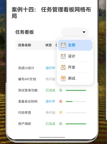
Select([
{ value: '全部', icon: $r('app.media.01') },
{ value: '设计', icon: $r('app.media.02') },
{ value: '开发', icon: $r('app.media.03') },
{ value: '测试', icon: $r('app.media.04') }
])
.selected(0)
.onSelect((index: number) => {
this.currentFilter = ['全部', '设计', '开发', '测试'][index]
})
.width(120)
.backgroundColor(this.isDarkMode ? '#2D2D2D' : '#FFFFFF')
}
.margin({ bottom: 16 })
.width('100%')
// 任务状态分布
Row() {
const statusCounts = this.getStatusCounts()
Column() {
Text('待开始')
.fontSize(12)
.fontColor('#9E9E9E')
Text(`${statusCounts['待开始']}`)
.fontSize(20)
.fontWeight(FontWeight.Bold)
.fontColor('#9E9E9E')
}
.layoutWeight(1)
.alignItems(HorizontalAlign.Center)
Divider()
.vertical(true)
.height('80%')
.color(this.isDarkMode ? '#444444' : '#E0E0E0')
Column() {
Text('进行中')
.fontSize(12)
.fontColor('#2196F3')
Text(`${statusCounts['进行中']}`)
.fontSize(20)
.fontWeight(FontWeight.Bold)
.fontColor('#2196F3')
}
.layoutWeight(1)
.alignItems(HorizontalAlign.Center)
Divider()
.vertical(true)
.height('80%')
.color(this.isDarkMode ? '#444444' : '#E0E0E0')
Column() {
Text('已完成')
.fontSize(12)
.fontColor('#4CAF50')
Text(`${statusCounts['已完成']}`)
.fontSize(20)
.fontWeight(FontWeight.Bold)
.fontColor('#4CAF50')
}
.layoutWeight(1)
.alignItems(HorizontalAlign.Center)
}
.height(60)
.backgroundColor(this.isDarkMode ? '#2D2D2D' : '#F5F5F5')
.borderRadius(8)
.margin({ bottom: 16 })
// 表头
GridRow({ columns: 1 }) {
GridCol({ span: 1 }) {
Row() {
Text('任务名称')
.fontSize(14)
.fontWeight(FontWeight.Bold)
.width('40%')
.fontColor(this.isDarkMode ? '#E0E0E0' : '#000000')
Text('状态')
.fontSize(14)
.fontWeight(FontWeight.Bold)
.width('15%')
.fontColor(this.isDarkMode ? '#E0E0E0' : '#000000')
Text('优先级')
.fontSize(14)
.fontWeight(FontWeight.Bold)
.width('15%')
.fontColor(this.isDarkMode ? '#E0E0E0' : '#000000')
Text('进度')
.fontSize(14)
.fontWeight(FontWeight.Bold)
.width('30%')
.fontColor(this.isDarkMode ? '#E0E0E0' : '#000000')
}
.padding(12)
.backgroundColor(this.isDarkMode ? '#2D2D2D' : '#F5F5F5')
.borderRadius(8)
}
}
// 任务列表
Scroll() {
GridRow({
columns: {
xs: 1, // 小屏幕设备使用单列布局
sm: 1, // 小屏幕设备使用单列布局
md: 2, // 中等屏幕设备使用双列布局
lg: 3 // 大屏幕设备使用三列布局
},
gutter: { x: 16, y: 16 }, // 设置列间距和行间距
breakpoints: {
value: ['320vp', '600vp', '840vp', '1080vp'],
reference: BreakpointsReference.WindowSize
}
}) {
ForEach(this.tasks.filter(task =>
this.currentFilter === '全部' || task.category === this.currentFilter
), (task: TaskType, index: number) => {
GridCol({
span: {
xs: 1, // 小屏幕设备占据整行
sm: 1, // 小屏幕设备占据整行
md: 1, // 中等屏幕设备占据半行
lg: 1 // 大屏幕设备占据三分之一行
}
}) {
Column() {
// 小屏幕下使用垂直布局
if (MediaQueryCondition.SmallDevice()) {
this.buildTaskCardVertical(task)
} else {
// 中大屏幕下使用水平布局
this.buildTaskCardHorizontal(task)
}
// 展开详情
if (this.expandedTaskId === task.id) {
Column() {
Divider()
.margin({ top: 8, bottom: 8 })
.color(this.isDarkMode ? '#444444' : '#E0E0E0')
// 使用嵌套的GridRow实现详情区域的布局
GridRow({ columns: 2, gutter: 8 }) {
GridCol({ span: 1 }) {
Column() {
Text('创建时间:')
.fontSize(14)
.fontColor(this.isDarkMode ? '#AAAAAA' : '#666666')
Text(task.createTime)
.fontSize(14)
.fontColor(this.isDarkMode ? '#E0E0E0' : '#000000')
}
.alignItems(HorizontalAlign.Start)
.width('100%')
}
GridCol({ span: 1 }) {
Column() {
Text('截止时间:')
.fontSize(14)
.fontColor(this.isDarkMode ? '#AAAAAA' : '#666666')
Text(task.deadline)
.fontSize(14)
.fontColor(this.isOverdue(task.deadline) ? '#F44336' : (this.isDarkMode ? '#E0E0E0' : '#000000'))
}
.alignItems(HorizontalAlign.Start)
.width('100%')
}
GridCol({ span: 2 }) {
Column() {
Text('负责人:')
.fontSize(14)
.fontColor(this.isDarkMode ? '#AAAAAA' : '#666666')
Text(task.assignee)
.fontSize(14)
.fontColor(this.isDarkMode ? '#E0E0E0' : '#000000')
}
.alignItems(HorizontalAlign.Start)
.width('100%')
.margin({ top: 8 })
}
if (task.description) {
GridCol({ span: 2 }) {
Column() {
Text('描述:')
.fontSize(14)
.fontColor(this.isDarkMode ? '#AAAAAA' : '#666666')
Text(task.description)
.fontSize(14)
.fontColor(this.isDarkMode ? '#E0E0E0' : '#000000')
}
.alignItems(HorizontalAlign.Start)
.width('100%')
.margin({ top: 8 })
}
}
}
Row() {
Button('编辑')
.fontSize(14)
.height(32)
.backgroundColor('#2196F3')
.margin({ right: 8 })
Button('完成')
.fontSize(14)
.height(32)
.backgroundColor('#4CAF50')
}
.justifyContent(FlexAlign.End)
.margin({ top: 8 })
}
}
}
.padding(12)
.backgroundColor(this.isDarkMode ? '#1E1E1E' : this.getCardBackgroundColor(task.priority))
.borderRadius(8)
.border({
width: task.priority === '高' ? 2 : 1,
color: this.getPriorityColor(task.priority),
style: BorderStyle.Solid
})
.onClick(() => {
if (this.expandedTaskId === task.id) {
this.expandedTaskId = ''
} else {
this.expandedTaskId = task.id
}
})
.gesture(
LongPressGesture()
.onAction(() => {
this.dragIndex = index
this.startDrag(task)
})
)
.onDragStart(() => {
return this.dragIndex === index
})
.onDrop((event: DragEvent) => {
if (this.dragIndex !== -1 && this.dragIndex !== index) {
// 交换任务位置
const temp = this.tasks[this.dragIndex]
this.tasks[this.dragIndex] = this.tasks[index]
this.tasks[index] = temp
this.dragIndex = -1
}
})
}
})
}
}
.height('70%')
.margin({ top: 8 })
}
.width('100%')
.height('100%')
.padding(16)
.backgroundColor(this.isDarkMode ? '#121212' : '#FFFFFF')
}
private buildTaskCardVertical(task: TaskType) {
Column() {
Text(task.title)
.fontSize(16)
.fontWeight(FontWeight.Bold)
.margin({ bottom: 8 })
.fontColor(this.isDarkMode ? '#E0E0E0' : '#000000')
Row() {
Text('状态:')
.fontSize(14)
.fontColor(this.isDarkMode ? '#AAAAAA' : '#666666')
Text(task.status)
.fontSize(14)
.fontColor(this.getStatusColor(task.status))
}
.width('100%')
.margin({ bottom: 4 })
Row() {
Text('优先级:')
.fontSize(14)
.fontColor(this.isDarkMode ? '#AAAAAA' : '#666666')
Text(task.priority)
.fontSize(14)
.fontColor(this.getPriorityColor(task.priority))
}
.width('100%')
.margin({ bottom: 4 })
Row() {
Text('进度:')
.fontSize(14)
.fontColor(this.isDarkMode ? '#AAAAAA' : '#666666')
.margin({ right: 8 })
Progress({ value: task.progress, total: 100, type: ProgressType.Linear })
.height(8)
.layoutWeight(1)
.color(this.getProgressColor(task.progress))
.style({
strokeWidth: 8,
scaleCount: 10,
scaleWidth: 2
})
Text(`${task.progress}%`)
.fontSize(14)
.margin({ left: 8 })
.fontColor(this.isDarkMode ? '#E0E0E0' : '#000000')
}
.width('100%')
}
.alignItems(HorizontalAlign.Start)
}
private buildTaskCardHorizontal(task: TaskType) {
Row() {
Text(task.title)
.fontSize(14)
.width('40%')
.textAlign(TextAlign.Start)
.fontColor(this.isDarkMode ? '#E0E0E0' : '#000000')
Text(task.status)
.fontSize(14)
.fontColor(this.getStatusColor(task.status))
.width('15%')
.textAlign(TextAlign.Center)
Text(task.priority)
.fontSize(14)
.fontColor(this.getPriorityColor(task.priority))
.width('15%')
.textAlign(TextAlign.Center)
Progress({ value: task.progress, total: 100, type: ProgressType.Linear })
.width('30%')
.height(8)
.color(this.getProgressColor(task.progress))
.style({
strokeWidth: 8,
scaleCount: 10,
scaleWidth: 2
})
}
}
private getStatusCounts() {
const counts = {
'待开始': 0,
'进行中': 0,
'已完成': 0
}
this.tasks.forEach(task => {
counts[task.status]++
})
return counts
}
private getStatusColor(status: string): string {
switch (status) {
case '已完成': return '#4CAF50'
case '进行中': return '#2196F3'
case '待开始': return '#9E9E9E'
default: return '#000000'
}
}
private getPriorityColor(priority: string): string {
switch (priority) {
case '高': return '#F44336'
case '中': return '#FF9800'
case '低': return '#4CAF50'
default: return '#000000'
}
}
private getProgressColor(progress: number): string {
if (progress < 30) return '#F44336' // 红色
if (progress < 70) return '#FF9800' // 橙色
return '#4CAF50' // 绿色
}
private getCardBackgroundColor(priority: string): string {
switch (priority) {
case '高': return '#FFF8F8'
case '中': return '#FFFBF0'
case '低': return '#F0F8F0'
default: return '#FFFFFF'
}
}
private isOverdue(deadline: string): boolean {
const today = new Date()
const deadlineDate = new Date(deadline)
return deadlineDate < today
}
private startDrag(task: TaskType) {
// 创建拖拽对象
const dragItemInfo = new DragItemInfo(task.title, {}, [new PixelMap(100, 100)])
// 开始拖拽
dragStart(dragItemInfo)
}
}
8. GridRow和GridCol的高级配置详解
8.1 响应式布局配置
在本案例中,我们使用了GridRow的响应式配置:
GridRow({
    columns: {
        xs: 1,  // 小屏幕设备使用单列布局
        sm: 1,  // 小屏幕设备使用单列布局
        md: 2,  // 中等屏幕设备使用双列布局
        lg: 3   // 大屏幕设备使用三列布局
    },
    gutter: { x: 16, y: 16 },  // 设置列间距和行间距
    breakpoints: {
        value: ['320vp', '600vp', '840vp', '1080vp'],
        reference: BreakpointsReference.WindowSize
    }
})
这种配置使任务看板能够根据屏幕尺寸自动调整布局:
- 在小屏幕设备(如手机)上,任务卡片以单列布局显示
- 在中等屏幕设备(如平板)上,任务卡片以双列布局显示
- 在大屏幕设备(如桌面)上,任务卡片以三列布局显示
8.2 断点配置详解
断点配置是响应式布局的关键:
breakpoints: {
    value: ['320vp', '600vp', '840vp', '1080vp'],
    reference: BreakpointsReference.WindowSize
}
这里定义了四个断点值:
- 320vp:超小屏幕设备(xs)
- 600vp:小屏幕设备(sm)
- 840vp:中等屏幕设备(md)
- 1080vp:大屏幕设备(lg)
reference: BreakpointsReference.WindowSize表示这些断点值是相对于窗口尺寸的。
8.3 嵌套网格详解
在任务详情部分,我们使用了嵌套的GridRow和GridCol:
GridRow({ columns: 2, gutter: 8 }) {
    GridCol({ span: 1 }) {
        // 创建时间
    }

    GridCol({ span: 1 }) {
        // 截止时间
    }

    GridCol({ span: 2 }) {
        // 负责人
    }

    GridCol({ span: 2 }) {
        // 描述
    }
}
这种嵌套网格布局使详情区域的内容排列更加灵活:
- 创建时间和截止时间并排显示,各占一半宽度
- 负责人和描述占据整行宽度
9. 响应式布局最佳实践
9.1 移动优先设计
在设计响应式布局时,应采用移动优先的策略:
- 首先为小屏幕设备设计基础布局
- 然后逐步扩展到更大屏幕的布局
这种方法确保在小屏幕设备上有良好的用户体验,同时在大屏幕设备上充分利用额外的空间。
9.2 内容优先级
在不同屏幕尺寸下,应根据内容的重要性调整显示方式:
- 在小屏幕上,只显示最重要的信息
- 在大屏幕上,可以显示更多详细信息
在本案例中,我们通过点击展开详情的方式,在小屏幕上隐藏次要信息,用户需要时可以点击查看。
9.3 断点选择策略
选择断点值时,应考虑常见设备的屏幕尺寸:
- 320vp:小型手机
- 600vp:大型手机和小型平板
- 840vp:平板和小型桌面
- 1080vp:桌面和大屏设备
这些断点值覆盖了大多数常见设备,确保布局在各种设备上都有良好的表现。
10. 总结
本教程详细讲解了如何优化和扩展任务管理看板的网格布局,实现更加灵活、美观和功能丰富的界面。主要内容包括:
- 响应式布局设计:通过配置GridRow的断点和列数,使任务看板能够适应不同屏幕尺寸
- 任务卡片的交互设计:添加点击展开详情和拖拽排序功能,提高用户体验
- 数据可视化增强:优化进度指示器和添加任务状态分布图表,使数据更直观
- 主题与样式定制:根据任务优先级设置不同的卡片样式,并添加主题切换功能
- GridRow和GridCol的高级配置:使用嵌套网格、列偏移和列顺序调整,实现更复杂的布局
通过这些优化和扩展,任务管理看板不仅在功能上更加完善,在视觉效果和用户体验上也有了显著提升。这些技术和方法可以应用到各种需要响应式布局和丰富交互的场景中,帮助开发者创建更加专业和用户友好的应用界面。
