[HarmonyOS NEXT 实战案例十四] 任务管理看板网格布局(上)
[HarmonyOS NEXT 实战案例十四] 任务管理看板网格布局(上)
项目已开源,开源地址: https://gitcode.com/nutpi/HarmonyosNextCaseStudyTutorial , 欢迎fork & star
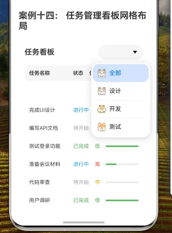
效果演示
1. 概述
本教程将详细讲解如何使用HarmonyOS NEXT的GridRow和GridCol组件实现一个任务管理看板的网格布局。任务管理看板是项目管理中常用的工具,通过网格布局可以清晰地展示任务信息,包括任务名称、状态、优先级和进度等。
本教程将涵盖以下内容:
- 任务数据结构设计
- 整体布局实现
- 标题和筛选功能
- 表头设计
- 任务列表实现
- 状态和优先级的视觉区分
2. 数据结构设计
首先,我们需要定义任务的数据结构,包含任务的基本信息:
interface TaskType {
    title: string;    // 任务名称
    status: string;   // 任务状态
    priority: string; // 优先级
    category: string; // 分类
    progress: number; // 进度
}
这个接口定义了任务的五个基本属性:
title:任务名称,如"完成UI设计"、"编写API文档"等status:任务状态,如"已完成"、"进行中"、"待开始"等priority:优先级,如"高"、"中"、"低"等category:分类,如"设计"、"开发"、"测试"等progress:进度,表示任务完成的百分比,范围为0-100
3. 数据准备
接下来,我们准备一些示例任务数据用于展示:
private tasks: TaskType[] = [
    { title: '完成UI设计', status: '进行中', priority: '高', category: '设计', progress: 60 },
    { title: '编写API文档', status: '待开始', priority: '中', category: '开发', progress: 0 },
    { title: '测试登录功能', status: '已完成', priority: '低', category: '测试', progress: 100 },
    { title: '准备会议材料', status: '进行中', priority: '高', category: '管理', progress: 30 },
    { title: '代码审查', status: '待开始', priority: '中', category: '开发', progress: 0 },
    { title: '用户调研', status: '已完成', priority: '低', category: '设计', progress: 100 }
]
这里我们创建了一个包含六个任务的数组,每个任务都包含名称、状态、优先级、分类和进度。
4. 状态管理
为了实现任务筛选功能,我们需要定义一个状态变量来跟踪当前选择的筛选条件:
@State currentFilter: string = '全部'
这个状态变量将用于存储当前选择的任务分类,初始值为"全部",表示显示所有任务。
5. 整体布局结构
任务管理看板的整体布局采用Column容器,内部包含三个主要部分:
build() {
    Column() {
        // 标题和筛选
        Row() {
            // ...
        }
        .margin({ bottom: 16 })
        .width('100%')

        // 表头
        GridRow({ columns: 1 }) {
            // ...
        }

        // 任务列表
        Scroll() {
            GridRow({ columns: 1 }) {
                // ...
            }
        }
        .height('70%')
        .margin({ top: 8 })
    }
    .width('100%')
    .height('100%')
    .padding(16)
}
这种结构将看板界面分为三个垂直排列的部分:
- 顶部的标题和筛选区域
- 中间的表头区域
- 底部的任务列表区域(可滚动)
整个Column容器设置宽高为100%,内边距为16像素,使内容与屏幕边缘保持适当距离。
6. 标题和筛选功能实现
标题和筛选区域使用Row容器,左侧显示标题,右侧是分类筛选下拉框:
// 标题和筛选
Row() {
    Text('任务看板')
        .fontSize(20)
        .fontWeight(FontWeight.Bold)
        .layoutWeight(1)

    Select([
        { value: '全部', icon: $r('app.media.01') },
        { value: '设计', icon: $r('app.media.02') },
        { value: '开发', icon: $r('app.media.03') },
        { value: '测试', icon: $r('app.media.04') }
    ])
        .selected(0)
        .onSelect((index: number) => {
            this.currentFilter = ['全部', '设计', '开发', '测试'][index]
        })
        .width(120)
}
.margin({ bottom: 16 })
.width('100%')
在这个部分:
- 左侧Text显示"任务看板"标题,设置字体大小为20像素,粗体,并使用layoutWeight(1)使其占据剩余空间
- 右侧Select组件作为分类筛选下拉框,包含四个选项:"全部"、"设计"、"开发"和"测试",每个选项都有对应的图标
- 下拉框初始选中第一项("全部"),宽度为120像素
- onSelect事件处理器在用户选择不同选项时更新currentFilter状态变量
- 整个Row设置下边距为16像素,宽度为100%
7. 表头实现
表头区域使用单列的GridRow和GridCol,内部包含一个Row容器,显示各列的标题:
// 表头
GridRow({ columns: 1 }) {
    GridCol({ span: 1 }) {
        Row() {
            Text('任务名称')
                .fontSize(14)
                .fontWeight(FontWeight.Bold)
                .width('40%')

            Text('状态')
                .fontSize(14)
                .fontWeight(FontWeight.Bold)
                .width('15%')

            Text('优先级')
                .fontSize(14)
                .fontWeight(FontWeight.Bold)
                .width('15%')

            Text('进度')
                .fontSize(14)
                .fontWeight(FontWeight.Bold)
                .width('30%')
        }
        .padding(12)
        .backgroundColor('#F5F5F5')
        .borderRadius(8)
    }
}
在这个部分:
- GridRow设置为单列布局(
columns: 1),GridCol占据整个行宽(span: 1) - 内部Row容器包含四个Text组件,分别显示"任务名称"、"状态"、"优先级"和"进度"列标题
- 每个Text组件设置字体大小为14像素,粗体,并设置不同的宽度百分比,使各列按比例分配空间
- 整个Row设置内边距为12像素,背景色为浅灰色(#F5F5F5),边框圆角为8像素
8. 任务列表实现
任务列表区域使用Scroll容器包裹单列的GridRow,通过ForEach循环遍历筛选后的任务数组:
// 任务列表
Scroll() {
    GridRow({ columns: 1 }) {
        ForEach(this.tasks.filter(task =>
        this.currentFilter === '全部' || task.category === this.currentFilter
        ), (task: TaskType) => {
            GridCol({ span: 1 }) {
                Row() {
                    Text(task.title)
                        .fontSize(14)
                        .width('40%')
                        .textAlign(TextAlign.Start)

                    Text(task.status)
                        .fontSize(14)
                        .fontColor(this.getStatusColor(task.status))
                        .width('15%')
                        .textAlign(TextAlign.Center)

                    Text(task.priority)
                        .fontSize(14)
                        .fontColor(this.getPriorityColor(task.priority))
                        .width('15%')
                        .textAlign(TextAlign.Center)

                    Progress({ value: task.progress, total: 100, type: ProgressType.Linear })
                        .width('30%')
                        .height(8)
                        .color('#4CAF50')
                }
                .padding(12)
                .backgroundColor('#FFFFFF')
                .borderRadius(8)
                .margin({ bottom: 8 })
            }
        })
    }
}
.height('70%')
.margin({ top: 8 })
在这个部分:
- Scroll容器使任务列表可滚动,设置高度为父容器的70%,顶部边距为8像素
- 内部GridRow设置为单列布局(
columns: 1) - ForEach循环遍历经过筛选的任务数组,筛选条件是:当前筛选为"全部"或任务分类与当前筛选相匹配
- 每个任务项使用GridCol包裹,占据整个行宽(
span: 1) - 每个任务项内部使用Row容器,包含四个组件,分别显示任务名称、状态、优先级和进度
- 任务名称使用Text组件,宽度为40%,左对齐
- 状态使用Text组件,宽度为15%,居中对齐,文本颜色根据状态动态设置
- 优先级使用Text组件,宽度为15%,居中对齐,文本颜色根据优先级动态设置
- 进度使用Progress组件,宽度为30%,高度为8像素,颜色为绿色
- 整个Row设置内边距为12像素,背景色为白色,边框圆角为8像素,底部边距为8像素
9. 辅助方法实现
为了根据任务状态和优先级设置不同的颜色,我们实现了两个辅助方法:
private getStatusColor(status: string): string {
    switch (status) {
        case '已完成': return '#4CAF50'
        case '进行中': return '#2196F3'
        case '待开始': return '#9E9E9E'
        default: return '#000000'
    }
}

private getPriorityColor(priority: string): string {
    switch (priority) {
        case '高': return '#F44336'
        case '中': return '#FF9800'
        case '低': return '#4CAF50'
        default: return '#000000'
    }
}
这些方法根据任务的状态和优先级返回不同的颜色代码:
- 状态颜色:已完成(绿色)、进行中(蓝色)、待开始(灰色)
- 优先级颜色:高(红色)、中(橙色)、低(绿色)
这种颜色编码使用户可以通过颜色快速识别任务的状态和优先级。
10. 完整代码
下面是任务管理看板网格布局的完整代码:
// 任务管理看板网格布局
interface TaskType {
    title: string;
    status: string;
    priority: string;
    category: string;
    progress: number;
}

@Component
export struct TaskBoardGrid {
    private tasks: TaskType[] = [
        { title: '完成UI设计', status: '进行中', priority: '高', category: '设计', progress: 60 },
        { title: '编写API文档', status: '待开始', priority: '中', category: '开发', progress: 0 },
        { title: '测试登录功能', status: '已完成', priority: '低', category: '测试', progress: 100 },
        { title: '准备会议材料', status: '进行中', priority: '高', category: '管理', progress: 30 },
        { title: '代码审查', status: '待开始', priority: '中', category: '开发', progress: 0 },
        { title: '用户调研', status: '已完成', priority: '低', category: '设计', progress: 100 }
    ]

    @State currentFilter: string = '全部'

    build() {
        Column() {
            // 标题和筛选
            Row() {
                Text('任务看板')
                    .fontSize(20)
                    .fontWeight(FontWeight.Bold)
                    .layoutWeight(1)

                Select([
                    { value: '全部', icon: $r('app.media.01') },
                    { value: '设计', icon: $r('app.media.02') },
                    { value: '开发', icon: $r('app.media.03') },
                    { value: '测试', icon: $r('app.media.04') }
                ])
                    .selected(0)
                    .onSelect((index: number) => {
                        this.currentFilter = ['全部', '设计', '开发', '测试'][index]
                    })
                    .width(120)
            }
            .margin({ bottom: 16 })
            .width('100%')

            // 表头
            GridRow({ columns: 1 }) {
                GridCol({ span: 1 }) {
                    Row() {
                        Text('任务名称')
                            .fontSize(14)
                            .fontWeight(FontWeight.Bold)
                            .width('40%')

                        Text('状态')
                            .fontSize(14)
                            .fontWeight(FontWeight.Bold)
                            .width('15%')

                        Text('优先级')
                            .fontSize(14)
                            .fontWeight(FontWeight.Bold)
                            .width('15%')

                        Text('进度')
                            .fontSize(14)
                            .fontWeight(FontWeight.Bold)
                            .width('30%')
                    }
                    .padding(12)
                    .backgroundColor('#F5F5F5')
                    .borderRadius(8)
                }
            }

            // 任务列表
            Scroll() {
                GridRow({ columns: 1 }) {
                    ForEach(this.tasks.filter(task =>
                    this.currentFilter === '全部' || task.category === this.currentFilter
                    ), (task: TaskType) => {
                        GridCol({ span: 1 }) {
                            Row() {
                                Text(task.title)
                                    .fontSize(14)
                                    .width('40%')
                                    .textAlign(TextAlign.Start)

                                Text(task.status)
                                    .fontSize(14)
                                    .fontColor(this.getStatusColor(task.status))
                                    .width('15%')
                                    .textAlign(TextAlign.Center)

                                Text(task.priority)
                                    .fontSize(14)
                                    .fontColor(this.getPriorityColor(task.priority))
                                    .width('15%')
                                    .textAlign(TextAlign.Center)

                                Progress({ value: task.progress, total: 100, type: ProgressType.Linear })
                                    .width('30%')
                                    .height(8)
                                    .color('#4CAF50')
                            }
                            .padding(12)
                            .backgroundColor('#FFFFFF')
                            .borderRadius(8)
                            .margin({ bottom: 8 })
                        }
                    })
                }
            }
            .height('70%')
            .margin({ top: 8 })
        }
        .width('100%')
        .height('100%')
        .padding(16)
    }

    private getStatusColor(status: string): string {
        switch (status) {
            case '已完成': return '#4CAF50'
            case '进行中': return '#2196F3'
            case '待开始': return '#9E9E9E'
            default: return '#000000'
        }
    }

    private getPriorityColor(priority: string): string {
        switch (priority) {
            case '高': return '#F44336'
            case '中': return '#FF9800'
            case '低': return '#4CAF50'
            default: return '#000000'
        }
    }
}
11. GridRow和GridCol组件详解
在本案例中,我们使用了单列的GridRow和GridCol组件来实现表头和任务列表的布局:
GridRow({ columns: 1 }) {
    GridCol({ span: 1 }) {
        // 内容
    }
}
这种配置使内容在水平方向上占据整个可用宽度,适合用于列表式布局。
11.1 GridRow组件
GridRow是HarmonyOS NEXT提供的网格行容器组件,用于创建网格布局。它具有以下主要属性:
| 属性 | 类型 | 描述 |
|---|---|---|
| columns | number | { xs?: number, sm?: number, md?: number, lg?: number, xl?: number, xxl?: number } | 设置布局列数 |
| gutter | number | { x?: number, y?: number } | 栅格间隔 |
| breakpoints | { value: string[], reference: BreakpointsReference } | 设置断点值的断点数列以及基于窗口或容器尺寸的相应参照 |
| direction | GridRowDirection | 栅格布局排列方向 |
11.2 GridCol组件
GridCol是HarmonyOS NEXT提供的网格列容器组件,用于在GridRow中创建网格列。它具有以下主要属性:
| 属性 | 类型 | 描述 |
|---|---|---|
| span | number | { xs?: number, sm?: number, md?: number, lg?: number, xl?: number, xxl?: number } | 列宽度 |
| offset | number | { xs?: number, sm?: number, md?: number, lg?: number, xl?: number, xxl?: number } | 列偏移量 |
| order | number | { xs?: number, sm?: number, md?: number, lg?: number, xl?: number, xxl?: number } | 列顺序 |
12. 布局效果分析
本案例中的任务管理看板布局具有以下特点:
- 垂直分区明确:整体布局分为三个垂直区域(标题和筛选、表头、任务列表),结构清晰
- 水平对齐一致:表头和任务项的各列宽度保持一致,使内容垂直对齐
- 视觉区分明显:通过不同的颜色标识任务状态和优先级,提高信息的可读性
- 交互功能实用:通过筛选下拉框可以按分类筛选任务,提高用户体验
- 滚动区域合理:任务列表区域可滚动,适合显示大量任务
这种布局设计使任务管理看板界面既美观又实用,用户可以轻松地查看和筛选任务信息。
13. 总结
本教程详细讲解了如何使用HarmonyOS NEXT的GridRow和GridCol组件实现任务管理看板的网格布局。通过合理的数据结构设计和布局规划,我们创建了一个功能完整、界面美观的任务管理看板。
主要内容包括:
- 任务数据结构设计和数据准备
- 整体布局结构的实现
- 标题和筛选功能的详细实现
- 表头和任务列表的设计与实现
- 状态和优先级的视觉区分
通过本教程,你应该已经掌握了如何使用GridRow和GridCol组件实现列表式布局,以及如何结合其他组件(如Select、Scroll、Progress等)创建功能丰富的界面。这些技能可以应用到各种需要列表展示和数据筛选的场景中,如任务管理、数据分析、信息展示等。
在下一篇教程中,我们将进一步探讨如何优化任务管理看板,添加更多功能和交互效果,使其更加实用和吸引人。
