[HarmonyOS NEXT 实战案例:教育应用] 高级篇 - 课程学习平台的高级布局与自适应设计
[HarmonyOS NEXT 实战案例:教育应用] 高级篇 - 课程学习平台的高级布局与自适应设计
项目已开源,开源地址: https://gitcode.com/nutpi/HarmonyosNextCaseStudyTutorial , 欢迎fork & star
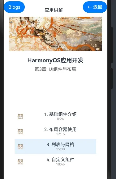
效果演示
引言
在前两篇教程中,我们学习了如何使用HarmonyOS NEXT的ColumnSplit组件构建课程学习平台的基本布局,以及如何添加交互功能和状态管理。本篇教程将进一步深入,讲解课程学习平台的高级布局技巧和自适应设计,使应用能够在不同尺寸的设备上提供一致且优质的用户体验。
自适应布局概述
自适应布局是指应用界面能够根据设备屏幕尺寸和方向自动调整布局,提供最佳的用户体验。在HarmonyOS NEXT中,我们可以使用以下技术实现自适应布局:
| 技术 | 描述 | 使用场景 |
|---|---|---|
| 媒体查询 | 根据设备屏幕尺寸和方向应用不同的样式 | 在不同尺寸的设备上使用不同的布局 |
| 百分比布局 | 使用百分比值设置组件尺寸 | 使组件尺寸相对于父容器自动调整 |
| 弹性布局 | 使用弹性布局使组件自动填充可用空间 | 使组件尺寸相对于可用空间自动调整 |
| 栅格布局 | 使用栅格系统组织界面元素 | 创建复杂且响应式的布局 |
高级布局技巧
1. 使用媒体查询实现响应式布局
媒体查询允许我们根据设备屏幕尺寸和方向应用不同的样式。在HarmonyOS NEXT中,我们可以使用@MediaQuery装饰器实现媒体查询:
@Component
export struct LearningPlatform {
    @State currentLesson: number = 0
    @State currentChapter: Lesson[] = [...]

    // 添加媒体查询状态
    @State isWideScreen: boolean = false
    @State videoHeight: string = '40%'
    @State contentPadding: number = 20

    // 媒体查询装饰器
    @MediaQuery(MediaQueryCondition.WIDE_SCREEN)
    onWideScreen(matches: boolean) {
        this.isWideScreen = matches
        this.videoHeight = matches ? '50%' : '40%'
        this.contentPadding = matches ? 30 : 20
    }

    build() {
        // 根据屏幕宽度选择不同的布局
        if (this.isWideScreen) {
            this.buildWideScreenLayout()
        } else {
            this.buildNormalLayout()
        }
    }

    // 宽屏布局
    buildWideScreenLayout() {
        ColumnSplit() {
            // 上部视频区
            Column() {
                Image($r('app.media.big14'))
                    .width('100%')
                    .height('100%')
                    .objectFit(ImageFit.Cover)
            }
            .height(this.videoHeight)

            // 下部内容区
            Row() {
                // 左侧课程列表
                Column() {
                    Text('课程章节')
                        .fontSize(18)
                        .fontWeight(FontWeight.Bold)
                        .margin({ bottom: 15 })

                    Scroll() {
                        Column() {
                            ForEach(this.currentChapter, (item: Lesson, index) => {
                                this.buildLessonItem(item, index)
                            })
                        }
                    }
                    .layoutWeight(1)
                }
                .width('30%')
                .padding(15)
                .backgroundColor('#f5f5f5')

                // 右侧课程详情
                Column() {
                    Text('HarmonyOS应用开发')
                        .fontSize(22)
                        .fontWeight(FontWeight.Bold)
                        .margin({ bottom: 10 })

                    Text('第3章: UI组件与布局')
                        .fontSize(18)
                        .fontColor('#666666')
                        .margin({ bottom: 20 })

                    // 课程详情内容
                    this.buildLessonDetail()

                    // 导航按钮
                    this.buildNavigationButtons()
                }
                .layoutWeight(1)
                .padding(this.contentPadding)
            }
            .layoutWeight(1)
        }
        .height(600)
    }

    // 普通布局
    buildNormalLayout() {
        ColumnSplit() {
            // 上部视频区
            Column() {
                Image($r('app.media.big14'))
                    .width('100%')
                    .height('100%')
                    .objectFit(ImageFit.Cover)
            }
            .height(this.videoHeight)

            // 下部内容区
            Column() {
                Text('HarmonyOS应用开发')
                    .fontSize(20)
                    .fontWeight(FontWeight.Bold)
                    .margin({ bottom: 10 })

                Text('第3章: UI组件与布局')
                    .fontSize(16)
                    .fontColor('#666666')
                    .margin({ bottom: 20 })

                Scroll() {
                    Column() {
                        ForEach(this.currentChapter, (item: Lesson, index) => {
                            this.buildLessonItem(item, index)
                        })
                    }
                }
                .layoutWeight(1)

                this.buildNavigationButtons()
            }
            .padding(this.contentPadding)
        }
        .height(600)
    }

    @Builder
    buildLessonItem(item: Lesson, index: number) {
        Row() {
            Image(item.completed ? $r('app.media.01') : $r('app.media.02'))
                .width(20)
                .height(20)
                .margin({ right: 15 })

            Column() {
                Text(item.title)
                    .fontSize(this.isWideScreen ? 16 : 14)
                Text(item.duration)
                    .fontSize(this.isWideScreen ? 12 : 10)
                    .fontColor('#999999')
            }
            .layoutWeight(1)
        }
        .padding(10)
        .backgroundColor(index === this.currentLesson ? '#e3f2fd' : 'transparent')
        .borderRadius(this.isWideScreen ? 8 : 4)
        .onClick(() => this.currentLesson = index)
    }

    @Builder
    buildLessonDetail() {
        Column() {
            Text(this.currentChapter[this.currentLesson].title)
                .fontSize(20)
                .fontWeight(FontWeight.Bold)
                .margin({ bottom: 15 })

            Text('课程时长: ' + this.currentChapter[this.currentLesson].duration)
                .fontSize(16)
                .fontColor('#666666')
                .margin({ bottom: 20 })

            Text('课程内容')
                .fontSize(18)
                .fontWeight(FontWeight.Bold)
                .margin({ bottom: 10 })

            Text('本课程将详细讲解HarmonyOS NEXT中的UI组件和布局容器,帮助你掌握构建优美界面的技巧。')
                .fontSize(16)
                .lineHeight(24)
        }
    }

    @Builder
    buildNavigationButtons() {
        Row() {
            Button('上一节')
                .width(120)
                .height(40)
                .enabled(this.currentLesson > 0)
                .opacity(this.currentLesson > 0 ? 1 : 0.5)
                .onClick(() => {
                    if (this.currentLesson > 0) {
                        this.currentLesson--
                    }
                })

            Button('下一节')
                .width(120)
                .height(40)
                .margin({ left: 20 })
                .enabled(this.currentLesson < this.currentChapter.length - 1)
                .opacity(this.currentLesson < this.currentChapter.length - 1 ? 1 : 0.5)
                .onClick(() => {
                    if (this.currentLesson < this.currentChapter.length - 1) {
                        this.currentLesson++
                    }
                })
        }
        .margin({ top: 20 })
        .justifyContent(FlexAlign.Center)
    }
}
在上面的代码中,我们使用@MediaQuery装饰器监听屏幕宽度的变化,并根据屏幕宽度选择不同的布局:
- 在宽屏模式下,我们使用
ColumnSplit将界面分为上部视频区和下部内容区,然后在下部内容区使用Row将其分为左侧课程列表和右侧课程详情。 - 在普通模式下,我们使用
ColumnSplit将界面分为上部视频区和下部内容区,然后在下部内容区显示课程列表。
此外,我们还根据屏幕宽度调整了组件的尺寸、字体大小和边距,使界面在不同尺寸的设备上都能提供良好的用户体验。
2. 使用栅格布局组织复杂界面
栅格布局是一种将界面划分为网格的布局方式,可以帮助我们创建复杂且响应式的布局。在HarmonyOS NEXT中,我们可以使用GridRow和GridCol组件实现栅格布局:
@Component
struct GridLayoutExample {
    build() {
        Column() {
            GridRow() {
                GridCol({ span: 12 }) {
                    Text('课程学习平台')
                        .fontSize(24)
                        .fontWeight(FontWeight.Bold)
                        .width('100%')
                        .textAlign(TextAlign.Center)
                        .margin({ bottom: 20 })
                }

                GridCol({ span: 4 }) {
                    this.buildCourseList()
                }

                GridCol({ span: 8 }) {
                    this.buildCourseDetail()
                }
            }
            .gutter(16) // 设置列间距
        }
        .width('100%')
        .padding(20)
    }

    @Builder
    buildCourseList() {
        // 课程列表内容
    }

    @Builder
    buildCourseDetail() {
        // 课程详情内容
    }
}
在这个例子中,我们使用GridRow和GridCol组件创建了一个12列的栅格布局:
- 标题占据12列(整行)
- 课程列表占据4列(1/3宽度)
- 课程详情占据8列(2/3宽度)
通过调整span属性的值,我们可以轻松地调整各部分的宽度比例,实现响应式布局。
3. 使用@BuilderParam实现布局定制
@BuilderParam装饰器允许我们将构建函数作为参数传递给组件,实现高度的布局定制。这在创建可复用的组件时特别有用:
@Component
struct LessonCard {
    @Prop lesson: Lesson
    @Prop isSelected: boolean
    @BuilderParam cardHeader: () => void
    @BuilderParam cardFooter: () => void
    onSelect: (lesson: Lesson) => void

    build() {
        Column() {
            // 使用传入的构建函数构建卡片头部
            this.cardHeader()

            // 卡片内容
            Row() {
                Image(this.lesson.completed ? $r('app.media.01') : $r('app.media.02'))
                    .width(20)
                    .height(20)
                    .margin({ right: 15 })

                Column() {
                    Text(this.lesson.title)
                        .fontSize(16)
                    Text(this.lesson.duration)
                        .fontSize(12)
                        .fontColor('#999999')
                }
                .layoutWeight(1)
            }
            .padding(10)

            // 使用传入的构建函数构建卡片底部
            this.cardFooter()
        }
        .backgroundColor(this.isSelected ? '#e3f2fd' : 'transparent')
        .borderRadius(8)
        .onClick(() => this.onSelect(this.lesson))
    }
}

// 使用LessonCard组件
@Component
struct LessonList {
    @State currentLesson: number = 0
    @State lessons: Lesson[] = [...]

    build() {
        Column() {
            ForEach(this.lessons, (item: Lesson, index) => {
                LessonCard({
                    lesson: item,
                    isSelected: index === this.currentLesson,
                    onSelect: (lesson: Lesson) => {
                        this.currentLesson = index
                    },
                    cardHeader: () => {
                        Text('课程 ' + (index + 1))
                            .fontSize(14)
                            .fontWeight(FontWeight.Bold)
                            .padding(5)
                            .backgroundColor('#f0f0f0')
                            .width('100%')
                    },
                    cardFooter: () => {
                        Row() {
                            Text('点击查看详情')
                                .fontSize(12)
                                .fontColor('#666666')
                        }
                        .padding(5)
                        .justifyContent(FlexAlign.Center)
                        .width('100%')
                    }
                })
                .margin({ bottom: 10 })
            })
        }
    }
}
在这个例子中,我们创建了一个LessonCard组件,它接受两个@BuilderParam参数:cardHeader和cardFooter。这允许使用者自定义卡片的头部和底部,实现高度的布局定制。
高级组件封装
1. 课程播放器组件
@Component
struct CoursePlayer {
    @Prop title: string
    @Prop duration: string
    @Prop videoSource: Resource
    @Prop isPlaying: boolean = false
    @State progress: number = 0
    onPlayStateChange: (isPlaying: boolean) => void
    onProgressChange: (progress: number) => void

    build() {
        Column() {
            // 视频播放区域
            Stack() {
                Image(this.videoSource)
                    .width('100%')
                    .height(200)
                    .objectFit(ImageFit.Cover)

                if (!this.isPlaying) {
                    Button({ type: ButtonType.Circle, stateEffect: true }) {
                        Image($r('app.media.play'))
                            .width(24)
                            .height(24)
                    }
                    .width(50)
                    .height(50)
                    .backgroundColor('rgba(0, 0, 0, 0.5)')
                    .onClick(() => this.onPlayStateChange(true))
                }
            }
            .width('100%')

            // 播放控制区域
            Column() {
                Text(this.title)
                    .fontSize(16)
                    .fontWeight(FontWeight.Bold)
                    .margin({ top: 10, bottom: 5 })

                Text(this.formatTime(this.progress * parseInt(this.duration)) + ' / ' + this.duration)
                    .fontSize(12)
                    .fontColor('#666666')
                    .margin({ bottom: 10 })

                Slider({
                    value: this.progress * 100,
                    min: 0,
                    max: 100,
                    step: 1,
                    style: SliderStyle.OutSet
                })
                    .width('100%')
                    .onChange((value: number) => {
                        this.progress = value / 100
                        this.onProgressChange(this.progress)
                    })

                Row() {
                    Button({ type: ButtonType.Circle, stateEffect: true }) {
                        Image(this.isPlaying ? $r('app.media.pause') : $r('app.media.play'))
                            .width(20)
                            .height(20)
                    }
                    .width(40)
                    .height(40)
                    .backgroundColor('#e3f2fd')
                    .onClick(() => this.onPlayStateChange(!this.isPlaying))

                    Button({ type: ButtonType.Circle, stateEffect: true }) {
                        Image($r('app.media.forward'))
                            .width(20)
                            .height(20)
                    }
                    .width(40)
                    .height(40)
                    .backgroundColor('#e3f2fd')
                    .margin({ left: 10 })
                    .onClick(() => {
                        this.progress = Math.min(1, this.progress + 0.1)
                        this.onProgressChange(this.progress)
                    })

                    Button({ type: ButtonType.Circle, stateEffect: true }) {
                        Image($r('app.media.fullscreen'))
                            .width(20)
                            .height(20)
                    }
                    .width(40)
                    .height(40)
                    .backgroundColor('#e3f2fd')
                    .margin({ left: 10 })
                }
                .margin({ top: 10 })
                .justifyContent(FlexAlign.Start)
            }
            .padding(10)
        }
        .width('100%')
        .backgroundColor('#ffffff')
        .borderRadius(8)
    }

    private formatTime(seconds: number): string {
        const minutes = Math.floor(seconds / 60)
        const remainingSeconds = Math.floor(seconds % 60)
        return `${minutes}:${remainingSeconds < 10 ? '0' : ''}${remainingSeconds}`
    }
}
这个CoursePlayer组件封装了视频播放器的功能,包括播放/暂停按钮、进度条、快进按钮和全屏按钮。通过@Prop和回调函数,它可以与父组件进行交互,实现播放状态和进度的同步。
2. 课程笔记组件
@Component
struct CourseNotes {
    @Link notes: string
    @State isEditing: boolean = false

    build() {
        Column() {
            Row() {
                Text('课程笔记')
                    .fontSize(16)
                    .fontWeight(FontWeight.Bold)
                    .layoutWeight(1)

                Button(this.isEditing ? '保存' : '编辑')
                    .fontSize(14)
                    .height(30)
                    .backgroundColor(this.isEditing ? '#4CAF50' : '#2196F3')
                    .onClick(() => this.isEditing = !this.isEditing)
            }
            .width('100%')
            .margin({ bottom: 10 })

            if (this.isEditing) {
                TextArea({ text: this.notes, placeholder: '在这里添加笔记...' })
                    .width('100%')
                    .height(150)
                    .onChange((value: string) => {
                        this.notes = value
                    })
            } else {
                Text(this.notes || '暂无笔记')
                    .fontSize(14)
                    .width('100%')
                    .height(150)
                    .backgroundColor('#f5f5f5')
                    .padding(10)
                    .borderRadius(4)
            }
        }
        .width('100%')
        .padding(15)
        .backgroundColor('#ffffff')
        .borderRadius(8)
    }
}
这个CourseNotes组件封装了课程笔记的功能,包括查看和编辑两种模式。通过@Link装饰器,它可以与父组件共享笔记数据,实现数据的双向绑定。
主题切换与多语言支持
1. 主题切换
在HarmonyOS NEXT中,我们可以使用AppStorage和@StorageProp实现主题切换功能:
// 在应用启动时初始化主题设置
AppStorage.SetOrCreate('isDarkMode', false)

@Component
struct ThemeSwitcher {
    @StorageProp('isDarkMode') isDarkMode: boolean = false

    build() {
        Row() {
            Text(this.isDarkMode ? '深色模式' : '浅色模式')
                .fontSize(16)
                .fontColor(this.isDarkMode ? '#ffffff' : '#333333')
                .layoutWeight(1)

            Toggle({ type: ToggleType.Switch, isOn: this.isDarkMode })
                .onChange((isOn: boolean) => {
                    AppStorage.Set('isDarkMode', isOn)
                })
        }
        .width('100%')
        .padding(15)
        .backgroundColor(this.isDarkMode ? '#333333' : '#ffffff')
        .borderRadius(8)
    }
}

// 在主组件中使用主题
@Component
struct LearningPlatform {
    @StorageProp('isDarkMode') isDarkMode: boolean = false

    build() {
        Column() {
            // 应用内容
        }
        .width('100%')
        .height('100%')
        .backgroundColor(this.isDarkMode ? '#121212' : '#f5f5f5')
        // 根据主题设置其他样式
    }
}
通过AppStorage和@StorageProp,我们可以在应用的不同组件之间共享主题设置,实现全局的主题切换功能。
2. 多语言支持
在HarmonyOS NEXT中,我们可以使用资源文件和$r函数实现多语言支持:
// 在resources/zh_CN/string.json中定义中文文本
{
    "course_title": "HarmonyOS应用开发",
    "chapter_title": "第3章: UI组件与布局",
    "prev_lesson": "上一节",
    "next_lesson": "下一节",
    "add_note": "添加笔记"
}

// 在resources/en_US/string.json中定义英文文本
{
    "course_title": "HarmonyOS App Development",
    "chapter_title": "Chapter 3: UI Components and Layouts",
    "prev_lesson": "Previous",
    "next_lesson": "Next",
    "add_note": "Add Note"
}

// 在组件中使用多语言文本
@Component
struct LearningPlatform {
    build() {
        Column() {
            Text($r('app.string.course_title'))
                .fontSize(20)
                .fontWeight(FontWeight.Bold)
                .margin({ bottom: 10 })

            Text($r('app.string.chapter_title'))
                .fontSize(16)
                .fontColor('#666666')
                .margin({ bottom: 20 })

            // 其他内容

            Row() {
                Button($r('app.string.prev_lesson'))
                    .width(120)
                    .height(40)

                Button($r('app.string.next_lesson'))
                    .width(120)
                    .height(40)
                    .margin({ left: 20 })
            }
            .margin({ top: 20 })
            .justifyContent(FlexAlign.Center)
        }
        .padding(20)
    }
}
通过使用资源文件和$r函数,我们可以根据设备的语言设置自动显示相应的文本,实现多语言支持。
小结
在本教程中,我们学习了课程学习平台的高级布局技巧和自适应设计,包括:
- 使用媒体查询实现响应式布局,使应用能够在不同尺寸的设备上提供一致的用户体验
- 使用栅格布局组织复杂界面,创建灵活且响应式的布局
- 使用
@BuilderParam实现布局定制,创建高度可定制的组件 - 封装高级组件,如课程播放器组件和课程笔记组件,提高代码的可维护性和复用性
- 实现主题切换功能,允许用户在浅色主题和深色主题之间切换
- 实现多语言支持,使应用能够在不同语言环境下显示不同的文本
