HarmonyOS Next 弹窗系列教程(2)
2025-04-29 07:51:53
412次阅读
0个评论
HarmonyOS Next 弹窗系列教程(2)
在上一章节中,我们详细介绍了自定义弹出框(openCustomDialog)的实现方法。然而,对于一些常见的业务场景,HarmonyOS Next 提供了多种内置弹窗组件,可以大大简化开发流程。这些内置弹窗包括:
| 弹窗类型 | 功能说明 |
|---|---|
| 不依赖 UI 组件的自定义弹出框 (openCustomDialog) | 适用于需要在自定义弹出框内动态更新弹出框属性的场景。 |
| 基础自定义弹出框-不推荐 (CustomDialog) | 适用于需要自定义弹出框内组件和内容的场景,但已不推荐使用。 |
| 警告弹窗 (AlertDialog) | 固定样式弹窗,用于展示用户需要关注的重要信息或操作,如敏感操作的二次确认。 |
| 列表选择弹窗 (ActionSheet) | 固定样式弹窗,适用于展示需要用户选择的列表项。 |
| 选择器弹窗 (PickerDialog) | 固定样式弹窗,用于在弹出框内选择日期、时间或文本内容。 |
| 对话框 (showDialog) | 固定样式弹窗,适用于需要异步处理弹出框响应结果的场景。 |
| 操作菜单 (showActionMenu) | 固定样式弹窗,用于展示可选操作菜单,并可异步处理选择结果。 |
警告弹窗 (AlertDialog)
警告弹窗主要用于向用户提问或获取用户许可的场景:
- 此类弹窗用于显示重要信息,但会中断用户当前操作,因此应尽量只提供必要的信息和有效的操作选项。
- 应避免仅以警告弹窗形式提供信息而不提供可操作选项,用户通常不希望被纯信息性的警告中断操作流程。
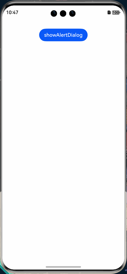
警告弹窗通过 UIContext 的showAlertDialog接口实现。
效果展示:
实现代码
根据上面的效果展示,警告弹窗需要配置多个属性:
- title - 弹窗标题
- message - 弹窗主体消息内容
- alignment - 弹窗在屏幕中的对齐方式
- offset - 弹窗相对于默认位置的偏移量
- gridCount - 弹窗按钮布局的网格数量
- transition - 弹窗的过渡动画效果
- buttons - 弹窗按钮的配置数组
@Entry
@Component
struct showAlertDialogExample {
  build() {
    Column() {
      Button('showAlertDialog')
        .margin(30)
        .onClick(() => {
          // 获取UI上下文并显示警告弹窗
          this.getUIContext().showAlertDialog(
            {
              // 设置弹窗标题
              title: 'title',
              // 设置弹窗消息内容
              message: 'text',
              // 设置是否允许自动取消
              autoCancel: true,
              // 设置弹窗对齐方式为居中
              alignment: DialogAlignment.Center,
              // 设置弹窗位置偏移量
              offset: { dx: 0, dy: -20 },
              // 设置按钮布局网格数量
              gridCount: 3,
              // 设置弹窗显示和隐藏的过渡动画效果
              transition: TransitionEffect.asymmetric(
                TransitionEffect.OPACITY.animation({ duration: 3000, curve: Curve.Sharp }).combine(
                  TransitionEffect.scale({ x: 1.5, y: 1.5 }).animation({ duration: 3000, curve: Curve.Sharp })
                ),
                TransitionEffect.OPACITY.animation({ duration: 100, curve: Curve.Smooth }).combine(
                  TransitionEffect.scale({ x: 0.5, y: 0.5 }).animation({ duration: 100, curve: Curve.Smooth })
                )
              ),
              // 配置弹窗按钮数组
              buttons: [{
                // 第一个按钮显示文本
                value: 'cancel',
                // 按钮点击回调函数
                action: () => {
                  console.info('Callback when the first button is clicked')
                }
              },
                {
                  // 设置按钮是否可用
                  enabled: true,
                  // 设置按钮是否默认获得焦点
                  defaultFocus: true,
                  // 设置按钮样式为高亮
                  style: DialogButtonStyle.HIGHLIGHT,
                  // 按钮显示文本
                  value: 'ok',
                  // 按钮点击回调函数
                  action: () => {
                    console.info('Callback when the second button is clicked')
                  }
                }],
            }
          )
        })
    }
    .width('100%')
    .margin({ top: 5 })
  }
}
API 参考
在实际开发中,可参考官方API 文档调整配置参数。
列表选择弹窗 (ActionSheet)
列表选择弹窗适用于展示多个可选操作项,特别是当界面中仅需显示操作列表而无需其他辅助内容时。
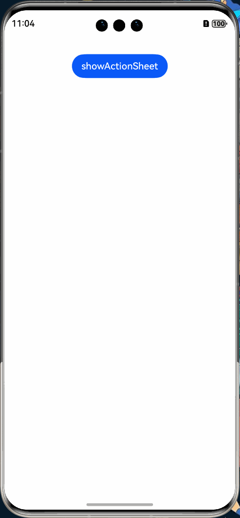
列表选择弹窗通过 UIContext 的showActionSheet接口实现。
效果展示:
实现代码
列表选择弹窗与警告弹窗的主要区别在于:
- showActionSheet - 使用此方法展示操作列表
- sheets - 配置操作列表中的选项数组,每个选项包含标题和点击回调函数
@Entry
@Component
struct showActionSheetExample {
  build() {
    Column() {
      Button('showActionSheet')
        .margin(30)
        .onClick(() => {
          // 获取UI上下文并显示列表选择弹窗
          this.getUIContext().showActionSheet({
            // 设置弹窗标题
            title: 'ActionSheet title',
            // 设置弹窗消息内容
            message: 'message',
            // 设置是否允许自动取消
            autoCancel: false,
            // 设置弹窗宽度
            width: 300,
            // 设置弹窗高度
            height: 300,
            // 设置弹窗圆角半径
            cornerRadius: 20,
            // 设置边框宽度
            borderWidth: 1,
            // 设置边框样式为实线
            borderStyle: BorderStyle.Solid,
            // 设置边框颜色为蓝色
            borderColor: Color.Blue,
            // 设置背景颜色为白色
            backgroundColor: Color.White,
            // 设置弹窗显示和隐藏的过渡动画效果
            transition: TransitionEffect.asymmetric(
              TransitionEffect.OPACITY.animation({ duration: 3000, curve: Curve.Sharp }).combine(
                TransitionEffect.scale({ x: 1.5, y: 1.5 }).animation({ duration: 3000, curve: Curve.Sharp })
              ),
              TransitionEffect.OPACITY.animation({ duration: 100, curve: Curve.Smooth }).combine(
                TransitionEffect.scale({ x: 0.5, y: 0.5 }).animation({ duration: 100, curve: Curve.Smooth })
              )
            ),
            // 配置确认按钮
            confirm: {
              value: 'Confirm button',
              action: () => {
                console.info('Get Alert Dialog handled')
              }
            },
            // 设置弹窗对齐方式为居中
            alignment: DialogAlignment.Center,
            // 配置操作列表选项数组
            sheets: [
              {
                title: 'apples',
                action: () => {
                }
              },
              {
                title: 'bananas',
                action: () => {
                }
              },
              {
                title: 'pears',
                action: () => {
                  console.log('pears')
                }
              }
            ]
          })
        })
    }
    .width('100%')
    .margin({ top: 5 })
  }
}
API 参考
详细配置可参考官方 API 文档。
对话框 (showDialog)
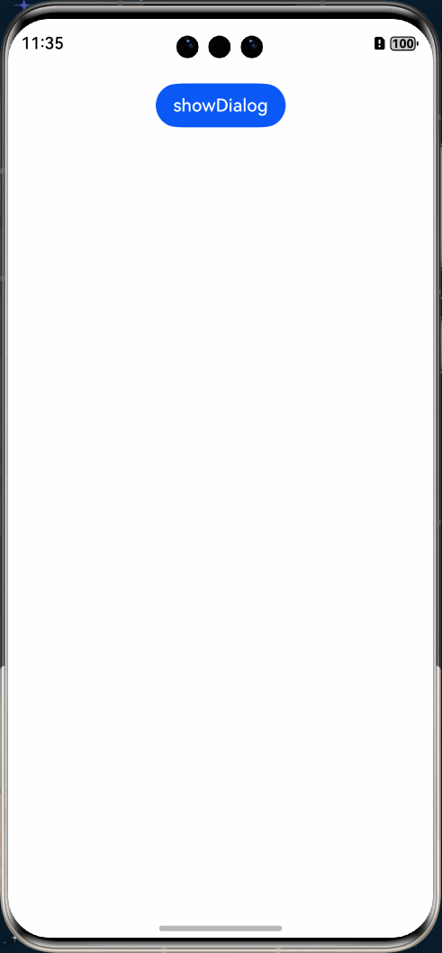
对话框是应用中使用频率最高的弹窗类型之一,适用于删除确认、操作确认、支付确认等场景,通常提供"取消"和"确定"两个选项供用户选择。
效果展示:
实现代码
@Entry
@Component
struct Index {
  build() {
    Column() {
      Button("showDialog")
        .margin(20)
        .onClick(() => {
          let uiContext = this.getUIContext();
          let promptAction = uiContext.getPromptAction();
          promptAction.showDialog({
            // 设置对话框标题
            title: 'showDialog Title Info',
            // 设置对话框消息内容
            message: 'Message Info',
            // 配置对话框按钮数组
            buttons: [
              {
                text: 'button1',
                color: '#000000'
              },
              {
                text: 'button2',
                color: '#000000'
              }
            ]
          }, (err, data) => {
            if (err) {
              console.error('showDialog err: ' + err);
              return;
            }
            console.info('showDialog success callback, click button: ' + data.index);
          });
        })
    }
    .width('100%')
  }
}
API 参考
详细配置可参考官方 API 文档。
操作菜单 (showActionMenu)
操作菜单弹窗主要用于展示一组可选操作选项,为用户提供清晰的功能菜单。
效果展示
实现代码
@Entry
@Component
struct Index {
  build() {
    Column() {
      Button("showDialog")
        .margin(20)
        .onClick(() => {
          let uiContext = this.getUIContext();
          let promptAction = uiContext.getPromptAction();
          promptAction.showActionMenu({
            title: 'showActionMenu Title Info',
            buttons: [
              {
                text: 'item1',
                color: '#666666'
              },
              {
                text: 'item2',
                color: '#000000'
              },
            ]
          })
            .then(data => {
              console.info('showActionMenu success, click button: ' + data.index);
            })
        })
    }
    .width('100%')
  }
}
API 参考
详细配置可参考官方 API 文档。
总结
在 HarmonyOS Next 应用开发中,应根据具体场景选择最适合的弹窗类型,以提供最佳的用户体验。固定样式弹窗满足大多数常见交互场景,而自定义弹窗则为特殊需求提供了更大的灵活性。
00