HarmonyOS Next-布局之线性布局(Row/Column)
2025-06-18 14:52:23
361次阅读
0个评论
学了一段时间鸿蒙next,总结了一下ArcTs提供了常见的一些布局,可根据实际应用场景选择合适的布局进行页面开发:
- 线性布局(Row / Column)
- 弹性布局(Flex)
- 层叠布局(Stack)
- 相对布局(RelativeContainer)
- 栅格布局(GridRow、GridCol)
- 媒体查询(@ohos.mediaquery)
- 列表(List)
- 网格(Grid)
- 轮播(Swipper)
线性布局
线性布局(LinearLayout)是开发中最常用的布局,通过线性容器Row和Column构建。
线性布局是其他布局的基础,其子元素在线性方向上(水平方向和垂直方向)依次排列。线性布局的排列方向由所选容器组件决定,Column容器内子元素按照垂直方向排列,Row容器内子元素按照水平方向排列。
官方文档使用链接:https://developer.huawei.com/consumer/cn/doc/harmonyos-guides-V5/arkts-layout-development-linear-V5
- 这里讲点特殊的用法
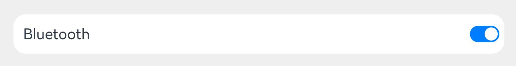
自适应拉伸
在线性布局下,常用空白填充组件Blank,在容器主轴方向自动填充空白空间,达到自适应拉伸效果。Row和Column作为容器,只需要添加宽高为百分比,当屏幕宽高发生变化时,会产生自适应效果。
    @Entry
    @Componentstruct
    BlankTest {
        build() {
            Column() {
                Row() {
                    Text('Bluetooth').fontSize(18)
                    Blank()
                    Toggle({ type: ToggleType.Switch, isOn: true })
                }
                .backgroundColor(0xFFFFFF)
                .borderRadius(15)
                .padding{left:12 })
                .width('100%')
            }
            .backgroundColor(0xEFEFEF)
            .padding(20)
            .width('100%')
        }
    }
自适应缩放
自适应缩放是指子组件随容器尺寸的变化而按照预设的比例自动调整尺寸,适应各种不同大小的设备。在线性布局中,可以使用以下两种方法实现自适应缩放。
@Entry
@Componentstruct
layoutWeightTest {
    build() {
        Column() {
            Text('1:2:3')
            .width('100%')
            Row() {
                Column() {
                    Text('layoutWeight(1)')
                    .textAlign(TextAlign.Center)
                }
                .layoutWeight(1)
                .backgroundColor(0xF5DEB3)
                .height('100%')
        Column() {
            Text('layoutWeight(2)')
            .textAlign(TextAlign.Center)
        }
        .layoutWeight(2)
        .backgroundColor(0xD2B48C)
        .height('100%')
        Column() {
            Text('layoutWeight(3)')
            .textAlign(TextAlign.Center)
        }.layoutWeight(3)
        .backgroundColor(0xF5DEB3)
        .height('100%')
      }
      .backgroundColor(0xffd306)
      .height('30%')
      Text('2:5:3').width('100%')
      Row() {
          Column() {
              Text('layoutWeight(2)')
              .textAlign(TextAlign.Center)
              }
              .layoutWeight(2)
              .backgroundColor(0xF5DEB3)
              .height('100%')
        Column() {
            Text('layoutWeight(5)')
            .textAlign(TextAlign.Center)
        }
        .layoutWeight(5)
        .backgroundColor(0xD2B48C)
        .height('100%')
        Column() {
            Text('layoutWeight(3)')
            .textAlign(TextAlign.Center)
            }
            .layoutWeight(3)
            .backgroundColor(0xF5DEB3)
            .height('100%')
            }.backgroundColor(0xffd306)
            .height('30%')
            }
        }
}

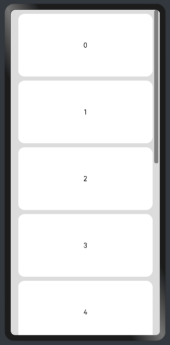
自适应延伸
自适应延伸是指在不同尺寸设备下,当页面的内容超出屏幕大小而无法完全显示时,可以通过滚动条进行拖动展示。这种方法适用于线性布局中内容无法一屏展示的场景。通常有以下两种实现方式。
- 在List中添加滚动条:当List子项过多一屏放不下时,可以将每一项子元素放置在不同的组件中,通过滚动条进行拖动展示。可以通过scrollBar属性设置滚动条的常驻状态,edgeEffect属性设置拖动到内容最末端的回弹效果。
- 使用Scroll组件:在线性布局中,可以进行垂直方向或者水平方向的布局。当一屏无法完全显示时,可以在Column或Row组件的外层包裹一个可滚动的容器组件Scroll来实现可滑动的线性布局。 例如:
@Entry
@Componentstruct
ScrollExample {
    scroller: Scroller = new Scroller();
    private arr: number[] = [0, 1, 2, 3, 4, 5, 6, 7, 8, 9];

  build() {
      Scroll(this.scroller) {
          Column() {
              ForEach(this.arr, (item) => {
                  Text(item.toString())
                  .width('90%')
                  .height(150)
                  .backgroundColor(0xFFFFFF)
                  .borderRadius(15)
                  .fontSize(16)
                  .textAlign(TextAlign.Center)
                  .margin({ top: 10 })
              }, item => item)
          }.width('100%')
         }
          .backgroundColor(0xDCDCDC)
          // 滚动方向为垂直方向
          .scrollable(ScrollDirection.Vertical)
          // 滚动条常驻显示
          .scrollBar(BarState.On)
          // 滚动条颜色
          .scrollBarColor(Color.Gray)
          // 滚动条宽度
          .scrollBarWidth(10)
          // 滚动到边沿后回弹
          .edgeEffect(EdgeEffect.Spring)
      }
}
00