[HarmonyOS NEXT 实战案例一:SideBarContainer] 侧边栏容器实战:新闻阅读应用侧边栏布局 基础篇
[HarmonyOS NEXT 实战案例一:SideBarContainer] 侧边栏容器实战:新闻阅读应用侧边栏布局 基础篇
项目已开源,开源地址: https://gitcode.com/nutpi/HarmonyosNextCaseStudyTutorial , 欢迎fork & star
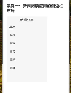
效果演示
一、SideBarContainer组件介绍
在现代移动应用和平板应用中,侧边栏导航已经成为一种常见且实用的UI设计模式。HarmonyOS NEXT提供了专门的SideBarContainer组件来实现这一功能,它能够轻松创建可显示和隐藏的侧边栏布局,非常适合新闻阅读、电子商务、文件管理等应用场景。
1.1 SideBarContainer组件概述
SideBarContainer是一个双区域容器组件,通过子组件定义侧边栏和内容区:
- 第一个子组件表示侧边栏
- 第二个子组件表示内容区
组件内部已实现侧边栏的显示与隐藏逻辑,开发者只需关注如何传入正确结构和控制显示行为即可。
1.2 SideBarContainer的显示模式
SideBarContainer支持三种显示模式,通过构造函数参数SideBarContainerType指定:
| 显示模式 | 说明 |
|---|---|
Embed |
侧边栏嵌入到组件内,和内容区并列显示 |
Overlay |
侧边栏浮在内容区上面 |
Auto |
根据容器宽度自动选择Embed或Overlay模式 |
1.3 SideBarContainer的主要属性
| 属性 | 类型 | 说明 |
|---|---|---|
showSideBar |
boolean | 设置是否显示侧边栏,默认值为true |
showControlButton |
boolean | 设置是否显示控制按钮,默认值为true |
controlButton |
ButtonStyle | 设置侧边栏控制按钮的属性 |
sideBarWidth |
number | Length | 设置侧边栏的宽度,默认值为200vp |
minSideBarWidth |
number | Length | 设置侧边栏最小宽度,默认值为200vp |
maxSideBarWidth |
number | Length | 设置侧边栏最大宽度,默认值为280vp |
autoHide |
boolean | 设置当侧边栏拖拽到小于最小宽度后,是否自动隐藏,默认值为true |
sideBarPosition |
SideBarPosition | 设置侧边栏显示位置,可选值为Start(左侧)和End(右侧),默认值为Start |
1.4 SideBarContainer的主要事件
| 事件 | 说明 |
|---|---|
onChange(callback: (value: boolean) => void) |
当侧边栏的状态在显示和隐藏之间切换时触发回调,true表示显示,false表示隐藏 |
二、新闻阅读应用侧边栏实战
接下来,我们将通过一个新闻阅读应用的实例,详细讲解如何使用SideBarContainer组件实现侧边栏布局。
2.1 需求分析
新闻阅读应用通常需要以下功能:
- 左侧侧边栏显示新闻分类列表
- 右侧内容区显示当前分类的新闻列表
- 侧边栏可以展开和收起
- 点击分类可以切换新闻内容
2.2 代码实现
首先,我们来看完整的代码实现:
// 新闻阅读应用的侧边栏布局

@Component
export struct NewsApp {
    @State isSideBarShow: boolean = true

    build() {
        SideBarContainer(SideBarContainerType.Embed) {
            // 侧边栏内容 - 新闻分类
            Column() {
                Text('新闻分类').fontSize(20).margin(10)
                List({ space: 10 }) {
                    ForEach(['热点', '科技', '财经', '体育', '娱乐', '国际'], (item: string) => {
                        ListItem() {
                            Text(item).fontSize(16).margin({ left: 20, top: 10, bottom: 10 })
                        }
                        .onClick(() => {
                            console.log(`切换到${item}分类`)
                        })
                    })
                }
                .width('100%')
                .layoutWeight(1)
            }
            .width('70%')
            .backgroundColor('#f5f5f5')

            // 主内容区 - 新闻列表
            Column() {
                Row() {
                    Image($r('app.media.01'))
                        .width(30)
                        .height(30)
                        .onClick(() => {
                            this.isSideBarShow = !this.isSideBarShow
                        })
                    Text('今日热点').fontSize(20).margin({ left: 10 })
                }
                .width('100%')
                .padding(10)

                List({ space: 10 }) {
                    ForEach(['华为发布HarmonyOS NEXT', '全球AI发展峰会召开', '新能源汽车销量创新高'], (item: string) => {
                        ListItem() {
                            Text(item).fontSize(16).margin(10)
                        }
                        .borderRadius(8)
                        .backgroundColor(Color.White)
                        .shadow({ radius: 2, color: '#999', offsetX: 1, offsetY: 1 })
                    })
                }
                .width('100%')
                .layoutWeight(1)
            }
        }
        .sideBarPosition(SideBarPosition.Start)
        .controlButton({ left: 10, top: 50 })
        .onChange((value: boolean) => {
            this.isSideBarShow = value
        })
    }
}
2.3 代码详解
2.3.1 组件结构
我们使用@Component装饰器定义了一个名为NewsApp的自定义组件,并使用@State装饰器定义了一个状态变量isSideBarShow,用于控制侧边栏的显示和隐藏。
@Component
export struct NewsApp {
    @State isSideBarShow: boolean = true
    // ...
}
2.3.2 SideBarContainer配置
在build方法中,我们使用SideBarContainer组件作为根容器,并设置其显示模式为Embed,即侧边栏嵌入到组件内,和内容区并列显示。
SideBarContainer(SideBarContainerType.Embed) {
    // 侧边栏内容
    // 主内容区
}
.sideBarPosition(SideBarPosition.Start)
.controlButton({ left: 10, top: 50 })
.onChange((value: boolean) => {
    this.isSideBarShow = value
})
我们通过链式调用设置了以下属性:
sideBarPosition(SideBarPosition.Start):设置侧边栏显示在左侧controlButton({ left: 10, top: 50 }):设置控制按钮的位置onChange((value: boolean) => { ... }):监听侧边栏显示状态的变化
2.3.3 侧边栏内容
侧边栏内容是SideBarContainer的第一个子组件,我们使用Column组件作为容器,包含一个标题和一个新闻分类列表。
Column() {
    Text('新闻分类').fontSize(20).margin(10)
    List({ space: 10 }) {
        ForEach(['热点', '科技', '财经', '体育', '娱乐', '国际'], (item: string) => {
            ListItem() {
                Text(item).fontSize(16).margin({ left: 20, top: 10, bottom: 10 })
            }
            .onClick(() => {
                console.log(`切换到${item}分类`)
            })
        })
    }
    .width('100%')
    .layoutWeight(1)
}
.width('70%')
.backgroundColor('#f5f5f5')
这里我们使用了以下组件和技术:
Column:垂直布局容器Text:显示标题文本List:列表容器,设置了项目间距为10ForEach:遍历新闻分类数组,为每个分类创建一个列表项ListItem:列表项容器onClick:为每个列表项添加点击事件处理函数
2.3.4 主内容区
主内容区是SideBarContainer的第二个子组件,我们同样使用Column组件作为容器,包含一个顶部栏和一个新闻列表。
Column() {
    Row() {
        Image($r('app.media.01'))
            .width(30)
            .height(30)
            .onClick(() => {
                this.isSideBarShow = !this.isSideBarShow
            })
        Text('今日热点').fontSize(20).margin({ left: 10 })
    }
    .width('100%')
    .padding(10)

    List({ space: 10 }) {
        ForEach(['华为发布HarmonyOS NEXT', '全球AI发展峰会召开', '新能源汽车销量创新高'], (item: string) => {
            ListItem() {
                Text(item).fontSize(16).margin(10)
            }
            .borderRadius(8)
            .backgroundColor(Color.White)
            .shadow({ radius: 2, color: '#999', offsetX: 1, offsetY: 1 })
        })
    }
    .width('100%')
    .layoutWeight(1)
}
这里我们使用了以下组件和技术:
Column:垂直布局容器Row:水平布局容器,用于顶部栏Image:显示图标,并添加点击事件用于切换侧边栏的显示状态Text:显示标题文本List:列表容器,设置了项目间距为10ForEach:遍历新闻数组,为每个新闻创建一个列表项ListItem:列表项容器,设置了圆角、背景色和阴影效果
三、布局技巧与最佳实践
3.1 侧边栏宽度设置
在示例中,我们将侧边栏的宽度设置为70%,这是相对于SideBarContainer默认分配给侧边栏的宽度(200vp)的百分比。在实际应用中,可以根据需要调整这个值,或者使用sideBarWidth属性直接设置侧边栏的宽度。
// 方式1:设置侧边栏子组件的宽度
Column() {
    // 侧边栏内容
}
.width('70%')

// 方式2:设置SideBarContainer的sideBarWidth属性
SideBarContainer(SideBarContainerType.Embed) {
    // 侧边栏内容
    // 主内容区
}
.sideBarWidth(240)
3.2 控制按钮定制
SideBarContainer提供了controlButton属性,用于定制控制按钮的位置和外观。在示例中,我们只设置了按钮的位置,但实际上还可以设置按钮的大小和图标。
.controlButton({
    left: 10,
    top: 50,
    width: 32,
    height: 32,
    icons: {
        shown: $r('app.media.icon_shown'),
        hidden: $r('app.media.icon_hidden'),
        switching: $r('app.media.icon_switching')
    }
})
3.3 响应式布局
为了适应不同屏幕尺寸,我们可以结合SideBarContainerType.Auto模式和媒体查询来实现响应式布局。
// 使用Auto模式,根据容器宽度自动选择Embed或Overlay
SideBarContainer(SideBarContainerType.Auto) {
    // 侧边栏内容
    // 主内容区
}

// 使用媒体查询调整布局
@Media({ minWidth: 600 }) {
    // 大屏幕布局
}

@Media({ maxWidth: 599 }) {
    // 小屏幕布局
}
3.4 状态管理
在示例中,我们使用@State装饰器定义了isSideBarShow状态变量,并通过onChange事件和点击事件来更新这个状态。在实际应用中,可能需要更复杂的状态管理,例如记住用户选择的分类、保存阅读进度等。
@Component
export struct NewsApp {
    @State isSideBarShow: boolean = true
    @State currentCategory: string = '热点'
    @State newsItems: Array<NewsItem> = []

    // 加载指定分类的新闻
    loadNews(category: string) {
        // 加载新闻数据的逻辑
        this.currentCategory = category
    }

    // ...
}
四、总结
本教程详细介绍了如何使用HarmonyOS NEXT的SideBarContainer组件实现新闻阅读应用的侧边栏布局。 SideBarContainer组件为开发者提供了一种简单而强大的方式来实现侧边栏布局,适用于各种应用场景。通过合理使用这个组件,可以创建出用户体验良好的应用界面。 在下一篇教程中,我们将深入探讨如何为新闻阅读应用添加更多交互功能和状态管理,敬请期待!
