[HarmonyOS NEXT 实战案例五:SideBarContainer] 侧边栏容器实战:悬浮模式侧边栏(Overlay)
[HarmonyOS NEXT 实战案例五:SideBarContainer] 侧边栏容器实战:悬浮模式侧边栏(Overlay)
项目已开源,开源地址: https://gitcode.com/nutpi/HarmonyosNextCaseStudyTutorial , 欢迎fork & star
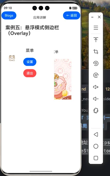
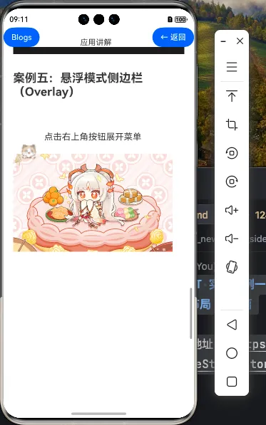
效果演示
一、组件概述
在移动应用开发中,侧边栏导航是一种常见的UI模式,它可以在不占用主屏幕空间的情况下提供丰富的导航选项。HarmonyOS NEXT的SideBarContainer组件提供了多种显示模式,其中Overlay模式特别适合移动设备的侧边栏菜单实现。
1.1 SideBarContainer的Overlay模式
SideBarContainer组件支持三种显示模式:
- Embed模式:侧边栏嵌入在内容区域内,与主内容共享空间
- Overlay模式:侧边栏覆盖在主内容上方,显示时会遮挡部分主内容
- Auto模式:根据屏幕尺寸自动选择Embed或Overlay模式
在本案例中,我们将重点关注Overlay模式,这种模式特别适合移动设备的侧边栏菜单,因为它不会挤压主内容区域,而是在需要时覆盖在主内容上方。
1.2 Overlay模式的应用场景
Overlay模式的侧边栏在以下场景特别有用:
- 移动应用的主导航:提供应用的主要导航选项
- 筛选面板:在搜索结果或列表页面提供筛选选项
- 设置菜单:显示应用设置选项
- 用户个人中心:显示用户信息和相关操作
1.3 Overlay模式的特点
Overlay模式的侧边栏具有以下特点:
- 覆盖式显示:侧边栏显示时会覆盖部分主内容
- 不影响主内容布局:主内容区域的布局不会因侧边栏的显示或隐藏而改变
- 适合小屏设备:特别适合手机等小屏设备,可以最大化利用屏幕空间
- 通常配合半透明遮罩:侧边栏显示时,主内容区域通常会添加半透明遮罩,提示用户当前焦点在侧边栏
二、实战代码实现
2.1 基本结构
首先,让我们看一下移动端抽屉菜单的基本结构:
@Entry
@Component
struct MobileMenu {
  @State isSideBarShow: boolean = false
  @State currentIndex: number = 0

  build() {
    SideBarContainer(SideBarContainerType.Overlay) {
      // 侧边栏内容 - 菜单选项
      this.SideBarContent()

      // 主内容区 - 当前选中的内容
      this.MainContent()
    }
    .showSideBar(this.isSideBarShow)
    .sideBarWidth(280)
    .minSideBarWidth(280)
    .maxSideBarWidth(280)
    .onChange((isShow: boolean) => {
      this.isSideBarShow = isShow
    })
  }

  // 侧边栏内容构建器
  @Builder SideBarContent() {
    // 侧边栏内容实现...
  }

  // 主内容区构建器
  @Builder MainContent() {
    // 主内容区实现...
  }
}
这个基本结构包含了:
- 使用
SideBarContainer的Overlay模式创建侧边栏布局 - 定义了两个关键的状态变量:
isSideBarShow控制侧边栏的显示状态,currentIndex记录当前选中的菜单项 - 使用
@Builder装饰器定义了侧边栏内容和主内容区的构建器
2.2 侧边栏内容 - 菜单选项
接下来,我们实现侧边栏内容,包括用户信息和菜单选项:
@Builder SideBarContent() {
  Column() {
    // 用户信息区域
    Column() {
      Image($r('app.media.avatar'))
        .width(80)
        .height(80)
        .borderRadius(40)
        .margin({ top: 60, bottom: 20 })

      Text('用户名')
        .fontSize(18)
        .fontWeight(FontWeight.Bold)
        .margin({ bottom: 5 })

      Text('user@example.com')
        .fontSize(14)
        .fontColor('#666666')
    }
    .width('100%')
    .alignItems(HorizontalAlign.Center)

    // 菜单选项
    Column() {
      // 首页
      this.MenuItem(0, $r('app.media.ic_home'), '首页')

      // 消息
      this.MenuItem(1, $r('app.media.ic_message'), '消息')

      // 收藏
      this.MenuItem(2, $r('app.media.ic_favorite'), '收藏')

      // 设置
      this.MenuItem(3, $r('app.media.ic_settings'), '设置')

      // 关于
      this.MenuItem(4, $r('app.media.ic_about'), '关于')
    }
    .margin({ top: 50 })

    // 底部退出按钮
    Button('退出登录')
      .width('80%')
      .height(40)
      .margin({ top: 100 })
      .backgroundColor('#FF4081')
      .fontColor(Color.White)
  }
  .width('100%')
  .height('100%')
  .backgroundColor('#FFFFFF')
}

// 菜单项构建器
@Builder MenuItem(index: number, icon: Resource, title: string) {
  Row() {
    Image(icon)
      .width(24)
      .height(24)
      .margin({ right: 16 })

    Text(title)
      .fontSize(16)
      .fontColor(this.currentIndex === index ? '#FF4081' : '#333333')
  }
  .width('100%')
  .padding({ left: 24, right: 24, top: 16, bottom: 16 })
  .backgroundColor(this.currentIndex === index ? '#F5F5F5' : '#FFFFFF')
  .borderRadius(8)
  .onClick(() => {
    this.currentIndex = index
    this.isSideBarShow = false
  })
}
在这个侧边栏内容中,我们实现了:
- 用户信息区域:显示用户头像、用户名和邮箱
- 菜单选项:使用自定义的
MenuItem构建器创建多个菜单项,包括图标和标题 - 底部退出按钮:提供退出登录功能
- 交互功能:点击菜单项时,更新
currentIndex状态变量,并自动关闭侧边栏
2.3 主内容区 - 当前选中的内容
接下来,我们实现主内容区,显示当前选中的内容:
@Builder MainContent() {
  Column() {
    // 顶部应用栏
    Row() {
      // 菜单按钮
      Image($r('app.media.ic_menu'))
        .width(24)
        .height(24)
        .margin({ right: 16 })
        .onClick(() => {
          this.isSideBarShow = !this.isSideBarShow
        })

      // 标题
      Text(this.getPageTitle())
        .fontSize(20)
        .fontWeight(FontWeight.Bold)

      // 右侧空白
      Blank()

      // 搜索按钮
      Image($r('app.media.ic_search'))
        .width(24)
        .height(24)
        .margin({ left: 16 })
    }
    .width('100%')
    .padding({ left: 16, right: 16, top: 16, bottom: 16 })
    .backgroundColor('#FFFFFF')

    // 内容区域
    Column() {
      // 根据当前选中的菜单项显示不同内容
      if (this.currentIndex === 0) {
        // 首页内容
        this.HomeContent()
      } else if (this.currentIndex === 1) {
        // 消息内容
        this.MessageContent()
      } else if (this.currentIndex === 2) {
        // 收藏内容
        this.FavoriteContent()
      } else if (this.currentIndex === 3) {
        // 设置内容
        this.SettingsContent()
      } else if (this.currentIndex === 4) {
        // 关于内容
        this.AboutContent()
      }
    }
    .width('100%')
    .layoutWeight(1)
    .backgroundColor('#F5F5F5')
  }
  .width('100%')
  .height('100%')
}

// 获取当前页面标题
private getPageTitle(): string {
  const titles = ['首页', '消息', '收藏', '设置', '关于']
  return titles[this.currentIndex] || '首页'
}

// 首页内容
@Builder HomeContent() {
  Column() {
    Text('首页内容')
      .fontSize(16)
      .fontColor('#333333')
  }
  .width('100%')
  .height('100%')
  .justifyContent(FlexAlign.Center)
}

// 消息内容
@Builder MessageContent() {
  Column() {
    Text('消息内容')
      .fontSize(16)
      .fontColor('#333333')
  }
  .width('100%')
  .height('100%')
  .justifyContent(FlexAlign.Center)
}

// 收藏内容
@Builder FavoriteContent() {
  Column() {
    Text('收藏内容')
      .fontSize(16)
      .fontColor('#333333')
  }
  .width('100%')
  .height('100%')
  .justifyContent(FlexAlign.Center)
}

// 设置内容
@Builder SettingsContent() {
  Column() {
    Text('设置内容')
      .fontSize(16)
      .fontColor('#333333')
  }
  .width('100%')
  .height('100%')
  .justifyContent(FlexAlign.Center)
}

// 关于内容
@Builder AboutContent() {
  Column() {
    Text('关于内容')
      .fontSize(16)
      .fontColor('#333333')
  }
  .width('100%')
  .height('100%')
  .justifyContent(FlexAlign.Center)
}
在主内容区中,我们实现了:
- 顶部应用栏:包含菜单按钮、页面标题和搜索按钮
- 内容区域:根据当前选中的菜单项显示不同的内容
- 交互功能:点击菜单按钮可以切换侧边栏的显示状态
三、代码详解
3.1 SideBarContainer配置
SideBarContainer(SideBarContainerType.Overlay) {
  // 侧边栏内容
  this.SideBarContent()

  // 主内容区
  this.MainContent()
}
.showSideBar(this.isSideBarShow)
.sideBarWidth(280)
.minSideBarWidth(280)
.maxSideBarWidth(280)
.onChange((isShow: boolean) => {
  this.isSideBarShow = isShow
})
这段代码配置了SideBarContainer组件:
- 显示模式:使用
SideBarContainerType.Overlay,将侧边栏覆盖在主内容区上方 - 显示控制:通过
showSideBar属性绑定isSideBarShow状态变量,控制侧边栏的显示和隐藏 - 侧边栏宽度:
sideBarWidth:设置默认宽度为280像素minSideBarWidth和maxSideBarWidth:设置最小和最大宽度也为280像素,这样侧边栏宽度就是固定的
- 状态变化监听:通过
onChange回调函数监听侧边栏显示状态的变化
与基础篇和进阶篇中的Embed模式不同,Overlay模式下我们没有使用controlButton属性,因为在移动应用中,侧边栏通常通过顶部应用栏中的菜单按钮控制。
3.2 侧边栏内容详解
侧边栏内容主要包括用户信息区域和菜单选项。
用户信息区域
// 用户信息区域
Column() {
  Image($r('app.media.avatar'))
    .width(80)
    .height(80)
    .borderRadius(40)
    .margin({ top: 60, bottom: 20 })

  Text('用户名')
    .fontSize(18)
    .fontWeight(FontWeight.Bold)
    .margin({ bottom: 5 })

  Text('user@example.com')
    .fontSize(14)
    .fontColor('#666666')
}
.width('100%')
.alignItems(HorizontalAlign.Center)
这段代码实现了用户信息区域:
- 使用
Image组件显示用户头像,设置为圆形 - 使用
Text组件显示用户名和邮箱 - 使用
alignItems(HorizontalAlign.Center)使内容水平居中
菜单选项
// 菜单选项
Column() {
  // 首页
  this.MenuItem(0, $r('app.media.ic_home'), '首页')

  // 消息
  this.MenuItem(1, $r('app.media.ic_message'), '消息')

  // 收藏
  this.MenuItem(2, $r('app.media.ic_favorite'), '收藏')

  // 设置
  this.MenuItem(3, $r('app.media.ic_settings'), '设置')

  // 关于
  this.MenuItem(4, $r('app.media.ic_about'), '关于')
}
.margin({ top: 50 })
这段代码使用自定义的MenuItem构建器创建多个菜单项:
- 每个菜单项都有一个索引、图标和标题
- 索引用于标识当前选中的菜单项
- 使用
margin({ top: 50 })在用户信息区域和菜单选项之间添加间距
菜单项构建器
@Builder MenuItem(index: number, icon: Resource, title: string) {
  Row() {
    Image(icon)
      .width(24)
      .height(24)
      .margin({ right: 16 })

    Text(title)
      .fontSize(16)
      .fontColor(this.currentIndex === index ? '#FF4081' : '#333333')
  }
  .width('100%')
  .padding({ left: 24, right: 24, top: 16, bottom: 16 })
  .backgroundColor(this.currentIndex === index ? '#F5F5F5' : '#FFFFFF')
  .borderRadius(8)
  .onClick(() => {
    this.currentIndex = index
    this.isSideBarShow = false
  })
}
这个构建器实现了菜单项:
- 使用
Row组件将图标和标题水平排列 - 根据
currentIndex和index的比较结果,为当前选中的菜单项应用不同的样式 - 点击菜单项时,更新
currentIndex状态变量,并自动关闭侧边栏
3.3 主内容区详解
主内容区主要包括顶部应用栏和内容区域。
顶部应用栏
// 顶部应用栏
Row() {
  // 菜单按钮
  Image($r('app.media.ic_menu'))
    .width(24)
    .height(24)
    .margin({ right: 16 })
    .onClick(() => {
      this.isSideBarShow = !this.isSideBarShow
    })

  // 标题
  Text(this.getPageTitle())
    .fontSize(20)
    .fontWeight(FontWeight.Bold)

  // 右侧空白
  Blank()

  // 搜索按钮
  Image($r('app.media.ic_search'))
    .width(24)
    .height(24)
    .margin({ left: 16 })
}
.width('100%')
.padding({ left: 16, right: 16, top: 16, bottom: 16 })
.backgroundColor('#FFFFFF')
这段代码实现了顶部应用栏:
- 使用
Row组件将菜单按钮、标题和搜索按钮水平排列 - 使用
Blank组件将标题和搜索按钮推到两侧 - 点击菜单按钮时,切换
isSideBarShow状态变量,控制侧边栏的显示和隐藏 - 使用
getPageTitle方法获取当前页面的标题
内容区域
// 内容区域
Column() {
  // 根据当前选中的菜单项显示不同内容
  if (this.currentIndex === 0) {
    // 首页内容
    this.HomeContent()
  } else if (this.currentIndex === 1) {
    // 消息内容
    this.MessageContent()
  } else if (this.currentIndex === 2) {
    // 收藏内容
    this.FavoriteContent()
  } else if (this.currentIndex === 3) {
    // 设置内容
    this.SettingsContent()
  } else if (this.currentIndex === 4) {
    // 关于内容
    this.AboutContent()
  }
}
.width('100%')
.layoutWeight(1)
.backgroundColor('#F5F5F5')
这段代码实现了内容区域:
- 使用条件语句根据
currentIndex状态变量显示不同的内容 - 使用
layoutWeight(1)使内容区域占用剩余空间 - 为每个页面内容创建单独的构建器,便于管理和维护
四、Overlay模式的特性与优化
4.1 遮罩效果
在Overlay模式下,当侧边栏显示时,通常会在主内容区域添加半透明遮罩,以提示用户当前焦点在侧边栏。我们可以通过以下方式实现这个效果:
@Builder MainContent() {
  Stack() {
    // 主内容
    Column() {
      // 顶部应用栏和内容区域...
    }
    .width('100%')
    .height('100%')

    // 遮罩层
    if (this.isSideBarShow) {
      Column()
        .width('100%')
        .height('100%')
        .backgroundColor('#000000')
        .opacity(0.5)
        .onClick(() => {
          this.isSideBarShow = false
        })
    }
  }
  .width('100%')
  .height('100%')
}
这段代码使用Stack组件将主内容和遮罩层叠加在一起:
- 当
isSideBarShow为true时,显示半透明遮罩层 - 点击遮罩层时,关闭侧边栏
- 使用
opacity(0.5)设置遮罩层的透明度
4.2 手势控制
在移动应用中,通常可以通过从屏幕左侧向右滑动手势打开侧边栏,通过从屏幕右侧向左滑动手势关闭侧边栏。我们可以通过以下方式实现这个功能:
@Entry
@Component
struct MobileMenu {
  // 状态变量...

  build() {
    SideBarContainer(SideBarContainerType.Overlay) {
      // 侧边栏内容...

      // 主内容区
      Stack() {
        this.MainContent()

        // 左侧手势区域
        Column()
          .width(20)
          .height('100%')
          .position({ x: 0, y: 0 })
          .gesture(
            PanGesture({ direction: PanDirection.Right })
              .onActionEnd(() => {
                this.isSideBarShow = true
              })
          )
      }
    }
    // SideBarContainer配置...
  }

  // 构建器...
}
这段代码在主内容区左侧添加了一个手势区域:
- 使用
PanGesture监听从左向右的滑动手势 - 当手势结束时,显示侧边栏
- 使用
position({ x: 0, y: 0 })将手势区域定位在屏幕左侧
4.3 动画效果
为了提升用户体验,我们可以为侧边栏的显示和隐藏添加动画效果:
@Entry
@Component
struct MobileMenu {
  // 状态变量...
  @State animationState: AnimationStatus = AnimationStatus.Initial

  build() {
    SideBarContainer(SideBarContainerType.Overlay) {
      // 侧边栏内容...

      // 主内容区...
    }
    .showSideBar(this.isSideBarShow)
    .sideBarWidth(280)
    .minSideBarWidth(280)
    .maxSideBarWidth(280)
    .onChange((isShow: boolean) => {
      this.isSideBarShow = isShow
      this.animationState = isShow ? AnimationStatus.Playing : AnimationStatus.Initial
    })
    .sideBarPosition(SideBarPosition.Start)
    .showControlButton(false)
    .animationDuration(300)
  }

  // 构建器...
}

// 动画状态枚举
enum AnimationStatus {
  Initial,
  Playing,
  Stopped
}
这段代码为SideBarContainer添加了动画效果:
- 使用
animationDuration(300)设置动画持续时间为300毫秒 - 使用
animationState状态变量跟踪动画状态 - 在
onChange回调函数中更新动画状态
4.4 响应式设计
虽然Overlay模式主要用于移动设备,但我们也可以考虑在不同屏幕尺寸下的响应式设计:
@Entry
@Component
struct MobileMenu {
  // 状态变量...
  @State screenWidth: number = 0

  aboutToAppear() {
    // 获取屏幕宽度
    this.screenWidth = px2vp(window.getWindowWidth())
  }

  build() {
    SideBarContainer(this.screenWidth > 600 ? SideBarContainerType.Embed : SideBarContainerType.Overlay) {
      // 侧边栏内容...

      // 主内容区...
    }
    // SideBarContainer配置...
  }

  // 构建器...
}
这段代码根据屏幕宽度动态选择SideBarContainer的显示模式:
- 当屏幕宽度大于600像素时,使用
Embed模式 - 当屏幕宽度小于或等于600像素时,使用
Overlay模式 - 在
aboutToAppear生命周期函数中获取屏幕宽度
五、布局技巧与最佳实践
5.1 侧边栏宽度设置
在移动设备上,侧边栏宽度的设置非常重要,它影响用户的操作体验:
.sideBarWidth(280)
.minSideBarWidth(280)
.maxSideBarWidth(280)
这种设置有以下优点:
- 固定宽度:在移动设备上,侧边栏通常使用固定宽度,避免用户调整宽度
- 适当的宽度:280像素提供了足够的空间显示菜单项,同时不会占用过多屏幕空间
- 一致的体验:固定宽度可以提供一致的用户体验
5.2 菜单项布局优化
在菜单项中,我们使用了Row和Image、Text组件来创建灵活的布局:
@Builder MenuItem(index: number, icon: Resource, title: string) {
  Row() {
    Image(icon)
      .width(24)
      .height(24)
      .margin({ right: 16 })

    Text(title)
      .fontSize(16)
      .fontColor(this.currentIndex === index ? '#FF4081' : '#333333')
  }
  .width('100%')
  .padding({ left: 24, right: 24, top: 16, bottom: 16 })
  .backgroundColor(this.currentIndex === index ? '#F5F5F5' : '#FFFFFF')
  .borderRadius(8)
  .onClick(() => {
    this.currentIndex = index
    this.isSideBarShow = false
  })
}
这种布局有以下优点:
- 水平排列:使用
Row组件将图标和文本水平排列 - 适当的间距:使用
margin和padding属性添加适当的间距,提高可读性 - 视觉反馈:根据选中状态应用不同的样式,提供直观的视觉反馈
- 触摸友好:使用足够大的点击区域,提高触摸操作的准确性
5.3 主内容区布局优化
在主内容区,我们使用了Column和条件渲染来显示不同的内容:
@Builder MainContent() {
  Column() {
    // 顶部应用栏...

    // 内容区域
    Column() {
      // 根据当前选中的菜单项显示不同内容...
    }
    .width('100%')
    .layoutWeight(1)
    .backgroundColor('#F5F5F5')
  }
  .width('100%')
  .height('100%')
}
这种布局有以下优点:
- 垂直排列:使用
Column组件将顶部应用栏和内容区域垂直排列 - 弹性布局:使用
layoutWeight(1)使内容区域占用剩余空间 - 条件渲染:根据
currentIndex状态变量显示不同的内容,避免不必要的渲染
5.4 交互优化
在交互方面,我们实现了以下优化:
- 点击菜单项自动关闭侧边栏:提高操作效率
- 点击遮罩层关闭侧边栏:提供直观的关闭方式
- 手势控制:支持滑动手势打开和关闭侧边栏
- 动画效果:为侧边栏的显示和隐藏添加平滑的动画效果
这些优化可以提升用户体验,使应用更加易用和直观。
六、Overlay模式的应用场景扩展
6.1 筛选面板
Overlay模式的侧边栏可以用作筛选面板,例如在电商应用中筛选商品:
@Builder SideBarContent() {
  Column() {
    // 筛选标题
    Text('筛选')
      .fontSize(20)
      .fontWeight(FontWeight.Bold)
      .margin({ top: 20, bottom: 20 })

    // 价格范围
    Text('价格范围')
      .fontSize(16)
      .fontWeight(FontWeight.Medium)
      .margin({ top: 10, bottom: 10 })

    Row() {
      Slider({
        value: this.minPrice,
        min: 0,
        max: 1000,
        step: 10
      })
        .width('80%')
        .onChange((value: number) => {
          this.minPrice = value
        })

      Text(`${this.minPrice}元`)
        .fontSize(14)
        .margin({ left: 10 })
    }
    .width('100%')
    .padding({ left: 16, right: 16 })

    // 更多筛选选项...

    // 应用按钮
    Button('应用筛选')
      .width('80%')
      .height(40)
      .margin({ top: 40 })
      .onClick(() => {
        this.applyFilter()
        this.isSideBarShow = false
      })
  }
  .width('100%')
  .height('100%')
  .backgroundColor('#FFFFFF')
  .padding(16)
}
6.2 用户个人中心
Overlay模式的侧边栏可以用作用户个人中心,显示用户信息和相关操作:
@Builder SideBarContent() {
  Column() {
    // 用户信息
    Column() {
      Image($r('app.media.avatar'))
        .width(80)
        .height(80)
        .borderRadius(40)
        .margin({ top: 40, bottom: 20 })

      Text('用户名')
        .fontSize(18)
        .fontWeight(FontWeight.Bold)
        .margin({ bottom: 5 })

      Text('user@example.com')
        .fontSize(14)
        .fontColor('#666666')

      Button('编辑资料')
        .width(120)
        .height(36)
        .fontSize(14)
        .margin({ top: 20 })
    }
    .width('100%')
    .alignItems(HorizontalAlign.Center)

    // 用户操作
    Column() {
      this.UserMenuItem($r('app.media.ic_profile'), '个人资料')
      this.UserMenuItem($r('app.media.ic_orders'), '我的订单')
      this.UserMenuItem($r('app.media.ic_address'), '收货地址')
      this.UserMenuItem($r('app.media.ic_payment'), '支付方式')
      this.UserMenuItem($r('app.media.ic_settings'), '设置')
    }
    .margin({ top: 40 })

    // 退出登录
    Button('退出登录')
      .width('80%')
      .height(40)
      .margin({ top: 60 })
      .backgroundColor('#FF4081')
      .fontColor(Color.White)
  }
  .width('100%')
  .height('100%')
  .backgroundColor('#FFFFFF')
}
6.3 设置菜单
Overlay模式的侧边栏可以用作设置菜单,提供应用设置选项:
@Builder SideBarContent() {
  Column() {
    // 设置标题
    Text('设置')
      .fontSize(20)
      .fontWeight(FontWeight.Bold)
      .margin({ top: 20, bottom: 20 })

    // 设置选项
    this.SettingItem('通知设置', true)
    this.SettingItem('深色模式', false)
    this.SettingItem('自动播放', true)
    this.SettingItem('数据同步', false)

    // 更多设置选项...

    // 版本信息
    Text('版本:1.0.0')
      .fontSize(14)
      .fontColor('#666666')
      .margin({ top: 40 })
  }
  .width('100%')
  .height('100%')
  .backgroundColor('#FFFFFF')
  .padding(16)
}

@Builder SettingItem(title: string, checked: boolean) {
  Row() {
    Text(title)
      .fontSize(16)
      .fontColor('#333333')

    Blank()

    Toggle({ type: ToggleType.Switch, isOn: checked })
      .onChange((isOn: boolean) => {
        // 处理开关状态变化
      })
  }
  .width('100%')
  .padding({ top: 16, bottom: 16 })
  .borderWidth({ bottom: 1 })
  .borderColor('#EEEEEE')
}
七、总结
在本教程中,我们学习了如何使用HarmonyOS NEXT的SideBarContainer组件的Overlay模式创建移动端抽屉菜单。 Overlay模式的侧边栏特别适合移动设备,它可以在不占用主屏幕空间的情况下提供丰富的导航选项。通过本教程的学习,你应该能够在自己的HarmonyOS NEXT应用中灵活运用SideBarContainer的Overlay模式,创建出符合移动设计规范的侧边栏菜单。
