134.[HarmonyOS NEXT 实战案例六:List系列] 垂直列表组件实战:打造高效联系人列表 进阶篇
2025-06-30 22:12:35
350次阅读
0个评论
[HarmonyOS NEXT 实战案例六:List系列] 垂直列表组件实战:打造高效联系人列表 进阶篇
项目已开源,开源地址: https://gitcode.com/nutpi/HarmonyosNextCaseStudyTutorial , 欢迎fork & star
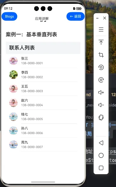
效果演示
一、List组件进阶特性
在基础篇中,我们已经学习了如何创建一个简单的垂直联系人列表。在本篇教程中,我们将深入探讨List组件的进阶特性,包括列表交互、状态管理、样式定制等方面。
1.1 List组件的进阶属性
| 属性 | 说明 | 用途 |
|---|---|---|
| scrollBar | 设置滚动条样式 | 控制滚动条的显示和外观 |
| edgeEffect | 设置边缘效果 | 控制列表到达边缘时的视觉反馈 |
| chainAnimation | 设置链式动画 | 控制列表项的连锁动画效果 |
| multiSelectable | 设置多选模式 | 允许用户选择多个列表项 |
| sticky | 设置吸顶效果 | 使特定列表项在滚动时保持在顶部 |
| cachedCount | 设置缓存数量 | 控制预加载的列表项数量 |
1.2 ListItem的进阶特性
| 特性 | 说明 | 用途 |
|---|---|---|
| selectable | 设置是否可选 | 控制列表项是否可被选中 |
| selected | 设置选中状态 | 控制列表项的选中状态 |
| swipeAction | 设置滑动操作 | 实现滑动显示操作按钮的功能 |
二、联系人列表的交互增强
在基础版本的联系人列表基础上,我们可以添加更多的交互功能,使列表更加实用和用户友好。
2.1 添加列表项选中效果
我们可以为联系人列表项添加选中效果,当用户点击列表项时,该项会显示为选中状态:
@Component
export struct AdvancedVerticalList {
    // 联系人数据
    private contacts:ContactType[] = [...] // 与基础版相同

    // 当前选中的联系人索引
    @State selectedIndex: number = -1

    build() {
        Column() {
            // 标题栏(与基础版相同)

            // 联系人列表
            List() {
                ForEach(this.contacts, (contact:ContactType, index: number) => {
                    ListItem() {
                        Row() {
                            // 头像和联系人信息(与基础版相同)
                        }
                        .width('100%')
                        .padding({ left: 16, right: 16, top: 12, bottom: 12 })
                        .backgroundColor(this.selectedIndex === index ? '#F0F0F0' : '#FFFFFF')
                    }
                    .height(64)
                    .onClick(() => {
                        this.selectedIndex = index
                        // 可以在这里添加其他操作,如显示详情等
                    })
                })
            }
            // List属性设置(与基础版相同)
        }
        // Column属性设置(与基础版相同)
    }
}
在这个示例中:
- 添加了一个@State装饰的selectedIndex状态变量,用于跟踪当前选中的联系人索引
- 在Row组件上添加了backgroundColor属性,根据selectedIndex动态设置背景色
- 为ListItem添加了onClick事件处理函数,点击时更新selectedIndex
2.2 实现列表项滑动操作
在移动应用中,滑动列表项显示操作按钮是一种常见的交互模式。我们可以使用ListItem的swipeAction属性来实现这一功能:
ListItem() {
    Row() {
        // 头像和联系人信息(与基础版相同)
    }
    .width('100%')
    .padding({ left: 16, right: 16, top: 12, bottom: 12 })
}
.height(64)
.swipeAction({
    end: this.getDeleteButton(index),  // 右侧滑出的删除按钮
    start: this.getCallButton(index)   // 左侧滑出的拨打电话按钮
})
其中,getDeleteButton和getCallButton是自定义的Builder函数:
@Builder getDeleteButton(index: number) {
    Button({
        type: ButtonType.Capsule
    }) {
        Image($r('app.media.ic_delete'))
            .width(24)
            .height(24)
    }
    .width(40)
    .height(40)
    .backgroundColor('#FF4081')
    .margin(12)
    .onClick(() => {
        // 实现删除联系人的逻辑
        this.contacts.splice(index, 1)
    })
}

@Builder getCallButton(index: number) {
    Button({
        type: ButtonType.Capsule
    }) {
        Image($r('app.media.ic_call'))
            .width(24)
            .height(24)
    }
    .width(40)
    .height(40)
    .backgroundColor('#4CAF50')
    .margin(12)
    .onClick(() => {
        // 实现拨打电话的逻辑
        console.info(`拨打电话:${this.contacts[index].phone}`)
    })
}
2.3 添加列表滚动控制
我们可以添加控制列表滚动的功能,例如滚动到顶部或特定位置:
@Component
export struct AdvancedVerticalList {
    // 联系人数据和状态变量

    // 列表控制器
    private listController: ListController = new ListController()

    build() {
        Column() {
            // 标题栏
            Row() {
                Text('联系人列表')
                    .fontSize(24)
                    .fontWeight(FontWeight.Bold)

                Blank()

                Button('回到顶部')
                    .fontSize(14)
                    .onClick(() => {
                        this.listController.scrollTo(0)
                    })
            }
            .width('100%')
            .height(56)
            .padding({ left: 16, right: 16 })
            .backgroundColor('#F1F3F5')

            // 联系人列表
            List({ space: 0, controller: this.listController }) {
                // 列表内容(与之前相同)
            }
            // List属性设置(与基础版相同)
        }
        // Column属性设置(与基础版相同)
    }
}
在这个示例中:
- 创建了一个ListController实例,用于控制列表的滚动
- 在List组件的构造参数中传入controller
- 在标题栏添加了一个"回到顶部"按钮,点击时调用scrollTo方法滚动到列表顶部
三、列表样式进阶定制
除了基本的样式设置外,我们还可以对列表进行更多的样式定制,使其更加美观和符合应用的设计风格。
3.1 自定义滚动条
List() {
    // 列表内容
}
.width('100%')
.layoutWeight(1)
.divider({
    strokeWidth: 1,
    color: '#E5E5E5',
    startMargin: 72,
    endMargin: 16
})
.scrollBar({
    width: 4,
    color: '#66000000',
    shape: ScrollBarShape.Rectangle
})
滚动条配置说明:
| 属性 | 值 | 说明 |
|---|---|---|
| width | 4 | 滚动条宽度为4像素 |
| color | '#66000000' | 滚动条颜色为半透明黑色 |
| shape | ScrollBarShape.Rectangle | 滚动条形状为矩形 |
3.2 自定义边缘效果
List() {
    // 列表内容
}
.width('100%')
.layoutWeight(1)
.divider({
    strokeWidth: 1,
    color: '#E5E5E5',
    startMargin: 72,
    endMargin: 16
})
.edgeEffect(EdgeEffect.Spring) // 设置边缘效果为弹簧效果
EdgeEffect枚举值说明:
| 值 | 说明 |
|---|---|
| EdgeEffect.Spring | 弹簧效果,列表会有回弹动画 |
| EdgeEffect.None | 无效果 |
| EdgeEffect.Fade | 淡出效果 |
3.3 链式动画效果
List() {
    // 列表内容
}
.width('100%')
.layoutWeight(1)
.divider({
    strokeWidth: 1,
    color: '#E5E5E5',
    startMargin: 72,
    endMargin: 16
})
.chainAnimation(true) // 启用链式动画
启用链式动画后,列表项会在滚动时产生连锁的动画效果,增强视觉体验。
四、列表状态管理
在实际应用中,列表的状态管理是一个重要的方面,包括数据的增删改查、选中状态管理等。
4.1 实现联系人搜索功能
我们可以添加一个搜索框,用于筛选联系人列表:
@Component
export struct AdvancedVerticalList {
    // 联系人数据
    private contacts:ContactType[] = [...] // 与基础版相同

    // 搜索关键词
    @State searchText: string = ''

    // 获取筛选后的联系人列表
    private getFilteredContacts(): ContactType[] {
        if (!this.searchText) {
            return this.contacts
        }

        return this.contacts.filter(contact =>
            contact.name.includes(this.searchText) ||
            contact.phone.includes(this.searchText)
        )
    }

    build() {
        Column() {
            // 标题栏
            Row() {
                Text('联系人列表')
                    .fontSize(24)
                    .fontWeight(FontWeight.Bold)
            }
            .width('100%')
            .height(56)
            .padding({ left: 16 })
            .backgroundColor('#F1F3F5')

            // 搜索框
            TextInput({ placeholder: '搜索联系人', text: this.searchText })
                .width('90%')
                .height(40)
                .margin({ top: 8, bottom: 8 })
                .onChange((value: string) => {
                    this.searchText = value
                })

            // 联系人列表
            List() {
                ForEach(this.getFilteredContacts(), (contact:ContactType, index: number) => {
                    // 列表项内容(与基础版相同)
                })
            }
            // List属性设置(与基础版相同)
        }
        // Column属性设置(与基础版相同)
    }
}
在这个示例中:
- 添加了一个@State装饰的searchText状态变量,用于存储搜索关键词
- 添加了getFilteredContacts方法,根据searchText筛选联系人
- 在Column中添加了TextInput组件作为搜索框
- 在ForEach中使用getFilteredContacts()替代原来的this.contacts
4.2 实现联系人分组
在大型联系人列表中,通常会按照字母或其他规则对联系人进行分组。我们可以使用ListItemGroup组件来实现这一功能:
@Component
export struct AdvancedVerticalList {
    // 联系人数据(按首字母排序)
    private contacts:ContactType[] = [...] // 与基础版相同,但已排序

    // 获取分组后的联系人数据
    private getGroupedContacts(): { [key: string]: ContactType[] } {
        const grouped: { [key: string]: ContactType[] } = {}

        this.contacts.forEach(contact => {
            const firstLetter = contact.name.charAt(0).toUpperCase()
            if (!grouped[firstLetter]) {
                grouped[firstLetter] = []
            }
            grouped[firstLetter].push(contact)
        })

        return grouped
    }

    build() {
        Column() {
            // 标题栏(与基础版相同)

            // 联系人列表(分组显示)
            List() {
                ForEach(Object.keys(this.getGroupedContacts()).sort(), (letter: string) => {
                    ListItemGroup({
                        header: this.getGroupHeader(letter)
                    }) {
                        ForEach(this.getGroupedContacts()[letter], (contact:ContactType) => {
                            ListItem() {
                                // 列表项内容(与基础版相同)
                            }
                            .height(64)
                        })
                    }
                })
            }
            // List属性设置(与基础版相同)
        }
        // Column属性设置(与基础版相同)
    }

    @Builder getGroupHeader(letter: string) {
        Text(letter)
            .fontSize(16)
            .fontWeight(FontWeight.Bold)
            .backgroundColor('#F0F0F0')
            .width('100%')
            .padding(8)
    }
}
在这个示例中:
- 添加了getGroupedContacts方法,将联系人按首字母分组
- 使用ForEach遍历分组的键(字母)
- 对每个字母组使用ListItemGroup组件
- 使用getGroupHeader Builder函数创建组标题
总结
在本篇教程中,我们深入探讨了HarmonyOS NEXT的List组件的进阶特性和用法。我们学习了如何:
- 使用List和ListItem的进阶属性增强列表功能
- 添加列表项选中效果和滑动操作
- 实现列表滚动控制
- 自定义列表样式,包括滚动条、边缘效果和链式动画
- 实现联系人搜索和分组功能
00
