144.[HarmonyOS NEXT 实战案例十:List系列] 字母索引列表组件实战:打造高效联系人应用 进阶篇
2025-06-30 22:19:03
316次阅读
0个评论
[HarmonyOS NEXT 实战案例十:List系列] 字母索引列表组件实战:打造高效联系人应用 进阶篇
项目已开源,开源地址: https://gitcode.com/nutpi/HarmonyosNextCaseStudyTutorial , 欢迎fork & star
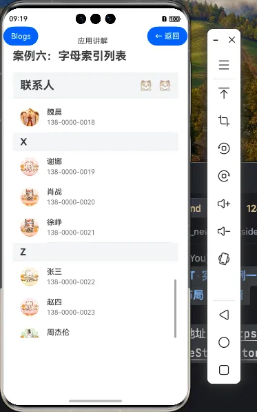
效果演示
一、字母索引列表进阶功能
在基础篇中,我们学习了如何使用ListItemGroup和AlphabetIndexer组件创建基本的字母索引列表。本篇教程将深入探讨字母索引列表的进阶功能,包括自定义样式、交互优化和高级功能实现,帮助你打造更加专业和用户友好的联系人应用。
1.1 进阶功能概览
| 功能类别 | 具体功能 |
|---|---|
| 样式定制 | 自定义索引器样式、分组头部粘性效果、列表项动画效果 |
| 交互优化 | 索引器触摸反馈、滑动优化、快速滚动 |
| 高级功能 | 搜索过滤、多选操作、分组折叠展开、空状态处理 |
| 性能优化 | 懒加载、复用机制 |
二、样式定制
2.1 自定义索引器样式
AlphabetIndexer组件提供了丰富的样式定制选项,可以根据应用的设计风格进行个性化定制:
AlphabetIndexer({
    arrayValue: this.indexLetters,
    selected: this.currentIndex
})
    .itemSize(20) // 调整索引项大小
    .font({ size: 14, weight: FontWeight.Normal }) // 普通字体
    .selectedFont({ size: 18, weight: FontWeight.Bold }) // 选中字体
    .popupFont({ size: 32, weight: FontWeight.Bold }) // 弹出提示字体
    .selectedColor('#FF5722') // 选中文字颜色
    .color('#666666') // 普通文字颜色
    .selectedBackgroundColor('#FBE9E7') // 选中背景色
    .popupColor('#FF5722') // 弹出提示颜色
    .alignStyle(IndexerAlign.Right) // 对齐方式
    .borderRadius(10) // 边框圆角
    .backgroundColor('#F5F5F5') // 背景色
    .padding({ top: 4, bottom: 4 }) // 内边距
    .margin({ right: 12 }) // 外边距
    .usingPopup(true) // 启用弹出提示
2.2 分组头部粘性效果
为了提升用户体验,我们可以为分组头部添加粘性效果,使其在滚动时保持在视图顶部:
List({ scroller: this.scroller }) {
    ForEach(this.contactGroups, (group:AlphabetIndexerType, groupIndex) => {
        ListItemGroup({
            header: this.GroupHeader(group.key),
            space: 0,
            sticky: StickyStyle.Header // 设置粘性头部
        }) {
            // 列表项内容
        }
    })
}
2.3 自定义分组头部样式
我们可以为分组头部添加更多样式和交互效果:
@Builder
GroupHeader(key: string) {
    Row() {
        Text(key)
            .fontSize(20)
            .fontWeight(FontWeight.Bold)
            .fontColor('#333333')

        Blank()

        Text(`${this.getContactCountByKey(key)}个联系人`)
            .fontSize(14)
            .fontColor('#999999')
    }
    .width('100%')
    .height(40)
    .backgroundColor('#F1F3F5')
    .padding({ left: 16, right: 16 })
    .borderRadius({ topLeft: 8, topRight: 8 })
}

// 获取指定分组的联系人数量
private getContactCountByKey(key: string): number {
    const group = this.contactGroups.find(item => item.key === key)
    return group ? group.contacts.length : 0
}
2.4 列表项动画效果
为列表项添加动画效果,可以提升用户体验:
ListItem() {
    Row() {
        // 联系人项内容
    }
}
.height(64)
.stateStyles({
    pressed: {
        .backgroundColor('#F0F0F0')
        .scale({ x: 0.98, y: 0.98 })
    }
})
.transition({ type: TransitionType.All, opacity: 0.2 }) // 添加过渡动画
三、交互优化
3.1 索引器触摸反馈
为了提供更好的触摸反馈,我们可以优化索引器的选择事件处理:
AlphabetIndexer({
    // 基本配置
})
.onSelect((index: number) => {
    // 更新当前索引
    this.currentIndex = index

    // 滚动到对应位置
    this.scroller.scrollToIndex(index)

    // 添加触觉反馈
    vibrator.vibrate({
        type: VibrationType.EFFECT_TICK,
        duration: 10
    })

    // 显示提示信息
    this.showToast(`跳转到${this.indexLetters[index]}组`)
})

// 显示提示信息
private showToast(message: string) {
    if (this.toastController) {
        this.toastController.close()
    }
    this.toastController = new CustomToastController({
        message: message,
        duration: 1000,
        bottom: 100
    })
    this.toastController.open()
}
3.2 滑动优化
优化列表的滑动体验,添加滚动效果和边缘效果:
List({ scroller: this.scroller }) {
    // 列表内容
}
.width('100%')
.layoutWeight(1)
.edgeEffect(EdgeEffect.Spring) // 边缘效果
.friction(0.6) // 摩擦系数
.scrollBar(BarState.Auto) // 滚动条
.scrollBarColor('#CCCCCC') // 滚动条颜色
.scrollBarWidth(4) // 滚动条宽度
.onScroll((offset: number) => {
    // 滚动事件处理
    console.info('List scroll offset: ' + offset)
})
3.3 快速滚动
实现快速滚动到顶部或底部的功能:
// 添加快速滚动按钮
Button() {
    Image($r('app.media.ic_top'))
        .width(24)
        .height(24)
}
.width(40)
.height(40)
.circle(true)
.position({ x: '85%', y: '85%' })
.backgroundColor('#007DFF')
.opacity(this.showTopButton ? 1 : 0) // 根据滚动位置显示或隐藏
.onClick(() => {
    // 滚动到顶部
    this.scroller.scrollEdge(Edge.Top)
})

// 监听滚动位置决定是否显示回到顶部按钮
@State showTopButton: boolean = false

List({ scroller: this.scroller }) {
    // 列表内容
}
.onScroll((offset: number) => {
    // 当滚动偏移超过一定值时显示回到顶部按钮
    this.showTopButton = offset > 200
})
四、高级功能实现
4.1 搜索过滤功能
添加搜索功能,实现联系人的快速查找:
// 添加搜索状态和过滤后的数据
@State searchText: string = ''
@State filteredGroups: AlphabetIndexerType[] = []

// 搜索框组件
@Builder
SearchBar() {
    Row() {
        Image($r('app.media.ic_search'))
            .width(20)
            .height(20)
            .margin({ right: 8 })

        TextInput({ placeholder: '搜索联系人', text: this.searchText })
            .fontSize(16)
            .backgroundColor(Color.Transparent)
            .placeholderColor('#999999')
            .width('100%')
            .height(36)
            .onChange((value: string) => {
                this.searchText = value
                this.filterContacts()
            })
    }
    .width('100%')
    .padding({ left: 12, right: 12 })
    .borderRadius(18)
    .backgroundColor('#F5F5F5')
}

// 过滤联系人
private filterContacts() {
    if (!this.searchText) {
        this.filteredGroups = this.contactGroups
        return
    }

    const result: AlphabetIndexerType[] = []

    this.contactGroups.forEach(group => {
        const filteredContacts = group.contacts.filter(contact =>
            contact.name.toLowerCase().includes(this.searchText.toLowerCase()) ||
            contact.phone.includes(this.searchText)
        )

        if (filteredContacts.length > 0) {
            result.push({
                key: group.key,
                contacts: filteredContacts
            })
        }
    })

    this.filteredGroups = result
}

// 在build方法中使用过滤后的数据
build() {
    Stack({ alignContent: Alignment.TopEnd }) {
        Column() {
            // 标题栏
            Row() {
                // 标题内容
            }

            // 搜索栏
            this.SearchBar()
                .margin({ left: 16, right: 16, top: 8, bottom: 8 })

            // 联系人列表,使用过滤后的数据
            List({ scroller: this.scroller }) {
                ForEach(this.filteredGroups, (group, index) => {
                    // 列表内容
                })
            }
        }

        // 字母索引器
        AlphabetIndexer({
            arrayValue: this.filteredGroups.map(group => group.key),
            selected: this.currentIndex
        })
    }
}
4.2 多选操作功能
实现联系人的多选操作,如批量删除、添加到分组等:
// 添加多选状态
@State isMultiSelectMode: boolean = false
@State selectedContacts: Set<string> = new Set()

// 多选模式下的列表项
@Builder
ContactItemInMultiSelectMode(contact: ContactType) {
    Row() {
        Checkbox()
            .select(this.selectedContacts.has(contact.name))
            .onChange((value: boolean) => {
                if (value) {
                    this.selectedContacts.add(contact.name)
                } else {
                    this.selectedContacts.delete(contact.name)
                }
                // 强制更新
                this.selectedContacts = new Set(this.selectedContacts)
            })
            .margin({ right: 16 })

        // 联系人信息
        Row() {
            // 头像和信息
        }
    }
    .width('100%')
    .padding(16)
}

// 多选操作栏
@Builder
MultiSelectActionBar() {
    Row() {
        Button('取消')
            .onClick(() => {
                this.isMultiSelectMode = false
                this.selectedContacts.clear()
            })

        Text(`已选择${this.selectedContacts.size}个联系人`)
            .fontSize(16)
            .fontColor('#666666')

        Button('删除')
            .onClick(() => {
                // 删除选中的联系人
                this.deleteSelectedContacts()
            })
    }
    .width('100%')
    .height(56)
    .padding({ left: 16, right: 16 })
    .backgroundColor('#FFFFFF')
    .justifyContent(FlexAlign.SpaceBetween)
}

// 删除选中的联系人
private deleteSelectedContacts() {
    // 实现删除逻辑
    this.contactGroups.forEach(group => {
        group.contacts = group.contacts.filter(contact =>
            !this.selectedContacts.has(contact.name)
        )
    })

    // 移除空分组
    this.contactGroups = this.contactGroups.filter(group =>
        group.contacts.length > 0
    )

    // 更新过滤后的数据
    this.filterContacts()

    // 退出多选模式
    this.isMultiSelectMode = false
    this.selectedContacts.clear()
}
4.3 分组折叠展开功能
实现分组的折叠和展开功能:
// 添加分组折叠状态
@State collapsedGroups: Set<string> = new Set()

// 更新分组头部,添加折叠/展开按钮
@Builder
GroupHeader(key: string) {
    Row() {
        Text(key)
            .fontSize(20)
            .fontWeight(FontWeight.Bold)

        Blank()

        Text(`${this.getContactCountByKey(key)}个联系人`)
            .fontSize(14)
            .fontColor('#999999')
            .margin({ right: 8 })

        Image(this.collapsedGroups.has(key) ?
            $r('app.media.ic_expand') : $r('app.media.ic_collapse'))
            .width(20)
            .height(20)
    }
    .width('100%')
    .height(40)
    .backgroundColor('#F1F3F5')
    .padding({ left: 16, right: 16 })
    .onClick(() => {
        // 切换折叠状态
        if (this.collapsedGroups.has(key)) {
            this.collapsedGroups.delete(key)
        } else {
            this.collapsedGroups.add(key)
        }
        // 强制更新
        this.collapsedGroups = new Set(this.collapsedGroups)
    })
}

// 在ListItemGroup中根据折叠状态显示或隐藏内容
ListItemGroup({
    header: this.GroupHeader(group.key),
    space: 0,
    sticky: StickyStyle.Header,
    // 根据折叠状态设置初始折叠状态
    initialExpand: !this.collapsedGroups.has(group.key)
}) {
    // 列表项内容
}
4.4 空状态处理
处理没有联系人或搜索结果为空的情况:
build() {
    Stack({ alignContent: Alignment.TopEnd }) {
        Column() {
            // 标题栏和搜索栏

            if (this.filteredGroups.length > 0) {
                // 显示联系人列表
                List({ scroller: this.scroller }) {
                    // 列表内容
                }
            } else {
                // 显示空状态
                Column() {
                    Image($r('app.media.ic_empty'))
                        .width(120)
                        .height(120)
                        .margin({ top: 100, bottom: 16 })

                    Text(this.searchText ? '未找到匹配的联系人' : '暂无联系人')
                        .fontSize(16)
                        .fontColor('#999999')

                    if (this.searchText) {
                        Button('清除搜索')
                            .margin({ top: 16 })
                            .onClick(() => {
                                this.searchText = ''
                                this.filterContacts()
                            })
                    } else {
                        Button('添加联系人')
                            .margin({ top: 16 })
                            .onClick(() => {
                                // 添加联系人逻辑
                            })
                    }
                }
                .width('100%')
                .layoutWeight(1)
                .justifyContent(FlexAlign.Center)
                .alignItems(HorizontalAlign.Center)
            }
        }

        // 字母索引器,仅在有数据时显示
        if (this.filteredGroups.length > 0) {
            AlphabetIndexer({
                // 索引器配置
            })
        }
    }
}
五、完整代码结构
以下是进阶版字母索引列表的完整代码结构:
@Component
export struct AdvancedAlphabetIndexerList {
    private scroller: Scroller = new Scroller()
    @State currentIndex: number = 0
    @State searchText: string = ''
    @State filteredGroups: AlphabetIndexerType[] = []
    @State isMultiSelectMode: boolean = false
    @State selectedContacts: Set<string> = new Set()
    @State collapsedGroups: Set<string> = new Set()
    @State showTopButton: boolean = false
    private toastController: CustomToastController = null

    // 联系人数据
    private contactGroups: AlphabetIndexerType[] = [
        // 数据定义
    ]

    aboutToAppear() {
        // 初始化过滤后的数据
        this.filteredGroups = this.contactGroups
    }

    // 获取索引字母数组
    private get indexLetters(): string[] {
        return this.filteredGroups.map(group => group.key)
    }

    // 获取指定分组的联系人数量
    private getContactCountByKey(key: string): number {
        const group = this.contactGroups.find(item => item.key === key)
        return group ? group.contacts.length : 0
    }

    // 过滤联系人
    private filterContacts() {
        // 过滤逻辑
    }

    // 删除选中的联系人
    private deleteSelectedContacts() {
        // 删除逻辑
    }

    // 显示提示信息
    private showToast(message: string) {
        // 提示逻辑
    }

    // 构建器定义
    @Builder
    GroupHeader(key: string) {
        // 分组头部实现
    }

    @Builder
    SearchBar() {
        // 搜索栏实现
    }

    @Builder
    ContactItem(contact: ContactType) {
        // 普通模式下的联系人项
    }

    @Builder
    ContactItemInMultiSelectMode(contact: ContactType) {
        // 多选模式下的联系人项
    }

    @Builder
    MultiSelectActionBar() {
        // 多选操作栏实现
    }

    build() {
        Stack({ alignContent: Alignment.TopEnd }) {
            Column() {
                // 标题栏
                Row() {
                    Text('联系人')
                        .fontSize(24)
                        .fontWeight(FontWeight.Bold)

                    Blank()

                    if (!this.isMultiSelectMode) {
                        Button() {
                            Image($r('app.media.ic_more'))
                                .width(24)
                                .height(24)
                        }
                        .type(ButtonType.Circle)
                        .backgroundColor(Color.Transparent)
                        .onClick(() => {
                            this.isMultiSelectMode = true
                        })
                    }
                }
                .width('100%')
                .height(56)
                .padding({ left: 16, right: 16 })

                // 搜索栏
                this.SearchBar()
                    .margin({ left: 16, right: 16, top: 8, bottom: 8 })

                // 联系人列表或空状态
                if (this.filteredGroups.length > 0) {
                    List({ scroller: this.scroller }) {
                        ForEach(this.filteredGroups, (group, groupIndex) => {
                            ListItemGroup({
                                header: this.GroupHeader(group.key),
                                space: 0,
                                sticky: StickyStyle.Header,
                                initialExpand: !this.collapsedGroups.has(group.key)
                            }) {
                                ForEach(group.contacts, (contact) => {
                                    ListItem() {
                                        if (this.isMultiSelectMode) {
                                            this.ContactItemInMultiSelectMode(contact)
                                        } else {
                                            this.ContactItem(contact)
                                        }
                                    }
                                    .height(64)
                                    .stateStyles({
                                        pressed: {
                                            .backgroundColor('#F0F0F0')
                                            .scale({ x: 0.98, y: 0.98 })
                                        }
                                    })
                                    .transition({ type: TransitionType.All, opacity: 0.2 })
                                })
                            }
                        })
                    }
                    .width('100%')
                    .layoutWeight(1)
                    .edgeEffect(EdgeEffect.Spring)
                    .scrollBar(BarState.Auto)
                    .scrollBarColor('#CCCCCC')
                    .scrollBarWidth(4)
                    .onScrollIndex((firstIndex: number) => {
                        this.currentIndex = firstIndex
                    })
                    .onScroll((offset: number) => {
                        this.showTopButton = offset > 200
                    })
                    .divider({
                        strokeWidth: 1,
                        color: '#E5E5E5',
                        startMargin: 72,
                        endMargin: 16
                    })
                } else {
                    // 空状态实现
                }
            }
            .width('100%')
            .height('100%')

            // 字母索引器,仅在有数据时显示
            if (this.filteredGroups.length > 0) {
                AlphabetIndexer({
                    arrayValue: this.indexLetters,
                    selected: this.currentIndex
                })
                    .itemSize(20)
                    .font({ size: 14 })
                    .selectedFont({ size: 18, weight: FontWeight.Bold })
                    .popupFont({ size: 32, weight: FontWeight.Bold })
                    .selectedColor('#FF5722')
                    .color('#666666')
                    .selectedBackgroundColor('#FBE9E7')
                    .popupColor('#FF5722')
                    .alignStyle(IndexerAlign.Right)
                    .borderRadius(10)
                    .backgroundColor('#F5F5F5')
                    .padding({ top: 4, bottom: 4 })
                    .margin({ right: 12 })
                    .usingPopup(true)
                    .onSelect((index: number) => {
                        this.currentIndex = index
                        this.scroller.scrollToIndex(index)
                        // 添加触觉反馈和提示
                    })
            }

            // 回到顶部按钮
            Button() {
                Image($r('app.media.ic_top'))
                    .width(24)
                    .height(24)
            }
            .width(40)
            .height(40)
            .circle(true)
            .position({ x: '85%', y: '85%' })
            .backgroundColor('#007DFF')
            .opacity(this.showTopButton ? 1 : 0)
            .onClick(() => {
                this.scroller.scrollEdge(Edge.Top)
            })
        }
        .width('100%')
        .height('100%')
        .backgroundColor('#FFFFFF')

        // 多选模式下显示底部操作栏
        if (this.isMultiSelectMode) {
            this.MultiSelectActionBar()
        }
    }
}
六、进阶功能要点总结
| 功能 | 实现要点 |
|---|---|
| 自定义索引器样式 | 使用AlphabetIndexer的样式属性进行定制,包括字体、颜色、大小等 |
| 分组头部粘性效果 | 使用ListItemGroup的sticky属性设置为StickyStyle.Header |
| 列表项动画效果 | 使用stateStyles和transition属性添加交互动画 |
| 索引器触摸反馈 | 在onSelect事件中添加触觉反馈和提示信息 |
| 滑动优化 | 使用edgeEffect、friction、scrollBar等属性优化滑动体验 |
| 快速滚动 | 添加回到顶部按钮,使用scroller.scrollEdge方法 |
| 搜索过滤 | 实现搜索逻辑,过滤联系人数据,更新UI显示 |
| 多选操作 | 添加多选模式状态,实现选择和批量操作功能 |
| 分组折叠展开 | 使用collapsedGroups状态和ListItemGroup的initialExpand属性 |
| 空状态处理 | 根据数据状态显示不同的UI,提供友好的用户提示 |
总结
在本篇教程中,我们深入探讨了HarmonyOS NEXT字母索引列表的进阶功能实现,包括样式定制、交互优化和高级功能。通过这些进阶功能,我们可以打造出更加专业和用户友好的联系人应用,提升用户体验。 字母索引列表是HarmonyOS NEXT应用中常见的UI模式,掌握其进阶用法对于开发高质量的应用至关重要。通过本教程的学习,你应该能够灵活运用ListItemGroup和AlphabetIndexer组件,实现各种复杂的列表需求,为用户提供流畅、高效的数据浏览体验。
00
