140.[HarmonyOS NEXT 实战案例八:List系列] 滑动操作列表组件实战:打造高效待办事项应用 进阶篇
[HarmonyOS NEXT 实战案例八:List系列] 滑动操作列表组件实战:打造高效待办事项应用 进阶篇
项目已开源,开源地址: https://gitcode.com/nutpi/HarmonyosNextCaseStudyTutorial , 欢迎fork & star
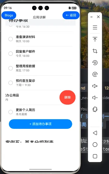
效果演示
一、滑动操作列表的进阶特性
在基础篇中,我们已经学习了如何创建基本的滑动操作列表。在本篇教程中,我们将深入探讨滑动操作列表的进阶特性,包括自定义滑动效果、滑动阈值设置、滑动事件监听等,帮助你构建更加强大和灵活的滑动操作列表。
1.1 滑动操作的进阶属性
| 属性 | 说明 | 用途 |
|---|---|---|
| edgeEffect | 滑动到边缘的效果 | 控制滑动到边缘时的视觉反馈 |
| swipeThreshold | 滑动阈值 | 设置触发滑动操作的阈值 |
| onSwipe | 滑动事件回调 | 监听滑动状态变化 |
1.2 滑动操作的交互模式
| 交互模式 | 说明 |
|---|---|
| 手动滑动 | 用户手动滑动列表项,显示操作按钮 |
| 自动关闭 | 点击操作按钮后自动关闭滑动区域 |
| 互斥滑动 | 一次只能滑动一个列表项,滑动新项目时自动关闭之前的项目 |
| 固定滑动 | 滑动超过阈值后自动展开到固定宽度 |
二、待办事项应用的进阶功能
在基础版本的待办事项应用基础上,我们可以添加更多的功能,使应用更加实用和用户友好。
2.1 分类显示待办事项
我们可以按照不同的分类显示待办事项,例如全部、未完成、已完成等:
@Entry
@Component
struct AdvancedSwipeActionList {
  // 待办事项数据
  private allTodoItems: TodoItem[] = todoData

  // 当前显示的待办事项
  @State todoItems: TodoItem[] = []

  // 当前选中的分类索引
  @State currentCategoryIndex: number = 0

  // 分类选项
  private categories: string[] = ['全部', '未完成', '已完成']

  // 根据分类筛选待办事项
  private filterTodoItems(categoryIndex: number) {
    switch (categoryIndex) {
      case 0: // 全部
        return this.allTodoItems
      case 1: // 未完成
        return this.allTodoItems.filter(item => !item.completed)
      case 2: // 已完成
        return this.allTodoItems.filter(item => item.completed)
      default:
        return this.allTodoItems
    }
  }

  aboutToAppear() {
    // 初始化显示全部待办事项
    this.todoItems = this.filterTodoItems(this.currentCategoryIndex)
  }

  build() {
    Column() {
      // 标题栏
      this.TitleBar()

      // 分类选择器
      this.CategorySelector()

      // 待办事项列表
      this.TodoList()
    }
    .width('100%')
    .height('100%')
    .backgroundColor('#F1F3F5')
  }

  @Builder TitleBar() {
    // 与基础版相同
  }

  @Builder CategorySelector() {
    Row() {
      ForEach(this.categories, (category: string, index: number) => {
        Text(category)
          .fontSize(14)
          .fontColor(this.currentCategoryIndex === index ? '#007DFF' : '#333333')
          .fontWeight(this.currentCategoryIndex === index ? FontWeight.Bold : FontWeight.Normal)
          .padding({ left: 16, right: 16, top: 8, bottom: 8 })
          .backgroundColor(this.currentCategoryIndex === index ? '#E6F2FF' : 'transparent')
          .borderRadius(16)
          .margin({ right: 8 })
          .onClick(() => {
            this.currentCategoryIndex = index
            this.todoItems = this.filterTodoItems(index)
          })
      })
    }
    .width('100%')
    .height(48)
    .padding({ left: 16 })
    .backgroundColor('#FFFFFF')
  }

  @Builder TodoList() {
    // 与基础版类似,但添加了互斥滑动逻辑
  }

  // 其他方法与基础版相同
}
在这个示例中:
- 添加了allTodoItems属性存储所有待办事项,todoItems状态变量存储当前显示的待办事项
- 添加了categories数组和currentCategoryIndex状态变量,用于管理分类
- 实现了filterTodoItems方法,根据分类索引筛选待办事项
- 添加了CategorySelector Builder方法,用于构建分类选择器UI
- 在分类选项的onClick事件中,更新currentCategoryIndex并重新筛选待办事项
2.2 实现互斥滑动
在实际应用中,通常希望一次只能滑动一个列表项,滑动新项目时自动关闭之前的项目。我们可以使用ListController和onSwipe事件来实现这一功能:
@Entry
@Component
struct AdvancedSwipeActionList {
  // 其他属性与方法

  // 列表控制器
  private listController: ListController = new ListController()

  // 当前打开的列表项索引
  @State openedItemIndex: number = -1

  @Builder TodoList() {
    List({ space: 8, controller: this.listController }) {
      ForEach(this.todoItems, (item: TodoItem, index: number) => {
        ListItem() {
          this.TodoItemView(item)
        }
        .swipeAction({
          end: this.getSwipeActionButtons(item),
          edgeEffect: SwipeEdgeEffect.Spring,
          onSwipe: (event: SwipeEvent) => {
            if (event.state === SwipeState.Opened) {
              // 如果有其他已打开的列表项,先关闭它
              if (this.openedItemIndex !== -1 && this.openedItemIndex !== index) {
                this.listController.closeSwipeAction(this.openedItemIndex)
              }
              // 更新当前打开的列表项索引
              this.openedItemIndex = index
            } else if (event.state === SwipeState.Closed) {
              // 如果当前列表项关闭,重置索引
              if (this.openedItemIndex === index) {
                this.openedItemIndex = -1
              }
            }
          }
        })
      })
    }
    .width('100%')
    .layoutWeight(1)
    .padding({ left: 16, right: 16 })
    .backgroundColor('#F1F3F5')
    .onClick(() => {
      // 点击列表空白区域时关闭所有滑动操作
      if (this.openedItemIndex !== -1) {
        this.listController.closeSwipeAction(this.openedItemIndex)
        this.openedItemIndex = -1
      }
    })
  }

  // 其他方法与基础版相同
}
在这个示例中:
- 添加了listController属性,用于控制列表的滑动操作
- 添加了openedItemIndex状态变量,用于跟踪当前打开的列表项索引
- 在swipeAction的onSwipe回调中,监听滑动状态变化,实现互斥滑动逻辑
- 在List的onClick事件中,点击列表空白区域时关闭所有滑动操作
2.3 自定义滑动阈值和效果
我们可以通过设置swipeThreshold属性来自定义滑动阈值,控制滑动操作的触发条件:
.swipeAction({
  end: this.getSwipeActionButtons(item),
  edgeEffect: SwipeEdgeEffect.Spring,
  swipeThreshold: 0.3, // 设置滑动阈值为30%
  onSwipe: (event: SwipeEvent) => {
    // 滑动事件处理
  }
})
通过设置edgeEffect属性,我们可以控制滑动到边缘时的视觉反馈:
.swipeAction({
  end: this.getSwipeActionButtons(item),
  edgeEffect: SwipeEdgeEffect.Spring, // 设置边缘效果为弹性效果
  // 其他属性
})
三、增强待办事项的交互体验
3.1 添加拖动排序功能
除了滑动操作外,我们还可以添加拖动排序功能,让用户可以通过拖动来调整待办事项的顺序:
@Entry
@Component
struct AdvancedSwipeActionList {
  // 其他属性与方法

  // 是否处于编辑模式
  @State isEditMode: boolean = false

  @Builder TitleBar() {
    Row() {
      Text('待办事项')
        .fontSize(24)
        .fontWeight(FontWeight.Bold)
        .layoutWeight(1)

      Button(this.isEditMode ? '完成' : '编辑')
        .fontSize(16)
        .fontColor('#007DFF')
        .backgroundColor('transparent')
        .margin({ right: 8 })
        .onClick(() => {
          this.isEditMode = !this.isEditMode
          // 退出编辑模式时关闭所有滑动操作
          if (!this.isEditMode && this.openedItemIndex !== -1) {
            this.listController.closeSwipeAction(this.openedItemIndex)
            this.openedItemIndex = -1
          }
        })

      Button() {
        Image($r('app.media.ic_add'))
          .width(24)
          .height(24)
      }
      .width(40)
      .height(40)
      .backgroundColor('#007DFF')
      .borderRadius(20)
      .onClick(() => {
        // 添加新待办事项的逻辑
      })
    }
    .width('100%')
    .height(56)
    .padding({ left: 16, right: 16 })
    .backgroundColor('#FFFFFF')
  }

  @Builder TodoList() {
    List({ space: 8, controller: this.listController }) {
      ForEach(this.todoItems, (item: TodoItem, index: number) => {
        ListItem() {
          Row() {
            if (this.isEditMode) {
              Image($r('app.media.ic_drag'))
                .width(24)
                .height(24)
                .margin({ right: 16 })
            }

            this.TodoItemView(item)
          }
          .width('100%')
        }
        .swipeAction({
          end: this.isEditMode ? null : this.getSwipeActionButtons(item),
          // 其他属性
        })
        .draggable(this.isEditMode) // 在编辑模式下启用拖动
      })
    }
    .width('100%')
    .layoutWeight(1)
    .padding({ left: 16, right: 16 })
    .backgroundColor('#F1F3F5')
    .onDragStart((event: DragEvent, extraParams: string) => {
      // 拖动开始事件处理
      return this.isEditMode
    })
    .onDrop((event: DragEvent, extraParams: string) => {
      // 拖动结束事件处理
      if (this.isEditMode) {
        let dragIndex = parseInt(extraParams.split(',')[0])
        let dropIndex = parseInt(extraParams.split(',')[1])

        // 调整待办事项顺序
        if (dragIndex !== dropIndex) {
          let item = this.todoItems[dragIndex]
          this.todoItems.splice(dragIndex, 1)
          this.todoItems.splice(dropIndex, 0, item)
          // 使用数组拷贝触发UI更新
          this.todoItems = [...this.todoItems]
        }
      }
    })
  }

  // 其他方法与基础版相同
}
在这个示例中:
- 添加了isEditMode状态变量,用于控制是否处于编辑模式
- 在TitleBar中添加了编辑/完成按钮,用于切换编辑模式
- 在编辑模式下,显示拖动图标,禁用滑动操作,启用拖动功能
- 实现了onDragStart和onDrop事件处理函数,用于处理拖动排序逻辑
3.2 添加批量操作功能
在编辑模式下,我们可以添加批量操作功能,让用户可以选择多个待办事项进行批量操作:
@Entry
@Component
struct AdvancedSwipeActionList {
  // 其他属性与方法

  // 选中的待办事项ID集合
  @State selectedIds: number[] = []

  // 是否全选
  @Computed get isAllSelected(): boolean {
    return this.todoItems.length > 0 && this.selectedIds.length === this.todoItems.length
  }

  // 切换全选状态
  private toggleSelectAll() {
    if (this.isAllSelected) {
      // 取消全选
      this.selectedIds = []
    } else {
      // 全选
      this.selectedIds = this.todoItems.map(item => item.id)
    }
  }

  // 切换单个待办事项的选中状态
  private toggleSelectItem(id: number) {
    let index = this.selectedIds.indexOf(id)
    if (index !== -1) {
      // 取消选中
      this.selectedIds.splice(index, 1)
    } else {
      // 选中
      this.selectedIds.push(id)
    }
    // 使用数组拷贝触发UI更新
    this.selectedIds = [...this.selectedIds]
  }

  // 批量删除选中的待办事项
  private deleteSelectedItems() {
    this.todoItems = this.todoItems.filter(item => !this.selectedIds.includes(item.id))
    this.allTodoItems = this.allTodoItems.filter(item => !this.selectedIds.includes(item.id))
    this.selectedIds = []
  }

  // 批量完成选中的待办事项
  private completeSelectedItems() {
    this.allTodoItems.forEach(item => {
      if (this.selectedIds.includes(item.id)) {
        item.completed = true
      }
    })
    // 更新当前显示的待办事项
    this.todoItems = this.filterTodoItems(this.currentCategoryIndex)
    this.selectedIds = []
  }

  @Builder TitleBar() {
    Row() {
      if (this.isEditMode) {
        Row() {
          Toggle({ type: ToggleType.Checkbox, isOn: this.isAllSelected })
            .width(24)
            .height(24)
            .margin({ right: 8 })
            .onChange(() => {
              this.toggleSelectAll()
            })

          Text(`已选择 ${this.selectedIds.length} 项`)
            .fontSize(16)
            .fontColor('#333333')
        }
        .layoutWeight(1)
      } else {
        Text('待办事项')
          .fontSize(24)
          .fontWeight(FontWeight.Bold)
          .layoutWeight(1)
      }

      Button(this.isEditMode ? '完成' : '编辑')
        .fontSize(16)
        .fontColor('#007DFF')
        .backgroundColor('transparent')
        .margin({ right: 8 })
        .onClick(() => {
          this.isEditMode = !this.isEditMode
          this.selectedIds = []
          // 退出编辑模式时关闭所有滑动操作
          if (!this.isEditMode && this.openedItemIndex !== -1) {
            this.listController.closeSwipeAction(this.openedItemIndex)
            this.openedItemIndex = -1
          }
        })

      if (!this.isEditMode) {
        Button() {
          Image($r('app.media.ic_add'))
            .width(24)
            .height(24)
        }
        .width(40)
        .height(40)
        .backgroundColor('#007DFF')
        .borderRadius(20)
        .onClick(() => {
          // 添加新待办事项的逻辑
        })
      }
    }
    .width('100%')
    .height(56)
    .padding({ left: 16, right: 16 })
    .backgroundColor('#FFFFFF')
  }

  @Builder TodoItemView(item: TodoItem) {
    Row() {
      if (this.isEditMode) {
        Toggle({ type: ToggleType.Checkbox, isOn: this.selectedIds.includes(item.id) })
          .width(24)
          .height(24)
          .margin({ right: 16 })
          .onChange(() => {
            this.toggleSelectItem(item.id)
          })
      } else {
        // 完成状态复选框(与基础版相同)
      }

      // 待办事项内容(与基础版相同)
    }
    .width('100%')
    .padding(16)
    .backgroundColor('#FFFFFF')
    .borderRadius(8)
  }

  @Builder BottomBar() {
    Row() {
      Button('删除')
        .width(120)
        .height(40)
        .fontSize(16)
        .fontColor('#FFFFFF')
        .backgroundColor('#FF0000')
        .borderRadius(20)
        .margin({ right: 16 })
        .enabled(this.selectedIds.length > 0)
        .opacity(this.selectedIds.length > 0 ? 1 : 0.5)
        .onClick(() => {
          this.deleteSelectedItems()
        })

      Button('标记为已完成')
        .width(160)
        .height(40)
        .fontSize(16)
        .fontColor('#FFFFFF')
        .backgroundColor('#4CAF50')
        .borderRadius(20)
        .enabled(this.selectedIds.length > 0)
        .opacity(this.selectedIds.length > 0 ? 1 : 0.5)
        .onClick(() => {
          this.completeSelectedItems()
        })
    }
    .width('100%')
    .height(64)
    .padding({ left: 16, right: 16 })
    .backgroundColor('#FFFFFF')
    .justifyContent(FlexAlign.Center)
  }

  build() {
    Column() {
      // 标题栏
      this.TitleBar()

      // 分类选择器(在非编辑模式下显示)
      if (!this.isEditMode) {
        this.CategorySelector()
      }

      // 待办事项列表
      this.TodoList()

      // 底部操作栏(在编辑模式下显示)
      if (this.isEditMode) {
        this.BottomBar()
      }
    }
    .width('100%')
    .height('100%')
    .backgroundColor('#F1F3F5')
  }
}
在这个示例中:
- 添加了selectedIds状态变量,用于存储选中的待办事项ID
- 添加了isAllSelected计算属性,用于判断是否全选
- 实现了toggleSelectAll和toggleSelectItem方法,用于切换全选和单选状态
- 实现了deleteSelectedItems和completeSelectedItems方法,用于批量删除和完成待办事项
- 在TitleBar中添加了全选复选框和已选择数量显示
- 在TodoItemView中添加了选择复选框
- 添加了BottomBar Builder方法,用于构建底部操作栏
3.3 添加滑动操作动画
我们可以为滑动操作添加动画效果,使交互更加流畅:
@Builder getSwipeActionButtons(item: TodoItem) {
  Row() {
    // 完成/取消完成按钮
    Button() {
      Column() {
        Image(item.completed ? $r('app.media.ic_undo') : $r('app.media.ic_check'))
          .width(24)
          .height(24)

        Text(item.completed ? '取消' : '完成')
          .fontSize(10)
          .fontColor('#FFFFFF')
          .margin({ top: 4 })
      }
      .width('100%')
      .height('100%')
      .justifyContent(FlexAlign.Center)
    }
    .width(80)
    .height('100%')
    .backgroundColor(item.completed ? '#FF9800' : '#4CAF50')
    .onClick(() => {
      // 更新待办事项完成状态
      this.updateTodoStatus(item.id, !item.completed)
      // 关闭滑动操作
      if (this.openedItemIndex !== -1) {
        this.listController.closeSwipeAction(this.openedItemIndex)
        this.openedItemIndex = -1
      }
    })
    .transition({ type: TransitionType.Insert, opacity: 0, translate: { x: 80 } })
    .transition({ type: TransitionType.Delete, opacity: 0, translate: { x: 80 } })

    // 删除按钮
    Button() {
      Column() {
        Image($r('app.media.ic_delete'))
          .width(24)
          .height(24)

        Text('删除')
          .fontSize(10)
          .fontColor('#FFFFFF')
          .margin({ top: 4 })
      }
      .width('100%')
      .height('100%')
      .justifyContent(FlexAlign.Center)
    }
    .width(80)
    .height('100%')
    .backgroundColor('#FF0000')
    .onClick(() => {
      // 删除待办事项
      this.deleteTodoItem(item.id)
      // 关闭滑动操作
      if (this.openedItemIndex !== -1) {
        this.openedItemIndex = -1
      }
    })
    .transition({ type: TransitionType.Insert, opacity: 0, translate: { x: 80 } })
    .transition({ type: TransitionType.Delete, opacity: 0, translate: { x: 80 } })
  }
  .transition({ type: TransitionType.All, opacity: 1, translate: { x: 0 }, scale: { x: 1, y: 1 }, rotate: { z: 0 } })
}
在这个示例中:
- 为操作按钮添加了Insert和Delete过渡效果,使按钮在显示和隐藏时有淡入淡出和平移效果
- 为整个Row容器添加了All过渡效果,使所有属性变化都有动画效果
- 在按钮的onClick事件中,添加了关闭滑动操作的逻辑
四、待办事项的高级功能
4.1 添加待办事项优先级
我们可以为待办事项添加优先级功能,让用户可以设置不同的优先级:
// 优先级枚举
enum Priority {
  Low = 0,
  Medium = 1,
  High = 2
}

// 待办事项类型定义
export class TodoItem {
  // 其他属性

  // 优先级
  priority: Priority = Priority.Medium

  constructor(id: number, title: string, description: string = '', completed: boolean = false, priority: Priority = Priority.Medium, dueDate?: Date) {
    // 其他属性初始化
    this.priority = priority
  }
}

// 在TodoItemView中显示优先级
@Builder TodoItemView(item: TodoItem) {
  Row() {
    // 复选框

    // 待办事项内容
    Column() {
      Row() {
        // 优先级标签
        Text(this.getPriorityText(item.priority))
          .fontSize(12)
          .fontColor('#FFFFFF')
          .backgroundColor(this.getPriorityColor(item.priority))
          .borderRadius(4)
          .padding({ left: 6, right: 6, top: 2, bottom: 2 })
          .margin({ right: 8 })

        // 标题
        Text(item.title)
          .fontSize(16)
          .fontWeight(FontWeight.Medium)
          .decoration({ type: item.completed ? TextDecorationType.LineThrough : TextDecorationType.None })
          .fontColor(item.completed ? '#999999' : '#333333')
      }

      // 描述和截止日期
    }
    .layoutWeight(1)
    .alignItems(HorizontalAlign.Start)
  }
  .width('100%')
  .padding(16)
  .backgroundColor('#FFFFFF')
  .borderRadius(8)
}

// 获取优先级文本
private getPriorityText(priority: Priority): string {
  switch (priority) {
    case Priority.Low:
      return '低'
    case Priority.Medium:
      return '中'
    case Priority.High:
      return '高'
    default:
      return ''
  }
}

// 获取优先级颜色
private getPriorityColor(priority: Priority): string {
  switch (priority) {
    case Priority.Low:
      return '#8BC34A'
    case Priority.Medium:
      return '#FF9800'
    case Priority.High:
      return '#F44336'
    default:
      return ''
  }
}
在这个示例中:
- 定义了Priority枚举,表示待办事项的优先级
- 在TodoItem类中添加了priority属性
- 在TodoItemView中添加了优先级标签
- 实现了getPriorityText和getPriorityColor方法,用于获取优先级的文本和颜色
4.2 添加待办事项分组
我们可以使用ListItemGroup组件将待办事项按照不同的条件分组显示:
@Builder TodoList() {
  List({ space: 8, controller: this.listController }) {
    // 按照日期分组
    ListItemGroup({ header: this.getGroupHeader('今天') }) {
      ForEach(this.getTodayItems(), (item: TodoItem, index: number) => {
        ListItem() {
          this.TodoItemView(item)
        }
        .swipeAction({
          end: this.getSwipeActionButtons(item),
          // 其他属性
        })
      })
    }

    ListItemGroup({ header: this.getGroupHeader('未来') }) {
      ForEach(this.getFutureItems(), (item: TodoItem, index: number) => {
        ListItem() {
          this.TodoItemView(item)
        }
        .swipeAction({
          end: this.getSwipeActionButtons(item),
          // 其他属性
        })
      })
    }

    ListItemGroup({ header: this.getGroupHeader('无截止日期') }) {
      ForEach(this.getNoDateItems(), (item: TodoItem, index: number) => {
        ListItem() {
          this.TodoItemView(item)
        }
        .swipeAction({
          end: this.getSwipeActionButtons(item),
          // 其他属性
        })
      })
    }
  }
  .width('100%')
  .layoutWeight(1)
  .padding({ left: 16, right: 16 })
  .backgroundColor('#F1F3F5')
}

@Builder getGroupHeader(title: string) {
  Text(title)
    .fontSize(16)
    .fontWeight(FontWeight.Bold)
    .width('100%')
    .padding({ left: 16, top: 8, bottom: 8 })
    .backgroundColor('#F1F3F5')
}

// 获取今天的待办事项
private getTodayItems(): TodoItem[] {
  const today = new Date()
  today.setHours(0, 0, 0, 0)
  const tomorrow = new Date(today)
  tomorrow.setDate(tomorrow.getDate() + 1)

  return this.todoItems.filter(item => {
    if (!item.dueDate) {
      return false
    }
    const dueDate = new Date(item.dueDate)
    dueDate.setHours(0, 0, 0, 0)
    return dueDate >= today && dueDate < tomorrow
  })
}

// 获取未来的待办事项
private getFutureItems(): TodoItem[] {
  const tomorrow = new Date()
  tomorrow.setHours(0, 0, 0, 0)
  tomorrow.setDate(tomorrow.getDate() + 1)

  return this.todoItems.filter(item => {
    if (!item.dueDate) {
      return false
    }
    const dueDate = new Date(item.dueDate)
    dueDate.setHours(0, 0, 0, 0)
    return dueDate >= tomorrow
  })
}

// 获取无截止日期的待办事项
private getNoDateItems(): TodoItem[] {
  return this.todoItems.filter(item => !item.dueDate)
}
在这个示例中:
- 使用ListItemGroup组件将待办事项按照日期分组
- 实现了getGroupHeader Builder方法,用于构建分组标题
- 实现了getTodayItems、getFutureItems和getNoDateItems方法,用于获取不同日期的待办事项
总结
在本篇教程中,我们深入探讨了HarmonyOS NEXT的滑动操作列表的进阶特性和用法。通过这些进阶技巧,我们可以构建更加功能丰富、交互友好的待办事项应用。这些知识点不仅适用于待办事项应用,也可以应用到其他类型的滑动操作列表界面设计中,如邮件列表、聊天消息列表等。
