142.[HarmonyOS NEXT 实战案例九:List系列] 分组列表组件实战:打造分类设置菜单 进阶篇
2025-06-30 22:17:48
326次阅读
0个评论
[HarmonyOS NEXT 实战案例九:List系列] 分组列表组件实战:打造分类设置菜单 进阶篇
项目已开源,开源地址: https://gitcode.com/nutpi/HarmonyosNextCaseStudyTutorial , 欢迎fork & star
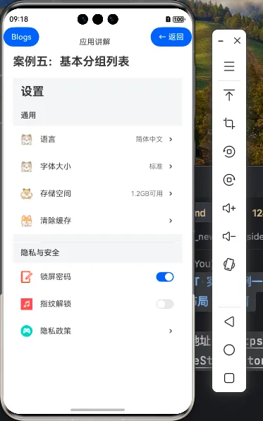
效果演示
一、ListItemGroup组件进阶特性
在基础篇中,我们已经学习了如何创建基本的分组设置菜单。在本篇教程中,我们将深入探讨ListItemGroup组件的进阶特性,包括交互功能、样式定制和状态管理等方面。
1.1 ListItemGroup进阶属性
| 属性 | 类型 | 说明 |
|---|---|---|
| sticky | boolean | 设置分组头部是否吸顶 |
| initialIndex | number | 设置初始展示的组索引 |
| divider | { strokeWidth?: number, color?: ResourceColor, startMargin?: number, endMargin?: number } |
设置分组内列表项之间的分割线样式 |
| header | @Builder | 自定义分组头部内容 |
| footer | @Builder | 自定义分组尾部内容 |
1.2 ListItemGroup与List组件的事件联动
ListItemGroup可以与List组件的多种事件结合使用,实现更丰富的交互效果:
| 事件 | 说明 |
|---|---|
| onScrollIndex | 监听列表滚动时的索引变化,可用于更新当前分组索引 |
| onGroupCollapse | 监听分组折叠事件(需自行实现折叠逻辑) |
| onGroupExpand | 监听分组展开事件(需自行实现展开逻辑) |
二、设置菜单的交互增强
2.1 添加分组折叠展开功能
我们可以为设置菜单添加分组折叠展开功能,让用户可以根据需要展开或折叠某个分组:
@State expandedGroups: Set<string> = new Set(['通用', '隐私与安全', '关于']) // 初始全部展开

// 切换分组展开状态
private toggleGroup(groupName: string) {
    if (this.expandedGroups.has(groupName)) {
        this.expandedGroups.delete(groupName)
    } else {
        this.expandedGroups.add(groupName)
    }
}

// 构建可折叠的分组头部
@Builder
CollapsibleGroupHeader(groupName: string) {
    Row() {
        Text(groupName)
            .fontSize(16)
            .fontWeight(FontWeight.Medium)
            .layoutWeight(1)

        // 展开/折叠图标
        Image(this.expandedGroups.has(groupName) ? $r('app.media.arrow_down') : $r('app.media.arrow_right'))
            .width(16)
            .height(16)
    }
    .width('100%')
    .backgroundColor('#F1F3F5')
    .padding({ left: 16, right: 16, top: 12, bottom: 12 })
    .onClick(() => this.toggleGroup(groupName))
}
然后在List中使用这个可折叠的头部:
List() {
    ForEach(this.settingsData, (group:SettingType) => {
        ListItemGroup({
            header: this.CollapsibleGroupHeader(group.groupName),
            footer: this.GroupFooter()
        }) {
            if (this.expandedGroups.has(group.groupName)) {
                ForEach(group.items, (item:ItemsType) => {
                    // 列表项内容(同基础篇)
                })
            }
        }
    })
}
2.2 添加设置项交互功能
我们可以为设置项添加点击事件和状态变化处理:
// 处理设置项点击
private handleItemClick(item: ItemsType) {
    // 根据不同设置项执行不同操作
    if (item.title === '清除缓存') {
        // 显示清除缓存确认对话框
        AlertDialog.show({
            title: '清除缓存',
            message: '确定要清除所有缓存吗?',
            primaryButton: {
                value: '取消',
                action: () => {}
            },
            secondaryButton: {
                value: '确定',
                action: () => {
                    // 执行清除缓存操作
                }
            }
        })
    } else if (item.rightText) {
        // 显示选项对话框
        // 这里可以根据不同设置项显示不同的对话框
    }
}

// 处理开关状态变化
private handleToggleChange(item: ItemsType, isOn: boolean) {
    // 更新开关状态
    item.toggle = isOn

    // 根据不同设置项执行不同操作
    if (item.title === '锁屏密码') {
        // 处理锁屏密码开关变化
    } else if (item.title === '指纹解锁') {
        // 处理指纹解锁开关变化
    }
}
然后在列表项中使用这些处理函数:
ListItem() {
    Row() {
        // 图标和标题(同基础篇)

        // 右侧文本或开关
        if (item.rightText) {
            Text(item.rightText)
                .fontSize(14)
                .fontColor('#666666')
                .margin({ right: 8 })
        }

        if (item.toggle !== undefined) {
            Toggle({ type: ToggleType.Switch, isOn: item.toggle })
                .onChange((isOn: boolean) => {
                    this.handleToggleChange(item, isOn)
                })
        } else {
            Image($r('app.media.arrowright'))
                .width(16)
                .height(16)
        }
    }
    .width('100%')
    .padding({ left: 16, right: 16, top: 12, bottom: 12 })
}
.height(56)
.onClick(() => {
    if (item.toggle === undefined) { // 不是开关类型的才响应点击
        this.handleItemClick(item)
    }
})
2.3 添加分组吸顶效果
我们可以为ListItemGroup添加sticky属性,实现分组头部吸顶效果:
ListItemGroup({
    header: this.CollapsibleGroupHeader(group.groupName),
    footer: this.GroupFooter(),
    sticky: true // 启用吸顶效果
}) {
    // 列表项内容
}
三、样式定制与优化
3.1 自定义分组样式
我们可以为不同的分组设置不同的样式,使界面更加丰富:
// 获取分组样式
private getGroupStyle(groupName: string) {
    switch (groupName) {
        case '通用':
            return {
                backgroundColor: '#F1F3F5',
                textColor: '#333333',
                iconColor: '#007DFF'
            }
        case '隐私与安全':
            return {
                backgroundColor: '#F5F1F1',
                textColor: '#D81B60',
                iconColor: '#D81B60'
            }
        case '关于':
            return {
                backgroundColor: '#F1F5F1',
                textColor: '#388E3C',
                iconColor: '#388E3C'
            }
        default:
            return {
                backgroundColor: '#F1F3F5',
                textColor: '#333333',
                iconColor: '#007DFF'
            }
    }
}

// 构建自定义样式的分组头部
@Builder
StyledGroupHeader(groupName: string) {
    const style = this.getGroupStyle(groupName)

    Row() {
        // 分组图标
        Circle({ width: 24, height: 24 })
            .fill(style.iconColor)
            .margin({ right: 8 })

        Text(groupName)
            .fontSize(16)
            .fontWeight(FontWeight.Medium)
            .fontColor(style.textColor)
    }
    .width('100%')
    .backgroundColor(style.backgroundColor)
    .padding({ left: 16, right: 16, top: 12, bottom: 12 })
}
3.2 列表项动画效果
我们可以为列表项添加动画效果,提升用户体验:
ListItem() {
    Row() {
        // 列表项内容(同上)
    }
    .width('100%')
    .padding({ left: 16, right: 16, top: 12, bottom: 12 })
    .borderRadius(8)
    .backgroundColor('#FFFFFF')
    .animation({
        duration: 300,
        curve: Curve.EaseOut,
        iterations: 1,
        playMode: PlayMode.Normal
    })
    .stateStyles({
        pressed: {
            .backgroundColor('#F0F0F0')
            .scale({ x: 0.98, y: 0.98 })
        },
        normal: {
            .backgroundColor('#FFFFFF')
            .scale({ x: 1.0, y: 1.0 })
        }
    })
}
.height(56)
.margin({ left: 8, right: 8, top: 4, bottom: 4 })
3.3 分组间距与分割线优化
我们可以优化分组之间的间距和分割线,使界面更加美观:
List() {
    ForEach(this.settingsData, (group:SettingType, index) => {
        ListItemGroup({
            header: this.StyledGroupHeader(group.groupName),
            footer: this.GroupFooter(),
            divider: { // 设置组内分割线
                strokeWidth: 1,
                color: '#E5E5E5',
                startMargin: 56,
                endMargin: 16
            }
        }) {
            // 列表项内容
        }

        // 添加分组间距(最后一个分组不添加)
        if (index < this.settingsData.length - 1) {
            Divider()
                .height(16)
                .color('transparent')
        }
    })
}
.width('100%')
.layoutWeight(1)
.listDirection(Axis.Vertical) // 确保垂直方向
.edgeEffect(EdgeEffect.Spring) // 添加边缘效果
.chainAnimation(true) // 启用链式动画
四、状态管理与数据处理
4.1 设置项状态管理
我们可以使用@State装饰器管理设置项的状态,实现数据的响应式更新:
@State settingsData: SettingType[] = [...] // 初始数据

// 更新设置项值
private updateSettingValue(groupName: string, itemTitle: string, newValue: string | boolean) {
    // 查找并更新设置项
    const groupIndex = this.settingsData.findIndex(group => group.groupName === groupName)
    if (groupIndex >= 0) {
        const itemIndex = this.settingsData[groupIndex].items.findIndex(item => item.title === itemTitle)
        if (itemIndex >= 0) {
            if (typeof newValue === 'string') {
                this.settingsData[groupIndex].items[itemIndex].rightText = newValue
            } else if (typeof newValue === 'boolean') {
                this.settingsData[groupIndex].items[itemIndex].toggle = newValue
            }
        }
    }
}
4.2 添加搜索功能
我们可以为设置菜单添加搜索功能,帮助用户快速找到所需的设置项:
@State searchText: string = ''
@State filteredData: SettingType[] = []

// 过滤设置项
private filterSettings() {
    if (!this.searchText) {
        this.filteredData = this.settingsData
        return
    }

    // 过滤包含搜索文本的设置项
    this.filteredData = this.settingsData.map(group => {
        const filteredItems = group.items.filter(item =>
            item.title.includes(this.searchText)
        )

        return filteredItems.length > 0 ?
            { groupName: group.groupName, items: filteredItems } :
            null
    }).filter(group => group !== null) as SettingType[]
}
然后在页面顶部添加搜索框:
Column() {
    // 标题栏
    Row() {
        Text('设置')
            .fontSize(24)
            .fontWeight(FontWeight.Bold)
    }
    .width('100%')
    .height(56)
    .padding({ left: 16 })
    .backgroundColor('#F1F3F5')

    // 搜索框
    Row() {
        Image($r('app.media.search'))
            .width(24)
            .height(24)
            .margin({ right: 8 })

        TextInput({ placeholder: '搜索设置项', text: this.searchText })
            .layoutWeight(1)
            .backgroundColor('transparent')
            .onChange((value: string) => {
                this.searchText = value
                this.filterSettings()
            })

        if (this.searchText) {
            Button() {
                Image($r('app.media.clear'))
                    .width(16)
                    .height(16)
            }
            .width(24)
            .height(24)
            .backgroundColor('transparent')
            .onClick(() => {
                this.searchText = ''
                this.filterSettings()
            })
        }
    }
    .width('100%')
    .height(48)
    .padding({ left: 16, right: 16 })
    .backgroundColor('#FFFFFF')
    .border({ width: { bottom: 1 }, color: '#E5E5E5' })

    // 设置列表(使用filteredData代替settingsData)
    // ...
}
4.3 设置项分类与排序
我们可以实现设置项的分类和排序功能,让用户可以自定义设置菜单的显示顺序:
// 设置项排序方式
enum SortOrder {
    DEFAULT,
    ALPHABETICAL,
    CUSTOM
}

@State sortOrder: SortOrder = SortOrder.DEFAULT
@State customOrder: string[] = [] // 自定义排序顺序

// 获取排序后的设置数据
private getSortedSettings(): SettingType[] {
    let result = [...this.filteredData]

    switch (this.sortOrder) {
        case SortOrder.ALPHABETICAL:
            // 按字母顺序排序
            result.forEach(group => {
                group.items.sort((a, b) => a.title.localeCompare(b.title))
            })
            break
        case SortOrder.CUSTOM:
            // 按自定义顺序排序
            if (this.customOrder.length > 0) {
                result.sort((a, b) =>
                    this.customOrder.indexOf(a.groupName) - this.customOrder.indexOf(b.groupName)
                )
            }
            break
        default:
            // 默认顺序,不做处理
            break
    }

    return result
}
总结
在本篇教程中,我们深入探讨了HarmonyOS NEXT的ListItemGroup组件的进阶特性和用法。通过这些进阶技巧,我们可以构建更加功能丰富、交互友好的分组设置菜单。这些知识点不仅适用于设置菜单,也可以应用到其他类型的分组列表界面设计中,如商品分类、文件管理等。
00
