175.[HarmonyOS NEXT 实战案例七:Grid] 嵌套网格布局基础篇:打造企业级仪表板界面
2025-06-30 22:58:04
370次阅读
0个评论
[HarmonyOS NEXT 实战案例七:Grid] 嵌套网格布局基础篇:打造企业级仪表板界面
项目已开源,开源地址: https://gitcode.com/nutpi/HarmonyosNextCaseStudyTutorial , 欢迎fork & star
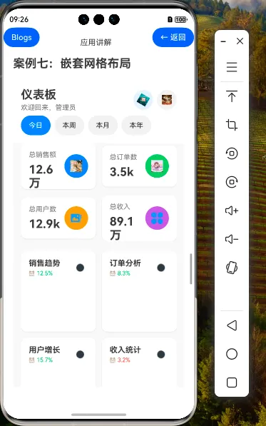
效果演示

1. 引言
在现代应用开发中,仪表板(Dashboard)界面是企业级应用的重要组成部分,它能够直观地展示关键数据和指标,帮助用户快速了解业务状况。HarmonyOS NEXT提供的Grid组件具有强大的布局能力,特别是通过嵌套使用,可以实现复杂的界面结构。本教程将详细讲解如何使用Grid组件的嵌套功能,打造一个功能完善、布局合理的企业级仪表板界面。
2. 数据模型设计
2.1 仪表板数据结构
在开始实现界面之前,我们需要设计合适的数据模型来支持仪表板的各个部分。以下是我们定义的数据接口:
interface DashboardData {
    overview: Overview;
    charts: Chart[];
    quickActions: QuickAction[];
    recentActivities: RecentActivity[];
}

interface Overview {
    totalSales: number;
    totalOrders: number;
    totalUsers: number;
    totalRevenue: number;
}

interface Chart {
    id: number;
    title: string;
    type: 'line' | 'bar' | 'area' | 'pie';
    data: number[];
    color: string;
    trend: 'up' | 'down';
    percentage: number;
}

interface QuickAction {
    id: number;
    title: string;
    icon: ResourceStr;
    color: string;
    count?: number; // 可选,部分项目没有计数
}

interface RecentActivity {
    id: number;
    title: string;
    description: string;
    time: string;
    type: 'user' | 'payment' | 'order' | 'system';
    icon: ResourceStr;
}
这些接口定义了仪表板的四个主要部分:
- 概览数据(Overview):包含总销售额、总订单数、总用户数和总收入等关键指标
- 图表数据(Charts):包含各种类型的图表,如销售趋势、订单分析等
- 快捷操作(QuickActions):提供常用功能的快速访问入口
- 最近活动(RecentActivities):显示系统中的最新动态
2.2 示例数据初始化
为了演示效果,我们初始化了一组示例数据:
@State dashboardData: DashboardData = {
    overview: {
        totalSales: 125680,
        totalOrders: 3456,
        totalUsers: 12890,
        totalRevenue: 890560
    },
    charts: [
        {
            id: 1,
            title: '销售趋势',
            type: 'line',
            data: [120, 150, 180, 200, 170, 220, 250],
            color: '#007AFF',
            trend: 'up',
            percentage: 12.5
        },
        // 其他图表数据...
    ],
    quickActions: [
        {
            id: 1,
            title: '新订单',
            icon: $r('app.media.big26'),
            color: '#007AFF',
            count: 23
        },
        // 其他快捷操作...
    ],
    recentActivities: [
        {
            id: 1,
            title: '新用户注册',
            description: '用户 张三 完成注册',
            time: '2分钟前',
            type: 'user',
            icon: $r('app.media.big19')
        },
        // 其他活动数据...
    ]
}
3. 辅助功能实现
3.1 数字格式化
为了更好地展示数据,我们实现了一个数字格式化函数,将大数字转换为更易读的形式:
formatNumber(num: number): string {
    if (num >= 100000) {
        return (num / 10000).toFixed(1) + '万'
    } else if (num >= 1000) {
        return (num / 1000).toFixed(1) + 'k'
    }
    return num.toString()
}
3.2 数据刷新功能
仪表板通常需要定期刷新数据,我们实现了一个简单的刷新功能:
@State refreshing: boolean = false

refreshData() {
    this.refreshing = true
    setTimeout(() => {
        this.refreshing = false
        console.log('数据刷新完成')
    }, 2000)
}
4. 组件构建器实现
为了实现界面的模块化和代码复用,我们使用@Builder装饰器创建了两个重要的构建器:
4.1 概览卡片构建器
@Builder
OverviewCard(title: string, value: number, icon: Resource, color: string) {
    Column() {
        Row() {
            Column() {
                Text(title)
                    .fontSize(14)
                    .fontColor('#666666')

                Text(this.formatNumber(value))
                    .fontSize(24)
                    .fontWeight(FontWeight.Bold)
                    .fontColor('#333333')
                    .margin({ top: 8 })
            }
            .alignItems(HorizontalAlign.Start)
            .layoutWeight(1)

            Row() {
                Image(icon)
                    .width(24)
                    .height(24)
                    .fillColor('#FFFFFF')
            }
            .width(48)
            .height(48)
            .borderRadius(24)
            .backgroundColor(color)
            .justifyContent(FlexAlign.Center)
        }
        .width('100%')
    }
    .width('100%')
    .padding(16)
    .backgroundColor('#FFFFFF')
    .borderRadius(12)
    .shadow({
        radius: 8,
        color: 'rgba(0, 0, 0, 0.1)',
        offsetX: 0,
        offsetY: 2
    })
}
4.2 图表卡片构建器
@Builder
ChartCard(chart:Chart) {
    Column() {
        // 图表头部
        Row() {
            Column() {
                Text(chart.title)
                    .fontSize(16)
                    .fontWeight(FontWeight.Bold)
                    .fontColor('#333333')

                Row() {
                    Image(chart.trend === 'up' ? $r('app.media.01') :
                        chart.trend === 'down' ? $r('app.media.02') : $r('app.media.03'))
                        .width(12)
                        .height(12)
                        .fillColor(chart.trend === 'up' ? '#34C759' :
                            chart.trend === 'down' ? '#FF3B30' : '#8E8E93')

                    Text(`${Math.abs(chart.percentage)}%`)
                        .fontSize(12)
                        .fontColor(chart.trend === 'up' ? '#34C759' :
                            chart.trend === 'down' ? '#FF3B30' : '#8E8E93')
                        .margin({ left: 4 })
                }
                .margin({ top: 4 })
            }
            .alignItems(HorizontalAlign.Start)
            .layoutWeight(1)

            Button() {
                Image($r('app.media.more_icon'))
                    .width(16)
                    .height(16)
                    .fillColor('#8E8E93')
            }
            .width(32)
            .height(32)
            .borderRadius(16)
            .backgroundColor('transparent')
        }
        .width('100%')
        .margin({ bottom: 16 })

        // 简化的图表显示
        Row() {
            ForEach(chart.data, (value:string, index) => {
                Column() {
                    Text(value)
                        .fontSize(14)
                        .fontColor('#333333')
                }
                .height(80)
                .justifyContent(FlexAlign.End)
                .margin({ right: index < chart.data.length - 1 ? 4 : 0 })
            })
        }
        .width('100%')
        .justifyContent(FlexAlign.SpaceEvenly)
    }
    .width('100%')
    .padding(16)
    .backgroundColor('#FFFFFF')
    .borderRadius(12)
    .shadow({
        radius: 8,
        color: 'rgba(0, 0, 0, 0.1)',
        offsetX: 0,
        offsetY: 2
    })
}
5. 页面结构与嵌套网格实现
5.1 页面整体结构
仪表板页面的整体结构如下:
build() {
    Column() {
        // 顶部导航栏
        // 时间范围选择
        // 主要内容区域(嵌套网格)
    }
    .width('100%')
    .height('100%')
    .backgroundColor('#F8F8F8')
}
5.2 顶部导航栏实现
顶部导航栏包含标题、欢迎信息和操作按钮:
// 顶部导航栏
Row() {
    Column() {
        Text('仪表板')
            .fontSize(24)
            .fontWeight(FontWeight.Bold)
            .fontColor('#333333')

        Text('欢迎回来,管理员')
            .fontSize(14)
            .fontColor('#666666')
            .margin({ top: 4 })
    }
    .alignItems(HorizontalAlign.Start)
    .layoutWeight(1)

    Row() {
        Button() {
            Image(this.refreshing ? $r('app.media.big23') : $r('app.media.big21'))
                .width(20)
                .height(20)
                .fillColor('#007AFF')
                .rotate({ angle: this.refreshing ? 360 : 0 })
                .animation({
                    duration: 1000,
                    iterations: this.refreshing ? -1 : 1,
                    curve: Curve.Linear
                })
        }
        .width(40)
        .height(40)
        .borderRadius(20)
        .backgroundColor('rgba(0, 122, 255, 0.1)')
        .margin({ right: 8 })
        .onClick(() => {
            this.refreshData()
        })

        Button() {
            Image($r('app.media.big20'))
                .width(20)
                .height(20)
                .fillColor('#333333')
        }
        .width(40)
        .height(40)
        .borderRadius(20)
        .backgroundColor('#F0F0F0')
    }
}
.width('100%')
.padding({ left: 16, right: 16, top: 16, bottom: 8 })
.backgroundColor('#FFFFFF')
5.3 时间范围选择实现
时间范围选择器允许用户切换不同的时间维度:
// 时间范围选择
Row() {
    ForEach(this.timeRanges, (range:string, index) => {
        Button(range)
            .fontSize(14)
            .fontColor(this.selectedTimeRange === range ? '#FFFFFF' : '#333333')
            .backgroundColor(this.selectedTimeRange === range ? '#007AFF' : '#F0F0F0')
            .borderRadius(16)
            .padding({ left: 16, right: 16, top: 8, bottom: 8 })
            .margin({ right: index < this.timeRanges.length - 1 ? 8 : 0 })
            .onClick(() => {
                this.selectedTimeRange = range
            })
    })

    Blank()
}
.width('100%')
.padding({ left: 16, right: 16, bottom: 16 })
.backgroundColor('#FFFFFF')
5.4 嵌套网格实现
这是本教程的核心部分,我们使用多层嵌套的Grid组件来实现复杂的布局:
5.4.1 概览数据网格
// 概览数据网格
Grid() {
    GridItem() {
        this.OverviewCard('总销售额', this.dashboardData.overview.totalSales,
            $r('app.media.big17'), '#007AFF')
    }

    GridItem() {
        this.OverviewCard('总订单数', this.dashboardData.overview.totalOrders,
            $r('app.media.big30'), '#34C759')
    }

    GridItem() {
        this.OverviewCard('总用户数', this.dashboardData.overview.totalUsers,
            $r('app.media.album_icon'), '#FF9500')
    }

    GridItem() {
        this.OverviewCard('总收入', this.dashboardData.overview.totalRevenue,
            $r('app.media.category_icon'), '#AF52DE')
    }
}
.columnsTemplate('1fr 1fr')
.rowsTemplate('1fr 1fr')
.rowsGap(12)
.columnsGap(12)
.width('100%')
.height(200)
.margin({ bottom: 20 })
这个网格使用2×2的布局,展示四个关键指标卡片。通过columnsTemplate和rowsTemplate属性,我们定义了网格的行列结构。
5.4.2 图表区域网格
// 图表区域网格
Grid() {
    ForEach(this.dashboardData.charts, (chart:  Chart) => {
        GridItem() {
            this.ChartCard(chart)
        }
    })
}
.columnsTemplate('1fr 1fr')
.rowsGap(12)
.columnsGap(12)
.width('100%')
.margin({ bottom: 20 })
图表区域使用2列布局,行数根据图表数量动态确定。
5.4.3 快捷操作网格
Grid() {
    ForEach(this.dashboardData.quickActions, (action:QuickAction) => {
        GridItem() {
            Column() {
                Stack({ alignContent: Alignment.TopEnd }) {
                    Row() {
                        Image(action.icon)
                            .width(24)
                            .height(24)
                            .fillColor('#FFFFFF')
                    }
                    .width(48)
                    .height(48)
                    .borderRadius(24)
                    .backgroundColor(action.color)
                    .justifyContent(FlexAlign.Center)

                    if (action.count !== undefined && action.count > 0) {
                        Text(action.count.toString())
                            .fontSize(10)
                            .fontColor('#FFFFFF')
                            .backgroundColor('#FF3B30')
                            .borderRadius(8)
                            .padding({ left: 4, right: 4, top: 2, bottom: 2 })
                            .margin({ top: -4, right: -4 })
                    }
                }

                Text(action.title)
                    .fontSize(12)
                    .fontColor('#333333')
                    .textAlign(TextAlign.Center)
                    .margin({ top: 8 })
            }
            .width('100%')
            .padding(8)
        }
        .onClick(() => {
            console.log(`点击快捷操作: ${action.title}`)
        })
    })
}
.columnsTemplate('1fr 1fr 1fr')
.rowsGap(16)
.columnsGap(8)
.width('100%')
快捷操作区域使用3列网格布局,每个网格项包含一个操作按钮和标题。
6. 嵌套网格的优势与技巧
6.1 嵌套网格的优势
| 优势 | 描述 |
|---|---|
| 布局灵活性 | 通过嵌套Grid,可以在不同区域使用不同的网格配置 |
| 代码组织 | 将界面分解为多个网格区域,使代码结构更清晰 |
| 响应式适配 | 每个网格区域可以独立配置响应式行为 |
| 维护性 | 修改某一区域时,不会影响其他区域的布局 |
6.2 嵌套网格使用技巧
- 合理划分区域:根据内容的逻辑关系,将界面划分为不同的区域,每个区域使用独立的Grid
- 统一间距:保持不同网格之间的间距一致,创造统一的视觉效果
- 灵活使用模板:根据内容特点,为每个网格设置合适的行列模板
- 组合其他容器:Grid可以与Row、Column等容器组合使用,实现更复杂的布局
7. 总结
在下一篇教程中,我们将深入探讨嵌套网格布局的进阶技巧,包括动态调整网格结构、高级交互效果和性能优化等内容,敬请期待!
00