185.[HarmonyOS NEXT 实战案例十:Grid] 仪表板网格布局进阶篇
2025-06-30 23:03:17
375次阅读
0个评论
[HarmonyOS NEXT 实战案例十:Grid] 仪表板网格布局进阶篇
项目已开源,开源地址: https://gitcode.com/nutpi/HarmonyosNextCaseStudyTutorial , 欢迎fork & star
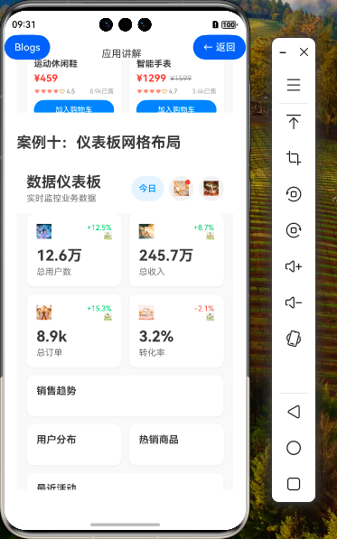
效果演示


1. 引言
在上一篇教程中,我们介绍了如何使用 HarmonyOS NEXT 的 Grid 组件实现基础的企业级仪表板界面。本篇教程将深入探讨仪表板网格布局的进阶技巧,包括动态调整网格结构、高级交互效果、数据可视化增强和性能优化等内容,帮助开发者构建更加专业和高效的仪表板应用。
2. 动态网格布局
2.1 响应式网格设计
企业级应用需要适应不同的屏幕尺寸和方向,响应式网格设计是实现这一目标的关键。
// 响应式网格布局
@State gridColumns: string = '1fr 1fr'
@State gridRows: string = 'auto auto auto auto'

// 屏幕方向变化监听
onPortraitChanged(isPortrait: boolean) {
    if (isPortrait) {
        // 竖屏模式:两列布局
        this.gridColumns = '1fr 1fr'
        this.gridRows = 'auto auto auto auto'
    } else {
        // 横屏模式:四列布局
        this.gridColumns = '1fr 1fr 1fr 1fr'
        this.gridRows = 'auto auto'
    }
}

// 在 Grid 组件中应用动态模板
Grid() {
    // GridItem 内容...
}
.columnsTemplate(this.gridColumns)
.rowsTemplate(this.gridRows)
.width('100%')
2.2 动态调整 GridItem 位置
根据屏幕方向或用户偏好,动态调整 GridItem 的位置和大小:
// 动态调整 GridItem 位置
@State salesTrendPosition: { start: number, end: number } = { start: 0, end: 1 }
@State userDistPosition: { start: number, end: number } = { start: 0, end: 0 }

// 根据屏幕方向更新位置
updateGridItemPositions(isPortrait: boolean) {
    if (isPortrait) {
        // 竖屏布局
        this.salesTrendPosition = { start: 0, end: 1 } // 跨两列
        this.userDistPosition = { start: 0, end: 0 }   // 占据第一列
    } else {
        // 横屏布局
        this.salesTrendPosition = { start: 0, end: 2 } // 跨三列
        this.userDistPosition = { start: 3, end: 3 }   // 占据第四列
    }
}

// 在 GridItem 中应用动态位置
GridItem() {
    this.ChartCard('销售趋势', () => {
        this.SalesTrendChart()
    })
}
.columnStart(this.salesTrendPosition.start)
.columnEnd(this.salesTrendPosition.end)
2.3 网格区域命名
使用网格区域命名可以更直观地定义复杂布局:
// 定义网格区域
@State gridAreas: string[] = [
    'overview overview',
    'sales users',
    'products activities'
]

// 横屏模式下的网格区域
@State gridAreasLandscape: string[] = [
    'overview overview sales sales',
    'users products activities activities'
]

// 在 Grid 中应用区域定义
Grid() {
    // 概览区域
    GridItem() {
        this.OverviewSection()
    }
    .gridArea('overview')

    // 销售趋势区域
    GridItem() {
        this.SalesTrendChart()
    }
    .gridArea('sales')

    // 其他区域...
}
.areas(this.isPortrait ? this.gridAreas : this.gridAreasLandscape)
.columnsTemplate(this.isPortrait ? '1fr 1fr' : '1fr 1fr 1fr 1fr')
.rowsTemplate(this.isPortrait ? 'auto auto auto' : 'auto auto')
3. 高级交互效果
3.1 卡片拖拽与重排
实现卡片拖拽功能,允许用户自定义仪表板布局:
// 卡片配置数据
@State cardConfigs: CardConfig[] = [
    { id: 'overview', title: '数据概览', type: 'overview', position: 0 },
    { id: 'sales', title: '销售趋势', type: 'chart', position: 1 },
    { id: 'users', title: '用户分布', type: 'chart', position: 2 },
    { id: 'products', title: '热销商品', type: 'list', position: 3 },
    { id: 'activities', title: '最近活动', type: 'list', position: 4 }
]

// 拖拽状态
@State dragStartIndex: number = -1
@State dragOverIndex: number = -1

// 拖拽处理函数
onDragStart(index: number) {
    this.dragStartIndex = index
}

onDragOver(index: number) {
    this.dragOverIndex = index
}

onDrop() {
    if (this.dragStartIndex >= 0 && this.dragOverIndex >= 0) {
        // 交换卡片位置
        const temp = this.cardConfigs[this.dragStartIndex]
        this.cardConfigs.splice(this.dragStartIndex, 1)
        this.cardConfigs.splice(this.dragOverIndex, 0, temp)

        // 更新位置属性
        this.cardConfigs.forEach((card, index) => {
            card.position = index
        })
    }

    // 重置拖拽状态
    this.dragStartIndex = -1
    this.dragOverIndex = -1
}

// 在 Grid 中应用拖拽功能
Grid() {
    ForEach(this.cardConfigs, (card: CardConfig, index: number) => {
        GridItem() {
            Column() {
                // 卡片标题栏(可拖拽)
                Row() {
                    Text(card.title)
                        .fontSize(16)
                        .fontWeight(FontWeight.Bold)

                    Image($r('app.media.drag_handle'))
                        .width(20)
                        .height(20)
                        .fillColor('#666666')
                }
                .width('100%')
                .padding(8)
                .backgroundColor(this.dragStartIndex === index ? '#E0E0E0' : '#F0F0F0')
                .border({
                    width: this.dragOverIndex === index ? 2 : 0,
                    color: '#007AFF'
                })
                .onDragStart(() => this.onDragStart(index))
                .onDragOver(() => this.onDragOver(index))
                .onDrop(() => this.onDrop())

                // 卡片内容
                if (card.type === 'overview') {
                    this.OverviewSection()
                } else if (card.type === 'chart') {
                    if (card.id === 'sales') {
                        this.SalesTrendChart()
                    } else if (card.id === 'users') {
                        this.UserDistributionChart()
                    }
                } else if (card.type === 'list') {
                    if (card.id === 'products') {
                        this.TopProductsList()
                    } else if (card.id === 'activities') {
                        this.RecentActivitiesList()
                    }
                }
            }
            .width('100%')
            .backgroundColor('#FFFFFF')
            .borderRadius(12)
            .shadow({
                radius: 6,
                color: 'rgba(0, 0, 0, 0.1)',
                offsetX: 0,
                offsetY: 2
            })
        }
        .columnStart(index % 2)
        .columnEnd(index % 2)
        .rowStart(Math.floor(index / 2))
        .rowEnd(Math.floor(index / 2))
    })
}
3.2 卡片展开与折叠
实现卡片的展开与折叠功能,优化屏幕空间利用:
// 卡片展开状态
@State expandedCards: Map<string, boolean> = new Map([
    ['overview', true],
    ['sales', true],
    ['users', true],
    ['products', true],
    ['activities', true]
])

// 切换卡片展开状态
toggleCardExpand(cardId: string) {
    const currentState = this.expandedCards.get(cardId) || false
    this.expandedCards.set(cardId, !currentState)
}

// 在卡片中应用展开/折叠功能
@Builder
CardHeader(title: string, cardId: string) {
    Row() {
        Text(title)
            .fontSize(16)
            .fontWeight(FontWeight.Bold)
            .fontColor('#333333')
            .layoutWeight(1)

        Button() {
            Image(this.expandedCards.get(cardId) ? $r('app.media.collapse') : $r('app.media.expand'))
                .width(20)
                .height(20)
                .fillColor('#666666')
        }
        .width(32)
        .height(32)
        .backgroundColor('transparent')
        .onClick(() => {
            this.toggleCardExpand(cardId)
        })
    }
    .width('100%')
    .padding({ left: 16, right: 16, top: 12, bottom: 12 })
    .border({
        width: { bottom: 1 },
        color: '#F0F0F0'
    })
}

// 在卡片内容中应用展开/折叠逻辑
@Builder
ChartCard(title: string, cardId: string, content: () => void) {
    Column() {
        this.CardHeader(title, cardId)

        if (this.expandedCards.get(cardId)) {
            content()
        }
    }
    .width('100%')
    .backgroundColor('#FFFFFF')
    .borderRadius(12)
    .shadow({
        radius: 6,
        color: 'rgba(0, 0, 0, 0.1)',
        offsetX: 0,
        offsetY: 2
    })
}
3.3 卡片缩放与全屏显示
实现卡片的缩放和全屏显示功能:
// 全屏显示状态
@State fullscreenCardId: string = ''

// 设置卡片全屏显示
setFullscreen(cardId: string) {
    this.fullscreenCardId = cardId
}

// 退出全屏显示
exitFullscreen() {
    this.fullscreenCardId = ''
}

// 在卡片标题栏中添加全屏按钮
@Builder
CardHeader(title: string, cardId: string) {
    Row() {
        Text(title)
            .fontSize(16)
            .fontWeight(FontWeight.Bold)
            .fontColor('#333333')
            .layoutWeight(1)

        Button() {
            Image($r('app.media.fullscreen'))
                .width(20)
                .height(20)
                .fillColor('#666666')
        }
        .width(32)
        .height(32)
        .backgroundColor('transparent')
        .margin({ right: 8 })
        .onClick(() => {
            this.setFullscreen(cardId)
        })

        // 展开/折叠按钮...
    }
    .width('100%')
    .padding({ left: 16, right: 16, top: 12, bottom: 12 })
    .border({
        width: { bottom: 1 },
        color: '#F0F0F0'
    })
}

// 全屏显示卡片
build() {
    Stack() {
        Column() {
            // 标题栏...

            // 仪表板网格...
        }

        // 全屏卡片
        if (this.fullscreenCardId !== '') {
            Column() {
                // 全屏卡片标题栏
                Row() {
                    Text(this.getCardTitle(this.fullscreenCardId))
                        .fontSize(20)
                        .fontWeight(FontWeight.Bold)
                        .fontColor('#333333')
                        .layoutWeight(1)

                    Button() {
                        Image($r('app.media.exit_fullscreen'))
                            .width(24)
                            .height(24)
                            .fillColor('#666666')
                    }
                    .width(40)
                    .height(40)
                    .backgroundColor('#F0F0F0')
                    .borderRadius(20)
                    .onClick(() => {
                        this.exitFullscreen()
                    })
                }
                .width('100%')
                .padding(16)

                // 全屏卡片内容
                if (this.fullscreenCardId === 'sales') {
                    this.SalesTrendChart(true) // 传入全屏参数
                } else if (this.fullscreenCardId === 'users') {
                    this.UserDistributionChart(true)
                } else if (this.fullscreenCardId === 'products') {
                    this.TopProductsList(true)
                } else if (this.fullscreenCardId === 'activities') {
                    this.RecentActivitiesList(true)
                } else if (this.fullscreenCardId === 'overview') {
                    this.OverviewSection(true)
                }
            }
            .width('100%')
            .height('100%')
            .backgroundColor('#FFFFFF')
        }
    }
    .width('100%')
    .height('100%')
}
4. 数据可视化增强
4.1 高级图表实现
4.1.1 增强的销售趋势图
// 增强的销售趋势图
@Builder
SalesTrendChart(isFullscreen: boolean = false) {
    Column() {
        // 图表标题和筛选器
        if (!isFullscreen) {
            Row() {
                Text('销售趋势')
                    .fontSize(16)
                    .fontWeight(FontWeight.Bold)
                    .fontColor('#333333')
                    .layoutWeight(1)

                Select(this.timeRanges)
                    .selected(this.timeRanges.indexOf(this.selectedTimeRange))
                    .value(this.selectedTimeRange)
                    .font({ size: 14 })
                    .fontColor('#333333')
                    .selectedOptionFont({ size: 14 })
                    .optionFont({ size: 14 })
                    .onSelect((index: number) => {
                        this.selectedTimeRange = this.timeRanges[index]
                        this.refreshData()
                    })
            }
            .width('100%')
            .margin({ bottom: 16 })
        }

        // 图表图例
        Row() {
            Row() {
                Circle({ width: 8, height: 8 })
                    .fill('#007AFF')
                    .margin({ right: 4 })

                Text('销售额')
                    .fontSize(12)
                    .fontColor('#666666')
            }
            .margin({ right: 16 })

            Row() {
                Circle({ width: 8, height: 8 })
                    .fill('#34C759')
                    .margin({ right: 4 })

                Text('订单数')
                    .fontSize(12)
                    .fontColor('#666666')
            }
        }
        .width('100%')
        .justifyContent(FlexAlign.End)
        .margin({ bottom: 8 })

        // 图表内容
        Stack() {
            // 背景网格线
            Column() {
                ForEach([0, 1, 2, 3], (item) => {
                    Divider()
                        .vertical(false)
                        .strokeWidth(1)
                        .color('#F0F0F0')
                        .lineCap(LineCapStyle.Round)

                    Blank()
                        .layoutWeight(1)
                })
            }
            .width('100%')
            .height('100%')

            // 柱状图
            Row() {
                ForEach(this.dashboardData.charts.salesTrend, (item: SalesTrend, index) => {
                    Column() {
                        // 销售额柱子
                        Column()
                            .width(isFullscreen ? 40 : 20)
                            .height((item.value / 350000) * (isFullscreen ? 200 : 100))
                            .backgroundColor('#007AFF')
                            .borderRadius({ topLeft: 4, topRight: 4 })
                            .margin({ bottom: 4 })

                        // 订单数柱子
                        Column()
                            .width(isFullscreen ? 40 : 20)
                            .height((item.orders / 1000) * (isFullscreen ? 200 : 100))
                            .backgroundColor('#34C759')
                            .borderRadius({ topLeft: 4, topRight: 4 })
                            .margin({ bottom: 8 })

                        // 月份标签
                        Text(item.month)
                            .fontSize(isFullscreen ? 14 : 10)
                            .fontColor('#666666')
                            .textAlign(TextAlign.Center)

                        // 数值
                        Text(this.formatNumber(item.value))
                            .fontSize(isFullscreen ? 12 : 8)
                            .fontColor('#999999')
                            .textAlign(TextAlign.Center)
                            .margin({ top: 2 })
                    }
                    .alignItems(HorizontalAlign.Center)
                    .layoutWeight(1)
                })
            }
            .width('100%')
            .height(isFullscreen ? 240 : 120)
            .alignItems(VerticalAlign.Bottom)
        }
        .width('100%')
        .height(isFullscreen ? 240 : 120)

        // 全屏模式下显示更多信息
        if (isFullscreen) {
            Column() {
                Text('销售趋势分析')
                    .fontSize(16)
                    .fontWeight(FontWeight.Bold)
                    .fontColor('#333333')
                    .margin({ top: 24, bottom: 8 })

                Text('本季度销售额整体呈上升趋势,7月份达到峰值,环比增长15.3%。订单数量与销售额基本保持一致的增长态势,客单价相对稳定。')
                    .fontSize(14)
                    .fontColor('#666666')
                    .margin({ bottom: 16 })

                // 更多详细数据表格
                // ...
            }
            .width('100%')
            .padding(16)
        }
    }
    .width('100%')
    .padding(isFullscreen ? 0 : 16)
    .backgroundColor('#FFFFFF')
    .borderRadius(isFullscreen ? 0 : 12)
}
4.1.2 增强的用户分布图
// 增强的用户分布饼图
@Builder
UserDistributionChart(isFullscreen: boolean = false) {
    Column() {
        // 图表标题
        if (!isFullscreen) {
            Text('用户分布')
                .fontSize(16)
                .fontWeight(FontWeight.Bold)
                .fontColor('#333333')
                .width('100%')
                .textAlign(TextAlign.Start)
                .margin({ bottom: 16 })
        }

        Row() {
            // 饼图
            Stack() {
                // 背景圆
                Circle({ width: isFullscreen ? 160 : 80, height: isFullscreen ? 160 : 80 })
                    .fill('#F0F0F0')

                // 中心圆
                Circle({ width: isFullscreen ? 120 : 60, height: isFullscreen ? 120 : 60 })
                    .fill('#FFFFFF')

                // 饼图扇区(简化实现)
                Stack() {
                    // 新用户扇区
                    Arc()
                        .width(isFullscreen ? 160 : 80)
                        .height(isFullscreen ? 160 : 80)
                        .startAngle(0)
                        .sweepAngle(108) // 30% = 108度
                        .fill('#007AFF')

                    // 活跃用户扇区
                    Arc()
                        .width(isFullscreen ? 160 : 80)
                        .height(isFullscreen ? 160 : 80)
                        .startAngle(108)
                        .sweepAngle(180) // 50% = 180度
                        .fill('#34C759')

                    // 休眠用户扇区
                    Arc()
                        .width(isFullscreen ? 160 : 80)
                        .height(isFullscreen ? 160 : 80)
                        .startAngle(288)
                        .sweepAngle(72) // 20% = 72度
                        .fill('#FF9500')
                }

                // 中心文字
                Text('用户\n分布')
                    .fontSize(isFullscreen ? 16 : 10)
                    .fontColor('#666666')
                    .textAlign(TextAlign.Center)
            }
            .margin({ right: isFullscreen ? 32 : 16 })

            // 图例
            Column() {
                ForEach(this.dashboardData.charts.userDistribution, (item: UserDistribution) => {
                    Row() {
                        Circle({ width: isFullscreen ? 12 : 8, height: isFullscreen ? 12 : 8 })
                            .fill(item.color)
                            .margin({ right: isFullscreen ? 12 : 8 })

                        Text(item.category)
                            .fontSize(isFullscreen ? 16 : 12)
                            .fontColor('#666666')
                            .layoutWeight(1)

                        Text(`${item.value}%`)
                            .fontSize(isFullscreen ? 16 : 12)
                            .fontWeight(FontWeight.Bold)
                            .fontColor('#333333')
                    }
                    .width('100%')
                    .margin({ bottom: isFullscreen ? 16 : 8 })
                })

                // 全屏模式下显示更多信息
                if (isFullscreen) {
                    Divider()
                        .vertical(false)
                        .strokeWidth(1)
                        .color('#F0F0F0')
                        .margin({ top: 8, bottom: 16 })

                    Text('用户增长率')
                        .fontSize(14)
                        .fontWeight(FontWeight.Bold)
                        .fontColor('#333333')
                        .margin({ bottom: 8 })

                    Row() {
                        Text('新用户增长率')
                            .fontSize(14)
                            .fontColor('#666666')
                            .layoutWeight(1)

                        Text('+12.5%')
                            .fontSize(14)
                            .fontWeight(FontWeight.Bold)
                            .fontColor('#34C759')
                    }
                    .margin({ bottom: 8 })

                    Row() {
                        Text('活跃用户增长率')
                            .fontSize(14)
                            .fontColor('#666666')
                            .layoutWeight(1)

                        Text('+8.3%')
                            .fontSize(14)
                            .fontWeight(FontWeight.Bold)
                            .fontColor('#34C759')
                    }
                    .margin({ bottom: 8 })

                    Row() {
                        Text('用户留存率')
                            .fontSize(14)
                            .fontColor('#666666')
                            .layoutWeight(1)

                        Text('78.2%')
                            .fontSize(14)
                            .fontWeight(FontWeight.Bold)
                            .fontColor('#333333')
                    }
                }
            }
            .layoutWeight(1)
        }
        .width('100%')
    }
    .width('100%')
    .padding(isFullscreen ? 24 : 16)
    .backgroundColor('#FFFFFF')
    .borderRadius(isFullscreen ? 0 : 12)
}
4.2 数据筛选与过滤
实现数据筛选功能,允许用户根据不同条件查看数据:
// 筛选条件
@State filterOptions: FilterOptions = {
    timeRange: '今日',
    region: '全部',
    category: '全部',
    channel: '全部'
}

// 筛选选项
private timeRanges: string[] = ['今日', '本周', '本月', '本季度', '本年']
private regions: string[] = ['全部', '华东', '华南', '华北', '西南', '西北', '东北']
private categories: string[] = ['全部', '电子产品', '服装', '食品', '家居', '美妆']
private channels: string[] = ['全部', '线上', '线下', '代理商']

// 筛选面板
@Builder
FilterPanel() {
    Column() {
        // 时间范围筛选
        Row() {
            Text('时间范围:')
                .fontSize(14)
                .fontColor('#666666')
                .width(80)

            Flex({ wrap: FlexWrap.Wrap }) {
                ForEach(this.timeRanges, (item: string) => {
                    Button(item)
                        .fontSize(14)
                        .fontColor(this.filterOptions.timeRange === item ? '#FFFFFF' : '#333333')
                        .backgroundColor(this.filterOptions.timeRange === item ? '#007AFF' : '#F0F0F0')
                        .borderRadius(16)
                        .padding({ left: 12, right: 12, top: 6, bottom: 6 })
                        .margin({ right: 8, bottom: 8 })
                        .onClick(() => {
                            this.filterOptions.timeRange = item
                            this.applyFilters()
                        })
                })
            }
            .layoutWeight(1)
        }
        .width('100%')
        .margin({ bottom: 16 })

        // 区域筛选
        Row() {
            Text('区域:')
                .fontSize(14)
                .fontColor('#666666')
                .width(80)

            Flex({ wrap: FlexWrap.Wrap }) {
                ForEach(this.regions, (item: string) => {
                    Button(item)
                        .fontSize(14)
                        .fontColor(this.filterOptions.region === item ? '#FFFFFF' : '#333333')
                        .backgroundColor(this.filterOptions.region === item ? '#007AFF' : '#F0F0F0')
                        .borderRadius(16)
                        .padding({ left: 12, right: 12, top: 6, bottom: 6 })
                        .margin({ right: 8, bottom: 8 })
                        .onClick(() => {
                            this.filterOptions.region = item
                            this.applyFilters()
                        })
                })
            }
            .layoutWeight(1)
        }
        .width('100%')
        .margin({ bottom: 16 })

        // 其他筛选条件...

        // 筛选按钮
        Row() {
            Button('重置')
                .fontSize(16)
                .fontColor('#666666')
                .backgroundColor('#F0F0F0')
                .borderRadius(8)
                .width(120)
                .height(40)
                .margin({ right: 16 })
                .onClick(() => {
                    this.resetFilters()
                })

            Button('应用筛选')
                .fontSize(16)
                .fontColor('#FFFFFF')
                .backgroundColor('#007AFF')
                .borderRadius(8)
                .width(120)
                .height(40)
                .onClick(() => {
                    this.applyFilters()
                    this.showFilterPanel = false
                })
        }
        .width('100%')
        .justifyContent(FlexAlign.Center)
        .margin({ top: 16 })
    }
    .width('100%')
    .padding(16)
    .backgroundColor('#FFFFFF')
    .borderRadius(16)
}

// 应用筛选
applyFilters() {
    // 根据筛选条件更新数据
    this.refreshData()
}

// 重置筛选
resetFilters() {
    this.filterOptions = {
        timeRange: '今日',
        region: '全部',
        category: '全部',
        channel: '全部'
    }
    this.applyFilters()
}
4.3 数据导出功能
实现数据导出功能,允许用户导出仪表板数据:
// 导出数据
exportData(format: 'csv' | 'excel' | 'pdf') {
    // 显示导出进度对话框
    this.showExportProgress = true

    // 模拟导出过程
    setTimeout(() => {
        this.exportProgress = 30
        setTimeout(() => {
            this.exportProgress = 60
            setTimeout(() => {
                this.exportProgress = 100
                setTimeout(() => {
                    this.showExportProgress = false
                    this.showExportSuccess = true

                    // 3秒后自动关闭成功提示
                    setTimeout(() => {
                        this.showExportSuccess = false
                    }, 3000)
                }, 500)
            }, 800)
        }, 600)
    }, 500)
}

// 导出进度对话框
@Builder
ExportProgressDialog() {
    Column() {
        Text('正在导出数据')
            .fontSize(18)
            .fontWeight(FontWeight.Bold)
            .fontColor('#333333')
            .margin({ bottom: 16 })

        Progress({ value: this.exportProgress, total: 100 })
            .width('80%')
            .color('#007AFF')
            .margin({ bottom: 16 })

        Text(`${this.exportProgress}%`)
            .fontSize(14)
            .fontColor('#666666')
            .margin({ bottom: 24 })

        Button('取消')
            .fontSize(16)
            .fontColor('#666666')
            .backgroundColor('#F0F0F0')
            .borderRadius(8)
            .width(120)
            .height(40)
            .onClick(() => {
                this.showExportProgress = false
            })
    }
    .width('80%')
    .padding(24)
    .backgroundColor('#FFFFFF')
    .borderRadius(16)
}

// 导出成功提示
@Builder
ExportSuccessDialog() {
    Row() {
        Image($r('app.media.success'))
            .width(24)
            .height(24)
            .fillColor('#34C759')
            .margin({ right: 8 })

        Text('数据导出成功')
            .fontSize(16)
            .fontColor('#333333')
    }
    .width('60%')
    .padding(16)
    .backgroundColor('#FFFFFF')
    .borderRadius(8)
    .shadow({
        radius: 6,
        color: 'rgba(0, 0, 0, 0.1)',
        offsetX: 0,
        offsetY: 2
    })
}
5. 性能优化
5.1 懒加载与分页
实现数据懒加载和分页功能,优化大数据量下的性能:
// 分页参数
@State pageSize: number = 10
@State currentPage: number = 1
@State totalPages: number = 1
@State isLoading: boolean = false

// 加载数据
loadData(page: number = 1) {
    this.isLoading = true

    // 模拟网络请求延迟
    setTimeout(() => {
        // 更新数据和分页信息
        this.currentPage = page
        this.totalPages = Math.ceil(this.totalItems / this.pageSize)
        this.isLoading = false
    }, 1000)
}

// 加载下一页
loadNextPage() {
    if (this.currentPage < this.totalPages && !this.isLoading) {
        this.loadData(this.currentPage + 1)
    }
}

// 在列表底部添加加载更多功能
@Builder
LoadMoreRow() {
    Row() {
        if (this.isLoading) {
            LoadingProgress()
                .width(24)
                .height(24)
                .color('#007AFF')
                .margin({ right: 8 })

            Text('加载中...')
                .fontSize(14)
                .fontColor('#666666')
        } else if (this.currentPage < this.totalPages) {
            Text('加载更多')
                .fontSize(14)
                .fontColor('#007AFF')
        } else {
            Text('已加载全部数据')
                .fontSize(14)
                .fontColor('#999999')
        }
    }
    .width('100%')
    .height(50)
    .justifyContent(FlexAlign.Center)
    .onClick(() => {
        if (this.currentPage < this.totalPages && !this.isLoading) {
            this.loadNextPage()
        }
    })
}
5.2 虚拟列表优化
使用虚拟列表优化长列表的性能:
// 在热销商品和最近活动中使用虚拟列表
@Builder
TopProductsList(isFullscreen: boolean = false) {
    Column() {
        // 标题
        if (!isFullscreen) {
            Text('热销商品')
                .fontSize(16)
                .fontWeight(FontWeight.Bold)
                .fontColor('#333333')
                .width('100%')
                .textAlign(TextAlign.Start)
                .margin({ bottom: 16 })
        }

        // 使用虚拟列表
        List() {
            ListItemGroup({ header: isFullscreen ? this.ProductListHeader() : null }) {
                ForEach(this.dashboardData.charts.topProducts, (product: TopProduct, index) => {
                    ListItem() {
                        this.ProductListItem(product, index)
                    }
                })
            }
        }
        .width('100%')
        .height(isFullscreen ? 400 : 200)
        .divider({
            strokeWidth: 1,
            color: '#F0F0F0',
            startMargin: 32,
            endMargin: 0
        })

        // 全屏模式下显示分页控制
        if (isFullscreen) {
            Row() {
                Button() {
                    Image($r('app.media.prev_page'))
                        .width(20)
                        .height(20)
                        .fillColor(this.currentPage > 1 ? '#333333' : '#999999')
                }
                .width(40)
                .height(40)
                .borderRadius(20)
                .backgroundColor('#F0F0F0')
                .margin({ right: 16 })
                .enabled(this.currentPage > 1)
                .onClick(() => {
                    if (this.currentPage > 1) {
                        this.loadData(this.currentPage - 1)
                    }
                })

                ForEach(this.getPaginationArray(), (page: number) => {
                    Button(`${page}`)
                        .fontSize(14)
                        .fontColor(this.currentPage === page ? '#FFFFFF' : '#333333')
                        .backgroundColor(this.currentPage === page ? '#007AFF' : '#F0F0F0')
                        .borderRadius(20)
                        .width(40)
                        .height(40)
                        .margin({ right: 8 })
                        .onClick(() => {
                            this.loadData(page)
                        })
                })

                Button() {
                    Image($r('app.media.next_page'))
                        .width(20)
                        .height(20)
                        .fillColor(this.currentPage < this.totalPages ? '#333333' : '#999999')
                }
                .width(40)
                .height(40)
                .borderRadius(20)
                .backgroundColor('#F0F0F0')
                .margin({ left: 8 })
                .enabled(this.currentPage < this.totalPages)
                .onClick(() => {
                    if (this.currentPage < this.totalPages) {
                        this.loadData(this.currentPage + 1)
                    }
                })
            }
            .width('100%')
            .justifyContent(FlexAlign.Center)
            .margin({ top: 16 })
        }
    }
    .width('100%')
    .padding(isFullscreen ? 24 : 16)
    .backgroundColor('#FFFFFF')
    .borderRadius(isFullscreen ? 0 : 12)
}
5.3 图表渲染优化
优化图表渲染性能:
// 图表渲染优化
@State chartRendered: boolean = false

// 延迟渲染图表
onPageShow() {
    // 先渲染基础UI
    this.chartRendered = false

    // 延迟200ms渲染图表
    setTimeout(() => {
        this.chartRendered = true
    }, 200)
}

// 在图表组件中应用条件渲染
@Builder
SalesTrendChart(isFullscreen: boolean = false) {
    Column() {
        // 图表标题...

        if (this.chartRendered) {
            // 完整图表内容
            // ...
        } else {
            // 图表占位符
            Column() {
                Row() {
                    ForEach([1, 2, 3, 4, 5, 6], (item) => {
                        Column() {
                            Column()
                                .width(isFullscreen ? 40 : 20)
                                .height(40)
                                .backgroundColor('#F0F0F0')
                                .borderRadius(4)
                                .margin({ bottom: 8 })

                            Column()
                                .width(isFullscreen ? 40 : 20)
                                .height(8)
                                .backgroundColor('#F0F0F0')
                                .borderRadius(4)
                        }
                        .alignItems(HorizontalAlign.Center)
                        .layoutWeight(1)
                    })
                }
                .width('100%')
                .height(isFullscreen ? 240 : 120)
                .alignItems(VerticalAlign.Bottom)
            }
            .width('100%')
        }
    }
    .width('100%')
    .padding(isFullscreen ? 24 : 16)
    .backgroundColor('#FFFFFF')
    .borderRadius(isFullscreen ? 0 : 12)
}
6. 主题与样式定制
6.1 主题切换
实现主题切换功能:
// 主题设置
@State isDarkMode: boolean = false
@State accentColor: string = '#007AFF'

// 获取主题颜色
getThemeColor(lightColor: string, darkColor: string): string {
    return this.isDarkMode ? darkColor : lightColor
}

// 切换主题
toggleTheme() {
    this.isDarkMode = !this.isDarkMode
}

// 设置强调色
setAccentColor(color: string) {
    this.accentColor = color
}

// 应用主题到组件
@Builder
ChartCard(title: string, cardId: string, content: () => void) {
    Column() {
        this.CardHeader(title, cardId)

        if (this.expandedCards.get(cardId)) {
            content()
        }
    }
    .width('100%')
    .backgroundColor(this.getThemeColor('#FFFFFF', '#1C1C1E'))
    .borderRadius(12)
    .shadow({
        radius: 6,
        color: this.getThemeColor('rgba(0, 0, 0, 0.1)', 'rgba(0, 0, 0, 0.3)'),
        offsetX: 0,
        offsetY: 2
    })
}
6.2 自定义卡片样式
实现卡片样式自定义功能:
// 卡片样式配置
@State cardStyles: Map<string, CardStyle> = new Map([
    ['overview', { borderRadius: 12, shadow: true, borderColor: '' }],
    ['sales', { borderRadius: 12, shadow: true, borderColor: '' }],
    ['users', { borderRadius: 12, shadow: true, borderColor: '' }],
    ['products', { borderRadius: 12, shadow: true, borderColor: '' }],
    ['activities', { borderRadius: 12, shadow: true, borderColor: '' }]
])

// 更新卡片样式
updateCardStyle(cardId: string, style: Partial<CardStyle>) {
    const currentStyle = this.cardStyles.get(cardId) || { borderRadius: 12, shadow: true, borderColor: '' }
    this.cardStyles.set(cardId, { ...currentStyle, ...style })
}

// 应用卡片样式
@Builder
StyledCard(cardId: string, content: () => void) {
    const style = this.cardStyles.get(cardId) || { borderRadius: 12, shadow: true, borderColor: '' }

    Column() {
        content()
    }
    .width('100%')
    .backgroundColor(this.getThemeColor('#FFFFFF', '#1C1C1E'))
    .borderRadius(style.borderRadius)
    .border(style.borderColor ? {
        width: 1,
        color: style.borderColor
    } : undefined)
    .shadow(style.shadow ? {
        radius: 6,
        color: this.getThemeColor('rgba(0, 0, 0, 0.1)', 'rgba(0, 0, 0, 0.3)'),
        offsetX: 0,
        offsetY: 2
    } : undefined)
}
7. 仪表板网格布局最佳实践
| 最佳实践 | 描述 |
|---|---|
| 响应式设计 | 使用响应式网格布局,适应不同屏幕尺寸和方向 |
| 模块化组件 | 将仪表板拆分为可重用的模块化组件,提高代码复用性 |
| 数据驱动 | 采用数据驱动的设计方式,使界面能够根据数据自动更新 |
| 懒加载策略 | 对于大量数据,采用懒加载和分页策略,提高性能 |
| 用户自定义 | 允许用户自定义仪表板布局和样式,提高用户体验 |
| 主题支持 | 支持明暗主题切换,适应不同使用场景 |
| 性能优化 | 采用虚拟列表、延迟渲染等技术优化性能 |
| 交互反馈 | 提供丰富的交互反馈,如加载动画、操作提示等 |
8. 总结
本教程深入探讨了 HarmonyOS NEXT 仪表板网格布局的进阶技巧,包括动态网格布局、高级交互效果、数据可视化增强和性能优化等内容。通过这些技巧,开发者可以构建更加专业、高效和用户友好的企业级仪表板应用。
00
